


Houzz Tour: A 1920s House Gets a Family-friendly Makeover
A layout rejig to create better flow and more open space made this period property perfect for 21st century family life
Sarah Warwick
13 January 2019
Houzz Contributor. I'm a freelance journalist and editor writing for nationals, magazines and websites. A serial house revamper, I love great design, beautiful interiors and practical solutions.
Houzz Contributor. I'm a freelance journalist and editor writing for nationals, magazines... More
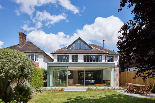
The 1920s house that architect Frederik Rissom was asked to reimagine was sizeable enough for a young household, but it didn’t make the grade when it came to togetherness. “They felt detached from one another,” Frederik says. Creating family space in a more open layout was therefore essential – but so, too, was following the strict rules of the conservation area in which the house is located.
House at a Glance
Who lives here? A professional couple and their two children
Location Richmond, London
Property A 1920s detached house
Size Five bedrooms and three bathrooms
Architect Frederik Rissom of R2 Studio Architects
Photos by Andy Stagg
The interior layout of the house was of its time. “In that period, they were thinking of a dining room as a dining room and a kitchen as a kitchen, and the two never really met,” Frederik says. “The way we live today is much more fluid.”
Sofa, B&B Italia. Form dining chairs; Form bar stools, Normann Copenhagen. Big Bang pendant light, Foscarini.
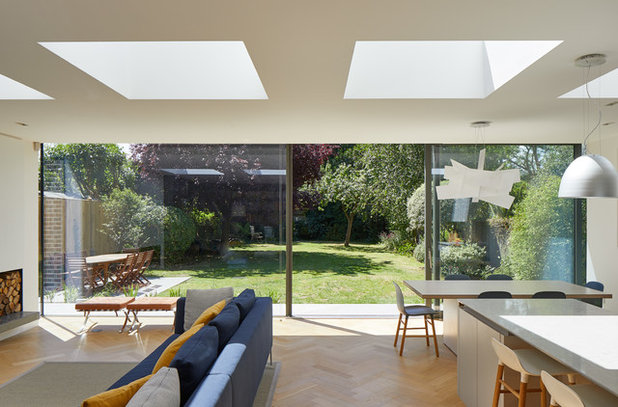
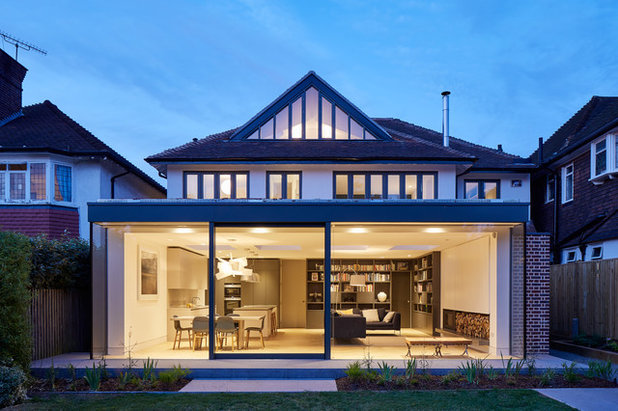
To break down the old barriers and create the shared space the family wanted, Frederik designed an open-plan rear extension connected to the garden. Now, it’s where the family spend most of their time.
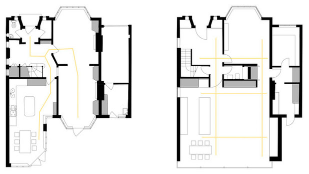
These before and after floorplans show how both circulation and views were improved.
These before and after floorplans show how both circulation and views were improved.
The new rear extension accommodates the kitchen, dining space, living area and library. With views extending from the front wall to the rear glass façade, the generous size of the home can be appreciated.
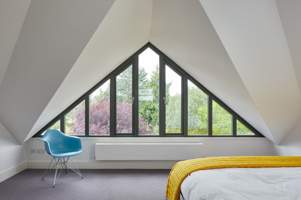
The project also included a loft conversion. Rules on what could be altered in the conservation area were strict, and the shape of the roof made adding a conventional box dormer out of the question. Frederik’s solution was the sizeable triangular dormer seen here, which creates space inside the loft.
The project also included a loft conversion. Rules on what could be altered in the conservation area were strict, and the shape of the roof made adding a conventional box dormer out of the question. Frederik’s solution was the sizeable triangular dormer seen here, which creates space inside the loft.
The original rear façade of the period home featured a rendered upper floor with brick on the ground floor, so Frederik respected that use of materials when constructing the extension.
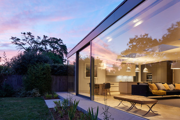
The extension is fitted with a single sliding door and frameless structural glazing for the fixed panes. “You achieve more transparency with larger pieces of fixed glass,” Frederik says.
The terrace behind the extension is narrow. “We were keen to bring the garden as close as possible to the rear façade, so when you’re in the lounge, you’re almost in the garden,” he says.
The terrace behind the extension is narrow. “We were keen to bring the garden as close as possible to the rear façade, so when you’re in the lounge, you’re almost in the garden,” he says.
Frederik steered clear of strong colours. “The homeowners wanted the space to look calm and restrained,” he says. “They prefer to bring in colour through soft furnishings or accessories.”
The garden connection makes an impact, too. “It’s a very green wall that’s quite dominant,” he says.
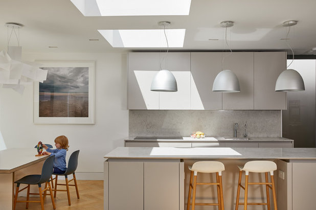
Roof lights were positioned deep into the space to give the rear section maximum daylight.
Nur pendant lights, Artemide.
The garden connection makes an impact, too. “It’s a very green wall that’s quite dominant,” he says.
Roof lights were positioned deep into the space to give the rear section maximum daylight.
Nur pendant lights, Artemide.
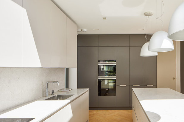
The kitchen cabinetry was kept sleek and contemporary. It’s fitted to ceiling height to maximise storage, with rarely used items stowed in the top-most cupboards.
The homeowners chose to locate the hob on the perimeter units, so the island can be used for other functions, including breakfast. It also means the children can sit on the stools and help with food preparation.
Kitchen cabinetry; marble worktops, all Hi-Spec Design.
The homeowners chose to locate the hob on the perimeter units, so the island can be used for other functions, including breakfast. It also means the children can sit on the stools and help with food preparation.
Kitchen cabinetry; marble worktops, all Hi-Spec Design.
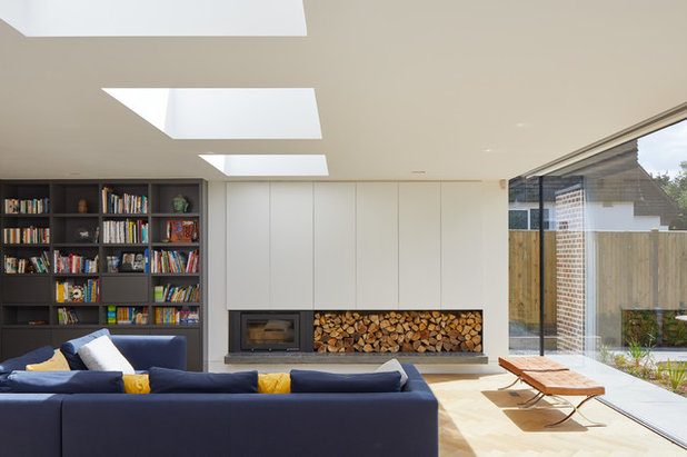
The seating area faces a wood-burning stove with built-in log storage alongside. Above is a series of doors that slide to one side to reveal the TV when it’s needed. “They didn’t want to see it,” Frederik says.
Library shelving was constructed to the left of the stove and at the rear of the room. The dark grey finish gives the space depth and the books add some colour. “It’s a nice backbone to the play space there,” Frederik says.
Fireplace cabinetry, Woodsmith. Stove, Westfire. Bespoke cabinetry in grey, Proline Interiors.
Shop Houzz for wood-burning stoves, many with free shipping.
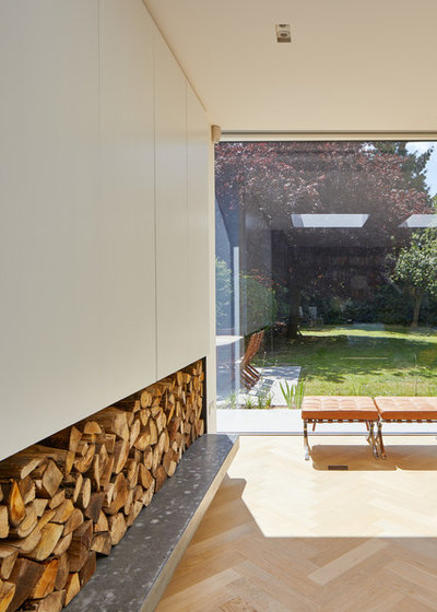
Beneath the stove and log store is a concrete bench, made bespoke for the room, which does the job of a hearth. “It adds a bit of richness and goes well with the white and grey colour palette,” Frederik says. “It also separates the logs from the wood flooring.”
The herringbone floor runs throughout this level of the home. “In an otherwise white and grey scheme, it brings in warmth and variation,” Frederik says.
Concrete bench, Mortise Concrete. Engineered wood parquet floor, Hitt Oak.
The herringbone floor runs throughout this level of the home. “In an otherwise white and grey scheme, it brings in warmth and variation,” Frederik says.
Concrete bench, Mortise Concrete. Engineered wood parquet floor, Hitt Oak.
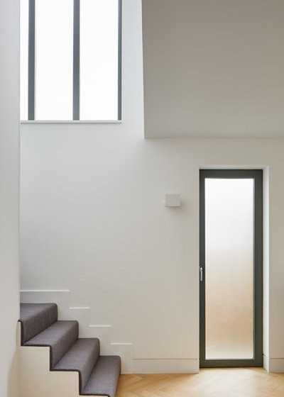
The staircase was flipped to allow more light into the hallway. At the bottom is a tilt-and-turn window that can provide extra ventilation on hot days.
With young children using them, the stairs were carpeted to avoid slips and deaden sound.
With young children using them, the stairs were carpeted to avoid slips and deaden sound.
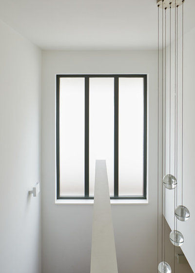
The window on the first floor landing, like the others in the house, is new, but respects the original pattern of the glazing.
Pendant light, Bocci.
Pendant light, Bocci.
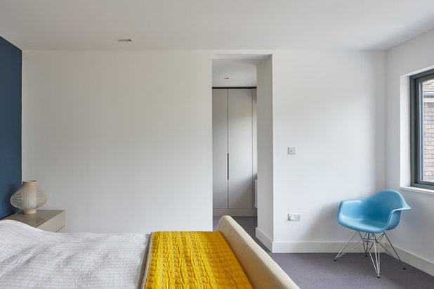
The master bedroom on the first floor was made smaller in order to screen off a dressing area. “What you need in a master suite is lots of storage and a comfortable bathroom – and the bedroom is still generous,” Frederik says.
The doorway to the dressing area, like all the doors in the house, almost reaches the ceiling. “Having tall doors makes it much more open,” Frederik explains.
The cabinetry for the dressing area was made for the room.
Fitting out a dressing room? Find cabinetry professionals in your area.
The doorway to the dressing area, like all the doors in the house, almost reaches the ceiling. “Having tall doors makes it much more open,” Frederik explains.
The cabinetry for the dressing area was made for the room.
Fitting out a dressing room? Find cabinetry professionals in your area.
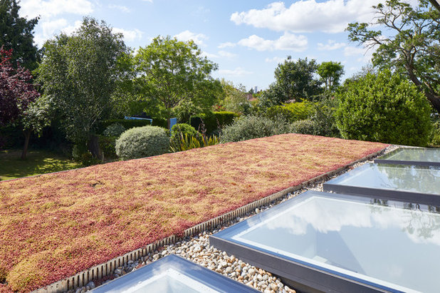
The master bedroom overlooks the sedum roof of the new rear extension. “It was chosen primarily to avoid having to look at a flat roof from the master suite,” Frederik says.
“An added benefit is that, because it retains water, which evaporates, it helps to cool the room below,” he says.
Get expert advice on green roofs.
“An added benefit is that, because it retains water, which evaporates, it helps to cool the room below,” he says.
Get expert advice on green roofs.
The bedroom has fabulous views of the mature garden. “The area was built to a master plan, with generous gardens and space between the houses,” Frederik says.
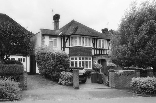
The old side extension didn’t match the mock Tudor pattern of the front of the original house.
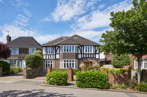
The side extension is now in tune with the original façade, with mock Tudor planks added at first-floor level.
Tell us…
What do you like about this open and airy home? Share your thoughts in the Comments section.
Tell us…
What do you like about this open and airy home? Share your thoughts in the Comments section.

Related Stories

House Tours
Houzz Tour: A Midcentury Home With a Strong Indoor-outdoor Link
By Becky Harris
A nature-inspired renovation has given this ranch house a relaxed mood and a connection to the outdoors from most rooms
Full Story

House Tours
Houzz Tour: Warm Tones and Luxurious Surfaces in a City Townhouse
An earthy colour palette, hidden storage and well-placed texture add character and practicality to this London home
Full Story

Room Tours
Kitchen Tour: A Gorgeous Extension With a Leafy Glasshouse Feel
By Kate Burt
When the owners of this terraced house extended, they were keen to retain its period feel and highlight the garden
Full Story

Gardens
Garden Tour: A Bare Roof Terrace Becomes a Pretty, Sociable Space
By Kate Burt
A retired couple got help transforming their large rooftop into a gorgeous, welcoming, multi-functional retreat
Full Story

House Tours
Houzz Tour: A Smart Layout and Genius Storage in a Victorian Home
Flipping the standard layout and carving out excellent storage have turned this tired house into a brilliant family home
Full Story

House Tours
Houzz Tour: A Victorian House Brought Impressively Up to Date
By Jo Simmons
A cohesive layout and warm colours combined with energy-efficiency measures thoroughly modernise this terraced home
Full Story

Kitchen Tours
Kitchen Tour: An Open, Airy Space Made for Entertaining
Combining two separate rooms has improved flow and created a sociable open-plan kitchen, dining and seating space
Full Story

House Tours
Houzz Tour: A Family Home Inspired by its Seaside Location
Coastal colours and practical design combine to create a house that will adapt as the family grows
Full Story

Kitchens
5 Inspiring Before and After Kitchen Transformations
Whether you want to boost storage, incorporate original features or maximise your space, take ideas from these designs
Full Story

House Tours
Houzz Tour: An Airy, Scandi Finish for a Tall Victorian House
By Kate Burt
From a tricky inherited bath to a sticky-out staircase, on-site problem-solving led to a seamless update for an old home
Full Story
What happened to the chimney? On the 'after' photo from the front it looks like it has been removed as a sloping roof has been added. Hard to believe this would have been approved in a conservation area!
@ bessiem
thank you for the comments! The family is indeed enjoying all of the new connections - this was the main thing the project aimed to achieve.
@Rachel Mortimer
The chimney removal was indeed approved by the local authority as it would not have been in a meaningful location after adding the pitched roof. The new pitched roof over the side extension was deemed more important as it helped blend the 1980s side extension into the context - this previously had a flat roof and jarred visually with the original house and the wider streetscape.
Absolutely amazing! Just wondering what you did about the fireplace(s)?