Houzz Tours

Room Tours
London Room Tour
Room Tour: A Small Victorian House Gains an Unusual Extension
Extraordinary glazing, cool cladding and a 3m-high door make this modern dining-space extension stand out from the crowd

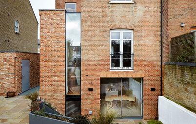
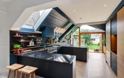
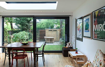
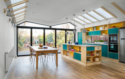
Built in simpler times as humble workers’ cottages, the dinky half houses that line this street have all been adapted in some way or other. Extending up and out is fairly standard practice, but the addition to this home is anything but standard. “The houses are quite close to each other at the back and you can see so many other extensions, but they’re mostly of a type,” says Tristan Wigfall, who is behind this bold design. “I like to think that this one is different.” A 3m-high glazed door pops out of the sloping roof, creating a jaw-dropping space for both entertaining and everyday life.
The extension is on a different level from the rest of the house. “There was an existing step down from the backdoor into the garden area so we incorporated that level change into the extension,” says Wigfall. “Now, when you’re standing at the upper level in the kitchen you’ve got a clear view out to the garden through that elevated door.”
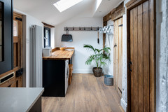
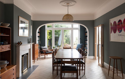
The reclaimed pine floorboards are the original timber from when the house was built.
Get more white kitchen ideas from the Houzz photo stream
The reclaimed pine floorboards are the original timber from when the house was built.
Get more white kitchen ideas from the Houzz photo stream
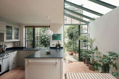
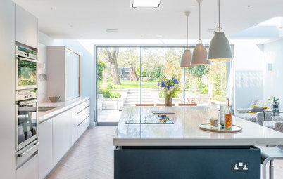
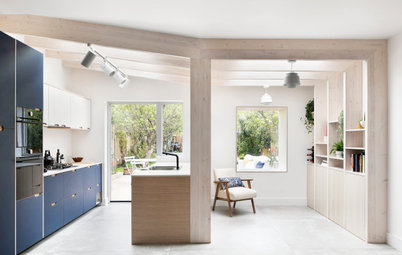
The compact kitchen sits between the more traditional area at the front of the house and the new extension. It combines cool concrete worktops and surrounds and warm timber on the floor. “The timber is softer and it joins the front living space with the more contemporary rear addition.” Wigfall suggested customising inexpensive units here. “We used a good-quality but cost-effective kitchen, but made it bespoke with the concrete worktops from a specialist company.”
Concrete worktops, Paul Davies Design. Kitchen, Howdens.
Try these tips for keeping small kitchens clutter-free
Concrete worktops, Paul Davies Design. Kitchen, Howdens.
Try these tips for keeping small kitchens clutter-free
The sloped roof of the extension mirrors the neighbouring add-ons. “We wanted to add some drama into the space with dynamic forms but needed to follow the line of the property next door because of planning restrictions. The trick we played was with the pop-out 3m-high glazed door,” says Wigfall.
Sleek grey fibre cement cladding completes the contemporary finish. “It’s more commonly seen on larger commercial buildings, but the client was keen to use something a bit different. This contrasts with the existing building but gives quite a refined appearance. It was also something we could use on the vertical walls as well as the roof.”
The cladding was also added to the existing dormer roof extension. “The loft was quite a basic off-the-shelf design clad in clay tiles, so we took them off and added the same material as the extension to tie the two elements together,” says Wigfall. Wooden window frames were also added to match those below.
Door supplied and fitted by Dask Timber Products. Cladding, Swiss Pearl.
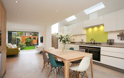
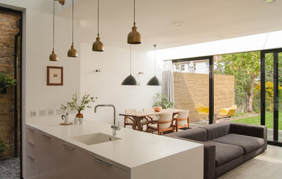
Light floods in from all angles thanks to a generous use of glass that runs up and over the door, across the roof and alongside the back wall of the house. The chairs and pendant shade provide bursts of colour, contrasting with the neutral walls and beautifully smooth concrete floor.
Concrete floor, Steyson.
Concrete floor, Steyson.
A glass slot runs along the back of the extension roof against the original back wall (see the previous photo for another view). “We didn’t want a collision between the old and the new. We wanted to blend them,” says Wigfall. “When you look up you can see through the glass to the original elevation of the building. It creates quite an unusual indoor/outdoor effect because what’s normally the external material of the brick comes down and is inside the building.”
A window provides convenient ventilation in the dining space if the owners don’t want to open up the huge door. The wooden frame is accoya. “It’s a very resilient treated timber that’s been stained so it’s slightly darker in colour,” says Wigfall.
Walls painted Cornforth White estate emulsion, Farrow & Ball. Masters chairs, Heal’s.
Walls painted Cornforth White estate emulsion, Farrow & Ball. Masters chairs, Heal’s.
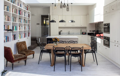
Full-width cast concrete steps lead down into the dining area creating extra ceiling height and adding to the drama. The same material continues up onto the kitchen surrounds and worktops.
See more inspiring uses of concrete
See more inspiring uses of concrete
Wigfall and his team also redesigned the back garden to help his clients make the most of the entire space. “We did the paved area at the same level as the dining room so you can flow in and out very easily. Because it’s a pivot door rather than a hinged one, it’s very easy to open and to feel connected with the garden. Our clients are really happy with how they use the space.”
Do you have a modern kitchen extension on an old building? Tell us about it in the Comments section.
Do you have a modern kitchen extension on an old building? Tell us about it in the Comments section.

Sponsored
Who lives here A couple and their cat
Location East Dulwich, London
Property A Victorian half house with 2 bedrooms and 2 bathrooms
Size of extension 10 m sq
Designer Tristan Wigfall of Alma-nac
Photos by Jack Hobhouse
With their shared front doors and communal hallways, half houses can feel quite cramped. When Wigfall was called in to rethink the ground floor of this one, he was struck by its peculiar layout, including a “kind of outrigger”, as he puts it, tacked on the back, with the bathroom accessed through the kitchen. The one thing his clients knew they wanted was a good space for entertaining. Other than that, the brief was quite open. “In the early stages we looked at all sorts of ways we could reorganise the space,” says Wigfall. “We played around with the idea of putting the kitchen at the front or the rear with a dining space in the centre. But it made more sense to have the kitchen in the middle.” The existing lean-to was dispensed with and replaced by a structure defined by angular glass panels and an oversize glazed door, which fills the property with light.