


How to Create a Relaxed, Nearly All-white Scheme
Easy, breezy and inviting – these white spaces are anything but minimal
Kate Burt
14 August 2017
Houzz UK. I'm a journalist and editor, previously for the Independent, Guardian and various magazines. I'm now excited to part of the editorial team at Houzz UK & Ireland, bringing the best of British and Irish design, interiors and architecture to Houzz.com.
Houzz UK. I'm a journalist and editor, previously for the Independent, Guardian and... More
There are lots of ways to work white in your home – and if your version is at the opposite end of the scale to clean-lined and glossy, read on. Can’t get enough of pale – but aren’t sure how to make it ‘and interesting’? Let these gorgeous homes give you some ideas. From layering textures to sourcing architectural salvage and even switching your pyjamas, there are plenty of tips for making a space that’s not only calming and uncluttered, but also relaxed and inviting.
Paint absolutely everything
That’s right – floors, furniture, walls, skirting, banisters… and then furnish with white and off-white pieces. The trick to not making this type of scheme feel flat or stark is to have interesting surfaces (that’s why it works well in older houses and with vintage furniture), which will generally add a touch of the higgledy-piggledy. And vary the white paints and washes you use to give depth to the final look.
That’s right – floors, furniture, walls, skirting, banisters… and then furnish with white and off-white pieces. The trick to not making this type of scheme feel flat or stark is to have interesting surfaces (that’s why it works well in older houses and with vintage furniture), which will generally add a touch of the higgledy-piggledy. And vary the white paints and washes you use to give depth to the final look.
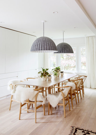
Layer up
Soften the edges of a crisp white scheme by layering on tactile textures. Picture this room without the sheepskin throws and felt lampshades and it would have an entirely different feel altogether. If you don’t like the idea of using the real thing, the Ikea Tejn just won ‘Best faux sheepskin rug’ at the PETA Vegan Homeware Awards but there are plenty of others out there. Linen is another informal, soft textile and a tufty white Berber-style rug is a good choice either on the floor, hung on the wall or flung over the back of a sofa. Soft pale blankets are also good for draping across the backs of armchairs.
Colour: How to decorate with winter whites
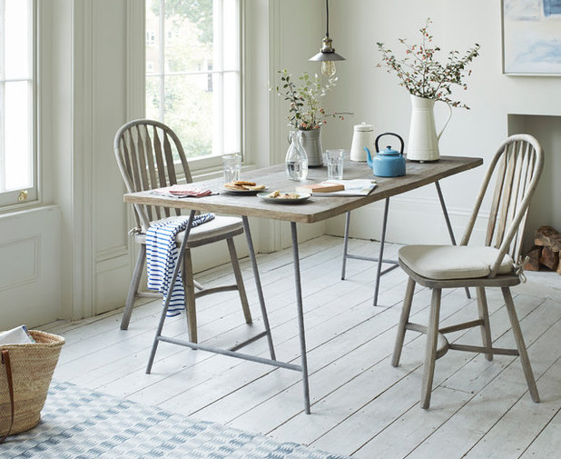
Mix with pale wood
In adding texture, wood is a good option, too, and always warms up a space. But to keep the white-on-white feel going, choose very pale wood, or even limewash or whitewash pieces that let the grain show through while keeping the wood light.
In adding texture, wood is a good option, too, and always warms up a space. But to keep the white-on-white feel going, choose very pale wood, or even limewash or whitewash pieces that let the grain show through while keeping the wood light.
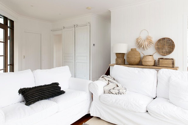
Choose loose covers
White or pale sofas and chairs may not seem like the most practical of choices, especially if you have younger children or pets. However, you can still pull it off – in fact, quite literally – by opting for loose covers, which you can regularly wash.
White or pale sofas and chairs may not seem like the most practical of choices, especially if you have younger children or pets. However, you can still pull it off – in fact, quite literally – by opting for loose covers, which you can regularly wash.
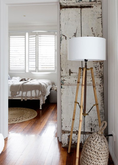
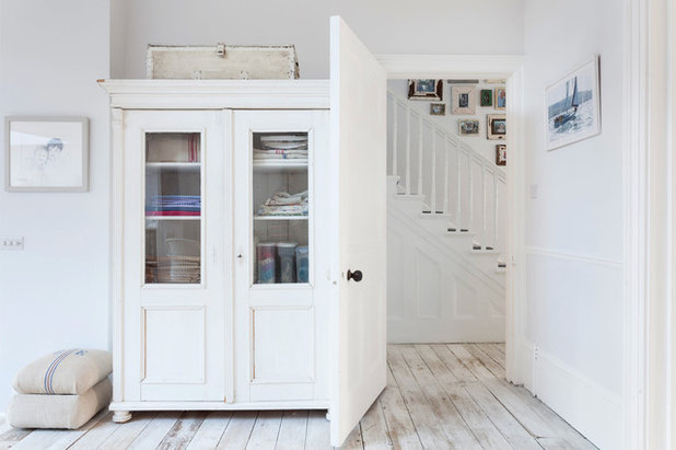
Get salvaging
Seek out white-painted but well-battered antique features – think old shutters, doors, windows (which could be turned into interesting mirrors), vintage oars and even slabs of scrapwood – as they can add instant character to a white scheme. Search online or visit your local salvage yard and let what’s there inspire you.
This is a clever idea. Rather than expensively – and perhaps incongruously – replacing a new door with an old one, you can simply lean the antique door against a wall for a fabulous feature.
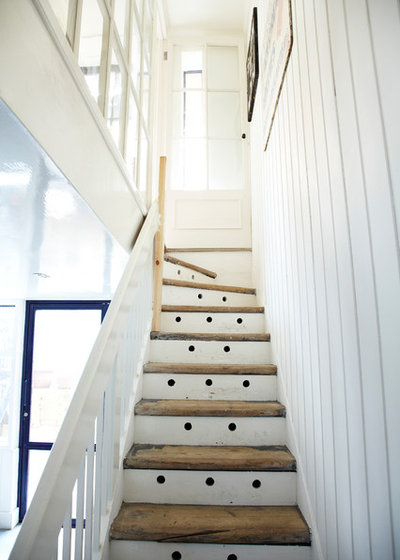
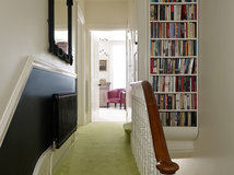
Rise(r) above it
Mixing bare wood with white has already been mentioned as a good way to relax an all-white scheme. And a staircase can be a good place to put the idea into practice, as the steps are likely already to be wood and you can then simply paint the risers. (You may need to sand and treat the treads – ensure you make them slip- and splinter-free, but not too pristine-looking if relaxed is your aesthetic aim.)
These stairs are in a beautifully restored 18th-century house in London, and the unusual holes are in fact vent holes for the storage below and create an interesting visual detail that draws the eye upwards. Panelled walls can add a casual beachy feel, which you might think wouldn’t work in an urban house like this – but it really does.
Another detail to note is the glass panelling at the top of the stairs – many whites can look surprisingly dingy and dark when starved of light, this ensures these stairs remain light and bright.
13 fresh options for painted stairs
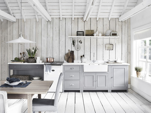
Team with grey
The overall colour of this airy, kick-off-your-shoes kitchen appears to be white thanks to the expanse of pale-painted wood walls, floor and ceiling. And yet the comparatively small surface of the kitchen cabinets is painted in pale grey, with a dash of dark grey at the left-hand end of the run. Not only does this gently add depth to the scheme, but it also tricks the eye into seeing grey tones in the whites.
Try out lots of testers and paint them ideally onto offcuts of the wood you’re using in the space to avoid pairing the wrong white with the wrong grey. Prop or hang them up around the room and live with them for a bit, seeing how they look in different lights before committing. It would be a lot of paint to get wrong.
How to pick the perfect paint colours for light-starved spaces
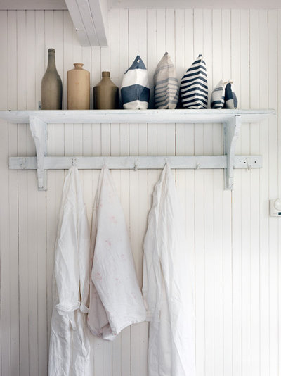
Try artful accessorising
For serious commitment to a look, consider items beyond your décor and even beyond obvious accessories. If you’ll be hanging things on hooks that are on show, and you’re a purist, the colour of what you hang on them will be important. And if you are a purist your family are already probably used to you switching things around on their behalf – and so hopefully won’t mind when their PJs, dressing gowns or even toothbrushes (you can get some lovely bare wood ones) change colour overnight.
For serious commitment to a look, consider items beyond your décor and even beyond obvious accessories. If you’ll be hanging things on hooks that are on show, and you’re a purist, the colour of what you hang on them will be important. And if you are a purist your family are already probably used to you switching things around on their behalf – and so hopefully won’t mind when their PJs, dressing gowns or even toothbrushes (you can get some lovely bare wood ones) change colour overnight.
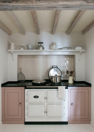
Pair with pink
‘Millennial pink’ is one of the colours du jour… and long may this last if this cute kitchen is anything to go by. We’ve discussed the merits of grey as a barely-there accent colour in an informal white scheme and this dusty, putty pink, while a little more prominent, is just as gentle. And notice how those tiles are a different shade to the walls and the ceiling is different again. As before, samples and tester pots will be your friend for getting different pairings just right.
Millennial Pink: Popular, perennial or passé?
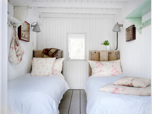
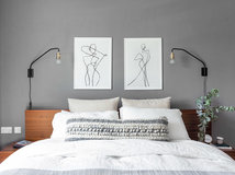
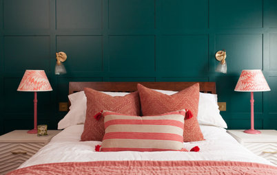
Flower up
This pocket-sized bedroom makes use of all the tricks to add interest and easy style to an all-white scheme: wood-panelled walls, yep. Pink, yep. A dash of grey, indeed. Antiques? Check. Oh yes and battered bare wood, uh-huh, that too.
One new touch, however, is the addition of a soft floral in those pillows and cushions. Faded is the way to go for this look – and in an informal arrangement like this, blending warmer and cooler whites, as seen where the cushions and pillows meet the duvet covers, is to be encouraged.
Will you save any of these photos to your own ideabooks? Tell us which ones and what you love about them in the Comments section.


Related Stories

More Rooms
The 5 Most Popular Laundry Rooms on Houzz Right Now
Get decorating ideas for your laundry or utility room from these most-saved photos on Houzz
Full Story
Dining Rooms
The 5 Most Popular Dining Rooms on Houzz Right Now
By Kate Burt
Vintage furniture, great lighting and top tables – feast your eyes on dining room ideas collated from your own clicks
Full Story
Colour
8 Clever Ways to Use Strategic Colour Blocking in Your Home
By Kate Burt
Paint can do so much more than refresh your walls. Explore ways to highlight features, zone areas and trick the eye
Full Story
Utility Rooms
15 Richly Coloured Utility Rooms
The trend for strong, earthy tones has reached the utility room, with hues from plum to ochre to deep green adding depth
Full Story

Kitchens
Which Kitchen Worktop Colour Should You Choose?
By tidgboutique
Consider these popular colours and styles to get the look you want, no matter which material you use
Full Story
Colour
8 Ways to Work a Rust Red and Blue Palette in the Bedroom
By Kate Burt
We’re seeing variations of this combination all over Houzz right now. Check out these tips for trying it yourself
Full Story
Colour
Creative Ways to Make a Feature of Structural Beams
Turn your RSJ into something more than just functional with these clever ideas from our Houzz Tours
Full Story
Gardens
9 Ways to Enjoy Colour in Your Garden All Year Round
By Kate Burt
However your garden grows, you can add colour with hardscaping, furniture and accessories
Full Story
Gardens
What Will We Want in Our Gardens in 2024?
Discover the gardening trends homeowners will be bringing into their outdoor spaces this spring and summer
Full Story
Kitchens
What to Expect at the Biggest Kitchen, Bedroom and Bathroom Show
Plan ahead with our rundown of what’s in store at the kbb Birmingham event this March
Full Story
If that's a door at the top of those ventilated stairs there doesn't appear to be a landing. Seems treacherous...or maybe just an optical illusion (I hope).
That little dining area with the blue teapot looks sooo inviting! I agree with Lynn re the need for natural wood for balance.
Lovely, pale, calm...yep, I can deal with that, thank you!
I'm not too much of an all-white person, and I think that, eventhough white is supposed to bring in a max of light, it is not necessarily the ideal choice if you live in a climate where it's often grey/rainy/there's little sunlight. I've been in modern homes where everything is white and grey with large windows everywhere, when it rains it just looks dreary, really lacks warmth. Wood and a bit of color work much better in these cases. I however found many inspiring ideas in this article, some beautiful pictures and I'm in love with that little pink kitchen.