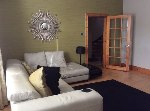
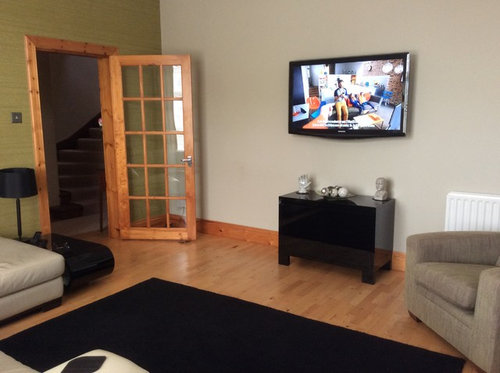
New living room-North/west , not great light.
sandratreacle1
8 years ago


Featured Answer
Sort by:Oldest
Comments (6)

Monica
8 years agolast modified: 8 years agoRelated Discussions
Help! West facing living room ... Can't decide colours
Comments (6)I think a duck egg would work well for the evening but may look a bit chilly in the morning? Why not look at adding warm colours for accessories such as orange, coral, pink etc? You could also try a feature wallpaper. Duck egg is pretty much neutral so you should be able to find a paper mixing duck egg and warm colours. In terms of paint you could look at borrowed light or Teresa's green by F&B or Antiguan sky by Benjamin Moore ( apparently now available in the UK). I would just get a variety of testers, give some a3 paper a couple of coats and hang them round the room in various places and look at how the colour changes throughout the day...See MoreLink get rooms - North east and west facing
Comments (3)At the moment the kitchen walls are F&B New White which is ok but not suitable for the adjacent rooms as it is too yellow looking as I need to take the oatmeal sofa in the living room into consideration. The three rooms lead into each other and are open plan to each other. The living room is the darkest and the others have good light. Kitchen is to the left of dining room and living room is behind dining room. The house is cottage style but no beams...See MoreWarm white paint for a dark North facing living room in England
Comments (37)Hi Evie. The reason I've been slow to post photos is because my house is very much still a building site and work in very slow progress. I have flung paint on walls a relief from 1927 plaster and peeling wallpaper that went up decades ago. I haven't hung pictures yet as the walls are so hard - picture hooks break - and the friend who is going to do the task hasn't yet been. So, none of these photos will persuade you to use colour - the walls are bleak. But I'm posting them in the right spirit. As for feature walls, I have never liked them. For info, Kate Watson-Smyth said, in a recent post, that they are "so ova". I associate them with the 1970s, which is when I believe they first emerged. I like all over colour; I find it much less intrusive than one wall that stands out awkwardly. As for my furniture, it's mostly interim - on loan as I had nothing after chucking out my two sofas which I bitterly regret. Anyway, with all those embarrassing provisos, here we go. Terracotta sitting room: Caravan by Paper & Paint Library (it's not a current colour; my local independent paint shop keeps records of previous colours and identified it for me); it goes up to the picture rail; I haven't yet found the colour I want above it and on the ceiling; the picture rail, window frames, doors and door frames will all be Caravan, too; the room is really bitty (four doors, jutting out bits, fussy door and windows into the garden, a big fireplace, original tiles around the fire area that I wanted to complement but tone down, and a busy stained glass window) and needs blanket coverage to make it seem less busy. .Green bedroom: Sanderson Laurel below the picture rail; Goblin Green above it and on the ceiling; picture rail and all other woodwork not yet painted; I might do them in a linen colour to tie in with the bed frame though I hate the bed frame and am desperate for a new one. You can see that I'm work in progress by the undealt-with and unpainted grille covering the hole where the fireplace was. Hideous and offensive; longing to put it right. Lots of pictures/paintings to be hung all over. Blue bedroom: This blue is a bit flat but it was only after painting it that I discovered the colour I really want - Abigail Ahern's Bowery Blue which despite being intense has a real lift to it giving it life and vibrancy. The ceiling in here is the wrong blue (bought in haste); I will use a lighter blue. The unhung painting on the right (sorry it's not more visible) is so much more vibrant against this blue than it was against the pale yellow of the wall it was hung on in my previous home. I will have mirrors above the bedhead and a gallery wall opposite plus a mirror near the small window to throw a bit more light in this seriously dark bedroom (dismally dark before I painted it interestingly dark). Bronze shower room: Impossible to photograph this as it's a tiny room; the tiles in the shower area are subtly jazzy and moody. I love having it open (I grew up in India where all showers were in the middle of the room so I've never understood the closed-in box version or the fiddly over the bath option). The bronze tiles are much richer in colour than the photo conveys; the walls are Sanderson Brick Light which looks pale and peculiar in this photo; it is a lot more interesting than on the paint card and picks up on colours streaking through the tiles; it's not such a stark contrast as the photo conveys. That's it. The bedroom that will be a mustardy yellow isn't painted yet so I can't show the walls in there. And, again, apologies for the really unsophisticated furniture and mismatched upholstery, etc. Lots still to be done!...See MoreNorth facing living room colour
Comments (28)This is Little Greene Acre in our east facing living room. It definitely looks like a very soft green and although it is very calm and restful, I don't think it will look quite right with your navy sofas. It would, however, be perfect with your fireplace and would complement the tiles really well if you fancied recovering the sofas....See More PRO
PRORevive Your Space
8 years ago
sandratreacle1
8 years agominnie101
8 years ago- PRO
Revive Your Space
8 years ago


minnie101