lauragillman

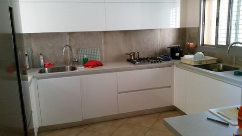
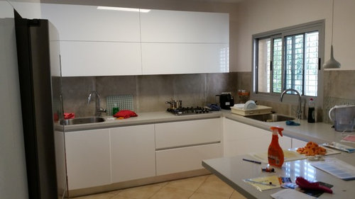
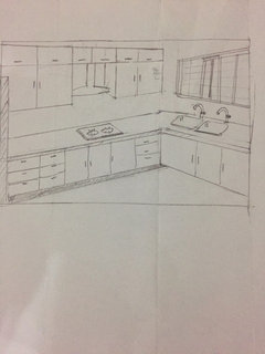
Something is not right in my new kitchen

lauragillman
7 years ago

I have recently had a new kitchen - white gloss handleless cabinets, London Grey Caeserstone surfaces. The kitchen is open plan with the lounge and dining area and gets little natural light. The backsplash that was chosen was large 60*60cm ceramic tiles (Unika Ecru) which have a textured concrete look and kind of blend in with the countertops. Something doesn't work and I can't put my finger on it. The cabinets and countertops are staying - but I am unsure on the back splash, they kind of make me feel like I am in prison- what would look better? (smaller tiles? lighter tiles? Matt? Gloss?)

The floor I am aware does not match and is the same throughout the downstairs - what would look best? I am leaning towards laminate flooring.

The paint colour on the walls is matches that of the lounge and dining area - but does it clash with the white of the kitchen? I am going insane trying to work out how to change it without spending another fortune. Please help!! (and please excuse the mess!)


Comments (87)

  • PRO
    The Bulb Co
    7 years ago

    Hi Laura, have you considered adding in some under-cabinet lighting as in particular in the area around your sink it looks like it can be quite dark at times so adding some under-cabinet lighting would solve this problem and would also give you some extra lighting whilst you are cooking too.

    Something like this perhaps?

    Endon EL-10132 Tangent 3.5W Cabinet Light · More Info

    There are also many other styles available too such as these ones too:

    Saxby 52653 Chrome & Clear Pepa 1.05W · More Info

    Endon EL-10018 Fianto 1W LED Kitchen Cabinet Light · More Info

    You can view our full range of under-cabinet lighting here but if you do decide on these and need any help please feel free to email us at info@thebulbco.com or give us a call on 0161 737 7333.

  • lauragillman
    Original Author
    7 years ago

    Yes I have a LED strip under the cabinet.... will post pictures shortly

  • Related Discussions

    help! my new hallway needs "something" but i don't know what!

    Q

    Comments (16)
    Hi There I would add a hallway runner to take away the echo that would be there (due to there being a hard floor). I would also add something in the hall either a coat rack wall, mounted or free standing and change the light fittings for something unusual, a striking fitting is what is necessary in a room with very few features.
    ...See More

    Something doesn't feel right..

    Q

    Comments (30)
    A brick wall talking!!!! This has made me chuckle!!! Margo, I saw that Tom had commented after me asking what the home owners did in the end!!! I thought, at first, ' hang on a minute! They have hardly had time to make a cup of coffee and read their Houzz thread!' Then it suddenly dawned on me and I scrolled back to see that this was in fact a two year old thread and I had put such a comprehensive reply on it.... as if my life depended on it! Never mind! Maybe the owner will revisit and post an after pic one day soon!
    ...See More

    Something not quite right... But what?!!

    Q

    Comments (6)
    Hi. It's a very pretty room. I'd turn the table the other way and pull it out from the ŵall. I think ŷou need a couple more display shelves of different lengths so they're staggered. Maybe pop a couple of pieces of art on them. I'd pop the plant in the corner and add a couple of green cushions to the bench. Have you thought of pendant lights over the bar? Maybe something in metal? It's hard to see the kitchen but maybe bring in some more of the country elements? The clock frame also looks a little dark so would consider painting it and maybe hang it central to the radiator cabinet?
    ...See More

    My new kitchen

    Q

    Comments (27)
    Hi Lynda, It's a shame that you don't love your kitchen, but I can see why. It doesn't mesh together. You've combined stark, modern black and white gloss units with a more rustic brown/grey slate effect floor. The walls are broken up by boxy units, a green wall and a wall papered in a small black and white design. First, despite the expense, I'd change the floor to a light oak to go with the eating area. Remove the wallpaper and introduce something large, round and inclusive of some green. Perhaps a large clock like this one from Vintage Watches Newgate Cookhouse Wall Clock Kettle Green - COOK343KG may interest you. http://www.watchandjewellery.co.uk/featured-clocks/newgate-coookhouse-wall-clock.html. Finally, hang a pendant light in green over the eating area. Try https://www.estoreuk.com/aerial-pendant-light-e27-edison-screw-60-watt-yellow-red-lime-green-purple-new in green. If you don't want all green touches to your kitchen, introduce a combination of green, lime green and yellow through your wine rack, canisters and textiles.
    ...See More
  • hounoc
    7 years ago
    last modified: 7 years ago

    Your kitchen isn't all that bad. Like many others, the first thing I thought was that the floor doesn't go with it. Until you have money to change the floor, I would recommend painting the walls. You could go with something bold and striking like an egg-yolk yellow, a more muted mustard tone or a soft sage green (or minty green but I'm not 100% sure if that would work with your light/ aspect). Even a cornflower blue might be good. Anyway get some testers and try things out. I think your splashback is interesting and could look quite striking once the floor and wall-colour are sorted out.

    I'm a sucker for an oak floor but I'm not totally sure about wood in your kitchen. It might work fine, I'm just finding it a little hard to picture. My instinct would be for a large. dark tile as long as the wall is a bright colour (and by bright, I don't mean pale - I mean vivid). Your glossy white units do bounce some light around. Good luck. Your kitchen is almost there!

  • lauragillman
    Original Author
    7 years ago

    I wanted to add a few photos to get a perspective of the whole room. I am aware that the dining table/chairs need to be modernised. And the floor needs to be changed. I painted the wall around the window a kind of teal/turquoise because I loved the colour and though it would give a bit of colour to the room and the lounge area is brown/greyish beige I am not sure if to change the blue to something that could work better with the kitchen or incorporate the blue into the kitchen. I want to bring the whole room together. ... how do I do it?????

  • hounoc
    7 years ago
    last modified: 7 years ago

    I think that colour is lovely and, now having a better idea of the quality of natural light in your room, I think that could work nicely with the kitchen. Like others have suggested, you could buy some bright accessories to accent/ complement the blue wall colour e.g. cerise pink. A wooden floor would look lovely with that wall colour - I think pale blue and the yellowish tones of natural wood go really nicely together (they're complementary colour-wise I suppose). My only slight hesitation would be that I'm not sure how it would work with your splashback and I think it would be a shame to lose that as it's a real statement and gives your kitchen 'edge'.

    What about a vinyl floor (or even lino) with some modern, geometric pattern?

    lauragillman thanked hounoc
  • Karen Kemp
    7 years ago
    Your kitchen looks lovely. I would replace the backsplash with a grey or white back painted glass.. Then the floor doesn't work. But you already know that. Try getting a sample of Podium Pro 55 vinyl planks I have used them on a few jobs... They look great. Great texture and very durable for a kitchen .. And not as cold as tiles..
  • Sam Chong
    7 years ago
    I beg to differ with most comments. I think there is nothing wrong with the tiles of the floor even though the color may be a bit out. The thing that makes the kitchen look odd are the wall cabinets:

    (1) The color. I don't know if it is due to the lighting but the brilliant white does not match the color of the lower cabinets.

    (2) The size. The wall cabinets are disproportionate to everything else in the kitchen. Normally the focus of the kitchen should be the stove and the sink. With the ventilation hood hidden within the cabinet, which hangs over the hobs, it looks weird.

    I would use a kitchen ventilation hood to break the wall cabinet into two portions with the hobs in the centre of the counter. I love the location of the sink where one can look out the window while washing the dishes. So I would move the other sink to the window and turn it into a double sink.

    I have done a simple sketch to redesign the cabinets including converting some of them to drawers to make them less "clumsy." I'm not an artist nor an interior designer/decorator so please bear with my drawing.
  • Daisy England
    7 years ago
    The splashback needs to go. It's the first thing I noticed. Stood out in a bad way. Far too many joints in it which you would get using tiles. You need to use a different material for the splashback and try to get it manufactured all in one piece.
  • vandar
    7 years ago

    I am surprised with most comments. You kitchen is fantastic, really cool. To be honest, the backsplash tiles are my favorite feature in it. (maybe the problem here is that they are so different from everybody else's!) I think they make your kitchen unique. About the floor, I would definitly put there a red toned oriental rug for contrast with such modern space.

    lauragillman thanked vandar
  • Daisy England
    7 years ago

    Think the difference opinions come from each of us living in a different country. In the UK it's called a splashback not a backsplash. We can buy it in specific sizes or get it manufactured so that it's in one piece per wall. We wouldn't accept joints in it. Whether it's granite, laminate or solid surface the pieces are long to cater for the space.

  • T B
    7 years ago

    luckily i saw this. We have a similar kitchen and trying to find a backsplash (uk spelling). The Mrs wants tiles just like you have, but now i've seen them.. i dont like them. I dislike the grout lines as it breaks up the linear flow of ur kitchen units.

    IMO u need a matt white back splash, or singular glass piece. U have a beautiful kitchen which is linear and slick... dnt ruin it with anything poppy...put something matt and cooling in there. You can add warmth with a plant or funky toaster instead!

  • minnie101
    7 years ago

    Hi Laura. I agree with Sam, the first thing that jumps out to me are the wall units as the gap looks a little unintentional. I'd paint those walls white. I quite like the wall tiles. Re what to do, what styles do you like? The kitchen is leaning towards industrial. If you like this I'd swap the dining chairs for tolix ones, these can be picked up cheaply and just paint the table legs until budget allows. For the floor look for engineered wood/wood effect tiles/vinyl with grey and blonde'ish tones I would avoid laminate unless its the waterproof stuff as it can only be washed infrequently and then with a dry mop. I'm not sure the blue feature wall works with the overall space, what is the other grey/beige paint colour as it looks to have a green undertone? I think the sofas need lightening up, use light greige colours for cushions and maybe a throw (then choose an accent colour once the feature wall is decided if you change it). For the kitchen I'd look at different textures and materials for accessories ie copper, marble, wood boards etc plus herbs. There's only a couple of pics in your ideabook though so if you advise on styles (and whether you also want to change the wall tiles) people can give other ideas

    http://www.milandirect.co.uk/home-furniture/most-popular/tolix/vintage-metal-cafe-chair-xavier-pauchard-reproduction-industrial-3

  • Diane J
    7 years ago
    I agree that the vertical lines of the tiles jar with the horizontal lines of the drawers & cabinets. A single run of glass or heat resistant Perspex would solve this in a colour you love. Could those tiles be screeded in some way to 'remove' the join lines? Again the floor would look good as a single colour with no lines, so polished concrete, vinyl or linoleum perhaps?
  • Angela
    7 years ago
    This a modern sleek kitchen so the look should be followed through with a glass splash back or a matching upstand to the worktops. The floor should ideally be tiled. Why 2 sinks ? the double cooker seems stuck in a corner behind the enormous fridge.
  • lauragillman
    Original Author
    7 years ago

    The backsplash tiles were a bit of a risk to be honest as they are indeed floor tiles . My designer thought they would be a good idea rather than cleaning smaller tiles and I actually thought it would be good to have a contrast between sleek and rough... and I don't really want glass. In the shop the backsplash tiles did not look nearly as grey as they do... i feel a bit like i'm in a prison. I never even wanted a grey kitchen it just kind of ended up like that...so I'd be happy to play down the grey as much as possible. I initially thought to put something a bit colourful in the back splash. Now I am torn totally. Would subway tiles fit or not? If I build up the caeserstone round the edge is that enough? How can I paint the kitchen walls so that they are in a different colour.... won't it look wierd if the rest of the room is a greige colour. Should I change the turquoise wall to reddish? Then I can incorporate more red into the kitchen??

  • torneyteam
    7 years ago
    Ghan, thanks so much for your reply! Just knowing they are glass not ceramic is really helpful. We don't have big ranges of these sorts of things here in Australia but I will check out the smaller places and see what I can find. Thanks so much, and enjoy your lovely space!
  • hounoc
    7 years ago

    Personally, re your question about subway tiles, I don't think they go with those kinds of modern units (they work better with painted shaker for example in my opinion). If you are going to change the splashback I would go for glass, or no splashback at all and an upstand matching your counter-top if possible , or maybe stainless steel if not.

  • PRO
    Cassidy Interiors
    7 years ago

    I think a pop of colour would transform your space. Try adding a light turquoise or duck egg colour to your space through kitchen accessories (kettle, toaster, tea towels, mugs, anything!) and maybe change your blinds to a light fabric blind and put it above your window so when its open your not losing any light. We think this would be the best way to transform your space whilst keeping costs down.

  • kl55hp
    7 years ago

    I like your accent wall. And the splash back. (I wouldn't be too bothered by a few mms of grout. You stop noticing that kind of thing once you've lived in the kitchen for a bit - and it's become your home, rather than an idea / photo. Is that blasphemous on Houzz? ). I also like your table cover that camouflages the cherry wood table. An inexpensive "fix"; particularly good if you have kids.

    lauragillman thanked kl55hp
  • kl55hp
    7 years ago

    As several have said what about some light blue appliances? - see e.g. these appliances in duck egg blue at Dunelm. Or a brabantia bin in light blue. Or stainless steel appliances (like your fridge)?

    SOme other ideas eg a set of canisters like these or these, a tea towel in a style you like, a fruit bowl like this or like this, new accessorised mugs , a vase of flowers on the table (any colour / any style) and maybe a green plant somewhere.

    (Hope the web links work; can't check them before I post).

  • PRO
    Helen Sykes Art
    7 years ago

    An honest reaction to the photo... nice kitchen but the hob area doesn't seem right. I'm not sure it's in the right place, too near the window sink. The cupboard fascia over the top of it is too low and heavy, and also partially blocks the window. This is not good feng shui. A few tweaks will sort this. You are nearly there.

  • gilliifer
    7 years ago

    I think the kitchen needs a feature to give it some character and a wow factor. I agree with comments such as bringing in bronze or copper features to enhance the industrial look. You could try painting the walls in a rusty red ('the sort if colour you might see in a factory). Maybe some metal signage if you are into vintage industrial.

  • Sylvia Timoney
    7 years ago
    my firstt thought would be why 2 sinks ?just wondering! thats alittle distracting and the hob in an odd placement if you did nothing else id centred that it would look balanced .
  • corakeating2
    7 years ago
    I think the press over the sink and the hob is down far too low . I would prefer to get rid of it altogether or else have it half the depth
  • Celia McGuirk
    7 years ago

    Hate that back splash,sooooo dreary,something red or yellow or anything but that colour

  • hornbygail
    7 years ago

    Is this what you were hoping to achieve. If it is look at the photo and see how they have incorporated certain elements. This is a very high end house, but they have placed everything strategically and highlighted the areas like the backsplash which are key to the look.


  • wrightyja65
    7 years ago
    I'm not keen on the tiles as a splash back or the floor. The kitchen units are great. I think I would just paint the walls in a natural colour that coordinates with the work tops and add in a wood effect floor (Karndean do some great floors, maybe with a limed look, which I have used myself). Try not to panic, a few tweaks and I'm sure it will look fabulous!!
  • PRO
    Charlie Howe Design Ltd
    7 years ago

    It is as often the lighting that is at fault here - although I think the tiles (floor and wall) could do with some help. Have a look at Charlie Howe Design and a completely fresh and contemporary take on kitchen lighting! Jenny 0788 1620418

  • PRO
    Conquest Fine Bespoke Furniture
    7 years ago

    I agree that a coloured splash back would help add a bit of warmth and interest. Here are some examples we've done with purple and a pale blue. Hope its helpful, best wishes Rachel

  • wilmet45
    7 years ago
    I think it's the floor. If you can't afford to change it, cover with a cheap rug or a sisal carpet until you can afford what you want. If you add a rug, you could add colour and softness to your kitchen: otherwise, I like the rest of the kitchen, including the wall tiles.
  • PRO
    Olive Grove Home Ltd
    7 years ago

    For me the only thing that's lacking is an accent colour. The lampshade gets lost in the wall tiles at the minute and is a missed opportunity to bring in the warmth. I would find a nice fabric that introduces one or 2 accent colours and have it made up into a roman blind, then carry the colour/s through the room in the pendant lampshade, some flowers/a vase perhaps and some accessories, bar stools and possible tea towels and oven gloves. This will draw the eye to the accent colours and away from the wall tiles. Incidentally the wall tiles work for me, they keep the sleek straight lines going and complement the straight line of the bottom of the units (good choice).
    Keep the fridge, it probably cost a small fortune and it's a good functionality feature.

  • PRO
    Olive Grove Home Ltd
    7 years ago

    Also lighting can do wonders for the charactor of a kitchen, some warming LED strips under and/or over the cabinets would look good; you could put some under the base cabinets above the plinth and under the worktop too for a striking look.

  • mudsi
    7 years ago

    I agree with the first post, and say that it's the floor that's the problem. You have a sleek modern kitchen with a floor that's older style. I haven't read all the posts so please forgive me if I'm repeating someone, but how about using the same tile on the floor that were used for the splashback? I love those concrete effect tiles and think it adds texture. A complementary colour is an almost babyblue teal.

  • Gregory Wells-King
    7 years ago
    Now I see the rest of the room, I see no problem at all, just the fact you need to live in it, magazines, coffee cups, plants, laptops, strange sculptures, plants, hats, robots. Vintage dressers, Bladerunner posters. Whatever man !.
  • PRO
    Alban Gray Interiors
    7 years ago

    Both the splash back and the floor tiles are too dark. The tone of the splash back works but it is still to dark, the floor tiles are very warm toned and so stand apart from the whole room. I agree that an oven hood would improve your space and give your kitchen a definitive finish. I like you'r colour choice and would look great around the kitchen window. I think laminate would be fine but tiles or wood will always be preferable. (in my opinion).

  • PRO
    Girl About The House
    7 years ago

    Hi there

    I think the rustic style floor and wall tiles are at odds with the high tech cabinet style.

    Both need to go.

    As you have already had the kitchen fitted the only way forward is to echo the high tech flooring and splash back.

    Some colour or shine would work, but it all depends on if you are a neutral person. If this is so maybe you could work with texture and shine rather than colour.

    Someone mentioned glass splashbacks they are very chic and add another dimension to a bland kitchen.

  • juliekfn
    6 years ago

    Like the teal paint on wall, so take that colour to walls under cabinets, glass tiles, or standup as worktop & paint above. Use clear glass panels to catch splats from cooker, which can be removed for change of paint colour.

    Paint your table & chairs & recover pads .

    Throws for sofas in teal/ grey.

    Floor, it looks to me as if colour of wall tiles works with kitchen, just too big & rustic, so if you like these tiles use on floor. Otherwise laminated in light grey.

  • Susie Campbell
    6 years ago
    Nice kitchen and worktop. I think the floor should be different and not laid diamond style as it’s old fashioned compared to the kitchen cabinets. Is that fridge black? If you have invested in that perhaps use some more black in the splashback like glass or reflective glass in black or grey. If the fridge is silver I would introduce a pop colour as someone else said. I am a layperson so this is my own tastes only.
  • PRO
    The Luxury Code
    6 years ago
    I would say it’s because your flooring is yellow based and the rest is white and silver, you’d need a grey based colour instead..

    Also the wall tiles are a little large, they almost make it look like it’s plaster and you’ve not had the tiling done yet but it may just be the colouring in the picture!

    The kitchen is stunning!
  • PRO
    ARC Bespoke Interiors
    6 years ago
    by looking at pictures ,the cooker is off centered and the floors does not match
  • kl55hp
    6 years ago

    btw - zombie alert - this Dilemma was originally posted in May 2016. Don't think the poster is looking for more ideas.

  • Karen P
    4 years ago

    Laura any update - what did you do in the end?

    lauragillman thanked Karen P
  • Wayne Bryan - Designer
    4 years ago

    Sam Chong has hit the nail on the head. He says he's not an interior designer but he's got the eye for it. As he suggests, sort the wall cabinets out or anything else you do will be a waste of time.

  • lauragillman
    Original Author
    4 years ago


    ..... !

  • kwg kwg
    4 years ago

    oh wow that looks lovely! Love the splashback tiles and the change of floor has really given a good contrast to the cabinets, nice touch with the mirror too. Much better than before. Well done :-).

  • shelleyuk
    4 years ago

    Yes that's a really good change


  • Karen P
    4 years ago

    Hi Laura, thanks for posting. Wow, it looks amazing! Amazing how much difference the floor, splashback and mirror make, it's transformed. Well done.

    I'm struggling to like a splashback in my new kitchen (even though I chose it) so was looking for inspiration - my partner just doesn't get it and will probably leave me if I even dare to mention changing it :-)

  • E D
    4 years ago

    Lol Karen P.

    Let‘s hope your partner doesn’t read this...

    :-)

  • lauragillman
    Original Author
    4 years ago

    It's not a mirror! We remade the wall that was a partition between the lounge and kitchen and put a kind of pretty see through window/lattice type think made of metal that also introduces colour and also let's light through to the kitchen!

  • E D
    4 years ago

    Kitchen looking great, lauragillman!

    Any chance of more photos?

United Kingdom
Tailor my experience with cookies

Houzz uses cookies and similar technologies to personalise my experience, serve me relevant content, and improve Houzz products and services. By clicking ‘Accept’ I agree to this, as further described in the Houzz Cookie Policy. I can reject non-essential cookies by clicking ‘Manage Preferences’.