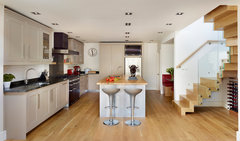
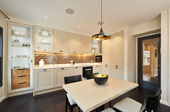
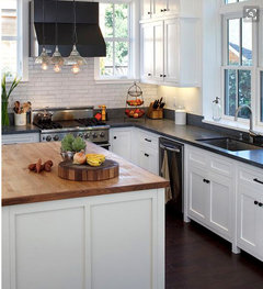
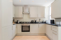
How can I neutralize warm white cabinets?
Alette V
7 years ago
Featured Answer
Sort by:Oldest
Comments (20)

Alette V
7 years agoRelated Discussions
Warm or neutral off whites for walls
Comments (11)Unless Dulux have updated the formula, the Light and Space paints are more like a semi-opaque glaze, especially the satinwood paint. Bear this in mind when painting over any strong colours, it'll take multiple coats. Better to paint over with a one-coat white emulsion, or white primer for woodwork, ensuring you have full coverage before applying the Light and Space paint. Having said that, once the Dulux is on, it does look nice and bright, the woodwork has a sheen to it, rather than being flat....See MoreWarm white paint for a dark North facing living room in England
Comments (37)Hi Evie. The reason I've been slow to post photos is because my house is very much still a building site and work in very slow progress. I have flung paint on walls a relief from 1927 plaster and peeling wallpaper that went up decades ago. I haven't hung pictures yet as the walls are so hard - picture hooks break - and the friend who is going to do the task hasn't yet been. So, none of these photos will persuade you to use colour - the walls are bleak. But I'm posting them in the right spirit. As for feature walls, I have never liked them. For info, Kate Watson-Smyth said, in a recent post, that they are "so ova". I associate them with the 1970s, which is when I believe they first emerged. I like all over colour; I find it much less intrusive than one wall that stands out awkwardly. As for my furniture, it's mostly interim - on loan as I had nothing after chucking out my two sofas which I bitterly regret. Anyway, with all those embarrassing provisos, here we go. Terracotta sitting room: Caravan by Paper & Paint Library (it's not a current colour; my local independent paint shop keeps records of previous colours and identified it for me); it goes up to the picture rail; I haven't yet found the colour I want above it and on the ceiling; the picture rail, window frames, doors and door frames will all be Caravan, too; the room is really bitty (four doors, jutting out bits, fussy door and windows into the garden, a big fireplace, original tiles around the fire area that I wanted to complement but tone down, and a busy stained glass window) and needs blanket coverage to make it seem less busy. .Green bedroom: Sanderson Laurel below the picture rail; Goblin Green above it and on the ceiling; picture rail and all other woodwork not yet painted; I might do them in a linen colour to tie in with the bed frame though I hate the bed frame and am desperate for a new one. You can see that I'm work in progress by the undealt-with and unpainted grille covering the hole where the fireplace was. Hideous and offensive; longing to put it right. Lots of pictures/paintings to be hung all over. Blue bedroom: This blue is a bit flat but it was only after painting it that I discovered the colour I really want - Abigail Ahern's Bowery Blue which despite being intense has a real lift to it giving it life and vibrancy. The ceiling in here is the wrong blue (bought in haste); I will use a lighter blue. The unhung painting on the right (sorry it's not more visible) is so much more vibrant against this blue than it was against the pale yellow of the wall it was hung on in my previous home. I will have mirrors above the bedhead and a gallery wall opposite plus a mirror near the small window to throw a bit more light in this seriously dark bedroom (dismally dark before I painted it interestingly dark). Bronze shower room: Impossible to photograph this as it's a tiny room; the tiles in the shower area are subtly jazzy and moody. I love having it open (I grew up in India where all showers were in the middle of the room so I've never understood the closed-in box version or the fiddly over the bath option). The bronze tiles are much richer in colour than the photo conveys; the walls are Sanderson Brick Light which looks pale and peculiar in this photo; it is a lot more interesting than on the paint card and picks up on colours streaking through the tiles; it's not such a stark contrast as the photo conveys. That's it. The bedroom that will be a mustardy yellow isn't painted yet so I can't show the walls in there. And, again, apologies for the really unsophisticated furniture and mismatched upholstery, etc. Lots still to be done!...See MoreWarm Grey Neutral colour for bedroom
Comments (7)There's no such thing as a 'warm' grey per se as colour temperature can't be measured. Greys all have a hue, this means they are blue-ish, or greenish etc. A blue-ish grey will look much cooler than a reddish grey and so on. My advice would be to paint the room pure white (dulux trade) first, then you have a direction to go in. If you love how light the room then looks, you know that you want a paint that has a high LRV (light reflectant value). If the room feels very cold pure white, then you know to avoid anything that looks and feels a bit blue. If the paint you test feels bleak, then you might want something with more colour or saturation. As the room has a sloping ceiling, my advice would be to paint the whole room the same colour which may mean somehting not too dark. I am really sensitive to colour temperature which means in terms of neutrals I would always opt for something that feels warmer than cooler, especially in less well lit rooms. I second Sonia's recommendations of Skimming Stone and Slaked LIme and would add Portland Stone (Little Greene) as another grey that can feel warmer than blue greys. Hope this helps. In summary, colour temperature is relative and so a grey that is described as 'warm' is subjective, that 'warm' grey is likely to look cool in different rooms and likely to look cool next to a warmer grey, it constantly shifts. Avoid any greys that you think look blue is my advice....See MoreWarm off white recommendation needed for inside of window frames pls
Comments (10)Hi yes, I think they are foiled, certainly more of a matt finish. We have the flush casement ones. I also have off white ( grey white ) aluminium bifolds which I love and which blend seamlessly with shaded white walls. But there is more flexibility with white windows when it comes to choosing wall colours. With the off white, you find yourself looking for a colour that works well with the frames. This obviously can work out really well but is still more limiting. So if you are just looking to reduce the starkness, I think the matt effect will do that enough. Obviously still a personal opinion...See MoreAlette V
7 years agoAlette V
7 years agoAlette V
7 years agoAlette V
7 years ago
Carolina
7 years agoCarolina
7 years agoAlette V
7 years agoAlette V
7 years agoCarolina
7 years agoCarolina
7 years agoAlette V
7 years agoAlette V
7 years agoCarolina
7 years agoAlette V
7 years ago


User