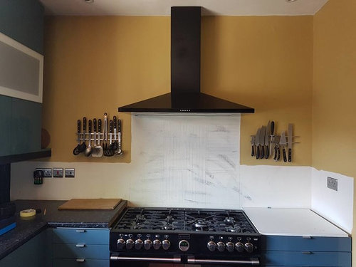
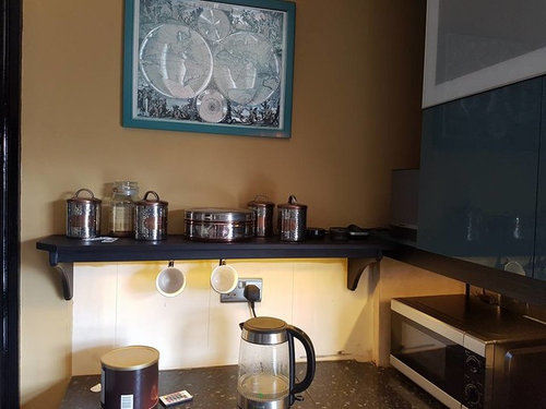
Kitchen wall splash colours, keep it moody or add contrast?
Rose Williams
6 years ago


Featured Answer
Comments (9)

Rose Williams
6 years agolast modified: 6 years agoRelated Discussions
A Moody Reversed Scandinavian Living Room
Comments (20)What a contrast, very smart indeed although the centre light doesn't do much for me.........sorry! How about a wonderful modern chandelier instead? A long mirror would finish it off too, together with thick 2.5" to 3" thick white shelves in both alcoves bringing out the white which is so Scandinavian with your grey walls....See MoreAre multi-coloured tiled walls in kitchens a big faux-pas these days?
Comments (9)I am afraid I think you both need guidance. Both colour and border will date your kitchen, the expensive items you should keep very subtle as they are expensive to change when you get bored of the look. If your units are cream, try the metro tiles with a soft colour, either grey or sage green (not dark), you need to check the colours against your worktop as they have to look right together. I would suggest you do something exciting with colour on the walls. Having no picture of your kitchen makes giving advice tricky, but putting colour on the walls is cheap and by doing it this way, in a couple of years if you are bored with it you can pick a completely different colour and change the whole look. Again, with the floor, keep it fairly neutral, as it is an expensive item, if it's a small room keep it light as this will make it feel bigger, if a big room you could be more daring with a darker colour....See MoreKitchen wall colours. Add a splash of colour?
Comments (7)So we have decided on Wimborne White on all walls. We plan to add 2 or 3 very large pictures on the radiator wall. If we still feel this is plain we can repaint either this wall or the one with the shelves. Header13 we really like blue and have used it in our south facing bedroom. Carolina I'm afraid to say no. Picking the floor seems to be by far the hardest decision. We really cant decide on light vs (warm) medium grey. We have so many samples and I think it is just making it worse. We feel light should help keep the room bright but could make it all too plain and samey? Darker may give better contrast and more interesting? Lighting in the kitchen is currently really poor (we took the lights down for plastering as they are being replaced) but here is some pictures showing examples of flooring shades we are considering. Most of the colours seem to be falling in these two camps. White oak vs a grey/smoke oak....See MoreWall panels. Advice needed. To keep or not to keep.
Comments (8)I like the idea to make them all one colour, the white one might be a good option for the room. What colours are attached rooms (kitchen and sitting room)? It is important they have one colour scheme, it brings balance into design. You also can add focal points. White colour is visually a bit cold in a winter time (personal experience). I solved that problem adding warm accents and decor, especially textile....See More
Juliet Docherty
6 years ago
claire morgan
6 years agokikiamack
6 years ago
A S
6 years agoA S
6 years agoRose Williams
6 years ago


Juliet Docherty