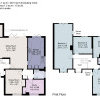
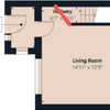
Warm gold hues or dark moody tones - which do you prefer?
Stoneham Kitchens
6 years ago

Warm gold hues

Dark moody tones
Featured Answer
Comments (6)
 PRO
PROStoneham Kitchens
6 years agoRelated Discussions
Do you like blue?
Comments (26)I love blue, all shades of it, especially when paired with grey. My favourite item in our new house is my blue swivel chair, the perfect spot to curl up with a good book! As we decorate the house room by room, blue and grey are becoming a recurring theme.......See MoreWarm white paint for a dark North facing living room in England
Comments (37)Hi Evie. The reason I've been slow to post photos is because my house is very much still a building site and work in very slow progress. I have flung paint on walls a relief from 1927 plaster and peeling wallpaper that went up decades ago. I haven't hung pictures yet as the walls are so hard - picture hooks break - and the friend who is going to do the task hasn't yet been. So, none of these photos will persuade you to use colour - the walls are bleak. But I'm posting them in the right spirit. As for feature walls, I have never liked them. For info, Kate Watson-Smyth said, in a recent post, that they are "so ova". I associate them with the 1970s, which is when I believe they first emerged. I like all over colour; I find it much less intrusive than one wall that stands out awkwardly. As for my furniture, it's mostly interim - on loan as I had nothing after chucking out my two sofas which I bitterly regret. Anyway, with all those embarrassing provisos, here we go. Terracotta sitting room: Caravan by Paper & Paint Library (it's not a current colour; my local independent paint shop keeps records of previous colours and identified it for me); it goes up to the picture rail; I haven't yet found the colour I want above it and on the ceiling; the picture rail, window frames, doors and door frames will all be Caravan, too; the room is really bitty (four doors, jutting out bits, fussy door and windows into the garden, a big fireplace, original tiles around the fire area that I wanted to complement but tone down, and a busy stained glass window) and needs blanket coverage to make it seem less busy. .Green bedroom: Sanderson Laurel below the picture rail; Goblin Green above it and on the ceiling; picture rail and all other woodwork not yet painted; I might do them in a linen colour to tie in with the bed frame though I hate the bed frame and am desperate for a new one. You can see that I'm work in progress by the undealt-with and unpainted grille covering the hole where the fireplace was. Hideous and offensive; longing to put it right. Lots of pictures/paintings to be hung all over. Blue bedroom: This blue is a bit flat but it was only after painting it that I discovered the colour I really want - Abigail Ahern's Bowery Blue which despite being intense has a real lift to it giving it life and vibrancy. The ceiling in here is the wrong blue (bought in haste); I will use a lighter blue. The unhung painting on the right (sorry it's not more visible) is so much more vibrant against this blue than it was against the pale yellow of the wall it was hung on in my previous home. I will have mirrors above the bedhead and a gallery wall opposite plus a mirror near the small window to throw a bit more light in this seriously dark bedroom (dismally dark before I painted it interestingly dark). Bronze shower room: Impossible to photograph this as it's a tiny room; the tiles in the shower area are subtly jazzy and moody. I love having it open (I grew up in India where all showers were in the middle of the room so I've never understood the closed-in box version or the fiddly over the bath option). The bronze tiles are much richer in colour than the photo conveys; the walls are Sanderson Brick Light which looks pale and peculiar in this photo; it is a lot more interesting than on the paint card and picks up on colours streaking through the tiles; it's not such a stark contrast as the photo conveys. That's it. The bedroom that will be a mustardy yellow isn't painted yet so I can't show the walls in there. And, again, apologies for the really unsophisticated furniture and mismatched upholstery, etc. Lots still to be done!...See MoreWhich kitchen do you prefer?
Comments (12)Are you having different coloured unit doors, that is either grey or cream with the dark blue? if so, then as the cream is a very pale cream, I think it would look good with the dark blue and be warmer. It isn’t that sickly buttercream cream. Blue and grey can look cold. I’ve seen lots of people on Houzz asking how to warm up a grey kitchen! I also would choose a wood effect floor in a nice warm tone - porcelein is great and very hardwearing. it also comes in a huge range of colours from palest white to deepest walnut. Something like this:...See MoreTwo-tone kitchen or one colour?
Comments (33)Hi Aisling There is a lot of good advice here and the only thing I would add is that when I re-did my kitchen I asked myself a couple of basic questions; the first being did I intend to stay in the house - in my case the answer was yes, the second question was how often was I going to 'do' the kitchen. Given the expense, enviromental considerations etc I estimated I wanted my kitchen to last 15/20 years. With this in mind I had to decide if a two tone kitchen would date and simply look mis-matched in 5 years time as trends moved on. For me the choice was simply I decided on one colour, in a classic design and added 'modern'' touches/colour via lighting, handles, tap, applicances i.e. kettle, toaster which are less expensive to change if you want to ring in the changes. Ps. a great place to purchase handles of all sorts is More Handles Limited, they have two showroom where you can browse, an online website and brilliant customer service. Good luck with the re-do....See More
Sonia
6 years ago- PRO
Stoneham Kitchens
6 years ago 
Juliet Docherty
6 years ago PRO
PROK Design and Build Ltd
6 years ago


Pallas