forzaitalia

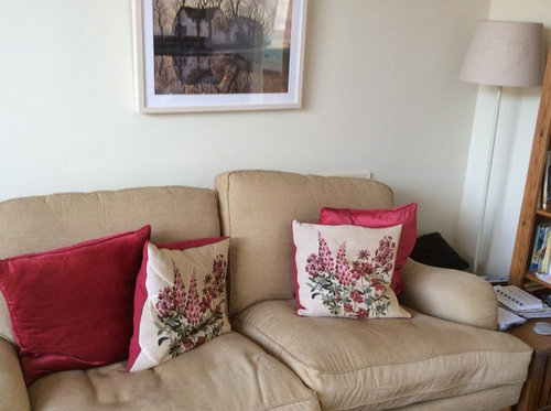
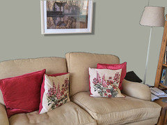
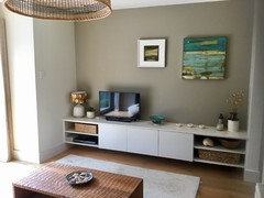
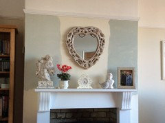
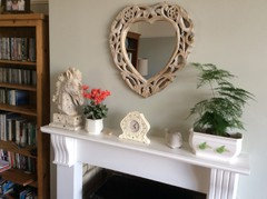
Need help choosing new wall colour for sitting room.

Sonia
5 years ago

Hi all, i am pondering whether to paint sitting room walls a different colour. It is currently Dulux Elderflower Tea which is a nice, but tad boring, cream. It goes with everything in the room, but I wonder if something bolder would suit it better. All the furniture, curtains and rug will stay as they were not cheap! i did wonder of a duck egg blue as it seems to go well with red, or does it? I’ve got duck egg in my sunny kitchen and it looks great, but the sitting room is North-east facing so will it look a bit bleak? The room is bright due to a big bay window despite its aspect. Here’s a few pics:


Comments (53)

  • PRO
    Celery. Visualization, Rendering images
    5 years ago

    Here is an idea to paint not all walls in color

    Avissa Design with Hush Homes - Oakville Model Home · More Info

    Sonia thanked Celery. Visualization, Rendering images
  • Related Discussions

    Hi, I need help in choosing right colour/type rug for my living room

    Q

    Comments (21)
    What about a bespoke rug made from a cream coloured carpet with a mink / black border? We have a great 'Make me a rug' designer on our website where you can have a play, but here are a couple of combinations that we loved! http://www.alternativeflooring.com/rugsrunners/make_me_a_rug
    ...See More

    Need help choosing range colour, wall colour and tiles in kitchen

    Q

    Comments (27)
    Update - alabaster painted oak units, oak worktop, (curved end units and worktop corners) belfast sink, 1100 stainless steel rangemaster porcelain large high gloss ivory 600x600 floor tiles, ivory grout - please see attached look book just still to decide on shade of sage on walls - deciding between F&B Mizzle, Vert De Terre, Ball Green and Cooking Apple Green... Also metro sub/way tiles on walls - whether to go for a sage tile or cream/white... The dining room area off the kitchen will have oak parquet floor which will follow through from hall and will also be in the lounge but Im thinking of following the wall colour in the kitchen through to the dining room for continuity and potentially painting the chimney brest or wall furthest away from and facing the kitchen a darker green complementary colour... Thoughts please
    ...See More

    Need help with choosing painting color for wall for boys room

    Q

    Comments (8)
    You could go for completely white washable Matt, then around each boys bed you could have objects on shelves, rugs etc that are particular to them and their ages. This will help you create a room applicable to both boys. Plain white will also make the room look larger. You could also go for a pale light blue or a light grey as a base and do the same with shelving for night lights etc.
    ...See More

    Help us choose curtain colours for a sitting room?

    Q

    Comments (11)
    Dear all, Thank you for your very helpful comments! I greatly appreciate it. My partner likes curtains (he always found curtains pretty and they would help with insulation as we have single glazed windows) although I also love the idea of blinds and see how curtains can crowd the place and get a bit lost behind the sofa. I think the idea of oatmeal curtains or blinds with a blue trim would be really lovely and I will definitely look into this. Do you mean a trim running the vertical length of the fabric? We had thin sheer white shades already that you can see now in the pictures. Carolina, it's great advice to make sure to get wider poles so the curtains flank the windows - I think this will make a big difference to open up the room. If we get curtains we would also probably replace the wooden poles with thin chrome poles. Bathroom Eleven, thank you also very much for recommending blue cushions to tie it all together and suggesting we switch the table direction. I followed your advice on both (I had gotten this cushion last week and didn't put it out yet) and I think it looks great! I will look at the links you sent. Thank you all very much again. Beks
    ...See More
  • PRO
    Celery. Visualization, Rendering images
    5 years ago
    last modified: 5 years ago

    one more idea of colours

    South Miami House · More Info

    And I tried this colour on your wall

    Sonia thanked Celery. Visualization, Rendering images
  • User
    5 years ago
    Hello, how about green? I think the reds would go nicely with a muted shade of green such as F&Bs vert de terre or mizzle, or maybe one of Crown's sage tones. I've actually got your cushion print on my bedroom curtains with mizzle walls and think it looks lovely, but the room is west facing so very sunny.
    Sonia thanked User
  • Sonia
    Original Author
    5 years ago

    I do like the greys. Despite it being a north facing room it has a huge bay window and the light from the kitchen patio doors also comes through into the room. Do u think the greys would be okay with the cream and soft red curtains? Here’s some pics


  • User
    5 years ago
    Mizzle - can look quite grey, but also had a bit of blue in it.
    Sonia thanked User
  • User
    5 years ago
    Vert de terre, a more of a definite green.
    Sonia thanked User
  • Sonia
    Original Author
    5 years ago

    shjuly71 doesn’t mizzle look good? Getting some good ideas here!

  • Sonia
    Original Author
    5 years ago

    I think I’m a bit in love with Mizzle. My house is very Laura Ashley (as you can see!) and Celergirl‘s last pic is very, very similar.

  • E D
    5 years ago

    Lovely room forza, especially with the window.

    I think Mizzle would look the perfect match. I feel it will freshen up and update the look of your room without trying too hard to be trendy.

    Sonia thanked E D
  • E D
    5 years ago

    If I can make a (predictable) suggestion...

    Try move the sofa(s) away from the walls. Even a little might already work.

    Sonia thanked E D
  • User
    5 years ago
    I love my mizzle bedroom! Just tried to take a picture but the sun is blazing through so it's not shown up very well. When it's sunny it looks quite green but on a dull day it takes on more of a grey-blue tone. Either way I think it looks nice!
    Sonia thanked User
  • User
    5 years ago
    Also, not quite your cushion print but very similar and also Laura Ashley!
    Sonia thanked User
  • Juliet Docherty
    5 years ago
    last modified: 5 years ago

    Hi Forzaitalia, there are a few different options that you could try. Firstly, although digital representations are good in some sense, you would always need to test a colour on large pieces of paper first, so a digital image you discount you may like in real life. All rooms have areas of light and shade and that alters how things look. I recently visited the house of a well known printmaker and his huge Victorian lounge was painted in Pigeon, it looked stunning and would be a good colour to complement the warm reds and the sofa. As suggested Mizzle is a paler version of this so may look good too. Farrow and Ball light Grey 17 is a gorgeous warm grey with green undertones, I have it in two rooms in my house but I colour block it, this means other walls are paler. I do this almost everywhere as it means you can go darker on certain walls but retain lightness overall. I would ignore the term feature wall as it is misleading. You can darken and lighten walls as you need to reflect light or change proportions. This is Pigeon below.


    Sonia thanked Juliet Docherty
  • E D
    5 years ago

    Aren't paint colours tricky? In Shjuly's last pic the Mizzle looks a lot more blue... (on my screen anyway).

    Sonia thanked E D
  • Juliet Docherty
    5 years ago

    Another tricky thing about paint colours is how they are described. I once painted an East facing room in Elephant's Breath (described as warm). It was dreary and cold, but could have worked in a South or West facing room.

    Sonia thanked Juliet Docherty
  • cavgirl
    5 years ago
    Cromarty is lovely too. It’s just a smidgeon lighter than Mizzle.
    Sonia thanked cavgirl
  • Sonia
    Original Author
    5 years ago

    E D - yes sofas hug the wall too much, I agree. However, both sofas have castors on the front feet so every time we sit on them they shoot back! Quite irritating and I’ll never have castor feet again. I’ve tried placing the feet on the rug and they still move - Hmmm


    shjuly71 - Mizzle looks gorgeous with your curtains so a good choice for the red details.


    Colourhappy - good suggestion for painting large pieces of paper. Liking the Light Grey 17 and Pigeon but maybe better with your colourblocking suggestion?


    cavgirl - Cromarty is lovely too!


    i think I will be buying some match pots very soon.

  • jbtanyderi
    5 years ago
    There are some interesting colours in that rather lonely painting. One of them could work on the walls - especially as you can already see how those colours work with the natural light in the space.
  • Jonathan
    5 years ago
    Consider a combination of Inchyra blue and light blue.

    Caster cups could be the solution to the sofa moving.
  • Sonia
    Original Author
    5 years ago

    The room does get morning sun, as you can see below. Colourhappy I wonder about painting the fireplace wall in pigeon or mizzle or light grey 17 and leave the rest plain and neutral? Looking at the F&B colour chart they all look greenish in this light in this room right now and I love them.

    jbtanyderi I love my lonely picture! It’s by Mondrian before he went all abstract. I’m just not a fan of clusters of pictures, sorry......:-)

    jonathan, never thought of blue. I will have a look thank you.

  • PRO
    Origin - Doors and Windows
    5 years ago

    I think a beige or olive colour would complement the reds that you have- beautiful furniture by the way!

    Either of these would look nice!


    This guide may also help you: http://bit.ly/Origin-guide-to-colour-in-the-home

    Sonia thanked Origin - Doors and Windows
  • Sonia
    Original Author
    5 years ago

    Thank you origin. Doesn’t green go well with red? I’m really veering towards the green grey slightly muddy shades.

  • PRO
    Origin - Doors and Windows
    5 years ago

    You're welcome.

    The olive and grey for me are really working. The question is.. could you do both?

  • Juliet Docherty
    5 years ago

    It's all down to test pots and elimination! I buy sheets of grey card form the art shop and meticulously paint two coats on to that as it's rigid and doesn't buckle. If you are combining two colours in a room, they need to be sufficiently different tonally to work. I have Light grey and Clunch in one room (East and West facing) and Light grey, Mouses Back and Skimming Stone in another (East facing). I found Clunch too yellow in an East facing Room, Elephants Breath too cold. Skimming Stone can look cool but works. I would avoid anything with a violet undertone as it will clash with your sofa. Test pot time.

    Sonia thanked Juliet Docherty
  • User
    5 years ago
    Ah, clunch, my go to F&B colour! I painted my wardrobes clunch in the mizzle bedroom as it had worked so well in other rooms as an offset to whatever colour I'd used. Didn't like it at first, but as time has passed I've got to see how the light picks up on the olive undertones and now think it works perfectly... just as well because I'm not painting the wardrobes again if I can help it! The other colour I tried with mizzle first was F&B French grey. They work really well together but it was a touch too dark for the look I wanted. Definitely tester pot time!
  • Juliet Docherty
    5 years ago

    Forzaitalia, this is Clunch (walls) with Light Grey 17 (wall) woodwork Shadow White in my kid's lounge. It is very light and East and West facing. Clunch all over too bland, it needed the dark for the artwork.


  • Sonia
    Original Author
    5 years ago

    I like that! What do you think of F&B paint? I’ve heard some painters hate it and it is expensive compared to others, but they do such gorgeous colours!

  • Juliet Docherty
    5 years ago

    It is chalky but a bit thin on coverage. Some colours can't be replicated, such as Shadow White, there is no substitute. I buy it because it's convenient and I am familiar with the colours, but nothing compares to Paint and Paper and Little Greene, they are more pigmented and need fewer coats. F&B is still nice chalky paint though. I do my own painting so it doesn't matter really. Painters say they can match it which is often completely untrue, some colours will match reasonably well, most won't.

  • User
    5 years ago
    I do all my own decorating and only came to use f&b paints a few years ago. For me it's the nicest paint I've used. You can get a duff batch, but F&B will simply replace via wherever you got it from. The worst part is the expense. Other than F&B I like crown paints for the look and finish, but they don't have the same muted qualities as f&b.
  • Juliet Docherty
    5 years ago

    I agree about the expense, it's a really costly business. But I use the test pots in my teaching and my kids use them in their art projects which softens the blow!

  • Sonia
    Original Author
    5 years ago

    Thank you all so much for your input. I can be too much of a matchy matchy person which can give a dull, uninteresting look, so putting a more interesting colour on the wall that isn’t cream is the way to go, I’m on Pinterest at the moment looking at rooms painted in F&B greeny greys and loving them so much. I never would have looked at them without all of your suggestions!

  • E D
    5 years ago
    last modified: 5 years ago


    We have used F&B paint (Pigeon, Skimmed Stone, Off Black) and yes it's good paint but yes ridiculously expensive.

    Forza, I was going to suggest castor cups as well. They do the job of both protecting your floor and keeping the seats in place.

  • cavgirl
    5 years ago
    Btw, if you like Cromarty, look at Craig and Rose’s Pale Celadon. Very similar colour, beautiful paint quality, and usually a good £10-15 cheaper than F&B. Superb coverage too, I’ve found, and that same lovely chalky quality. Also: they’re a genuinely old company (200 years) whereas F&B is not. I admit that as a historian that last matters!
  • rachelmidlands
    5 years ago
    Hi Forzaitalia, I think the general opinion for a soft greyish green/blue is defenitly the way to go. Mizzle is a great suggestion and think it would look nice in your lovely sitting room. Just wanted to second cavgirl’s recommendation for Craig and Rose paints. I’ve been trying a few testers of it in my art and crafty bits and bobs and quality seems great with good amount of pigment. And it’s cheaper! :) whichever colour you choose I’m sure it will look great. Do let us know how you get on. X
  • ianthy
    5 years ago

    I also support the soft greys. I'm just about to paint our north facing sitting room F&B Drop Cloth. I have been wrestling for weeks...no months with a more vibrant colour from Vardo to Stiffkey. I like my interiors very calm with the colour coming from soft furnishings etc., Drop Cloth will provide an ideal contemporary background. Also, I am really nervous about current fashion colours - Dark Grey was in, then Navy etc., I decorate every 7 years and need a colour that will stand the test of this period.

    Interestingly, many years ago I had a home visit from Joa Studholme of F&B and she created a colour scheme for our home. She kept the smaller spaces - the loo, top bathroom skirting board, back of the front door etc for the dramatic colours. The rest of house was a mix of light colours … which still looks good after nearly 8 years.

  • Sonia
    Original Author
    5 years ago

    Thanks for all your help. Greeny grey it is so I’ll get some match pots and card and try a few colours out. My garage door is green so I obviously like the colour so that’s a start, but prefer a more smudgy green.

  • PRO
    Domus Venus
    5 years ago

    Hi! I would paint the small fireplace "wall" in a dark grey to give a nice depth to it, and the rest of the room in a much lighter grey. You can also think about adding a ceiling cornice (it is so cheap! You could get your whole living room for about 50-70£, and may be a dado rail too.

    Painting these can be SO interesting and you can try many combinations.

  • Sonia
    Original Author
    5 years ago

    Rightyho folks. I’ve narrowed paint choice to F&B Cromarty and Mizzle, although who knows, I may change my mind! In my sitting room both look a lot darker than the colour chart as room is North East facing (Colourhappy you are so right about light!). I did paint some card but then thought what the heck I’ll paint directly on the wall. The colour on the left is Cromarty and the one on the right is Mizzle. Both look so much paler in my sunny kitchen. Which do you prefer, if any? Many thanks.


  • Juliet Docherty
    5 years ago

    The effect is always diluted over the whole wall so I vote for Mizzle.

  • E D
    5 years ago
    last modified: 5 years ago

    I think I prefer Cromarty. It looks more neutral (with a hint of grey) than Mizzle but is still not a boring colour.

    I generally prefer lighter colours for walls anyway unless I'd be after a dramatic look.

  • E D
    5 years ago
    last modified: 5 years ago

    Btw, forza, maybe I missed something but are you going to paint your kitchen in the same colour?

  • Sonia
    Original Author
    5 years ago

    Thank you Colourhappy and E D. No E D my kitchen is a darkish duck egg. I just used the kitchen table to paint the initial pieces of card and that’s where the colours looked paler. In fact it was harder to tell them apart in the bright kitchen!

  • jenniimatthews
    5 years ago
    Could I suggest you pain your fire surround a darker colour than your walls....If you leave it white it will make too much of a statement....what do you think?
  • Sonia
    Original Author
    5 years ago

    Thank you Jennii. I have a fear of the “dark side” and prefer lighter colours, but that is worth considering. Interesting!

  • User
    5 years ago
    The mizzle sample looks great. Do you have enough left to do a second coat of paint? That will really make a difference and show you what the finished product will look like. As you've committed to painting the walls now (!) add another patch above the sofa and by the curtains to see how the different colours look with your fabrics.
  • Sonia
    Original Author
    5 years ago

    Thank you shjuly71. I haven’t got much left as I did two coats on sheets of card, but I’m nearly there decision wise. All will be revealed soon!

  • Sonia
    Original Author
    5 years ago
    last modified: 5 years ago

    Well the walls have been repainted at last. And the winner was....................... F&B Cromarty! Second was Mizzle, but it looked a little too dark in my north facing room, but it was a close contender. Thank you all for your brilliant advice. We both love the colour, and you can see how different it is in various areas. E D - the sofas are now away from the walls and the castors are sitting on brass cups (the plastic ones shattered) and it has worked, they don’t move!

  • rachelmidlands
    5 years ago
    Ooh, it looks lovely forza. I’m glad you went with cromarty, looks fresh and inviting without being too cold a colour. Good choice. I love your new cushions as well:)
  • Carolina
    5 years ago
    It's beautiful. Such a lovely, elegant room.
United Kingdom
Tailor my experience with cookies

Houzz uses cookies and similar technologies to personalise my experience, serve me relevant content, and improve Houzz products and services. By clicking ‘Accept’ I agree to this, as further described in the Houzz Cookie Policy. I can reject non-essential cookies by clicking ‘Manage Preferences’.