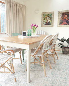
flooring/furniture choice in south facing open plan living space
Heather
5 years ago
Featured Answer
Sort by:Oldest
Comments (12)

minipie
5 years ago
rinked
5 years agoRelated Discussions
ideas for south facing dull living room
Comments (12)It looks like you like brown and it does contrast with the floor which is good (yin/yang). Adding a tall halogen lamp in the corner between the wall and the sofa would help you to read and help your eyes when you are watching the TV. The room would also welcome a lush plant in the South west where it can thrive or a bouquet of silk flowers in pink and white . A coffee table, preferably oval or a puff in the middle of the carpet will help conversations flowing. Avoid putting everything against the walls as your energy runs out of the window. As it is the south, you can add candles, perhaps scented ones too. The picture on the wall is too small in proportion to the size of the room. A red sunset or sunrise, a field of flowers, an image of trees, would give the room a happy lift. Browns can be complimented in the south with reds, orange, greens. White or cream walls would be better than grey. Too much of the same color in a room creates a dull effect and a boring life. So just add accessories in the colors that appeals to you. I would not recommend blues but yellows, oranges, or greens. Just a touch here and there, a throw, two cushions, a red lampshade. Perhaps some floral curtains rather the stripes that are too symmetric and promotes arguments. Add a pair in the Southwest for love. Have fun....See MoreRug choice for open plan kitchen living
Comments (17)Everything you've done so far is very neutral. It blends together the two different areas in one open space, yet I think you'd get a more pleasing effect defining them and adding interest. In the simple form of one dimensional carpet you can achieve this. I would suggest a bright and geometric carpet as a stark contrast to the neutral, coordinating (that same mustard) or using opposite (Aubergine?) or tertiary (brighter yellow and goldenrod or into greens) colours with the cushions to separate living from dinning while also bringing continuity. When it comes to colours, ask yourself how you want to feel in this space. Choose colour to guide your mood. Two other small details: 1. The lamp beside the couch should be higher and darker. That charcoal you've used would be an appropriate colour repetition here. 2. The art on the wall above the dinning table is too small. What about bigger and brighter, but keep a charcoal element in either the frame or the art? Lovely job so far :)...See MoreFurniture layout open plan kitchen
Comments (133)I might get overruled on that one! (Although my husband is obviously wanting to watch it for different reasons!). I'm pleased that you're happy with it! That's great that they're washable, so handy, and that the dog likes it!! No Xmas took over... I need to look at it urgently as damp has now appeared in one room, I feel like I've cursed it :( we went to Bruges last week and I admired numerous houses, as you do (!), and I'm now thinking of slightly less traditional colours.... I just can't make my mind up, i wish whoever hadn't rendered it in the first place as it would be so much easier!...See MoreOpen Plan Living/Dining/Kitchen Distribution
Comments (167)Hey! I've just seen the last comments. I live in Spain and there doesn't seem to be as much choice over here as there is in the USA after browsing at lot.. the Gubi light does look similar to one of the Tom Dixon beats shapes and I like the oriental vibe they give.. I am leaning toward that style for the pendants and will probably end up going with one. As for the splashback.. it's a nightmare.. I really have no idea.. I think dark like black and I think it will look to much and take away from the accents.. I think of grey and I think it's too boring and monocromatic.. I think of colour and I get scared lol.. really don't know and to be honest... I do regret going all white in the kitchen and not going with something darker or mid tone on the lowers at the back to ground it a bit more. I see so many kitchens on Instagram and Pinterest and I am always drawn to the darker ones.. but as I have a darker floor, I thought it would be too much. Anyway, it's done now and I guess we all have things we would do differently. I could always relacquer the lower doors quite cheaply if it came to it I guess. I really love Hague Blue by farrow and ball and have always wanted to use it but I think it wouldn't fit in anywhere and I'm not brave enough anyway🙈 Some good news is that I have finally managed to get the stonemason to change the island worktop which he destroyed after cleaning it with paint thinner.. after 4 months of fighting and the carpenter also finished up all the last details this week.. after 5 months. Stonemason has offered to give me a big discount on the splashback if I put a slab on the wall but really have no idea.. options are Dekton, Silestone, Neolith and Compac colours. By the way.. just saw this flat on pinterest and it reminded me of mine a bit but well done and with a more interesting kitchen.. trying to get some inspiration from it: https://hot-walls.ru/portfolio/сердце-столицы-99/ My favourite designs seem to all be Russian for some reason.. 😅...See More
Carolina
5 years agorinked
5 years ago
Heather
5 years ago PRO
PROCarrie Cotton Design
5 years ago
Ally
5 years ago
Tani H-S
5 years agoHeather
5 years ago PRO
PROFAIRFAX FLOORING
5 years ago
Årm ßåçk
5 years ago


Tani H-S