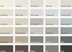
Wall colour to go with Pointing and Hague Blue kitchen units
cushioncover
4 years ago
Featured Answer
Comments (8)

cushioncover
4 years agoRelated Discussions
Hague blue lounge, but running out of ideas, please help!
Comments (13)firstly I love the vibe of your room colour glorious and the chairs and tan sofa are fab. I would try and balance the sitting arrangement so centred around the fireplace. I would defo have a rug perhaps in golds citrus shades very decedent perhaps geometric pattern to go with the moody walls and pick up pieces like mirror and photo frames in gold and copper tones. I like the bay bare and let the light flood in or gorgeous sheer voiles. little milk stools are lovely touch so would keep them. Drinks trolley with beautiful cut glass decanters and glass bouncing light across the room. why stop there over sized crystal lamps and chandeliers with lovely shades. I would be careful with art work as my clash with strong colour on walls may not even need anything more. beautful coffee table in crystal with gilt frame adorned with lovely bits and pieces that reflect your life and personality. and perhaps a tall glass shelf unit with similar frame. old books throws. im getting carried away sorry but would love to have a go at this project have fun that's the most important thing I feel and only invest inpieces you totally love because then you will always love them and can always move them around to refresh or even style another room...See Morecolour - should we continue the blue or go pale?
Comments (10)Hi guys, Thanks both for the comments - I should have been clearer - the cornice (and above the picture rail) are already painted in slaked lime... they were a very big job and am definitely not doing them again - I used the same colour as the walls and ceiling as whilst they're lovely, they have some areas where they're not in great condition so needed them to blend in slightly (they've had quite a bit of repair work etc!). The grey we've chosen for the kitchen (though not painted yet so up for debate!) is 'dash of soot' with the 'dock blue' on the island. I think painting the doors and skirting could look good painted in the same blue... but I'm not sure I could do the windows as well - we're getting into seriously dark territory then!! Minnie - I love that picture - and it shows how the pale and the blue could look lovely together on a wall! We're definitely going brass for handles and knobs so will check out buster and punch - thanks for the tip! And it's interesting what you say about the kitchen cabinet colours AJ.... the indigo blue would be on the island - with the wall cupboards (which dont have a gap for the worktop - but the top cabinets are set back a little showing an oak worktop - with appliance garage etc) going up very tall - to 255cm.... we thought having these a paler colour would stop them closing in on the room - and I'm not sure we're keen on a paler blue - but nor did we want a cream/beige - like a darker version of the slaked lime might look... It's so tricky to know if we're doing the right thing! And are doing the work ourselves so aren't keen on having to do too much more of the painting than we need to! Cheers Greg...See MoreF&B black blue vs off black kitchen units
Comments (115)Hello! It’s arrived but is being fitted Monday :0) The colour wasn’t quite what I wanted as although it’s not supposed to have any blue in it, if can look blue in some lights. I don’t mind it looking deep navy but sometimes it looks lighter. Will see when it’s all up though as with the worktop on the island and overhang, it will probably just look more black! Bear in mind the company didn’t use actually F&B paints as they mix their own. Definately advises paying for a test door first as they got the colour totally wrong at first (was bright blue!) and it was hard work getting the manufacturers to check it and do it again. They almost didn’t....See MoreWhat colour kitchen walls? Grey units/oak worktops
Comments (15)In my opinion it is the saturation level of the paint that is the problem. The beauty of your kitchen is the natural flooring and the wooden worktops, it looks earthy. This is swamped by the blue paint, it just looks wrong. Without seeing the cupboard door colours close up it is tricky but I would suggest looking for something a bit darker than the cupboards but with the same hue. If you want a strong contrasting wall a deep olive green would work as it would balance the wood and the purpley greys....See More
Sonia
4 years agominnie101
4 years agominipie
4 years ago
rinked
4 years agorinked
4 years agocushioncover
4 years ago


Sonia