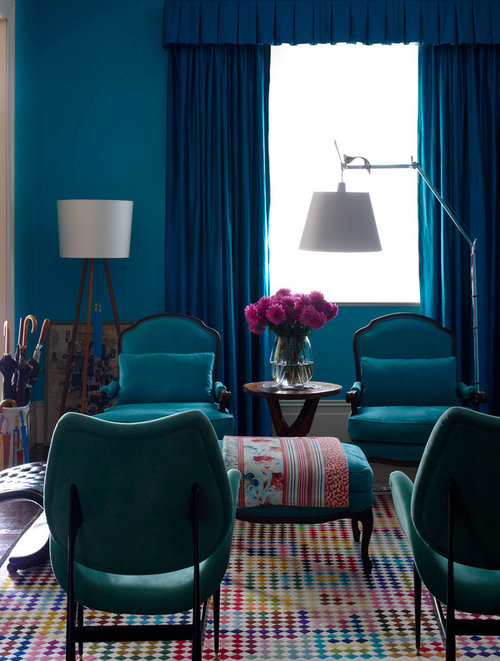
injecting life into a dark room ....but how ?
mag499
4 years ago


Featured Answer
Sort by:Oldest
Comments (10)

rachelmidlands
4 years agoRelated Discussions
How can I bring this kitchen to life?
Comments (28)Hi Daniel What a lovely light kitchen! I see you have decided to change the worktop which is a good idea if you don't like the existing (temporary fixes always seem to stay forever in my house, much better to go for a permanent solution if it's within budget!) if you like colours I think the suggested mustard yellow would be good, or teal works really well with white and wood. Also, you mentioned tiled wallpaper, how about some real tiles? I have a new kitchen too, it has very pale grey gloss units and a white quartz worktop and white walls (at the moment, eventually I'm planning to paint them dark grey). It's lovely but a little plain like yours. I found some lovely tiles which are white and grey which sounds very dull. It they introduce pattern which really ties it all together. I think you could choose some tiles with a nice pattern (they don't have to be brightly coloured if that's not your thing). You'd only need 2 rows, not all the way up to the upper units, introducing some pattern could really bring it to life. And perhaps some coloured chairs when you get round to thinking about furniture? Also, how about hanging a picture on the wall below the wall unit above the washing machine? I love a picture in a kitchen! Hope this helps, enjoy decorating your new home!...See MoreLive Chat: How to inject colour into your home with Bright Bazaar
Comments (28)A5) I would start by giving yourself a focal point to refer back to when you are choosing new cushions. This could be a hero piece of artwork hung behind the sofa, or a rug on the floor, for example. Take a picture of this piece on your phone so you can have it with you to compare side by side with new cushions when you are in a shop and making a decision on whether you think they will sit well alongside the artwork within the space. When it comes to pattern, consider the 60/30/10 approach. Stick to 60 percent of a favourite pattern, 30 percent of a second pattern, and 10 percent of a third as an accent. My key tip when you are mixing those patterns together is to mix up the size of the patterns, and be sure to break them up with a solid, too. For example, you could pair a narrow stripe with a medium size geometric or a large-scale floral pattern. When you layer in solids, make sure the colour is from the same colour family as one of the other patterned pieces to keep the overall look cohesive....See MoreWarm white paint for a dark North facing living room in England
Comments (37)Hi Evie. The reason I've been slow to post photos is because my house is very much still a building site and work in very slow progress. I have flung paint on walls a relief from 1927 plaster and peeling wallpaper that went up decades ago. I haven't hung pictures yet as the walls are so hard - picture hooks break - and the friend who is going to do the task hasn't yet been. So, none of these photos will persuade you to use colour - the walls are bleak. But I'm posting them in the right spirit. As for feature walls, I have never liked them. For info, Kate Watson-Smyth said, in a recent post, that they are "so ova". I associate them with the 1970s, which is when I believe they first emerged. I like all over colour; I find it much less intrusive than one wall that stands out awkwardly. As for my furniture, it's mostly interim - on loan as I had nothing after chucking out my two sofas which I bitterly regret. Anyway, with all those embarrassing provisos, here we go. Terracotta sitting room: Caravan by Paper & Paint Library (it's not a current colour; my local independent paint shop keeps records of previous colours and identified it for me); it goes up to the picture rail; I haven't yet found the colour I want above it and on the ceiling; the picture rail, window frames, doors and door frames will all be Caravan, too; the room is really bitty (four doors, jutting out bits, fussy door and windows into the garden, a big fireplace, original tiles around the fire area that I wanted to complement but tone down, and a busy stained glass window) and needs blanket coverage to make it seem less busy. .Green bedroom: Sanderson Laurel below the picture rail; Goblin Green above it and on the ceiling; picture rail and all other woodwork not yet painted; I might do them in a linen colour to tie in with the bed frame though I hate the bed frame and am desperate for a new one. You can see that I'm work in progress by the undealt-with and unpainted grille covering the hole where the fireplace was. Hideous and offensive; longing to put it right. Lots of pictures/paintings to be hung all over. Blue bedroom: This blue is a bit flat but it was only after painting it that I discovered the colour I really want - Abigail Ahern's Bowery Blue which despite being intense has a real lift to it giving it life and vibrancy. The ceiling in here is the wrong blue (bought in haste); I will use a lighter blue. The unhung painting on the right (sorry it's not more visible) is so much more vibrant against this blue than it was against the pale yellow of the wall it was hung on in my previous home. I will have mirrors above the bedhead and a gallery wall opposite plus a mirror near the small window to throw a bit more light in this seriously dark bedroom (dismally dark before I painted it interestingly dark). Bronze shower room: Impossible to photograph this as it's a tiny room; the tiles in the shower area are subtly jazzy and moody. I love having it open (I grew up in India where all showers were in the middle of the room so I've never understood the closed-in box version or the fiddly over the bath option). The bronze tiles are much richer in colour than the photo conveys; the walls are Sanderson Brick Light which looks pale and peculiar in this photo; it is a lot more interesting than on the paint card and picks up on colours streaking through the tiles; it's not such a stark contrast as the photo conveys. That's it. The bedroom that will be a mustardy yellow isn't painted yet so I can't show the walls in there. And, again, apologies for the really unsophisticated furniture and mismatched upholstery, etc. Lots still to be done!...See MoreHow can I bring this living room to life?
Comments (40)We were going for the 3 seater + the chaise, so it'd be wide. Then the footstool as well so when it's just us two we can create 2 chaises for ultimate comfort. We considered a 3 seater + 2 seater but the room is awkwardly shaped / laid out for that. We wanted something large enough for multiple people to sit on if we have visitors. The 3 seater on its own with the footstool would make for smaller width as you'd lose the + chaise seat, know what I mean? Unless we did a 3 seater plus a chair. With the TV in one corner and the wood stove in the other, I can't figure out how to place two sofas without one of them being back / side on to something or blocking it....See More
mag499
4 years agomag499
4 years ago
Kyle Barrett
4 years agorachelmidlands
4 years ago
Sam Potter
4 years agorachelmidlands
4 years ago
rinked
4 years ago PRO
PRObubbles bathrooms and tiles
4 years ago


rachelmidlands