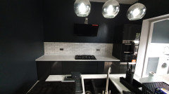
Wrong coloured tiles
HU-476790670
4 years ago
last modified: 4 years ago
Featured Answer
Sort by:Oldest
Comments (8)

HU-476790670
4 years agoEllie
4 years agoRelated Discussions
wrong colour kitchen cabinet doors
Comments (4)As an alternative to painting, you could consider just buying & fitting new replacement doors and selling on your existing (new!) doors through ebay or a local selling site/facebook page. While it may be possible to paint the doors, depending on the finish, the results may be less than perfect and you might be even less pleased with the outcome than your current doors. A badly painted door will have virtually no resale value. There are many door replacement companies out there, and the prices can be a lot less than you might think. Something to consider perhaps! John at Caldicot Kitchen & Bathroom Centre...See MoreGot Kitchen Cabinets colours wrong, need help.....
Comments (51)Dear Azfar, I think your units are lovely, very sophisticated and much nicer than white. Your units and work tops are very similar to those I have in my kitchen, which also have black granite tops. I also have a wooden floor of a similar shade, please don't change this, it is lovely. I was aware when I had my kitchen fitted that the units appeared darker than in the showroom but this was due entirely to the colour of the walls they were installed on. To lift the units, and celebrate their beautiful colour, you should paint your walls a darker and contrasting colour, I have chosen a really shocking pink, Rock Candy, but there lots of options. The showroom I saw my units in used a burgundy colour, too dark for my Victorian kitchen. There are so many colour options which don't have to be expensive, play around with a few tester pots and see which you prefer. This is by far the cheapest option, and I'm sure you'll fall in love with your kitchen units again once your units are allowed to stand out. Incidentally your unit colour helps to visually integrate your stainless steel 'fridge, another reason to stick with it. If you want to add units in the future you could pick up on your new wall colour for a very stylish look....See MoreWall colour and carpet colour suggestions for this hall tile?
Comments (13)Hello Dub M, Well it also depends on what else colour wise you're choosing for your scheme.. Whether you want bold and dramatic or whether you want something lighter in feel... Using them sparingly with a lot of plain in between or perhaps as boarders can then lend themselves to accent rather than statement... All depends on what you want from them as they're versatile! For pale schemes.. Think of colours such as creams, wheat and pale sun hued creams with hints of yellow.. Light and earthy tones on the cream, wheat, canvas, hessian colours perhaps beige and pale mustards, or pale golden creams and burnt siena with hints of brown,ochres .. For bold consider dark almost purple blues and hints of mauve.. Also Charcoal and greys with black and brown hues... For a warm but dramatic look.. The colours are chalky and have depth... Include wood work and again wall covering is versatile in that it could be half height or whole height.. Put tiles and colours together to see what you like.. Paint onto squares of paper no less than A4 and place them where you might want to use them.. Look throughout the day to see how they react and interact with their space and the changing light.. From one colour you can begin to mix it to blend and become another.. In this way you can see colours interact with each other. Use versions of them by working with lighter and or darker varieties of the chosen colour.. Here's a doodle to show the colours blue and others I'm suggesting so you can see the blue is still quite dominant. I rather like blue and elements of yellows, old golds and creams.. Look at the tiles themselves too for inspiration... : ))...See Moreselected the wrong floor tiles!!
Comments (12)Hi Minfas - I've just done a quick concept board for you, so you can see how ideas might fit together. But these are all dependent on checking that the various colour tones work together by holding materials against etc and being critical! Also don't over do the wall, otherwise you might end up with a log cabin look, which am guessing is not what you want! Decide what metal finish you want and stick with it. Brass would soften it overall, chrome would modernize it even more....Flowing drapes at the windows would soften it further, and remember, there are grey tones in the floor and the wall too, so use them! Good luck, let us all know how it goes! Kate...See MoreJonathan
4 years ago
Sonia
4 years agoHU-476790670
4 years agoHU-476790670
4 years ago
E D
4 years agolast modified: 4 years ago


Patrina