kelly_evans5

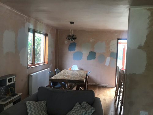
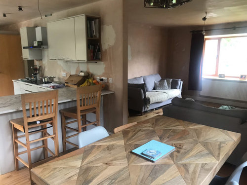
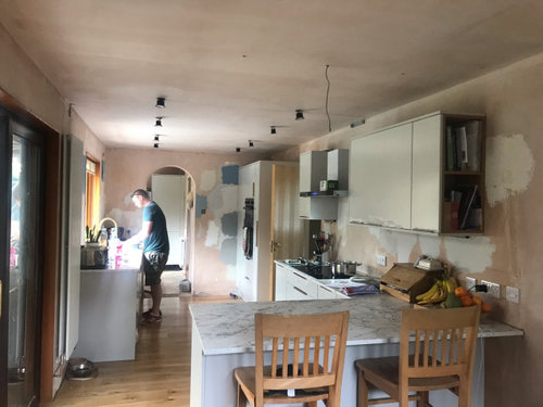
Colour dilemma north/south facing open plan space

Kelly E
3 years ago

We’re mid renovation and we have opened up our kitchen to make a large L shaped lounge/kitchen/diner. The lounge window is north facing and it can be quite dark in there. Around the corner a bit to the kitchen and it’s lovely and light (south facing). The kitchen cabinets are light grey with brushed brass handles. Going for modern brass accents throughout (furniture, lighting , tap etc ). I’m having a colour dilemma for the walls. I’d like the main colour in the space to be a light grey. We’ve chosen Little Greene colonial blue for an accent wall (behind the dining table and through to the kitchen). I’ve chosen blush pink tiles for splashback and will be having blush pink cushions etc. The problem I’m having is finding the right grey to bring it all together. I need a warm grey in the lounge but I’m finding a lot of them look purple or too beige. I wanted the same grey in the kitchen area too but I’m wondering due to the different light a cooler grey might look better there? We’ve tried Dulux pebble shore, just walnut, polished pebble (too cool for lounge), Little Greene french grey pale (too pale and looks a bit cool for lounge), dusted moss 3 (too green)...help! Any ideas?! Photos to show the space (excuse the mess in the kitchen!).

Comments (53)

  • Marylee H
    3 years ago

    Here tou can see the LG French Greys are from the Yellow Hue Family. The Hue angle shows where they sit within that family.

  • Kelly E
    Original Author
    3 years ago

    Hi, floor is a warm oak, hopefully you can see in this photo. Table is also a warm mango wood.

  • Related Discussions

    flooring/furniture choice in south facing open plan living space

    Q

    Comments (12)
    We are just fitting our kitchen in a new 8 x 4m south facing extension with 2.4m high x 6m wide bi-folds and have 2 x skylights. I am worried about the fading so we had laminated glass put on the outside of the doors (rather than 2 x panes of toughened glass). It's supposed to block most of the UV rays that cause fading. The rooflights aren't directly over the kitchen furniture but there must be some sheer blinds you can fit that have a UV filter and won't block out the light? Thinking when it's super hot and sunny they would be used. My floor fitted said that as long as you buy a UV stable LVT (should say on the product) and it's fitted with a heat stable glue (to allow for contractions) then there shouldn't be an issue. Not saying it won't happen but will see how our dark kitchen lasts!
    ...See More

    open plan dilemma

    Q

    Comments (3)
    I’m not very good at flows etc but I do wonder whether you might be a bit short on worktop space? There’s a long run of tall units, but not much worktop area that I can see. I’m not a fan of hobs on islands, but I know they are popular. I think I would try to find a way to incorporate the Christmas lounge with the rest of the house, maybe glazed doors in place of the wall to improve lighting and give the option of closing off if need be. With the dining table so close to the island, do you need both? But there are others on here who have much more insight than I do on these matters. Have fun planning. Angie
    ...See More

    Open plan layout dilemma

    Q

    Comments (16)
    You know I think I still prefer no. 2, whilst retaining the cloakroom, because in this version you have three seating areas spread quite thinly. I think it is better to have a decent sized seating area in the family area and, if you have the luxury of space, a snug to escape to. Also it is nice to be able to look out at the garden from the kitchen especially if you have children out there and you want to keep an eye whilst you are cooking. I have only just noticed that you have two doors into the utility. Could you manage with just the one? It would give you more room for more cupboards in there. The smaller dining table works better or you can have an expandable one for big gatherings. I have forgotten what a big gathering feels like. Heck I have forgotten what a group of more than two feels like!
    ...See More

    north/south facing open living room.

    Q

    Comments (4)
    For me, it's more the size of room that would make me want to paint different areas. If it's just one normal size room eg 6m X 6 m then it could be one colour. If it's just one room, used for one thing I'd do it in same colour. If it's open plan and is like 2 rooms knocked together and there is going to be a living area as well as another area that you want to zone then painting a different colour can make this work.
    ...See More
  • Kelly E
    Original Author
    3 years ago

    Would you say a yellow hue would work with the floor then? Is a yellow hue warm for a north facing space? I was thinking of getting a tester for french grey mid. Spent so much on testers!

  • Marylee H
    3 years ago

    Greys from the Yellow Hue Family would look nice with the wood, but you need to think how well it sits with the marble & pink tiles too, (if you are set on them.) It’s a bit of a jigsaw puzzle.


    If I was helping you from scratch, my process would be to measure the colours of your fixed finishes first, to plot them into their Hue Families. i.e, Your work surface and flooring.

    That would give us key info - Lightness = how dark or light the colours appear, Chroma = how colourful or greyed and near to neutral they are, Hue = to which Hue family they belong. With multiple colours in a surface, we could take multiple measurements.


    Your flooring is likely to belong to the Yellow-Red or Yellow Hue Family. There are lovely warm greys in the Yellow-Red Hue Family, but as you discovered quite a number of near neutrals from that section of the colour wheel can shift purple in an imbalanced light. They aren’t purple & don’t have purple undertones, they are just heavily influenced by light and context. That’s why it‘s so important to sample colours in your space.


    We are guessing as to the greys in your marble without measuring them. But starting with greys from the Yellow Hue family would be a good start to team with the flooring.

  • Marylee H
    3 years ago

    LG French Grey is from the warmer side of the Yellow Hue Family so May well hold that warmth in your space. (it’s really only possible to know for sure by comparing to other surfaces in your space.) BUT it would definitely need sampling as at 83° it has the potential shift purple. It may not in your space but it might.

  • Marylee H
    3 years ago


  • Marylee H
    3 years ago

    If you find French Grey shifted in your space, it may be worth moving further clockwise past the 90° point to find something similar, (if you like it).


    Out of all the colours you tried, which came nearest to the colour you are hoping for?

  • Kelly E
    Original Author
    3 years ago

    Thanks for your help. This is the tile and worktop if it helps....
    French grey pale was just a bit pale i think. Haven’t tried mid yet.

  • Kelly E
    Original Author
    3 years ago

    We’re not keeping the stools by the way...I’m still searching for the perfect ones!

  • Marylee H
    3 years ago

    The pink looks very pretty next to the grey. How does it sit when you catch it in the same view as the golden flooring?


    French Grey is likely to pull warmer than French Grey mid, but it is also darker.

  • Kelly E
    Original Author
    3 years ago

    Tile against worktop and floor. Who knew finding the perfect grey would be so hard?!

  • Kelly E
    Original Author
    3 years ago

    I think my problem is I like the different colours we’ve tried better in one area (lounge for example) but not the kitchen due to the different lighting as they look so different!

  • Marylee H
    3 years ago

    Awe it can be tough with open plan! All your juggling now will pay off, it just doesn’t make it any easier when you are in the middle of it!


    I do like your tile and marble, which will obviously be adjacent, but am not as keen seeing the pink nearer the golden floor, but they won’t sit directly near each other,,,

    And you also have chosen a blue accent. Just keep an open mind to the possibility of finding an accent colour once you have chosen your main wall colour? We can use colour theory to create a harmonious palette, so it feels cohesive to you.


    If you sample anything you really quite like, but just find it too,,,,,

    dark/light/cool/warm/purple etc then I can help you further if you can describe what you like and what you don’t.

  • Sonia
    3 years ago

    Great space. Wow that’s a lot of samples on those walls! I’m not a colour expert, but when people say a “warm grey” I’m not sure such a thing exists. Grey is a cool colour to my eyes, as people call taupe a warm grey but to me it’s more on the beige side. Whatever colour you choose, it will look different in the two parts of the room. How about a gentle off white like F&B Pointing or Dulux Timeless? They have a warmth to them but not too yellow. Just a suggestion and I’m sure others will not agree, but does a warm grey exist?
    First is Pointing, second is Timeless.

  • Kelly E
    Original Author
    3 years ago

    My husband is a painter and decorator so he already had quite a few greys, then I obviously bought more lol. I’m fed up of looking! Might take a look at timeless thank you

  • Kelly E
    Original Author
    3 years ago

    Marylee I think I like dulux Just walnut best in the lounge but it’s maybe slightly too beige? I think I like dulux polished pebble in the kitchen but think it’s too cool for the lounge.

  • Kelly E
    Original Author
    3 years ago

    I’m thinking of trying Farrow and Ball ammonite too as it’s apparently neither too warm nor too cool?!

  • Sonia
    3 years ago

    My friend has Ammonite in her downstairs loo. It’s a very dark room but it looks a true pale grey, but no idea what it’s like in a brighter room. Here’s two rooms in Ammonite

  • Marylee H
    3 years ago

    Hi. I will have a look at those colours tonight and get back to you.


    Your endeavour highlights the issues with our reliance on descriptive words to compare colour attributes. Especially when trying to describe the differences between similar near neutral colours. It’s tough! Comparing their attributes through colour measurement, makes the similarities and differences a whole lot clearer!


    As for warm and cool greys? For sure you can have both.

    If you have a closer look at the colour wheel above, you can see each Hue Family has a warm and cool side. Depending upon where your colour falls, will show if it’s likely to be a warm or cool colour. (You will still need to compare to other surfaces in your space, but very often their warmer or cooler notation holds true.)


    A near neutral colour is one with a low quantity of colourfulness or Chroma and that can be measured. The closer to zero the more neutral a colour becomes. So it’s possible to see which of your colour choices are more greyed or more neutral than the others by comparing their Chroma.


    🌈


  • Marylee H
    3 years ago

    Hi - I have the data for Just Walnut but cannot find polished pebble. Does it have a code number as well that tou can see? Just Walnut is 90YR 73/029

  • Kelly E
    Original Author
    3 years ago

    I have a small sample and this is all it says

  • Marylee H
    3 years ago

    Thanks I will see what I can find. At least we can begin to compare in more detail, hopefully that will steer things for you a little.

    p.s.

    what colour are the cupboards painted? Or are they bought with a finish already applied?

  • Kelly E
    Original Author
    3 years ago

    Cupboards are bought pre painted - Second Nature dove grey - quite light. It’s not the best light to take a photo of the colour at the moment!

  • Marylee H
    3 years ago

    Thanks - you are right, it’s not really easy to read from a photo. At some point down the line, If you have more renovations, I think you would really benefit from investing in a Color Muse to measure colours.


    It’s a little device which links to a free app on your phone. It’s like taking a photo on your phone. It gives you a colour image & detailed data at the click of a button.


    It gives a Hue Angle° for everything so you know exactly where each colour sits in its hue family. So you don’t have to guess what neutrals you’ve got. You know what you are dealing with!


    Approx £55 from Amazon. 🤓

  • macbroom
    3 years ago

    Farrow and Ball Skimming Stone is the perfect warm grey, in my opinion. Painted half of our house in it so far and it looks great in every light; a versatile colour and easy to live with. 🙂

  • Irene Morresey
    3 years ago

    Bm misty grey

  • Marylee H
    3 years ago


  • Marylee H
    3 years ago

    Spread sheet to attempt to coral your experiments and highlight possible options.

    The coloured cells indicate colours you have tried already.


    As colourhappy mentions, in order for you to see less changes in the colour from one room to the other you would really need a more colourful colour. Something with more Chroma.


    The light is Boss in your space. And near neutral colours, like the ones you are experimenting with are those most affected by the light. They don’t have enough inherent colour of their own to stand up to the changes.


    So if you really love these light, low chroma colours most, then you may have to find one which fits best, but embrace the changes from one space to the next.


    Also some near neutral, low chroma colours are more inconstant than others! If you sample any more, make note of any that shift purpleish, then you know you need to move a little further away from that zone.


    I would try further samples on lining paper rather than the wall. You are then able to move them around much more easily. It's in the shadowy areas you particularly want to note how they render.

  • Marylee H
    3 years ago


  • Kelly E
    Original Author
    3 years ago

    Thank you, that’s really helpful. I think I will get my husband to mist coat the walls then try samples on paper

  • Marylee H
    3 years ago

    Let us know how you go? If in doubt, you may find it easier to limit the number of Hue Families you are working with. 🌈

  • Kelly E
    Original Author
    3 years ago

    Will do. We won’t be able to do it just yet though (not until the kids can get back to nursery!). I found the polished pebble code by the way. It’s 00NN 25/000. I think at the moment I’m leaning towards just walnut as it’s warmer, and I think skimming stone is similar?

  • Marylee H
    3 years ago

    Ooh will look.

    Also If you like the idea of Ammonite but find it a little cool/green in your space, here is Cornforth White

    L. a. b. C. H

    Cornforth White F&B 228 82.103 0.126 4.267 4.269 88.3°


    A few points deeper and warmer than Ammonite.


  • Marylee H
    3 years ago

    Cornforth White in comparison to Just Walnut/Ammonite/Skimming Stone.

    Darkest of the 4. More Chroma than Just Walnut but less than Skimming Stone.

    Is warmer than Ammonite.


    That bit more neutral than Skimming Stone. Beautiful in balanced light. Watch out for those with Hue Angles less than 90° for being more likely to shift Purple in imbalanced light.

    It may not happen in your space but it’s possible.


  • Marylee H
    3 years ago

    00N 25/000 I get as mid value (Lightness) grey from the Purple-Blue Hue Family.

    Much, much darker than all the others, does that sound right?


  • Kelly E
    Original Author
    3 years ago

    Yes. It looks more like a true grey. Probably why I like it in the kitchen where it’s light, but it’s too blue grey and cold for the darker lounge. I just want the space to feel light and airy which is tricky with different lighting! Just walnut looks grey in places but slightly purple in others in the light today, but still the best overall so far I think. I’m wondering if Cornforth white might be a bit dark but haven’t tried it yet.

  • Marylee H
    3 years ago

    I think you might prefer Cornforth White to Skimming Stone as it reads more neutral in comparison.


  • Marylee H
    3 years ago
    last modified: 3 years ago

    Hi Kelly - Dulux confirmed the Codes for Pebble Shore and Polished Pebble. We had Pebble Shore already as a possible, from the data.


  • colleen_osborne84
    3 years ago

    I had both F&B Ammonite and Moles Breath in my north facing lounge and recently painted the whole thing in Moles Breath. It’s lovely and warm if you’re willing to go darker.

  • Trudi Brown
    3 years ago

    Dulux Rock Salt is a grey but off-white which reflects a lot of light but dries darker than a white.

    It joins warmer colours like blush or grape well and the Laura Ashley Garrat side table in honey you can see sits well too. It easily matches your marble but would join your tiles, accent wall and floor up I'm positive.

    This is in our westerly facing landing and stairs which doesn't get a massive amount of light; painted this week (so not quite finished).

    In my view, yellowy greys look more of a beige too and would look sickly with your other colours (the dust sheets you can see are creamy beige for context). Rock salt looks very clean without out being cold.

  • Trudi Brown
    3 years ago

    p.s. I think it's never a good idea to try tester pots against another colour already on your walls... it skews the results. best viewed on a white wall only.

  • Kelly E
    Original Author
    3 years ago

    Thanks, will check it out. I know, it’s all bare plaster at the moment but it’s the original plaster and needs lining due to cracks reappearing (it’s a 1980’s timber framed house and seems to show cracks where the timbers are). It’s just getting around to doing it with a 1 and 3 year old at home during lockdown!

  • Marylee H
    3 years ago

    Viewing colours against a white background doesn’t actually do what people hope. That white ‘neutral’ surface makes paint samples appear less light and that little more greyed than they actually are.


    Equally, viewing against a ‘black‘ surface can make colours appear lighter & more colourful than they are likely to be, when painted as a whole wall.


    The surface which provides the least interference is a near neutral mid tone grey as you can find. Even your plaster will give you a less skewed idea than viewing against white.


  • Liz Sloan
    3 years ago

    Goose Down from Dulux is light grey but very easy to pair with a lot of colours. I used it in dark corners and it worked really well as it’s quite a cool grey. Worth testing.

  • Kelly E
    Original Author
    3 years ago

    We have actually tried goosedown too as we have used it elsewhere, but it is a really cool grey so it’s to cold for the north facing space.

  • Liz Sloan
    3 years ago

    Hi Kelly.
    Interested to know what colour you went for in the end.

  • Kelly E
    Original Author
    3 years ago

    We went for Dulux Khaki mists 6, and Little Greene colonial blue on the back wall. We are reallt pleased with it. It works really well with the kitchen and the blush pink accents too (cushions and tiles for splashback). The light isn't great here at the moment so can't get decent pics but have tried to show the colours in these pics and how it works with the kitchen accents.

  • Kelly E
    Original Author
    3 years ago

    Khaki mists looks almost beige in some parts and grey in others - depending on the light

  • Liz Sloan
    3 years ago

    Looks lovely. I’ve just bought the teal picture with the pink sun too! This is so similar to my lounge! But mine is south facing.
    I used a similar blue / grey called denim drift and paired it with an off white from Valspar called Shetland jumper.
    So glad you got there in the end. 👍👍

United Kingdom
Tailor my experience with cookies

Houzz uses cookies and similar technologies to personalise my experience, serve me relevant content, and improve Houzz products and services. By clicking ‘Accept’ I agree to this, as further described in the Houzz Cookie Policy. I can reject non-essential cookies by clicking ‘Manage Preferences’.