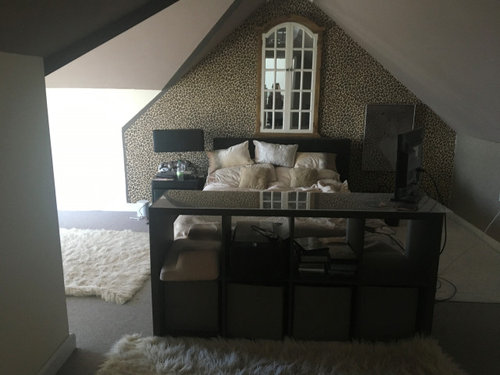
Only access to upstairs balcony plus not sure on colours & lighting
angelique5
3 years ago


Featured Answer
Comments (6)

angelique5
3 years agoRelated Discussions
Colour ideas for a kitchen
Comments (62)You are very kind and I'm so glad to help. That looks like the graham and brown, Desire wallpaper we collaborated on! It is stunning!! Side wall color supports it perfectly and it all looks great with your furniture. Your tastes always seem to fall on the cool and modern side of updated traditional. In the states, we call that transitional. An extension of that concept is what I call classic modern. I think you should continue the room in that vain so choose a modern/contemporary rug. I love Persian and traditional rugs, but these don't fit your decor. One thing that I have really enjoyed about working with you has been the excuse to see what's available across the pond. Found this UK online rug supplier with some great examples. Large pattern in mostly open background. Colors very harmonious. http://www.rugsdirect2u.co.uk/bargains/aspire-danube-cream-pink.html Deep colors ground the space yet relate to overall scheme. Has some red. Again, large pattern. I think a large pattern goes best with the scale do the damask. Also, I wouldn't go with anything more "floral" than this. A busy modern floral may compete with the damask. http://www.rugsdirect2u.co.uk/bargains/trance-anasia-owred-mulberry-red.html Not sure how much I like this one, but I like it enough to suggest it. It's another example of large scale floral but in serious reds. (You asked about red, and I think I definitely has a place either dominately or as accent.) http://www.rugsdirect2u.co.uk/bargains/trance-mia-red.html Tone on tone abstract makes a perfect complement to the room. This silver color ties in everything in the room and allows the wallpaper to remain the focus. http://www.rugsdirect2u.co.uk/contemporary/a-hedley-silver.html One color, cream. But the carved detail is interesting and modern http://www.rugsdirect2u.co.uk/contemporary/elements-el-20-cream.html The white on purple is bold and graphic. And this Pattern and repeat really speaks to your wallpaper. http://www.rugsdirect2u.co.uk/contemporary/harlequin-milano-ha10-044-purple-3.html Also in a beige color they call fawn. http://www.rugsdirect2u.co.uk/contemporary/harlequin-milano-ha10-046-fawn-3.html Purple and gray abstract. It's funky design would be an interesting contradiction to the wallpaper. http://www.rugsdirect2u.co.uk/contemporary/matrix-wave-ma09-946-purple-4.html Cowhide patchwork in ivory, sand, gold and gray. It's the ultimate in contradiction, yet works in an eclectic manner. http://www.rugsdirect2u.co.uk/contemporary/rodeo-metallic-ivory-2.html I hope some of these appeal to you and give you inspiration! Let me know what you think....See MoreNeed help with small (only) bathroom!
Comments (29)Thanks for all the comments, they are much appreciated. I am going to try and answer everyone! I think I have a plan outined at the bottom of the following comments/replies. @clofty24 - yes a sliding door was considered but it would either take more room out of the bathroom or consist of major work outside the door. @lottie27111975 @karrrla @tryphic - walk in shower/wet room would be ideal but would require quite a lot of work and as its upstairs been advised against it. Although im getting a second opinion from a local tiler soon. @Ensign Accessories I just photographed at a bad time, most of the time its not so cluttered. However it is the only space to store a lot of the stuff, so hence the many storage options. Corner unit is a no go because the room has no available corners (shower, window, door, toilet). @Rachel FitzGerald I think the toilet needs to stay where it is due to the plumbing of the large waste pipe and the fact my walls are 1.2m thick! @baxterh the back wall doesnt go onto the landing its inside the other bedroom but replacing the wall is currently not an option. Nice idea though :-) @Sharon Boughedda The matching tiles is a good idea, I was only going to tile the shower area and paint the rest a teal colour. But the floor could defo match. I think im going for a unit top sink, but place it partly on the windowsill (which is huge) and partly on a new unit. The window is huge so adds lot of light during the day. @kittihawke I think moving the doors is unworkable unfortunately as that would make more room. i hate the floor tiles so might have to have another look at ripping them up! @jonathandb1972 the window is an original sash window and it would be criminal to block it off I feel. Plus it gives the bathroom a lot of light which helps to alleviate the size issue a bit. Velux isnt possible due to loft above. I think im going to put in 760x900 quadrant shower, with a frameless design so its less imposing. The toilet will stay where it is but with a back wall toilet onto a hidden cistern. Two 500mm cabinets next to each other one with the toilet and another with the sink on top, and worktop on top of the cabinets which goes back and over the windowsill too. The sink will then be half on the cabinet and half on the windowsill (which is big). B+Q are the only place I have found which seem to do slimline cabinets which will make it all fit. Im trying to find a bit of planning software that includes B+Q items and also allows me to include the windowsill!! The tap to the sink will be to the side of the basin so all the plumbing can be in the under cabinet....See MoreWhat colour would you paint this house?
Comments (152)Hi Nicky, my apologies I have only just seen your message. We went for cornforth white Farrow and Ball (which it definitely not white). The shutters are not back open yet but some of them will need to go back on because the large expanses of grey look very grey. The bits next to the white look less austere. The new white garage door with windows has made a big difference. I'd be careful with a very pale grey because if your windows are anything like mine you'll find that they are not actually that white after all.......See MorePaint colour suggestions for hallway, stairs and landing
Comments (28)Hiya, we have a Victorian hallway and it is done very similar to Rukmini’s first image. We have a greeny grey under the dado (including the skirting and dado itself) and on the doors and architraves. It’s Blanket by Paint & Paper library which is a little darker than Rukmini’s pic. Then an off white above the dado and on the ceiling. It used to be off white all over and the grey definitely has made it darker. On the other hand it also feels smarter and shows the marks less! Swings and roundabouts. I wouldn’t have three colours, I would pick one colour plus off white above the dado/picture rail (Pointing seems sensible!!) Your tiles look browny grey so would suggest looking at Ammonite by F&B and its family of colours - (Cornforth White, Purbeck Stone). See below for the F&B families of greys. If you want bluey or greeny greys then Paint & Paper Library are a good source but be careful to see if they will go with your tiles....See More
Sarah U-S
3 years agoangelique5
3 years agoSarah U-S
3 years ago


Sonia