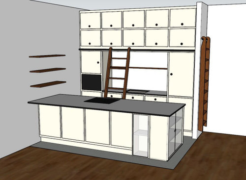
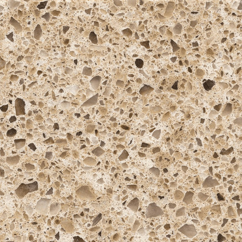
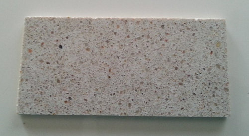
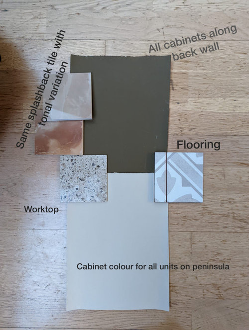
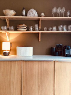
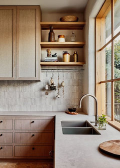
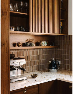
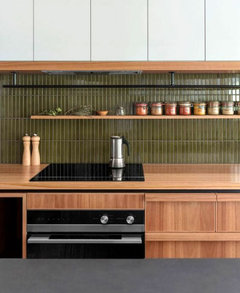
Kitchen finish / colours - another decision burnout!
periwinkl
last year


Featured Answer
Sort by:Oldest
Comments (11)

periwinkl
last yearRelated Discussions
Please help with kitchen decisions!!
Comments (160)Hi, the feet are on all of the cabinets at the end of every run when we hit an appliance or just came to the end of the run. Some of the photos up thread were taken before the feet had been added since they were literally the last thing to go on. We actually used the ikea deco strip to create the moulding but we didn't use it the way Ikea anticipate. We fixed it sideways. It is supposed to be fixed the other way around but that look would have been too "modern" for this kitchen. If I was designing the kitchen again I wouldn't bother with the ikea deco strips and would have used pre cut wooden moulding and then painted it. This would have enabled me to have slightly deeper moulding at the ceiling line. At the time of ordering the kitchen I didn't know that we would find an exact paint match for the ramsjo range though. The wooden worktops were incredibly good value IMO. They are american black walnut (butcher block) and are from wood and beyond here worktops This thread doesn't show it but at the same time as doing the kitchen we did the adjoining snug and the large utility room. In the utility room I used the ikea walnut worktop which was ridiculously cheap because it's not solid walnut. There is no way you could ever know it isn't solid though unless you installed it. Its perfectly good. ikea karlby worktop The flooring is my big mistake with this kitchen. As the thread shows, this wasn't originally going to be a complete kitchen refit and it spiralled out of control somewhat. The flooring was being replaced due to a water leak and we went for laminate due to cost. Its from kaindl and as laminate goes its decent stuff with bevelled edges, narrow planks and texture matched finish BUT it was a mistake. It looks great and when you tell people its laminate they have to get down really close to tell but it damages very easily and is scratched, particularly underneath the kitchen table where the kids scrape the chairs in and out (even with felt pads on the feet). If you drop anything on it and it chips thats a problem. This wouldn't have been a problem with wood. I've never had laminate before and hadn't realised it would be this difficult to live with but I wouldn't do it again, I would bite the bullet and install the hardwood. The big benefit of the laminate was that we could have underfloor heating mats which are nice in the winter. The lighting is from Jim Lawrence. The style is called Ava. I love the lighting too and the shape of the glass echos the shapes in the wallpaper. pendant lights The kitchen table was our old ikea oak table which we'd had for ten years. we stained the top in dark walnut and painted the legs white to match the cabinetry. I haven't got a precise figure for everything but in total with the appliances and with the snug and also the large utility room included (which in itself has 14 cabinets) flooring and the decorating in each of those rooms and a hallway, plus new glazed doors through to the hallway and the dining room we spent about £15,000 (a big chunk of this on lovely ikea interest free credit though!). This includes all labour, fitter, plumber (we changed out two radiators for a nicer style), electrician, decorator. We could have saved further money by doing some of the installation ourselves and doing our own decorating (but then it would probably have resulted in selling the house due to divorce!)...See MoreFinal decision time on f&b kitchen colours
Comments (19)Good for you!! honestly it will be good. It will make it feel lovely and warm and give you that country feel you want. My email is lccolourdesign@outlook.com. I think all my contact details are on my profile but you can also find me on Facebook @thecolourclub or my website is www.thecolourclub.com where you can see some of my projects. Please note that my website is still in work in progress so not all work is up on there as yet. Good luck and let me know how you get on would really love to know. Many thanks and enjoy:) Lucy...See MoreKitchen layout advise please - final decisions????
Comments (13)I would lose the wooden counter top and pull out larder. Put the hob next door but one to the sink with an extractor above. This will break up the run of wall units. Also think about when you are cooking pasta, filling up a saucepan with water and then draining it. You don't need to cross the room. Where you going to put bin, dishwasher and microwave? I would agree you need more drawers. I love my new pan drawers they hold alot. But my pull out larder does not and things fall down the back all the time. Also when you are taking something out of the oven, where are you going to put it? I never understand why designers put oven and fridges next to one another....See MoreArghh! Need help with colour decision.
Comments (35)Ooh....Totally forgot to update everyone. I finally finished it!! Took ages as i could only spare a couple of hours a week on it. Now for sale on Etsy if any one is interested:) https://www.etsy.com/uk/listing/664115591/vintage-upcycled-green-dressing-table?ga_order=most_relevant&ga_search_type=all&ga_view_type=gallery&ga_search_query=green+painted+dressing+table&ref=sr_gallery-1-15&organic_search_click=1&frs=1: (Not advertising....honest;), might have put a bit too much in the description as well....hey ho). Plus you can see the pineapple drawers if you follow the link and click on my shop. Anyway here's some photos:...See Moreperiwinkl
last yearlast modified: last yearperiwinkl
last yearLouise Burke
last year
CWD
last yearperiwinkl
last year
Sonia
last yearWendy H
last year


Daisy England