


6 Smart Swaps to Make the Most of a Small Space
By replacing just one thing in a compact room, you can make all the difference to how the space looks and functions
Amanda Pollard
13 November 2018
Senior Editor at Houzz UK and Ireland. Journalist and editor specialising in interiors and architecture.
Senior Editor at Houzz UK and Ireland. Journalist and editor specialising in interiors... More
When it comes to small spaces, designers have all sorts of tricks up their sleeves – some quite simple; others surprising. Often, by switching just one element of a room, they can alter the look and efficiency of the space quite dramatically. Check out these schemes to find out how a simple swap can make a difference.
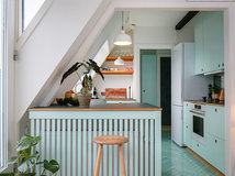
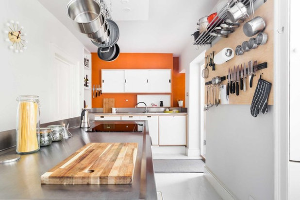
Ditch an extra worktop for added storage
This tiny kitchen is located in what used to be the cloakroom, so the space was quite tight.
The designer could have added work surfaces to both sides of the room, but that would have meant foregoing storage space. Instead, he’s built a run of floor-to-ceiling cabinets on one side with space for an integrated oven and fridge-freezer.
The plentiful storage keeps clutter off the worktops, and the minimal, white design helps to open up the space.
See more of this small London flat cleverly redesigned for modern living.
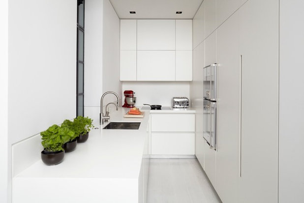
Create a raised edge in place of an overhang
Keep a small cookspace streamlined by avoiding any unnecessary additions. Rather than incorporate an overhang on this worktop, the designers have stolen a clever idea from commercial kitchens.
The worktop has been moulded at the front to create a raised lip to catch potential drips from oils and other liquids. This means the surface can sit neatly flush with the units and not encroach on the rest of the space.
Take a tour of this small kitchen packed with functionality and style.
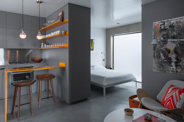
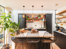
Switch a bulky breakfast bar for a slimline alternative
The kitchen area in this studio flat is mini, but the designers haven’t scrimped on a seating area. However, rather than building a peninsula unit that incorporates base cupboards, they’ve kept the bar area rather more streamlined.
A neat shelf is attached to the wall, and continues to the floor to make a space-efficient ledge under which a couple of bar stools can be tucked.
Browse products for every room in the Houzz Shop.
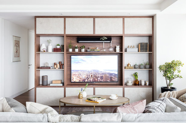
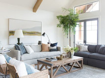
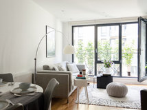
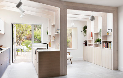
Replace small storage with a wall unit
The open-plan living space in this small flat consists of a kitchen, dining zone and seating area, each cleverly laid out to fit into an angled floorplan.
In such a tight area, the designers might have been tempted to keep furniture small to make it feel more spacious. Instead, they’ve filled the wall with this bespoke display unit, as a smaller bookcase might have felt untidy.
It also helps to define the living area and give the space some character.
Take a look around this small new-build apartment with a clever redesign.
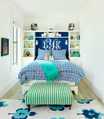
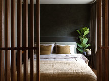
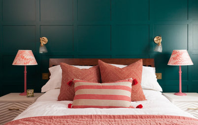
Swap small bedsides for high shelves
There’s plenty of storage in this compact bedroom thanks to the designer’s clever use of the back wall.
Two bedside drawer units weren’t quite enough, so a framework of extra shelving has been constructed up and over the bed. There’s even a wider ledge at the top, where the owner has the option to put those things they don’t need as often.
Looking for an interior designer? Find one in your area in the Houzz Professionals Directory.
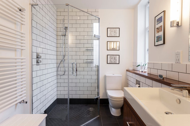
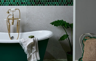
Exchange a square shower for a space-saving shape
In this bathroom, a large square shower would have been too bulky, so the designers might have opted for a small enclosure.
Instead, they’ve gone for an angled design, which doesn’t take up valuable floor space near the loo and basin, but still allows the shower area to be generous.
Tell us…
Have you chosen an alternative idea for your small space and made a difference to how it looks? Share your ideas and photos in the Comments section.


Related Stories

More Rooms
The 5 Most Popular Laundry Rooms on Houzz Right Now
Get decorating ideas for your laundry or utility room from these most-saved photos on Houzz
Full Story
Dining Rooms
The 5 Most Popular Dining Rooms on Houzz Right Now
By Kate Burt
Vintage furniture, great lighting and top tables – feast your eyes on dining room ideas collated from your own clicks
Full Story
Colour
8 Clever Ways to Use Strategic Colour Blocking in Your Home
By Kate Burt
Paint can do so much more than refresh your walls. Explore ways to highlight features, zone areas and trick the eye
Full Story
Utility Rooms
15 Richly Coloured Utility Rooms
The trend for strong, earthy tones has reached the utility room, with hues from plum to ochre to deep green adding depth
Full Story

Kitchens
Which Kitchen Worktop Colour Should You Choose?
By tidgboutique
Consider these popular colours and styles to get the look you want, no matter which material you use
Full Story
Colour
8 Ways to Work a Rust Red and Blue Palette in the Bedroom
By Kate Burt
We’re seeing variations of this combination all over Houzz right now. Check out these tips for trying it yourself
Full Story
Colour
Creative Ways to Make a Feature of Structural Beams
Turn your RSJ into something more than just functional with these clever ideas from our Houzz Tours
Full Story
Gardens
9 Ways to Enjoy Colour in Your Garden All Year Round
By Kate Burt
However your garden grows, you can add colour with hardscaping, furniture and accessories
Full Story
Gardens
What Will We Want in Our Gardens in 2024?
Discover the gardening trends homeowners will be bringing into their outdoor spaces this spring and summer
Full Story
Kitchens
What to Expect at the Biggest Kitchen, Bedroom and Bathroom Show
Plan ahead with our rundown of what’s in store at the kbb Birmingham event this March
Full Story
I love the yellow ledge! Brilliant idea in such a tiny space.
Well, here's a mixed bag indeed !
The first kitchen works really well, as long as only one person at a time needed to use it.
Second kitchen: can't really add to what most have already said about the 'night of the long knives' ... [Given that the display rack is not a picture, but a 3D structure, it would have been possible to tailor-make some doors for this which could still be streamlined, but would protect the contents from dust/grease and risk of damaging passers-by !]
Third kitchen: Not really my taste, but I find I quite like the way the streaks of orange lift the otherwise rather gloomy heavy-grey decor. Likewise the bursts of red for cushion and magazine rack in the sitting area. Given the miniscule scale of the whole studio flate, the shelf/table (Shable ? Telf?) is probably all that's needed. It looks more like a younger person's accommodation, rather than a retirement flat, so the lack of comfort may not be an issue. It also subtley delinieates the cooking area.
Fourth photo: nice idea, but such a large screen is not reall necessary in that small space. Did you notice that the static picture used for photography pursposes has a colour scheme which blends with and enhances the rest of the unit ? Imagine that as a yawning 'black hole' when switched off (or perhaps, with ever-moving, over-bright TV programmes).
Fifth photo: love the way they have made the absolute most of the available space, with making it seem crowded or poky.
Sixth photo: the shower idea is excellent. The white metro tiles are not. End of.
(Hi - Deborah and Cassandra !!)
Lipped edges: when we had our new kitchen installed, we opted for Corian worktops. The worktop edge in front of the sink is lipped. It is one of the best things we ever did. How often have you washed up and got your stomach wet because you have splashed onto the front of the sink area? With the lipped edge I no longer get wet. Maybe it is just me? Maybe I am a mucky washer-upper, but it works for me.