


Kitchen Tour: A Petite Terrace Gains Space Without Being Extended
Inspired spatial planning bagged this period worker’s cottage more room, generous storage and flexible open-plan living
Kate Burt
31 December 2019
Houzz UK. I'm a journalist and editor, previously for the Independent, Guardian and various magazines. I'm now excited to part of the editorial team at Houzz UK & Ireland, bringing the best of British and Irish design, interiors and architecture to Houzz.com.
Houzz UK. I'm a journalist and editor, previously for the Independent, Guardian and... More
When Katie Lee, the owner of this petite worker’s terrace in Whitley Bay, first approached interior designer Cathy Dean, she was planning a kitchen extension. Instead of the bitty downstairs layout – galley kitchen, small dining room, front living room, downstairs loo – Katie wanted a big, open-plan space the whole family could use, not to mention plenty of storage.
Katie had had plans drawn up by an architect, but had reservations. So she asked Cathy to take a quick look. Cathy’s conclusion? “I told her, ‘I don’t think you need an extension. You already have the space you need.’”
Extension plans were scrapped and the designer reworked the layout, packing into the existing footprint the family kitchen/diner/living area/home office Katie wanted, along with a bijou boot room, a tiny utility and a wonderful sense of space.
Kitchen at a Glance
Who lives here? Katie Lee, an interiors photographer, her husband, their two young daughters and Baxter the dog
Location Whitley Bay, Tyne and Wear
Property A traditional Georgian worker’s terrace
Room dimensions It’s an L-shaped space: the kitchen is 4.2 x 2.6m; the dining area is 2.5 x 5.4m
Designer Cathy Dean of Cathy Dean Interior Design
Budget £30,000
Photos by Katie Lee
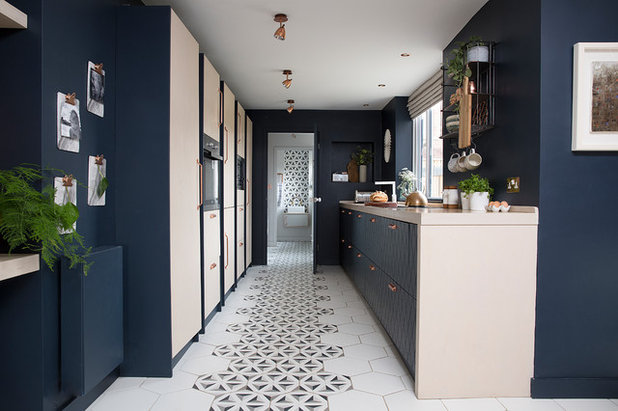
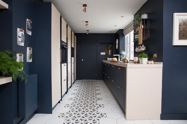
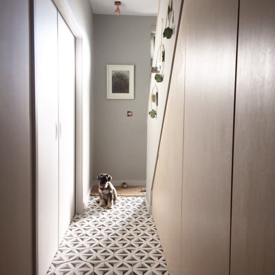
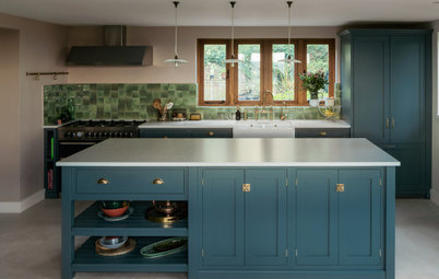
This view of the kitchen shows one of the many clever touches Cathy came up with to expand the sense of space in this small terrace. The patterned floor tiles run from the front door right down to the cloakroom and up the wall to form a splashback.
“We created this carpet of tiles running from front to back to make the space feel bigger,” she explains.
To allow for the splashback detail, the loo was repositioned. This also keeps it out of sight as you come into the house. “I always think there’s something awful about looking directly at a loo,” Cathy says. “We always try to make the view into each room beautiful.”
Who lives here? Katie Lee, an interiors photographer, her husband, their two young daughters and Baxter the dog
Location Whitley Bay, Tyne and Wear
Property A traditional Georgian worker’s terrace
Room dimensions It’s an L-shaped space: the kitchen is 4.2 x 2.6m; the dining area is 2.5 x 5.4m
Designer Cathy Dean of Cathy Dean Interior Design
Budget £30,000
Photos by Katie Lee
This view of the kitchen shows one of the many clever touches Cathy came up with to expand the sense of space in this small terrace. The patterned floor tiles run from the front door right down to the cloakroom and up the wall to form a splashback.
“We created this carpet of tiles running from front to back to make the space feel bigger,” she explains.
To allow for the splashback detail, the loo was repositioned. This also keeps it out of sight as you come into the house. “I always think there’s something awful about looking directly at a loo,” Cathy says. “We always try to make the view into each room beautiful.”
Another solution is simply to shut the door, which Cathy painted the same blue as the walls so it would almost disappear. Directly behind the door, in front of the cloakroom, is a new, mini utility room, with stacked appliances to maximise space.
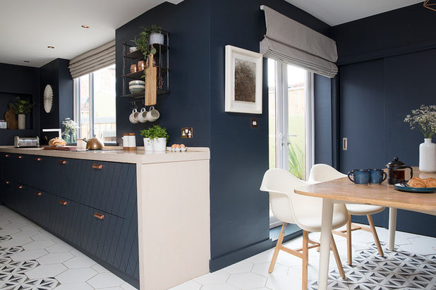
To open up the kitchen and dining room, Cathy took out the wall between them, creating a big L-shape rather than a closed galley kitchen.
Using just two main colours for the kitchen keeps the design simple, which also helps the room to look bigger.
Walls and base unit fronts painted in Polaris Blue, Benjamin Moore.
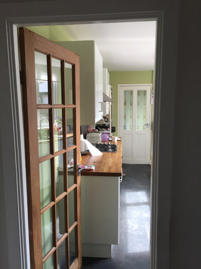
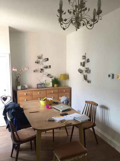
This photo shows the galley kitchen before Cathy’s clever reconfiguring of the space.
Choosing not to extend made good financial sense. “Instead of spending money on digging foundations and so on,” Cathy says, “they could spend on the stuff they really wanted.”
Choosing not to extend made good financial sense. “Instead of spending money on digging foundations and so on,” Cathy says, “they could spend on the stuff they really wanted.”
“It was a really awkward house,” Cathy recalls. “The rooms were like corridors and you had to walk diagonally across each space to get to the next.”
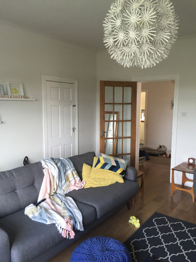
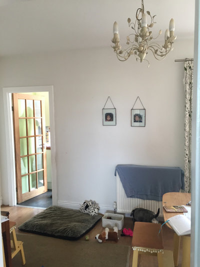
This before photo shows the view into what is now the dining space.
Could an interior designer unlock more space in your home? Search the Houzz Professionals Directory to discover interior designers in your area.
This before photo shows the view into what is now the dining space.
Could an interior designer unlock more space in your home? Search the Houzz Professionals Directory to discover interior designers in your area.
The French windows were already there, but Cathy replaced the curtains with neutral Roman blinds. “Something unobtrusive was the aim,” she says. “The blue was the main thing, so we picked a really natural linen and had this and the one at the kitchen window made to match.”
Copper is also a strong element in the design. “Katie loves copper,” Cathy says. “We chose to use it in an authentic, timeless way here by having it as the key metalwork rather than using it in lots of accessories.”
Hafele handles, More Handles.
Copper is also a strong element in the design. “Katie loves copper,” Cathy says. “We chose to use it in an authentic, timeless way here by having it as the key metalwork rather than using it in lots of accessories.”
Hafele handles, More Handles.
The original door into what is now the area was right in the middle of the bench seat. Cathy budged it up to the hallway end of the room to create more useable wall space.
She also packed in functionality and storage. Counterintuitively, she chose to shrink the room a little so as to build a false wall to house the tall cupboards seen here. These conceal shelving, the boiler and a TV. “This dining area has become a snuggly evening room for the parents while the children are watching television in the living room,” Cathy says.
On either side of the seating unit are full-height cupboards filled with pull-out baskets – one cupboard for each daughter and her own craft supplies. The storage beneath the bench was made by a joiner. “They’re very small cupboards but very useful,” Cathy says. “There are data sockets inside, so Katie can plug in her ethernet cable and edit photos on her laptop at the kitchen table.”
Katie and her husband already owned the table. “We considered getting a new one, but this is actually an Ercol one, so we stripped it and painted the legs,” Cathy says.
Craft storage cupboards, Ikea with bespoke fronts. Chairs, Danetti. Bench upholstered in linen woven with copper, Robert Allen. Breezin copper wallpaper, Tektura. Table legs and ceiling painted in Shoreline, Benjamin Moore.
The dining area before. The door that Cathy moved is just out of shot.
A ‘before’ view into the dining area towards the kitchen, taken from the original doorway.
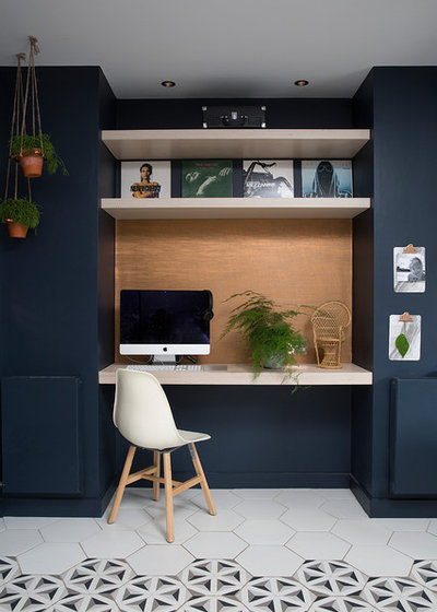
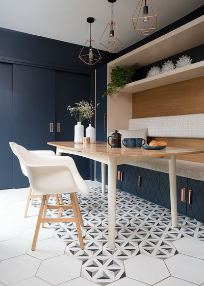
Opposite the table, Cathy built another false wall, which helped to create this workspace. It’s flanked by radiators painted the same colour as the walls, so they’re almost invisible.
The kitchen is to the right of the desk, and its full-height units are part of this same built-out wall. The thinking was that the 60cm deep units would appear less imposing if they weren’t entirely visible. The wall allows around 30cm of them to protrude.
The kitchen is to the right of the desk, and its full-height units are part of this same built-out wall. The thinking was that the 60cm deep units would appear less imposing if they weren’t entirely visible. The wall allows around 30cm of them to protrude.
The owners’ previous workstation.
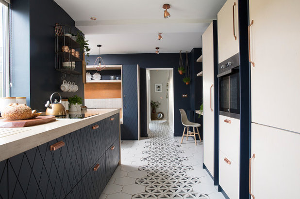
This view shows the ‘carpet of tiles’ from the other end, leading out to the front door, with the staircase opposite it on the right.
All the kitchen carcasses are Ikea, but the fronts were made bespoke and had the diamond pattern routed into the wood to mirror the pattern in the floor tiles.
The worktops, end panels and tall cupboard doors are all marine ply. An induction hob boosts the prep area. “You can use the rest of the hob as a worktop even when you’re using one pan on it,” Cathy says. “It also looks more seamless.”
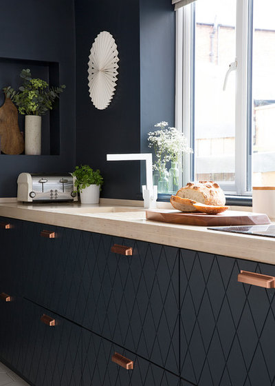
“I persuaded the owners to go for this unusual angular tap instead of a copper one,” Cathy says. “The white works well with the floor tiles.”
Above the toaster, concealed above the wall niche, is the kitchen extractor. The owners didn’t want to blow their budget on appliances, but rather spend it on beautiful finishing, so chose not to have a big cooker hood.
“An extractor doesn’t need to be over the hob for building regs,” Cathy says, “you just need extraction in the room. It’s about choosing the aesthetic over the immediate removal of cooking smells and, unless you’re doing deep-fat frying, you generally don’t need it to be extracting that quickly.”
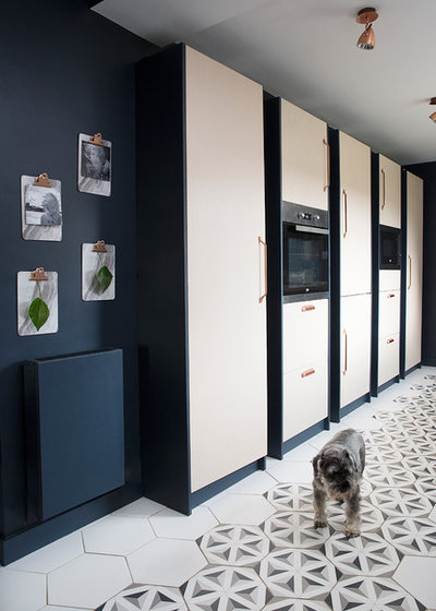
The tall units have spaces between them so they look like individual pieces of furniture. From this end, they house a larder, a single oven and storage, an integrated fridge-freezer, a microwave and storage, and another larder.
“I’m always talking clients out of having big American-style fridge-freezers,” Cathy says. “We wanted a kitchen that didn’t look like a kitchen.”
“I’m always talking clients out of having big American-style fridge-freezers,” Cathy says. “We wanted a kitchen that didn’t look like a kitchen.”
Out in the hall, Cathy got to work with another false wall and some ingenious understairs storage.
The wall on the left has been bumped further to the left; this makes the living room behind it a touch smaller, but creates a roomier entrance to the house.
Cathy also replaced the two doors that were originally at either end of this wall with sliding pocket doors, meaning the owners can choose to go open-plan or cosy in an instant.
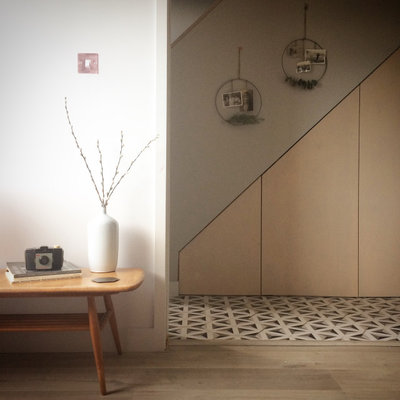
The cupboards under the stairs house a drawer for shoes, then a cupboard, then two doors into a micro boot room with enough space in which to sit and take off your shoes.
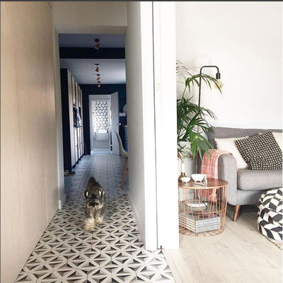
A view from the front door, showing the pocket doors open and the view into the kitchen.
Tell us…
What are your favourite space-expanding tips from this reconfigured ground floor? Share your thoughts in the Comments section.
Tell us…
What are your favourite space-expanding tips from this reconfigured ground floor? Share your thoughts in the Comments section.

Related Stories

House Tours
Houzz Tour: Warm Tones and Luxurious Surfaces in a City Townhouse
An earthy colour palette, hidden storage and well-placed texture add character and practicality to this London home
Full Story

Room Tours
Kitchen Tour: A Gorgeous Extension With a Leafy Glasshouse Feel
By Kate Burt
When the owners of this terraced house extended, they were keen to retain its period feel and highlight the garden
Full Story

Gardens
Garden Tour: A Bare Roof Terrace Becomes a Pretty, Sociable Space
By Kate Burt
A retired couple got help transforming their large rooftop into a gorgeous, welcoming, multi-functional retreat
Full Story

House Tours
Houzz Tour: A Smart Layout and Genius Storage in a Victorian Home
Flipping the standard layout and carving out excellent storage have turned this tired house into a brilliant family home
Full Story

House Tours
Houzz Tour: A Victorian House Brought Impressively Up to Date
By Jo Simmons
A cohesive layout and warm colours combined with energy-efficiency measures thoroughly modernise this terraced home
Full Story

Kitchen Tours
Kitchen Tour: An Open, Airy Space Made for Entertaining
Combining two separate rooms has improved flow and created a sociable open-plan kitchen, dining and seating space
Full Story

House Tours
Houzz Tour: A Family Home Inspired by its Seaside Location
Coastal colours and practical design combine to create a house that will adapt as the family grows
Full Story

Kitchens
5 Inspiring Before and After Kitchen Transformations
Whether you want to boost storage, incorporate original features or maximise your space, take ideas from these designs
Full Story

House Tours
Houzz Tour: An Airy, Scandi Finish for a Tall Victorian House
By Kate Burt
From a tricky inherited bath to a sticky-out staircase, on-site problem-solving led to a seamless update for an old home
Full Story
House Tours
Houzz Tour: A 17th Century Cottage Gains Warmth and Character
The clever use of colour and pattern has revived this old building while creating a 21st century family home
Full Story
Love those hexagon tiles - anyone know where they are from?
The hexagon tiles are from Walls & Floors if I’m not mistaken
My first positive review. Brilliant use of space, I’d definitely use this team.