


Houzz Tour: A Parisian Flat That Blends Modern Style and Period Details
Careful renovation restored the period character of this Parisian flat while giving it a cool and contemporary edge
Christine Gaspard
6 May 2015
Designers and architects Daniel and Michel Bismut have enthusiastically restored this beautiful 250 sq m family apartment. It’s located in Paris, on the fifth floor of a beautiful Haussmann building, and the designers wanted to unearth some of the character of the flat. ‘There were several elements that are typical of Haussmann buildings, such as the cornices, that had not been showcased. We therefore worked to give new life to these old components. Then we looked to bring in our contemporary touch, while still preserving the identity of the place.’ The apartment is bathed in beautiful natural light, and Bismut & Bismut Architecture maximised the space with zones that flow together.
Houzz at a Glance
Who lives here A couple and their two young children
Location Paris, France
Size 250 sq m
That’s interesting The architects moved the kitchen to the heart of the apartment. ‘The kitchen was one of the focal points of this project,’ they say.
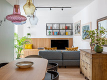
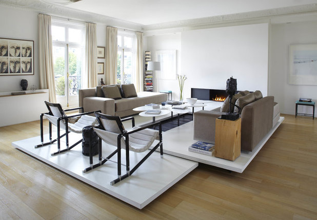
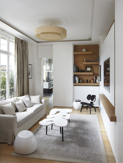
Elegance and sobriety define the apartment’s large sitting room. ‘We were dealing with a significant volume of space and we didn’t want sitting on the sofa to feel like drifting. We wanted to create a convivial space,’ say the architects. To achieve this, the duo of architect-designers banked on the idea ‘of a stack of sheets’. Rather than just opting for a carpet, they created a white structure covered in pliable resin. This raises and differentiates the spaces at the centre of the room, while contrasting with the classic oak floorboards.
Who lives here A couple and their two young children
Location Paris, France
Size 250 sq m
That’s interesting The architects moved the kitchen to the heart of the apartment. ‘The kitchen was one of the focal points of this project,’ they say.
Elegance and sobriety define the apartment’s large sitting room. ‘We were dealing with a significant volume of space and we didn’t want sitting on the sofa to feel like drifting. We wanted to create a convivial space,’ say the architects. To achieve this, the duo of architect-designers banked on the idea ‘of a stack of sheets’. Rather than just opting for a carpet, they created a white structure covered in pliable resin. This raises and differentiates the spaces at the centre of the room, while contrasting with the classic oak floorboards.
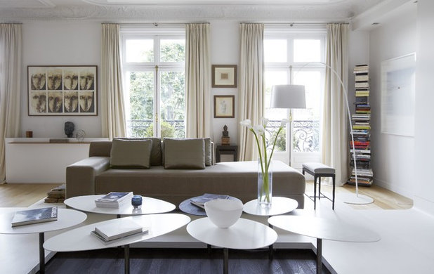
There’s plenty of white; on the walls, on the elements in wood and resin, and on the Petal coffee table in lacquered wood, wenge and metal. ‘We worked a lot on the volumes and the circulation of natural light,’ say the architects.
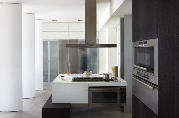
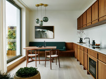
The kitchen was one of the main focal points of the restoration. ‘Originally, there was a small, badly placed kitchen, as is often the case in old apartments. So we decided to move the kitchen back to the centre of the apartment,’ they say. And because Daniel and Michel like to work with ‘the movement and animation of spaces’, they hijacked the sun-shade system and installed panels in large pivoting wing-like forms in the middle of the room. In white lacquered wood, these panels allow the kitchen and dining area to be separated or joined together as desired. The central island is composed of a surface in glossy white lacquered wood, resting on a base of black wenge, which matches the front of the other kitchen furniture.
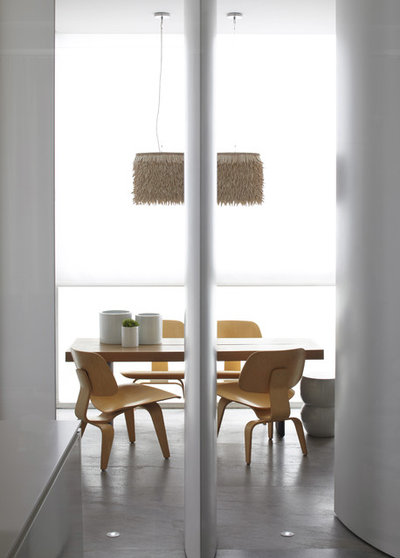
The kitchen opens onto a beautiful dining area next to a pre-existing bow window. ‘When the shutters are open, you can see the living room from the dining area.’
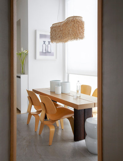
The HTO2 table, from the Bismut collection, sits at the heart of the dining area. It is a chunky table, composed of a wooden top with a base in sanded and blackened wenge. To go with the table, the designers chose chairs by Charles Eames for Vitra and an Ochre light fitting of coconut fibres, which adds interest to the space.
As old apartments often do, this one includes numerous transitional spaces. The architects needed to create a function for the hallway. ‘We decided to treat this transition space as a whole separate room, metamorphosing the corridor into an agreeable little TV room,’ they say. The Puzzle coffee table from the Bismut collection, a pony leather chair from Charles Eames and a linen Ruckstuhl carpet decorate the room.
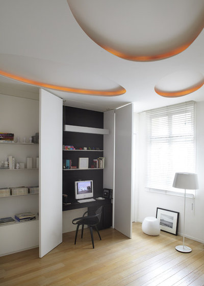
The old kitchen became another transitional space, in which Daniel and Michel Bismut installed a desk inside a cupboard, with a little Cherner chair. ‘Just closing the wooden doors makes it disappear, so that what is hidden behind them can neither be seen nor guessed at.’ The lighting adds interest.
Check out more on the Cherner chair
Check out more on the Cherner chair
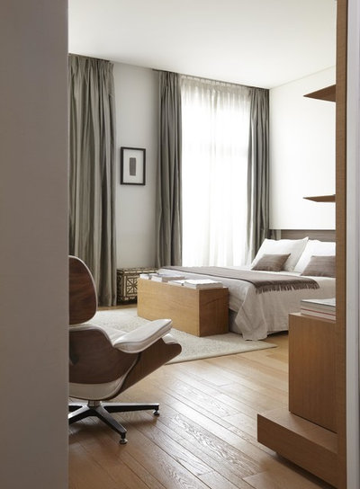
The master bedroom is largely white and oak. ‘We wanted a really chunky block of wood at the foot of the bed, and we had this bench of oak made to measure,’ explain the architects.
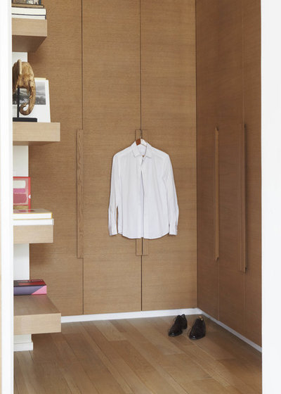
The dressing room is in oak, matching the floorboards.
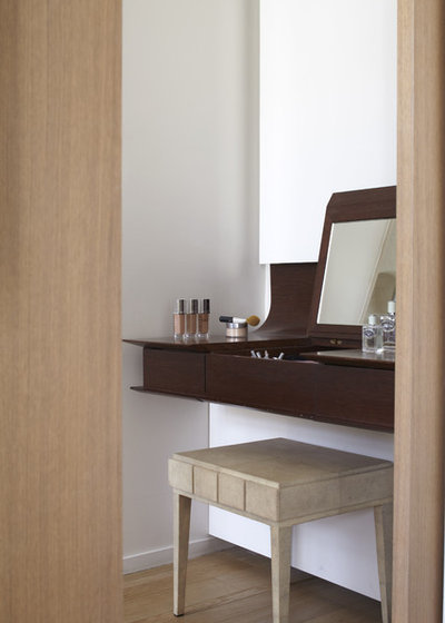
From the bedroom, the bathroom is accessible through a sliding wooden door. This opens first onto a pretty dressing-table, made to measure in wacapou wood. The stool has been mottled.
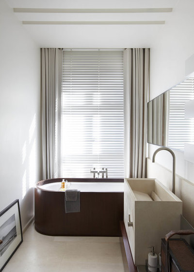
‘The bathroom is more minimalist, with the bath hidden, encircled in wood,’ explain the architects. The plumbing comes from Zuchetti and the flat sink is custom-made in stone to echo the flooring. ‘We also placed a big horizontal mirror on the wall to give the room a dynamic line,’ they add.
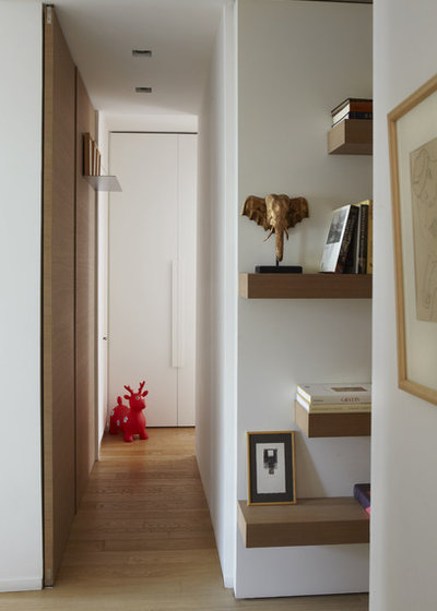
This corridor leads to one of the children’s bedrooms.
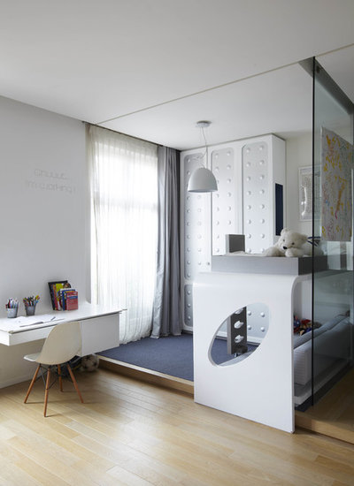
In this bedroom for a little boy, different spaces are distinguished through the use of two floor levels. In addition, a transparent glass wall isolates a small sink area. ‘We designed the bed so there would be a living space with a seat, under the bed that could also host a friend when required.’ The sleeping area is demarcated with a dark blue fitted carpet on the floor and a wardrobe made up of embossed panels in decorative sheet metal. ‘The desk is a sheet of Corian that reaches almost to the ceiling and the chair is from Vitra,’ they add.
Browse 10 ways to create a sleep zone in a small space
TELL US…
What do you like about this Parisian flat? Share your thoughts in the Comments below.
Browse 10 ways to create a sleep zone in a small space
TELL US…
What do you like about this Parisian flat? Share your thoughts in the Comments below.


Related Stories

House Tours
Houzz Tour: A Midcentury Home With a Strong Indoor-outdoor Link
By Becky Harris
A nature-inspired renovation has given this ranch house a relaxed mood and a connection to the outdoors from most rooms
Full Story

House Tours
Houzz Tour: Warm Tones and Luxurious Surfaces in a City Townhouse
An earthy colour palette, hidden storage and well-placed texture add character and practicality to this London home
Full Story

Room Tours
Kitchen Tour: A Gorgeous Extension With a Leafy Glasshouse Feel
By Kate Burt
When the owners of this terraced house extended, they were keen to retain its period feel and highlight the garden
Full Story

Gardens
Garden Tour: A Bare Roof Terrace Becomes a Pretty, Sociable Space
By Kate Burt
A retired couple got help transforming their large rooftop into a gorgeous, welcoming, multi-functional retreat
Full Story

House Tours
Houzz Tour: A Smart Layout and Genius Storage in a Victorian Home
Flipping the standard layout and carving out excellent storage have turned this tired house into a brilliant family home
Full Story

House Tours
Houzz Tour: A Victorian House Brought Impressively Up to Date
By Jo Simmons
A cohesive layout and warm colours combined with energy-efficiency measures thoroughly modernise this terraced home
Full Story

Kitchen Tours
Kitchen Tour: An Open, Airy Space Made for Entertaining
Combining two separate rooms has improved flow and created a sociable open-plan kitchen, dining and seating space
Full Story

House Tours
Houzz Tour: A Family Home Inspired by its Seaside Location
Coastal colours and practical design combine to create a house that will adapt as the family grows
Full Story

Kitchens
5 Inspiring Before and After Kitchen Transformations
Whether you want to boost storage, incorporate original features or maximise your space, take ideas from these designs
Full Story

House Tours
Houzz Tour: An Airy, Scandi Finish for a Tall Victorian House
By Kate Burt
From a tricky inherited bath to a sticky-out staircase, on-site problem-solving led to a seamless update for an old home
Full Story
Not keen there is not any elements that really give the beautiful building interest or beauty .there is no use of colour or texture to bring it down to a comfy relaxing vibe it's very bland but love some of the vitra pieces other then that over thinking designers have created in my opinion a slightly dull and particularly not very child friendly living space.