


The Freshest Colours for Spring
Bored with grey? Then give your home a pick-me-up with these fresh spring shades, from delicate dusty pink to brilliant buttercup
Cheryl F
20 March 2016
Houzz Contributor. I'm a London-based journalist with years of experience writing for the UK's top interiors titles. I love shopping for quirky accessories, have a passion for rummaging through vintage stores and I'm ever-hopeful of finding that elusive perfect paint shade.
Houzz Contributor. I'm a London-based journalist with years of experience writing... More
As the buds bloom, days lengthen and winter fades, you’re probably thinking of giving your home a lift for the spring season. Throwing a new colour into the mix is the fastest, smartest way to give rooms a mini-makeover and this year, a host of fresh, vibrant shades are coming to the fore. The colours bursting into paint charts and accessories guides are tiptoeing away from grey and towards more unusual territory. Check out these pretty hues for inspiration.
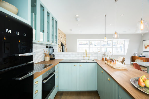
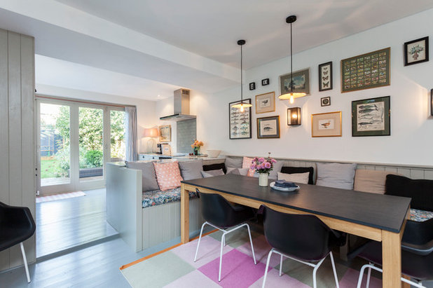
Aqua
Sitting on the watery spectrum between blue and green, aqua is paler and more versatile than turquoise. It’s been popping up in on-trend homes over the past year or so and for good reason – it looks surprisingly modern, so banish all thoughts of mermaids and drippy pastels.
This open-plan kitchen shows how fresh and chic aqua can look and it teams up brilliantly with wood, white and cream.
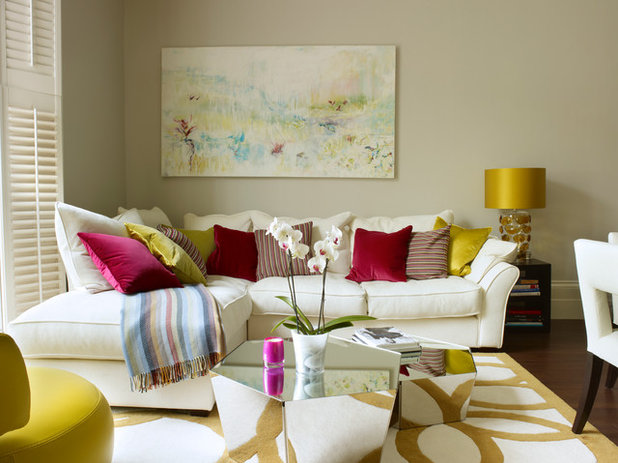
Gold
Cherished Gold was Dulux’s colour of 2016 – an earthy, modern metallic exuding warmth and sophistication.
This living room shows how gold and other metallics can be used subtly and elegantly. Gold accents in the lamp, cushions and rug beautifully complement the silver-coloured coffee tables and jewel-toned accessories. The whole look is softened by the muted canvas on the wall, which gives the space a cosy, inviting feel, but with an edge of vibrancy.
Off-white
Simple bright white and pale grey have been the neutrals of choice in recent times, with magnolia a bad 1990s memory. However, in the US, four paint brands chose off-whites as their colours of 2016, and there’s a lot to be said for a well-chosen off-white paint shade, whether you call it cream, buff, nude or biscuit.
Less harsh than brilliant white, and more forgiving of scuffs and marks, off-white adds a subtle softness to rooms, while still going with everything. It also opens up spaces and adds a feeling of light.
Take care when choosing off-white paints – always experiment with tester pots as they can be deceptively tricky to get right. How they appear will depend on which direction the room faces and which other colours they’re teamed with.
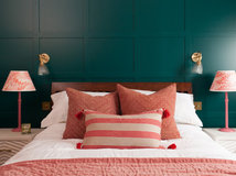
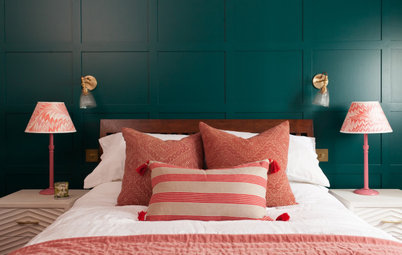
Rose pink
It’s been in fashion for a while – think of all those yummy pink woollen coats last winter – and now dusty, rosy pink is creeping into our homes, with Rose Quartz one of Pantone’s colours of 2016.
More subtle and less shouty than hot pink and less fleshy than salmon, dusty pink has a neutral tone that’s incredibly versatile. Use it to sweeten up rooms and add an indulgent feel. Here, touches of dusty rose in the rug, cushions, lampshade and artworks create a warm, vintage vibe.
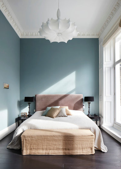
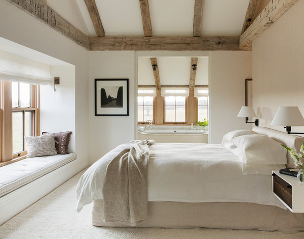
Pale blue
Serenity blue was one of Pantone’s colours for 2016 and it represents the uplifting colour of a wispy, watery blue sky on a crisp spring day in the English countryside, rather than the bolder blue of a Mediterranean sky in summertime.
As seen here, pale blue is perfect for bedrooms, as it’s calming, fresh and easy to live with. Ticks all round.
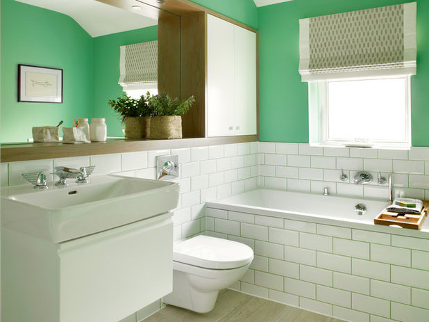
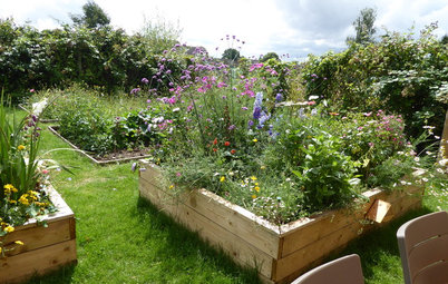
Spring green
Green might be a perennial spring favourite, but it comes in myriad shades, all vastly different from each other (just look to the varieties in Mother Nature).
Ultra-tasteful heritage grey-greens have been popular for a while, but why not go for something truer and bolder this year? The arsenic green on these walls nods back to the 1930s, with a vintage feel that’s fresh, not fusty. A bold acid green was another Pantone choice this year, and it’s no surprise, as it’s a favourite on the catwalks, too, from brilliant green frocks to vibrant sweaters.
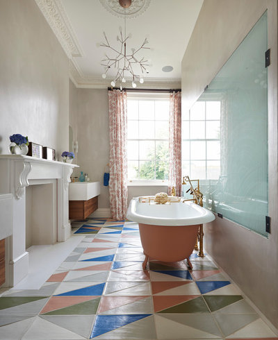
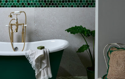
Coral
Coral might bring to mind bad lipstick and blusher, or dodgy prawn cocktails, but it’s actually come out the other side and is now starting to look, well, rather hip.
In this gorgeous bathroom, the coral on the geometric tiles, bath and floral curtains adds warmth, whimsy and interest. Coral also works deliciously with blue, as the flooring here demonstrates.
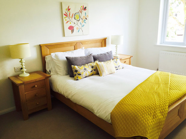
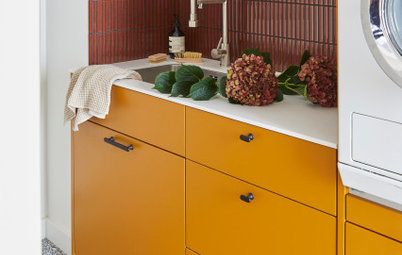
Buttercup
We bet that bold, almost neon flashes of yellow have recently crept into your house without you noticing – a yellow vase or wirework bowl here, a lemony print there. Bright yellow is one of those fringe trends that appeared seemingly out of nowhere.
No surprise, then, that Buttercup yellow popped up as yet another Pantone colour of 2016. It’s a shade that works best and most powerfully in small measures. In this bedroom, the yellow counterpane and cushions bring the whole scheme to life, injecting vibrancy into the space.
Find our why your home needs a splash of yellow
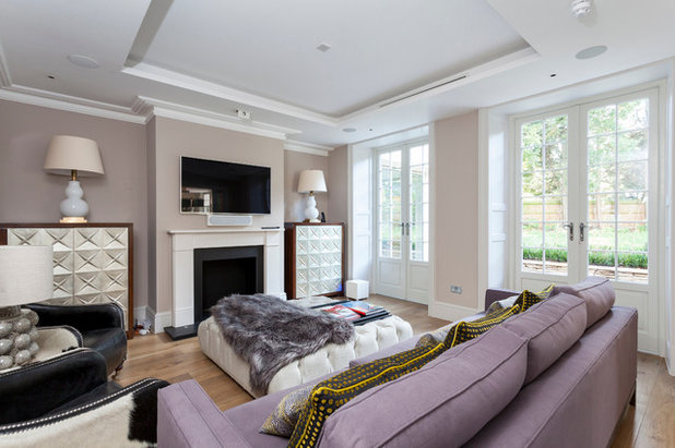
Lilac
Purple is one of those love or hate interiors shades that many of us instinctively shy away from. However, a soft, subtle greyish lilac can be restful, elegant and modern, and, if used well, is perfect for spring.
This generously sized lilac sofa ties in well with the muted shades of the taupe walls and wooden floor – using cream, grey or navy would have drained warmth from the room. If you’re not sure, simply place a bunch of lilac blossoms in a vase for a subtle nod to this shade.
Scared of purple? Here’s how to use it indoors without fear
TELL US…
Which spring colours do you love? Share your ideas in the Comments below.


Related Stories

More Rooms
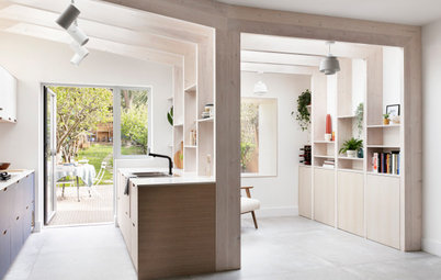
The 5 Most Popular Laundry Rooms on Houzz Right Now
Get decorating ideas for your laundry or utility room from these most-saved photos on Houzz
Full Story
Dining Rooms
The 5 Most Popular Dining Rooms on Houzz Right Now
By Kate Burt
Vintage furniture, great lighting and top tables – feast your eyes on dining room ideas collated from your own clicks
Full Story
Colour
8 Clever Ways to Use Strategic Colour Blocking in Your Home
By Kate Burt
Paint can do so much more than refresh your walls. Explore ways to highlight features, zone areas and trick the eye
Full Story
Utility Rooms
15 Richly Coloured Utility Rooms
The trend for strong, earthy tones has reached the utility room, with hues from plum to ochre to deep green adding depth
Full Story

Kitchens
Which Kitchen Worktop Colour Should You Choose?
By tidgboutique
Consider these popular colours and styles to get the look you want, no matter which material you use
Full Story
Colour
8 Ways to Work a Rust Red and Blue Palette in the Bedroom
By Kate Burt
We’re seeing variations of this combination all over Houzz right now. Check out these tips for trying it yourself
Full Story
Colour
Creative Ways to Make a Feature of Structural Beams
Turn your RSJ into something more than just functional with these clever ideas from our Houzz Tours
Full Story
Gardens
9 Ways to Enjoy Colour in Your Garden All Year Round
By Kate Burt
However your garden grows, you can add colour with hardscaping, furniture and accessories
Full Story
Gardens
What Will We Want in Our Gardens in 2024?
Discover the gardening trends homeowners will be bringing into their outdoor spaces this spring and summer
Full Story
Kitchens
What to Expect at the Biggest Kitchen, Bedroom and Bathroom Show
Plan ahead with our rundown of what’s in store at the kbb Birmingham event this March
Full Story
I painted the feature wall in my bedroom coral back in 2010 - I think it's a lovely colour with cream walls and is a good background for the art on my walls.
A little bit of mauve
I have just acquired a battered early 20th century sideboard for a VERY reasonable price with a view to creating a spring window in my shop. I am well known for my love of grey as it transforms even the dullest, most out of date piece of furniture into something stylish, and most importantly, it invariably sells! Had I paid more for it I might have caved in and settled for one of the many shades (but not quite 50 ;) of grey that I use, often several at a time as the 'weathered' paint look covers a multitude of sins I find! However I have decided to paint it white with green accents, including decoupaging a lovely paper on the doors featuring ferns, after all it is supposed to be a spring theme :) I generally find that anything too 'different' takes a while to sell but I keep trying for the sake of my sanity....let's hope some of my customers read this article :D