Decorating
10 Fresh Ways to Combine Black and Pastels at Home
Take the sweetness out of sugary shades by adding striking black accents

If you’ve tended to steer clear of pastel colours, believing them to be too saccharine for your tastes, it could be time to think again. When balanced with purposeful black accents, pale, sugared almond shades feel fresh and contemporary.
The secret to success when using pastel shades is an effective use of contrast: incorporate black elements in a way that best allows the other colours in the scheme to shine. This might mean only using a very small amount of black in a graphic or sculptural shape, or being bold with a larger area of colour, but using it in a softer texture. These 10 simple ideas should give you some food for thought (and apologies all round if the food in question is ice cream!).
The secret to success when using pastel shades is an effective use of contrast: incorporate black elements in a way that best allows the other colours in the scheme to shine. This might mean only using a very small amount of black in a graphic or sculptural shape, or being bold with a larger area of colour, but using it in a softer texture. These 10 simple ideas should give you some food for thought (and apologies all round if the food in question is ice cream!).
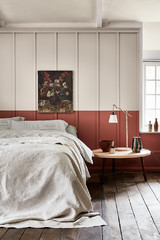
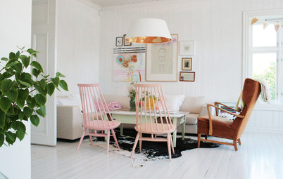
Skip the sugar
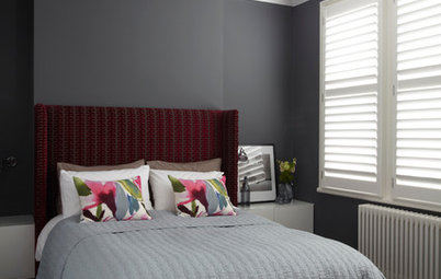
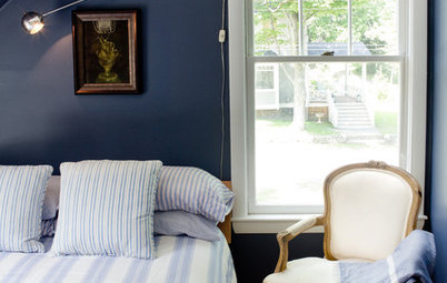
Use graphic black accents to punctuate pretty pastels and floral prints, preventing them from becoming too sickly sweet. In this bedroom, a coordinating lamp or mirror has been swapped in favour of more striking designs in dramatic jet black.
Use graphic black accents to punctuate pretty pastels and floral prints, preventing them from becoming too sickly sweet. In this bedroom, a coordinating lamp or mirror has been swapped in favour of more striking designs in dramatic jet black.
Add some edge
Introducing pale greys and pistachio greens will help to prevent an overload of sweet shades in spaces where balance is important. This eclectic dining area has an abundance of pastel colours, but also incorporates grey, black and biscuit tones in the cushions to help tone it down, while the robust plastic chairs add a masculine edge.
Introducing pale greys and pistachio greens will help to prevent an overload of sweet shades in spaces where balance is important. This eclectic dining area has an abundance of pastel colours, but also incorporates grey, black and biscuit tones in the cushions to help tone it down, while the robust plastic chairs add a masculine edge.
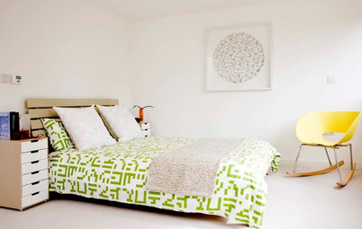
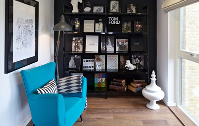
Try monochrome with a twist
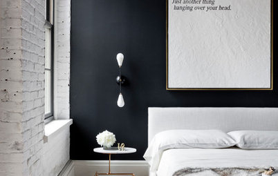
If your scheme is an ode to monochrome restraint and you’re looking to liven it up, pastels can pack an effective punch. Small tweaks, such as the tiny touch of peach, hint of mint and splash of neon, lift this minimal black and white space, enabling it to take on a whole new personality.
A monchrome fan? Discover winning ways to use it in the bathroom
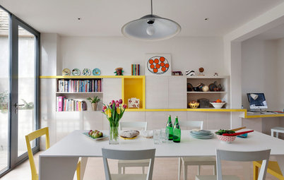
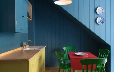
Switch onto industrial elements
The pastel shades appear balanced and contemporary in this dining room thanks to the darker, more masculine industrial elements and midcentury furniture. The statement dining chairs in faded orange, yellow and teal suggest lightness and frivolity, while the oversized black pendant light provides a no-nonsense counterpoint.
A black table lamp or a smattering of black accessories on the shelves would create the same effect as here. Similarly, for a subtle flash of pastel with a DIY element, consider colour-dipping your chair legs in complementary sherbet tones.
Keen to energise your kitchen? See how to uplift it with pretty pastels
Play with pattern
There’s something endlessly pleasing about a graphic black and white floor, particularly when combined with icy pastels and a classic 1950s-style fridge. Keep the look from going full ‘American diner’ by opting for painted floorboards rather than vinyl tiles. More texture means less cold feet.
There’s something endlessly pleasing about a graphic black and white floor, particularly when combined with icy pastels and a classic 1950s-style fridge. Keep the look from going full ‘American diner’ by opting for painted floorboards rather than vinyl tiles. More texture means less cold feet.
Look beyond the obvious
In this striking scheme, the pastel pink walls haven’t been paired with the usual bright white architrave and skirting boards, but with an unexpected nude tone (Farrow & Ball’s Smoked Trout) instead. This clever combination plays down the pink’s vibrancy. Similarly, the floral-print chair has a black background for a further hint of subversion.
For an easier update along these lines, look out for cushion covers or wall art featuring black and the pastel shade of your choice, then build your décor around it.
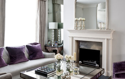
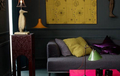
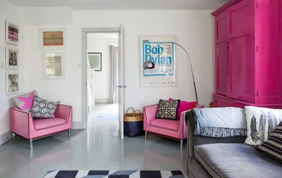
Accent with upholstery
A softer way to bring black elements alongside sugary shades is to use fabrics and upholstery. In this chic living room, a simple charcoal sofa offsets the lively mix of patterns and pastels on the cushions and rug, effectively helping to ground the scheme.
A softer way to bring black elements alongside sugary shades is to use fabrics and upholstery. In this chic living room, a simple charcoal sofa offsets the lively mix of patterns and pastels on the cushions and rug, effectively helping to ground the scheme.
Frame your space
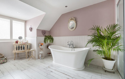
Even a small amount of black can introduce enough contrast to define paler colours and make them sing. This elegant bathroom features a border of black tiles on the floor, which outlines the space and is echoed in the black-framed print on the wall.
If dark tiles in the bathroom aren’t an option, try a washable cotton rug with a monochrome geometric pattern as a bathmat.
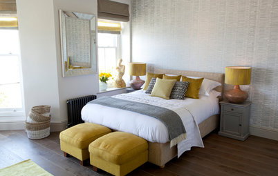
Use pastels as a neutral
You might not think it, but peachy pastels can appear almost neutral when used as a background to a subtle, sophisticated space, like this one. Wooden elements add warmth and mimic the greenery outside, while a black throw and grey cushions guard against uniformity.
TELL US…
Do you like the combination of pastels with black – how would you choose to pair them? Share your tips in the Comments below.

Sponsored
Coloured appliances are having a moment, but if you don’t feel confident choosing a bold shade for your priciest purchases, why not try classic black? It’s easy to keep clean, quick to coordinate and can give a mint-green kitchen oodles of adult appeal.