


How to Pick the Perfect Paint Colours for Light-starved Spaces
Make the most of cloudy days and dimly lit areas at home with tones that complement soft, diffused light
Denise O'Connor
18 September 2016
Denise holds a degree in architecture from Richview School of Architecture in UCD. After graduating in Dublin she moved to London where she worked on residential, healthcare and office schemes including the award-winning headquarters for Holiday Extras for which she was project architect at Walker and Martin. In 2005 she returned to Dublin and set up architecture and interior design consultancy Optimise Design.
Denise is an architecture and interiors columnist for the Irish Times and a contributor for HOUZZ. She is also a regular contributor to various other publications and also gives lectures on a range of topics. She was a presenter for the first series of the RTE TV show ‘The Design Doctors’ and is the creator and name behind the successful paint collection for Dulux called Signature...
Denise holds a degree in architecture from Richview School of Architecture in UCD.... More
Colour is an important part of design and it can have a powerful effect on how our home makes us feel. But choosing colour is something with which many people struggle – there’s so much choice, it’s easy to get bamboozled. Often, the images we use for inspiration are from places with completely different climates to our own and, while bright and vibrant shades look fantastic in sunny locations, they’re not so good in areas that have weaker light.
Ireland gets a large number of cloudy days throughout the year, which makes the light soft and diffused. Equally, many UK homes have darker, north-facing rooms or are light-starved at certain times of the year. Some colours work every time in this context, but others just don’t, and it’s not always obvious why. So here are a few rules that will help you to choose the perfect shade to work with soft light and dimly lit rooms alike.
Ireland gets a large number of cloudy days throughout the year, which makes the light soft and diffused. Equally, many UK homes have darker, north-facing rooms or are light-starved at certain times of the year. Some colours work every time in this context, but others just don’t, and it’s not always obvious why. So here are a few rules that will help you to choose the perfect shade to work with soft light and dimly lit rooms alike.
Avoid brilliant white…
A very common mistake for a north-facing or dark room is to paint it white to try to make it feel brighter. This doesn’t work and can actually make the room seem cold. Instead, what you should try to do is make the room feel cosy.
We have no control over orientation, so pulling more sunlight into a north-facing room is generally not an option. However, by going for a darker, softer shade on the walls and improving artificial lighting, a north-facing room can be a very snug, pleasant place to spend time, regardless of the climate conditions outside.
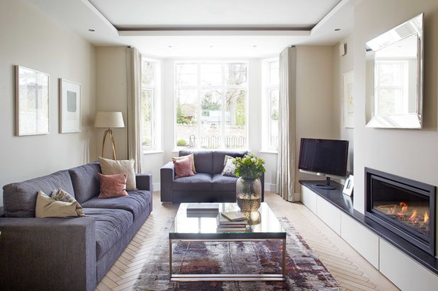
…but get to know your shades of white
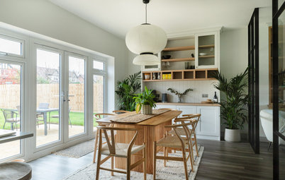
If a darker hue doesn’t appeal, you can still give the impression of white without going brilliant. In this beautifully simple room, the walls have been painted in a slightly softer shade of white than the ceiling. You’ll see that there’s a slight hint of green in the wall colour, which makes it feel less stark (see the next point for more on this).
White and even some off-whites can feel quite clinical, but by slightly contrasting the walls and ceiling, this room is anything but.
Use a hint of green in your neutrals
When trying to select a neutral colour for a room with dim natural light, I’d steer clear of any shade with a hint of pink or peach in it. These tones appear to be warm, which can be tempting in cooler climes, but, in fact, they’re very difficult to live with. This is particularly true with neutral shades – magnolia is a classic example – as their warmer tones tend to clash with everything.
Hot and warm colours work in sunnier climates, because the light there is strong. Weaker light needs cooler shades, at least where neutrals are concerned.
So when picking a neutral or off-white, I’d suggest going for one with a slight hint of green in it, as this has a neutralising effect, meaning that most colours will combine really well with it. The green also means it will react really well in the light that comes with the Irish climate, which tends to be very soft, as well as in other rooms with limited natural light.
More: How to Prevent Your Neutral Scheme From Falling Flat
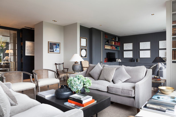
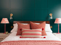
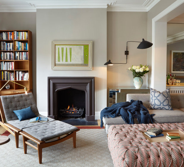
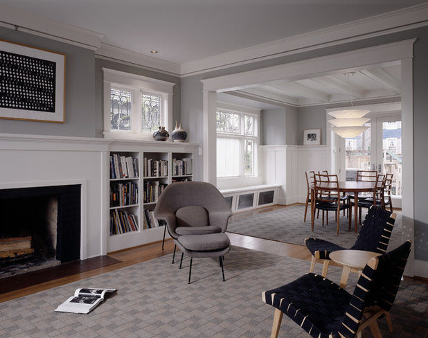
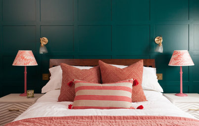
Create a focal point
Using a bold colour is a great way to create a point of focus in a room with changeable light, plus it helps to define different zones within an open-plan space. Really dark shades, like the grey in this living room, actually work as a neutral tone, contrasting beautifully with the brighter shades and providing a fantastic backdrop for artwork.
When selecting dark shades, do opt for the more earthy end of the spectrum. For example, this is a warm grey with sandy undertones, which is much softer and warmer than a cooler grey with blue or purple undertones.
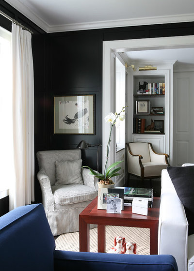
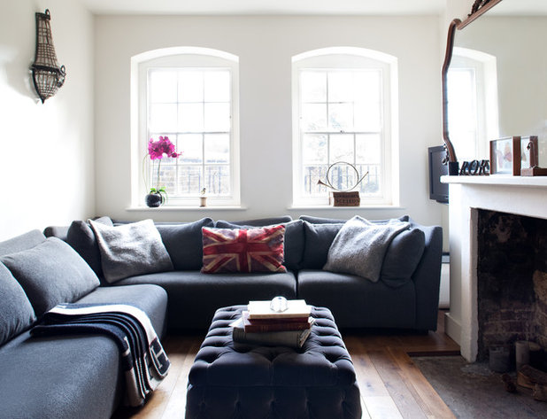
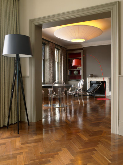
Keep your palette simple
While rooms in sunnier climes with more direct sunlight can handle a rainbow of shades, in climates where there’s frequent cloud cover, a simple colour palette works best. So if you’re planning to paint a dark or north-facing space in a bold shade, keep the rest of the scheme simple for a clean contrast. What you don’t want is too many strong colours in a room, as they will start to compete. Here, a monochrome palette creates a relaxed and elegant atmosphere.
While rooms in sunnier climes with more direct sunlight can handle a rainbow of shades, in climates where there’s frequent cloud cover, a simple colour palette works best. So if you’re planning to paint a dark or north-facing space in a bold shade, keep the rest of the scheme simple for a clean contrast. What you don’t want is too many strong colours in a room, as they will start to compete. Here, a monochrome palette creates a relaxed and elegant atmosphere.
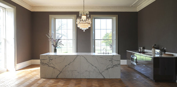
Paint a dark window wall
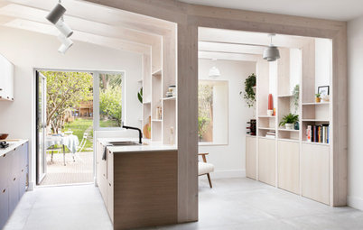
Where you have large windows, a deep shade can be very dramatic. The wall with the windows is actually the darkest in the room, as it gets no direct light, so it’s the ideal surface to paint a dark colour.
In this kitchen, the grey picks up the veining in the striking marble island, showing that contemporary colours can work wonderfully in a period setting. This gorgeous shade of grey has a slightly earthy undertone, making it work really well with the subdued light.
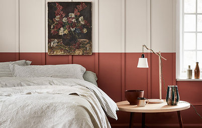
Be uniform with woodwork and ceiling…
When selecting your colour palette, paint the woodwork and ceiling in the same shade, but go for a contrast on the walls. This will give a unified look to your scheme. Steer clear of whites with pink or yellow undertones in muted light, as the base pigment is strong and can dominate the colour scheme, making it very difficult to find complementary tones for your walls.
When selecting your colour palette, paint the woodwork and ceiling in the same shade, but go for a contrast on the walls. This will give a unified look to your scheme. Steer clear of whites with pink or yellow undertones in muted light, as the base pigment is strong and can dominate the colour scheme, making it very difficult to find complementary tones for your walls.
…or try a darker shade for the woodwork
Don’t be afraid to go dark on the woodwork and lighter on the walls instead. This works really well where the woodwork is not in great condition, as the darker colour is more forgiving.
An earthy shade like this one is a great choice; colours with sandy, green or beige undertones all work really well with muted light. This is because they’re soft, too, and so don’t tend to dominate your colour scheme, making them ideal for woodwork, which will frame every room in the house.
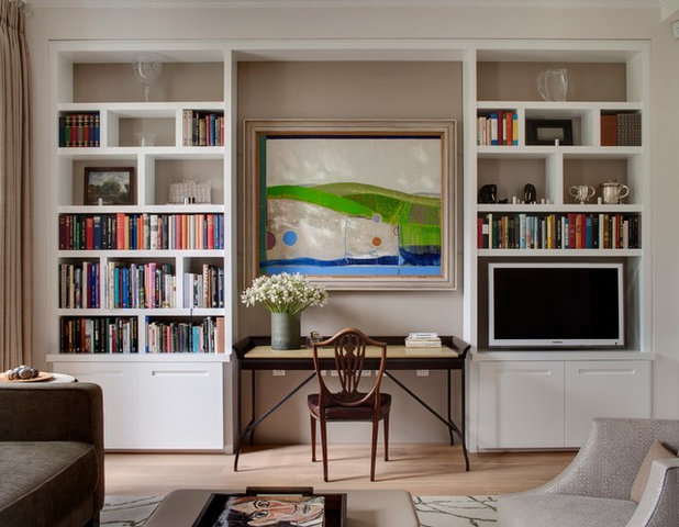
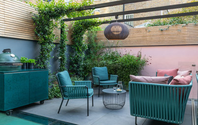
Create a backdrop for displaying accessories
One place you can really play with colour and darker tones despite the light you’re working with is on smaller panels, behind art and accessories, where the wall or shelves themselves aren’t the focal point, but rather what’s on them.
Dark colours are great for showcasing art: the contrast makes whatever you place in front stand out. Painting the wall behind this shelving unit in a dark grey has created the perfect backdrop for displaying these colourful accessories and brings this otherwise neutral scheme to life.
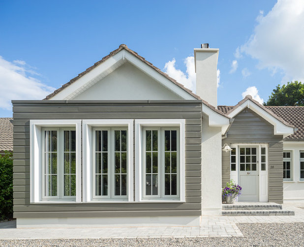
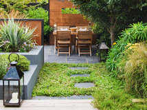
Explore earthy tones externally, too
When selecting external paint colours, tones with a slightly earth hue tend to work best, as they’re warm. Here, there’s a slight green tint to the grey colour used on the exterior cladding, making the grey feel warm and inviting. If your skies are grey or white for much of the year, choosing a warm shade for your exterior will mean your home will look its best whatever the weather.
Tell us…
Do you have a dark room? What colour have you painted it – and are you happy with the result? Share your experiences in the Comments.

What are you working on?


Related Stories

More Rooms
The 5 Most Popular Laundry Rooms on Houzz Right Now
Get decorating ideas for your laundry or utility room from these most-saved photos on Houzz
Full Story
Dining Rooms
The 5 Most Popular Dining Rooms on Houzz Right Now
By Kate Burt
Vintage furniture, great lighting and top tables – feast your eyes on dining room ideas collated from your own clicks
Full Story
Colour
8 Clever Ways to Use Strategic Colour Blocking in Your Home
By Kate Burt
Paint can do so much more than refresh your walls. Explore ways to highlight features, zone areas and trick the eye
Full Story
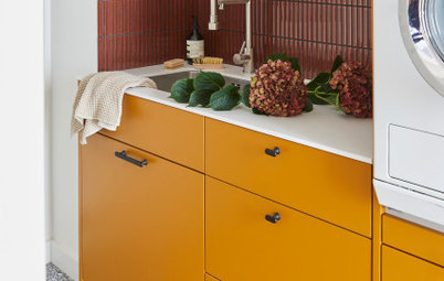
Utility Rooms
15 Richly Coloured Utility Rooms
The trend for strong, earthy tones has reached the utility room, with hues from plum to ochre to deep green adding depth
Full Story

Kitchens
Which Kitchen Worktop Colour Should You Choose?
By tidgboutique
Consider these popular colours and styles to get the look you want, no matter which material you use
Full Story
Colour
8 Ways to Work a Rust Red and Blue Palette in the Bedroom
By Kate Burt
We’re seeing variations of this combination all over Houzz right now. Check out these tips for trying it yourself
Full Story
Colour
Creative Ways to Make a Feature of Structural Beams
Turn your RSJ into something more than just functional with these clever ideas from our Houzz Tours
Full Story
Gardens
9 Ways to Enjoy Colour in Your Garden All Year Round
By Kate Burt
However your garden grows, you can add colour with hardscaping, furniture and accessories
Full Story
Gardens
What Will We Want in Our Gardens in 2024?
Discover the gardening trends homeowners will be bringing into their outdoor spaces this spring and summer
Full Story
Kitchens
What to Expect at the Biggest Kitchen, Bedroom and Bathroom Show
Plan ahead with our rundown of what’s in store at the kbb Birmingham event this March
Full Story
Like I said, it isn't "me" but I think it could look great. Good luck, love to hear what you decide.
Personally really happy with my dark kitchen. I know it’s not a particularly fashionable thing to say, but I think light bright kitchens while lovely if you have one also have some disadvantages, for example in the heat of summer my pale pink fridge freezer ( which I love, ridiculously) never struggles. It winter the room is warm and cosy. a blackboard painted wall behind a stainless steel plate rack works fine for me. Please excuse the messiness. My kitchen is never tidy.. even in lockdown when there is no excuse!
I agree as my kitchen too is dark wood in the middle of my home. I have careful lighting, reflective surfaces etc to help bounce light around. It is a cosy space in winter and has views of my very green garden via an internal window in the spring and summer.