


Houzz Tour: A Small Victorian Terrace Gains Dramatically More Space
This clever renovation maintains a sense of period charm, yet has boosted the size of the property dramatically
Kate Burt
5 September 2016
Houzz UK. I'm a journalist and editor, previously for the Independent, Guardian and various magazines. I'm now excited to part of the editorial team at Houzz UK & Ireland, bringing the best of British and Irish design, interiors and architecture to Houzz.com.
Houzz UK. I'm a journalist and editor, previously for the Independent, Guardian and... More
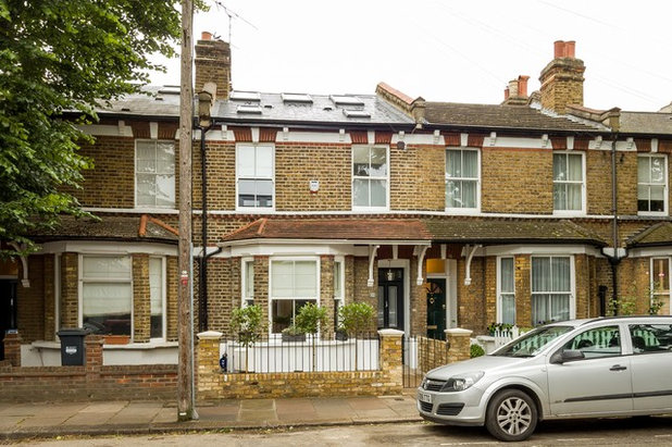
“This was a classic Victorian terraced house,” says Reuben Spiring of the property on which he’s recently finished an extensive and space-enhancing renovation. “When the owners bought it and we started work on the project, it hadn’t been touched for 40-odd years. It was the classic two-up, two-down with a 1960s kitchen extension; it was unusual for this type of house to be so untouched for decades.”
Spiring and his team gutted the house: they did a full loft conversion and side return extension, built a garden studio, replaced all the uPVC windows with traditional-style sashes, soundproofed everywhere, and incorporated numerous clever smaller touches – including underfloor heating so as to be able to remove protruding radiators – to boost space and make the house feel airier and lighter.
Spiring and his team gutted the house: they did a full loft conversion and side return extension, built a garden studio, replaced all the uPVC windows with traditional-style sashes, soundproofed everywhere, and incorporated numerous clever smaller touches – including underfloor heating so as to be able to remove protruding radiators – to boost space and make the house feel airier and lighter.
Houzz at a Glance
Location Chiswick, west London
Property Victorian terraced house
Size 4 bedrooms, 2 bathrooms, 1 cloakroom
Designer Reuben Spiring at JLB Property Developments
Photos by Simon Maxwell
From the outside, it’s hard to picture quite how much space there is inside this home. Originally, pre-renovation, there were two bedrooms and a bathroom upstairs, and a walk-through living room and small, dated extension containing a galley kitchen downstairs. There was no central heating or gas supply.
“The house wasn’t in terrible disrepair, it was just very dated,” Reuben Spiring says. “There were a few structural issues on the back extension, but nothing unusual. It was a pretty standard British house with a grassed garden – it was just quite unusual for one to be so untouched for decades.
“The brief was to upgrade it and turn it into a family home,” Spiring continues, “extending and expanding as much as was possible, so it could comfortably accommodate a family.” With the amount of structural work undertaken, Spiring describes the house as “a new build within an old building”.
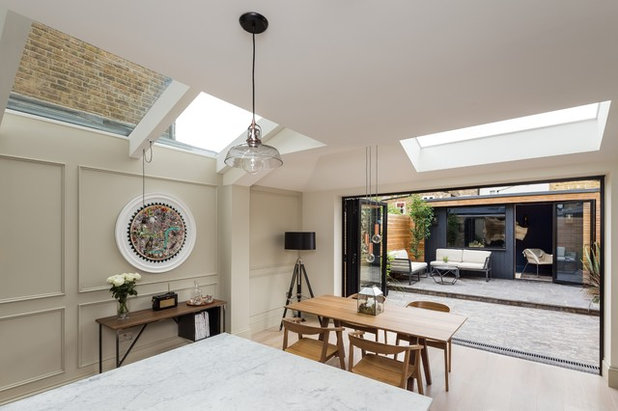
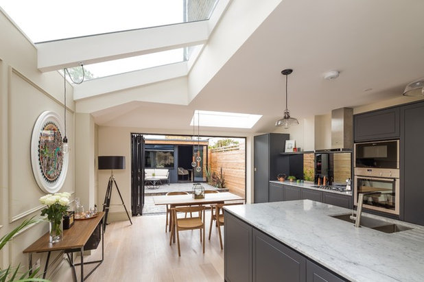
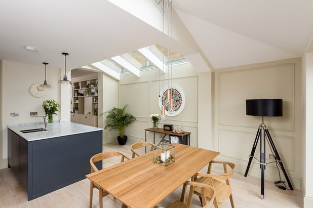
“Light and space are the two really basic elements for making a nice home, however small or large it is,” says Spiring.
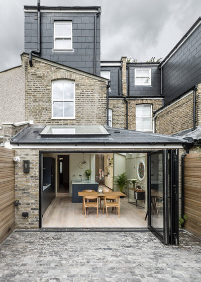
This was the thinking behind the three large, triple-glazed panels over what was originally the side return (see the next photo for a different view of these), and the additional roof light, as well as the black aluminium bifold doors onto the garden. “To keep a bit of a traditional feel, we used London stock brick on the exterior of the extension (see next image) and fitted sash windows in the loft extension.”
This was the thinking behind the three large, triple-glazed panels over what was originally the side return (see the next photo for a different view of these), and the additional roof light, as well as the black aluminium bifold doors onto the garden. “To keep a bit of a traditional feel, we used London stock brick on the exterior of the extension (see next image) and fitted sash windows in the loft extension.”
Spiring came up with a clever but not immediately obvious idea for the first-floor sash window: look closely and you might just notice it’s a little larger than would be standard. “It’s about 20cm wider,” he explains. “We enlarged it lengthwise, too, carefully keeping the original proportions. It’s very subtle, but it makes a lot of difference to the amount of light it lets through.”
The reason it’s so subtle is also because the builders skilfully used London stock bricks (like the originals) to rebuild the arch formwork at the top of the window and then bricked around that and repointed the lot. “Talented chaps!” says Spiring.
See 8 of the best kitchen extensions on Victorian houses
The view back into the house from the bright and airy, newly extended kitchen.
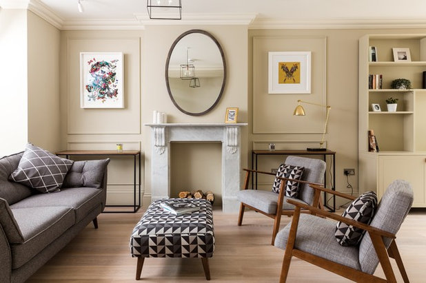
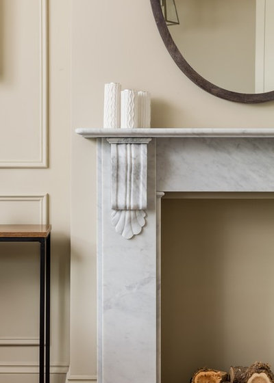
In order to create more space on the floor above, the decision was made to remove the chimney breast up there. This means that, although there’s a chimney breast in this room, it no longer extends up to a chimney and so cannot house a working fireplace.
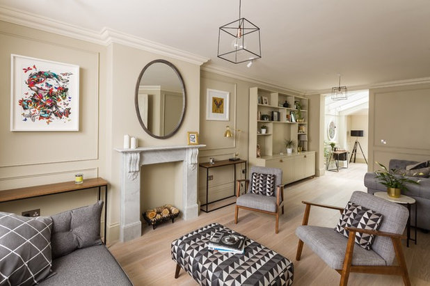
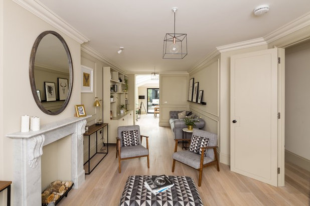
“In one way, it’s a shame,” concedes Spiring, “but the difference is that upstairs you now have a double rather than a single room. You could always put a bioethanol fireplace in the cavity here.” The Carrara marble fire surround nevertheless creates a focal point.
This room has been designed as a formal drawing room, a space for the grown-ups. On the other side of the open-plan room, before you reach the kitchen, there’s a more relaxed ‘snug’ area with a sofa for the kids to hang out on.
Zinc Express sofa; footstool, both French Connection at DFS. Ekenäset armchair, Ikea.
The clients wanted the design to feel traditional but not necessarily historical. Spiring and his team designed the wall panels to this end. “They’re not authentic,” he says, “but many of the details added to one-time workers’ cottages like these anywhere are not based on original features and this works well to define the area.”
He chose the wall colour to enhance the classic feel, rather than going for something more contemporary, such as grey or white.
Bespoke veneered walnut console table, JLB Property Developments. Oval mirror, French Connection. Walls painted in Old White, Farrow & Ball.
He chose the wall colour to enhance the classic feel, rather than going for something more contemporary, such as grey or white.
Bespoke veneered walnut console table, JLB Property Developments. Oval mirror, French Connection. Walls painted in Old White, Farrow & Ball.
The team also added coving to what had been unembellished walls when the project started. “It had probably been updated in the 1970s, when all of that kind of detailing, if it was ever there, was probably stripped out,” says Spiring. “There was even a sliding glass serving hatch through to the kitchen.”
A detail on the ground floor that has further added to the sense of space is that Spiring had the old, floating timber floor removed. “It meant we could dig down and gain about 20-30cm height in the room and install underfloor heating.”
He was then able to lower all the floors slightly, and this had a knock-on effect for the loft conversion. “Traditionally when you do a loft conversion, you get around 2m height, but with this change below we ended up with a 2.3m height, so it feels like a proper room. This is where the master bedroom is, so it’s a significant detail.”
The flooring downstairs is engineered oak whitewashed with Osmo oil. “This is something you can do if you buy your flooring unfinished,” Spiring explains. “You do it gradually, adding one coat at a time until you get the tint you’re after.”
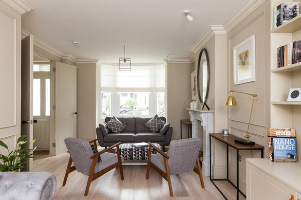
“What to do with the room that flows into your side return extension is a classic issue in these Victorian houses,” says Spiring.
How to deal with the wall at the back, which once opened onto the side return (seen here at the far end of the sofa), is part of the dilemma. “You could completely take the wall out, but removing it would have required steels and could have cost thousands. Besides, without it, you can’t have a sofa there. Sometimes you need a wall!”
Spiring did remove the door, however, which had no structural impact but created a semi-open-plan feeling. He also extended the opening where the door was right up to the ceiling, to boost the flow of light through the house.
The back part of this room is designed as a less formal sitting room, more of a TV space or somewhere to hang out playing on the Xbox, while parents enjoy a grown-up drink in the evening. Equally, when the parents are in the kitchen, they can still feel connected to the kids through the opening in the wall.
Wooden beehive door handles (fitted throughout), The Door Handle Company.
“The corridors in these Victorian houses can feel quite narrow,” says Spiring. “These double doors open up the whole space, but at the same time you can close them again if you want the room to feel cosier at any point.” Again, the doors were extended upwards almost to the ceiling to boost light.
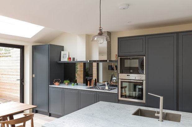
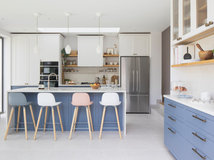
The kitchen was designed bespoke by Spiring’s team. For a contemporary yet timeless look, they went for a handless design, but one with groove detailing that gives the effect of a classic Shaker kitchen. “You get the best of both worlds,” says Spiring.
The worktops are Carrara marble.
The worktops are Carrara marble.
Here, in this east-facing back room, the glazing results in a comfortably bright kitchen and dining space, but Spiring has a word of warning. “Be aware of the position of your extension when looking at how to drop in light, especially if you have a south-facing garden. It can easily become uncomfortably hot unless you choose specialist uv-resistant glass.”
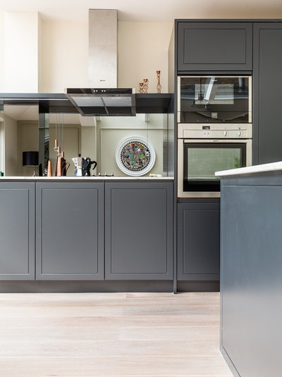
A mirrored splashback is another clever detail that adds to the airy feeling of this space. Rather than going for ordinary mirror, Spiring picked this grey-tinted version. “It still reflects light, but it’s nicely muted. It also works well with the quietly luxurious style of the house, and the darker colours.”
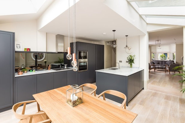
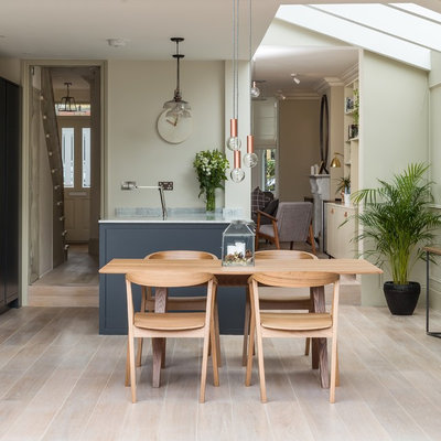
The island was pushed back against the wall to further increase space and allow room for a dining table. “You could easily fit a much larger table in here, too,” he says.
Another touch that adds a little more headspace is the choice to start the pitched windows over the former side return at the top of the original ceiling level, rather than lower and lining up.
Also, supporting steels – part of the box frame that forms the structure of the extension – have been partially buried into the party walls to reduce their visual and spatial impact on the room. Cutting into party walls may not always be viable, so do get advice from an expert and check relevant regulations if you’re dreaming of something similar. Here, one is visible to the left of the hob; one of the others you can see in the next image.
What you need to know about party walls
The second semi-buried steel can be seen to the right of the circular artwork here. “It’s a standard ‘goalpost’ framework,” explains Spiring.
The accessories in the room are not generally high-end designer pieces. The table and chairs are from Ikea’s discontinued Stockholm range. The light fittings are made up from individually bought cables, bulb-holders and vintage-style bulbs. “And we found the light above the island at BHS just before it went into receivership,” adds Spiring.
The accessories in the room are not generally high-end designer pieces. The table and chairs are from Ikea’s discontinued Stockholm range. The light fittings are made up from individually bought cables, bulb-holders and vintage-style bulbs. “And we found the light above the island at BHS just before it went into receivership,” adds Spiring.
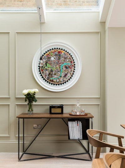
Appropriately, the print hung here depicts west London.
Vestur Uglu London 2016 artwork, Kristjana Williams.
Vestur Uglu London 2016 artwork, Kristjana Williams.
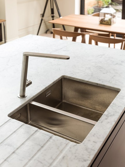
A simple sink and understated contemporary tap were picked so as not to compete with the marble.
Franke Centinox kitchen sink; Mizzo Trucio brushed-steel tap, both Kitchen Market.
Franke Centinox kitchen sink; Mizzo Trucio brushed-steel tap, both Kitchen Market.
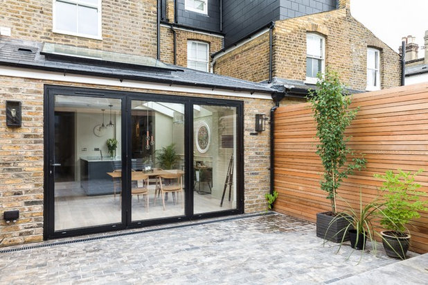
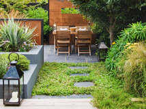
A big part of the brief was to make the kitchen feel like part of the garden, and to create a really beautiful courtyard space that wouldn’t require much maintenance. It’s a perfect spot for a coffee in the morning sunshine, but there’s also space for a dining table out here.
“Especially with young children, time is so precious and we get asked all the time to create spaces like this, where you can have some greenery but don’t need to spend time looking after it. There are so many beautiful parks nearby that it’s easy to find green space,” says Spiring.
“Especially with young children, time is so precious and we get asked all the time to create spaces like this, where you can have some greenery but don’t need to spend time looking after it. There are so many beautiful parks nearby that it’s easy to find green space,” says Spiring.
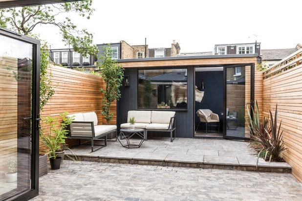
A western red cedar fence, made from alternating-size battens (45cm and 70cm) makes for an attractive backdrop for plants and furniture alike.
The new garden room is positioned opposite the kitchen.
Catania outdoor furniture, Made.com
Browse more photos of garden buildings
The new garden room is positioned opposite the kitchen.
Catania outdoor furniture, Made.com
Browse more photos of garden buildings
“The garden room is 100 sq ft inside and, for around £20-25,000, one of these can add so much space to a small house,” says Spiring.
Sofa-bed, Made.com.
Sofa-bed, Made.com.
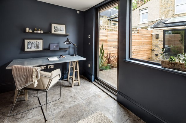
The room is set up as a home office, but could also be used as a small cinema room or even a spare room for guests. Spiring added skirting boards to subtly tie the room to the main house. The floor is tiled with Milan tumbled limestone, with underfloor heating below.
Armchair; desk; side table, all French Connection Home. Walls painted in Railings, Farrow & Ball.
Armchair; desk; side table, all French Connection Home. Walls painted in Railings, Farrow & Ball.
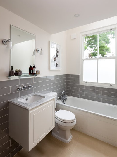
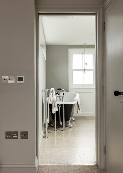
The family bathroom is on the first floor. The basin top matches the worktops in the kitchen and the floor tiles are white Moleanos limestone. “The wall tiles were very reasonably priced – only £16 per square metre I think,” says Spiring.
Grey metro wall tiles, Tile Mountain.
Grey metro wall tiles, Tile Mountain.
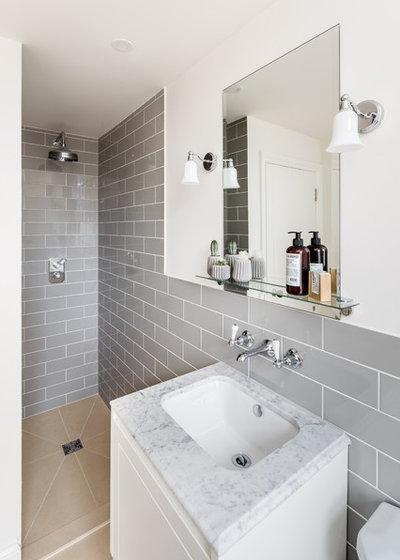
The bathroom features a separate walk-in shower.
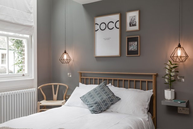
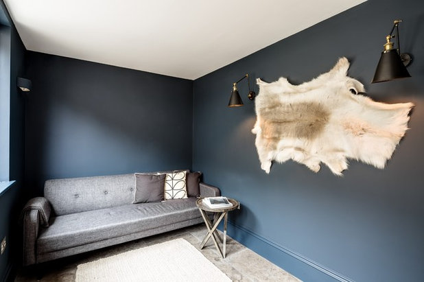
The spare room is painted in a dark, cosy shade; with so much light flooding in, it still feels airy.
Wishbone chair by Hans J Wegner, available at Skandium. Bedside tables/shelves, Ikea (painted to match wall).
Wishbone chair by Hans J Wegner, available at Skandium. Bedside tables/shelves, Ikea (painted to match wall).
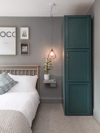
The practical slim wardrobe is perfect for a guest room, where not much space for clothes is required. Pendant bedside lights save on surface space, too, meaning the small shelf provides enough room for a book and a glass of water.
Cupboard painted in Inchyra Blue, Farrow & Ball. Cushion, H&M. Hampden bed frame, M&S.
Cupboard painted in Inchyra Blue, Farrow & Ball. Cushion, H&M. Hampden bed frame, M&S.
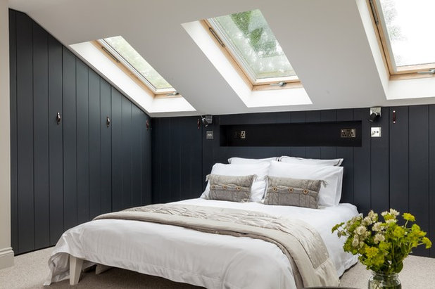
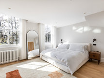
The master bedroom is in the new loft and has built-in wardrobes covered with tongue-and-groove panelling to add warmth to the space while still looking contemporary. To boost space, there’s a niche above the bed rather than side tables. The niche features power and USB charging points.
Walls painted in Railings, Farrow & Ball.
Walls painted in Railings, Farrow & Ball.
The master bedroom has its own en suite, complete with a roll-top bath, double basins and a separate shower. It has a roof light as well as a sash window for maximum airiness.
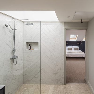
“We wanted to give this attic room a proper sense of it being a suite,” explains Spiring. “It has a boutique hotel, spa-like sense of luxury, which is a great thing to be able to get in smaller houses.”
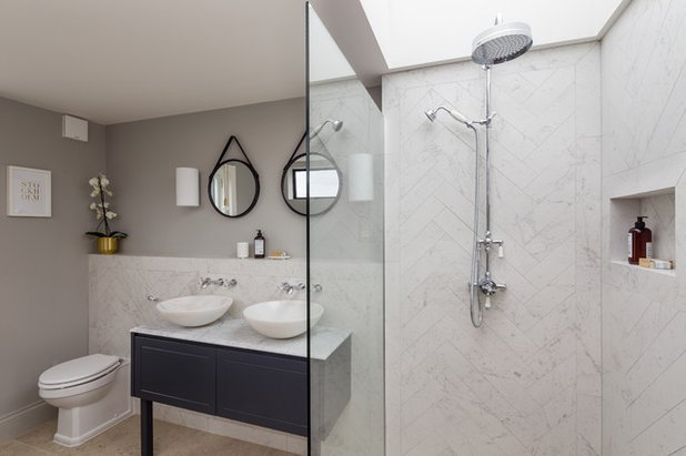
The tiles on the floor are blue honed Moleanos limestone. The wall tiles are marble-look porcelain tiles. The basins are solid marble. “They’re not as expensive as you might think,” says Spiring, “around £90 each.”
Mimica Carrara Matt Porcelain wall tiles, Mandarin Stone. Walls painted in Pavilion Gray, Farrow & Ball. Basin taps, Victorian Plumbing.
What do you think of this renovated home? Share your thoughts in the Comments below.
Mimica Carrara Matt Porcelain wall tiles, Mandarin Stone. Walls painted in Pavilion Gray, Farrow & Ball. Basin taps, Victorian Plumbing.
What do you think of this renovated home? Share your thoughts in the Comments below.


Related Stories

House Tours
Houzz Tour: A Midcentury Home With a Strong Indoor-outdoor Link
By Becky Harris
A nature-inspired renovation has given this ranch house a relaxed mood and a connection to the outdoors from most rooms
Full Story

House Tours
Houzz Tour: Warm Tones and Luxurious Surfaces in a City Townhouse
An earthy colour palette, hidden storage and well-placed texture add character and practicality to this London home
Full Story

Room Tours
Kitchen Tour: A Gorgeous Extension With a Leafy Glasshouse Feel
By Kate Burt
When the owners of this terraced house extended, they were keen to retain its period feel and highlight the garden
Full Story

Gardens
Garden Tour: A Bare Roof Terrace Becomes a Pretty, Sociable Space
By Kate Burt
A retired couple got help transforming their large rooftop into a gorgeous, welcoming, multi-functional retreat
Full Story

House Tours
Houzz Tour: A Smart Layout and Genius Storage in a Victorian Home
Flipping the standard layout and carving out excellent storage have turned this tired house into a brilliant family home
Full Story

House Tours
Houzz Tour: A Victorian House Brought Impressively Up to Date
By Jo Simmons
A cohesive layout and warm colours combined with energy-efficiency measures thoroughly modernise this terraced home
Full Story

Kitchen Tours
Kitchen Tour: An Open, Airy Space Made for Entertaining
Combining two separate rooms has improved flow and created a sociable open-plan kitchen, dining and seating space
Full Story

House Tours
Houzz Tour: A Family Home Inspired by its Seaside Location
Coastal colours and practical design combine to create a house that will adapt as the family grows
Full Story

Kitchens
5 Inspiring Before and After Kitchen Transformations
Whether you want to boost storage, incorporate original features or maximise your space, take ideas from these designs
Full Story

House Tours
Houzz Tour: An Airy, Scandi Finish for a Tall Victorian House
By Kate Burt
From a tricky inherited bath to a sticky-out staircase, on-site problem-solving led to a seamless update for an old home
Full Story
The reno in this article has given me inspiration for decor and furnishings - we gave away/sold most of our furniture as it was not suitable for the new house (we downsized from three storey 6 bed) so are starting from scratch bar a 1970s Danish Rosewood dining set we inherited. This extension is similar to what we have done with our small terraced two bed house on the outskirts of Birmingham. Almost at the end of the renovation, we also extended into the side return, and to the end of the building line where the outhouses were. We also took down the original external wall at the back of the house. I didn't use an architect and it took some time to find a builder who understood my vision of open plan living. Flooring (bamboo with underfloor heating) just going down now. This is the kitchen just after it was finished. Once we move back in there will be nothing on the worksurfaces.
Next step is to decorate it - will choose white to begin with (new plaster, old dark paint elsewhere)then will choose Farrow and Ball when we are used to the house and familiar with the light. The colours used in this house are inspiring.
More to the structure of the house: how was lowering all floors achieved and how much did it cost?
A good architect and designer are worth their weight in gold. Well done folks.