


Houzz Tour: A Bold Extension Soars on this Victorian Semi
Contemporary architecture and elegant styling combine beautifully in this welcoming family home

This Victorian semi in Chiswick, west London, was largely unmodernised when architect Felix Milns was asked to redesign it. “The property had only been worked on a little in the 1970s,” he says. “It’s a great house and had lots of potential to expand up and out.” The owners already had Planning Permission to extend the ground floor and add another room to the loft, but Milns and his team finessed these designs to create something more exciting and contemporary.
Now, a pitched rear has been added to the house, while inside, contemporary fittings are cleverly blended with original features. From the front step, this looks like a classic Victorian semi, but step inside and contemporary architecture and innovation combine with elegant style to create a warm, original family home.
Now, a pitched rear has been added to the house, while inside, contemporary fittings are cleverly blended with original features. From the front step, this looks like a classic Victorian semi, but step inside and contemporary architecture and innovation combine with elegant style to create a warm, original family home.
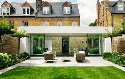
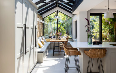
The new rear of the house has an exciting peaked design. “Like a rocket,” says Milns with a laugh.
The house originally had the classic Victorian layout of one room at the front and one at the back on the ground floor and an outrigger extension that stretched about two-thirds across the rear of the property. “We extended right into the side return,” says Milns. “But first we knocked the back outrigger off the house. We demolished it completely. This was a big job!”
The house originally had the classic Victorian layout of one room at the front and one at the back on the ground floor and an outrigger extension that stretched about two-thirds across the rear of the property. “We extended right into the side return,” says Milns. “But first we knocked the back outrigger off the house. We demolished it completely. This was a big job!”
The sliding doors open seamlessly onto the terrace. “Glazing is an area you can spend a fortune on,” says Milns. “What we did was to compromise a little by using thicker frames, which are less expensive, but with the mullions between only 20mm thick.”
This means the sightlines through to the garden are still minimal, giving the same feel as very expensive doors with super-skinny frames. “It’s a good way of getting that light look without spending so much,” says Milns. “We always try to look for smart ways to economise on a big project like this.”
Not sure what extension doors to go for? Be inspired by these ideas that aren’t wall-to-wall
The terrace is millboard, which is a composite deck made from recycled oak timber. “It looks like timber but needs zero maintenance and doesn’t splinter or warp,” says Milns. “You don’t have to be out there scrubbing green off it at the end of winter. Plus it’s very textural.”
Decking, Millboard.
Decking, Millboard.
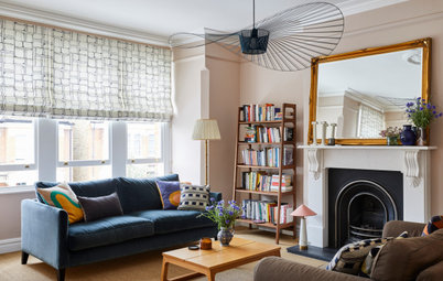
Milns created an extra-wide entrance to the living room at the front of the house, centred on the fireplace.
This room contains many original features and the owners’ classically elegant furniture, but it also has bespoke joinery and burnished mirrors behind the shelves. “It’s a contemporary twist on quite a traditional scheme,” says Milns. “The floating joinery has a modern, spray-painted finish and there’s lighting beneath.”
The owners sourced an original Murano glass chandelier, which makes a stunning focal point.
The owners’ existing furniture and accessories slot beautifully into the living room.
Walls painted in Westminster matt emulsion, Sanderson. All lighting, John Cullen Lighting.
Walls painted in Westminster matt emulsion, Sanderson. All lighting, John Cullen Lighting.
An antique cabinet with a distressed finish sits in the hallway, with a mirror reflecting the living room opposite. “There’s a roof light above and this space was the original side return,” says Milns.
The new rear extension includes a spacious living area. The oak flooring has a finish that’s been built up in layers to create a warm, natural tone. This contemporary space includes a floating unit running down one wall with storage and integrated AV equipment.
Oak flooring, Urbane Living.
Want to know what’s trending now? Then check out the many wonders of wood
Oak flooring, Urbane Living.
Want to know what’s trending now? Then check out the many wonders of wood
A contemporary gas fire is a focal point of the living space. “We were looking for something to give that nice, long, ribbon effect,” says Milns. “It’s a big area and we wanted to define the living space and add warmth.” Walnut veneer panelling has been added behind the shelves to tie in with the floor and bring in more warm tones.
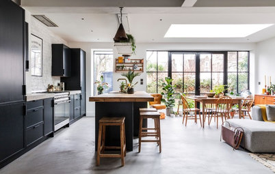
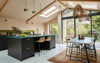
The owners love to entertain, so a cooking space that opens onto a large dining area was essential.
“This shot gives a good view of the complex sloping roof line,” says Milns, who fitted two separate angled roof lights above. “We also designed the width of the breakfast bar to deliberately line up with the first pane of glazing on the doors beyond.”
Stanley pendant lights in hammered copper, Original BTC.
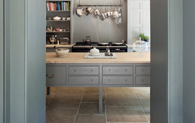
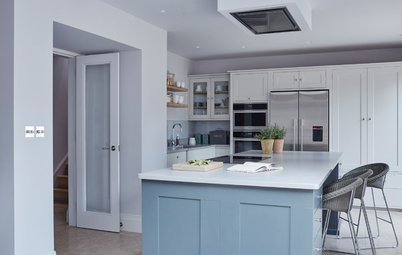
The kitchen is in what used to be the middle room of the original layout. “We tucked it in here,” says Milns. “This was quite a dark space, but now, with its high ceiling and roof lights, it feels open and bright.”
Milns designed the space, then the owners selected this contemporary, handleless kitchen from a supplier they’d used before.
Kitchen, Vogue Kitchens in Ealing. All appliances, Gaggenau.
Milns designed the space, then the owners selected this contemporary, handleless kitchen from a supplier they’d used before.
Kitchen, Vogue Kitchens in Ealing. All appliances, Gaggenau.
A sloping roof light draws daylight down onto the dining space. A colour scheme of warm taupe makes the area feel welcoming.
Walls painted in Westminster; ceiling painted in Birch White, both Sanderson.
Walls painted in Westminster; ceiling painted in Birch White, both Sanderson.
Milns designed a mini kitchen for the nanny, which is cleverly hidden behind these doors in her loft-floor bedroom.
“The kitchenette looks really neat when closed, but open it up and there’s everything you need in there,” says Milns. It includes a small sink, microwave and fridge. “We custom-made all the joinery,” he adds.
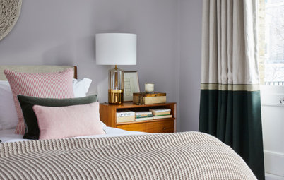
The main bedroom is on the first floor at the front of the house.
“We did the classic cannibalising of the second, middle bedroom to create a walk-in wardrobe with a shower room at the rear,” says Milns. “If people can afford to lose a bedroom, this is often a good idea. We find, these days, that homeowners are less hung up about the number of bedrooms unless they have a big family. Instead, they want a nice bedroom with a separate, spa-like bathroom, rather than just a poky little loft-style wash space tacked on.”
“We did the classic cannibalising of the second, middle bedroom to create a walk-in wardrobe with a shower room at the rear,” says Milns. “If people can afford to lose a bedroom, this is often a good idea. We find, these days, that homeowners are less hung up about the number of bedrooms unless they have a big family. Instead, they want a nice bedroom with a separate, spa-like bathroom, rather than just a poky little loft-style wash space tacked on.”
The owners went for a boutique hotel look and feel in the main bedroom, with a deeply upholstered headboard, soft carpet and integrated reading lights teamed with striking table lamps.
Walls painted in Chateau Grey, Sanderson.
Walls painted in Chateau Grey, Sanderson.
The main bathroom features marble tiles with a warm beige tone for a luxurious feel.
All fittings, Alternative Bathrooms. Tundra polished marble tiles (on walls); Tundra honed marble tiles (on floor), all Mandarin Stone.
All fittings, Alternative Bathrooms. Tundra polished marble tiles (on walls); Tundra honed marble tiles (on floor), all Mandarin Stone.
Milns had the shower tray custom-made to match the tiles and create a truly seamless look in the bathroom.
What do you think of this beautiful family home? Share your thoughts in the Comments below.
What do you think of this beautiful family home? Share your thoughts in the Comments below.


Sponsored
Who lives here A family of four
Location Chiswick, west London
Property A three-storey, semi-detached Victorian house
Size 5 bedrooms, 4 bathrooms
Architect Felix Milns of Zulufish
Photos by Guifré de Peray
“There’s a real juxtaposition between a traditional Victorian home at the front and the very contemporary rear architecture,” says Milns. “The owners love that contrast of styles and the surprise element.”