


How to Create a Feature Wall (Without Going Back to the 1990s)
Forget big, bold wallpaper, paint is your friend for creating the feature wall 2.0
Kate Burt
12 June 2017
Houzz UK. I'm a journalist and editor, previously for the Independent, Guardian and various magazines. I'm now excited to part of the editorial team at Houzz UK & Ireland, bringing the best of British and Irish design, interiors and architecture to Houzz.com.
Houzz UK. I'm a journalist and editor, previously for the Independent, Guardian and... More
The feature wall arguably first found favour in the 1990s, when a raft of home renovation shows began hitting our TV screens and started adding this decorative device to made-over homes week in week out. Perhaps as a result of this overkill, the idea has been seen less and less… until recent years. But this time, it’s not about a chimney breast covered in a vibrantly patterned wallpaper. Instead, it’s all about using paint and texture strategically. See what a modern feature wall could do for one of your rooms.
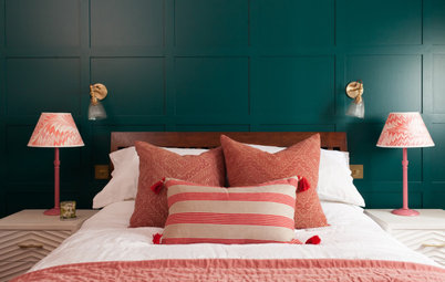
Cosy up
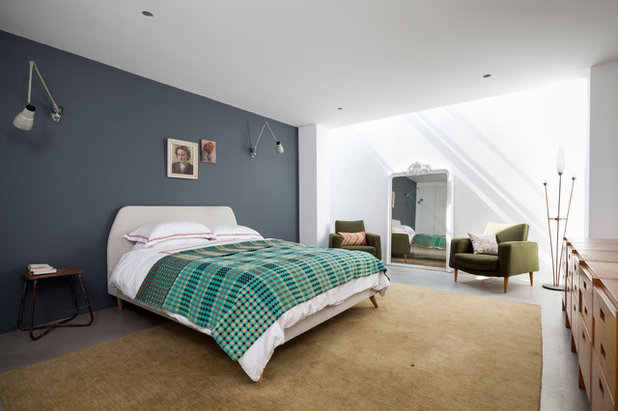
Charcoal is a dark shade, but also a soft and, perhaps unexpectedly, warm, too. This makes it perfect for adding depth and cosiness to a bedroom. In fact, the atmosphere-changing effect of this simple touch, something you can potentially do in a day, can be delightfully dramatic.
Where an all-dark bedroom can be super cosy and almost cavern-like (in a good way), this otherwise bright-white space retains its crisp feel, even with the addition of wood, a sandy-coloured rug and the green accents. It’s worth noting that the well-ironed bed linen is a key factor in this.
Should you include your skirting boards when you paint a wall? Find out here
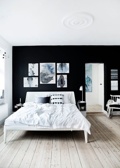
Max the monochrome
Isn’t it interesting how much difference a few shades can make? This sleep space effectively takes exactly the same idea – a dark feature wall behind the bed in an otherwise white room with wood accents – and yet here the atmosphere remains crisp, rather than cosy (though with interesting artwork, rumpled bedcovers and smooth, pale floors it’s incredibly inviting). A restricted colour palette and the inky black hue chosen for the one-off wall are responsible – it’s a trick used lots in Scandi style to great effect.
Isn’t it interesting how much difference a few shades can make? This sleep space effectively takes exactly the same idea – a dark feature wall behind the bed in an otherwise white room with wood accents – and yet here the atmosphere remains crisp, rather than cosy (though with interesting artwork, rumpled bedcovers and smooth, pale floors it’s incredibly inviting). A restricted colour palette and the inky black hue chosen for the one-off wall are responsible – it’s a trick used lots in Scandi style to great effect.
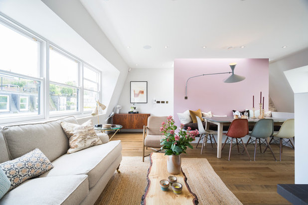
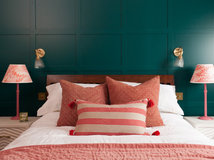
Add a hint of pink…
Pale neutrals – the oat-coloured upholstery, woven natural rug, and the various different woods – already work well to add texture and depth to the white-painted room. But that gently glowing wall behind the dining table is quite unexpected and really lifts the whole feel of the room, giving it a shot of style edginess.
The lesson? It doesn’t need to be bold to be transformative.
It’s not only living rooms that can look pretty in pink
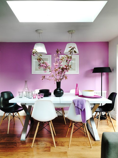
…or go full blossom
The impact of this deeper pink wall is on a different scale. Here, the wall (painted in Jaipur Dusk by Designers Guild) leads the look of the room, rather than subtly complementing it. If you’re up for a noticeable revamp, painting one wall can often be all it’ll take.
Be prepared to swap in accessories to echo your new colour – it won’t necessarily involve shopping, either. Here, cherry blossom-covered branches and a jumper draped over a chair work as well as the rosy tableware (a vintage dress on a hanger or a prominently displayed hat may offer a less fleeting alternative).
Tour the rest of this interior designer’s home in London
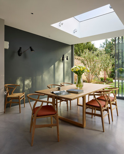
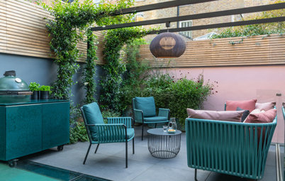
Extend your garden
A room as sunny as this can take a strong wall colour – especially on just one wall – without losing any of its airy, outdoorsy mood.
This dark grey-green doesn’t overplay the garden connection, but does really enhance it.
A room as sunny as this can take a strong wall colour – especially on just one wall – without losing any of its airy, outdoorsy mood.
This dark grey-green doesn’t overplay the garden connection, but does really enhance it.
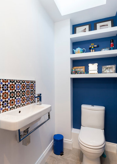
Tie it to the rest of the room
In this compact cloakroom a cobalt blue wall adds interest to what could otherwise be a plain, unremarkable space.
Blue and white can make for a chilly combination – in nautically-themed schemes wood or rattan or rope often feature to prevent this outcome. Here, the terracotta detail in the Moroccan-style tiled splashback does the same job, while also connecting the blue wall to the rest of the room. It’s a good reminder to think beyond the obvious link when choosing accessories that tie together.
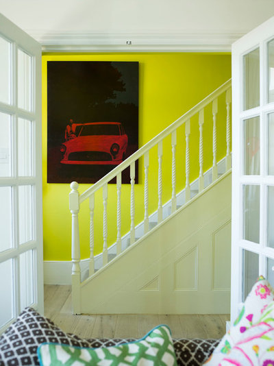
Dare to go neon
The beauty of a feature wall is that it’s just that – you don’t have to commit to painting an entire room in your chosen shade. A whole hallway in this acid yellow could make for a rather startling entrance, but used strategically like this – and surrounded by keep-it-real white paint – it’s more of a striking artwork than an immersive installation.
When putting a feature wall anywhere, but especially in a space like a hallway that links many parts of the house, consider the flow of colour and the home as a whole rather than looking at one area in isolation. The designer of this East Sussex interior was, in fact, led to choose this shade for the staircase wall because she’d already used it in accessories all over the rest of the house.
It’s a small but hugely significant trick that can really elevate the ‘designer-ness’ of a space.
See the rest of this adventurously decorated country home
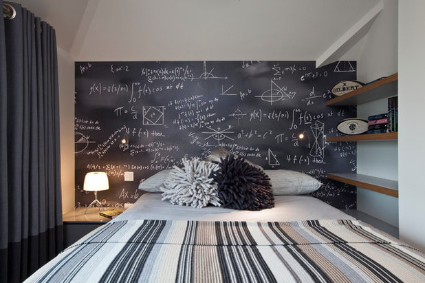
Put the writing on the wall
Not all paint is equal – and covering a wall with chalkboard paint turns the feature into something else entirely. This is a bold look for a bedroom, where messy notes and drawings could clutter up one’s brain rather than help it to rest before sleeping – though fill it with quiet poetry or calming phrases, rather than to-do lists, and it could positively aid relaxation. The risk of not being able to sleep is cleverly removed here anyway, since the feature wall is behind rather than adjacent to the bed, and therefore not visible to anyone trying to get to sleep in it.
This particular wall is probably created using wallpaper, otherwise you’d need a headboard to stop your pillows from smudging the chalk around. You can also get whiteboard paint that can be written on with special wipe-clean pens if you prefer a pale alternative.
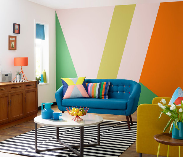
Make it multi-coloured
Why stop at one shade? When you’re not tackling every wall in a room you can perhaps afford to be bolder. Remember, it will really help your room décor to hang together if you pick up the wall colours elsewhere in the room – in this space, note the unifying effect of the table lamp, the chair and the cushions. If you’re tackling this sort of design, do invest in proper paint-blocking masking tape, which will ensure crisp edges to your paintwork.
Why stop at one shade? When you’re not tackling every wall in a room you can perhaps afford to be bolder. Remember, it will really help your room décor to hang together if you pick up the wall colours elsewhere in the room – in this space, note the unifying effect of the table lamp, the chair and the cushions. If you’re tackling this sort of design, do invest in proper paint-blocking masking tape, which will ensure crisp edges to your paintwork.
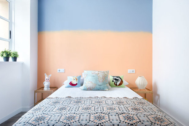
Embrace ombre
The same idea is used in this bedroom, but with fewer colours and a different paint technique. The colours in the two-tone ombre wall are picked up in the throw at the end of the bed beautifully. (There are heaps of guides to creating an ombre paint effect online.)
Here, it’s also interesting to note the effect that painting a back wall can have on the sense of depth in a space. If you have a room that feels a little cramped, a dark colour on the far wall will cause that wall to recede, thus visually expanding the space.
Do you have a feature wall in your home? If so what’s it like… and if not, where would you add one? Let us know in the comments below.


Related Stories

More Rooms
The 5 Most Popular Laundry Rooms on Houzz Right Now
Get decorating ideas for your laundry or utility room from these most-saved photos on Houzz
Full Story
Dining Rooms
The 5 Most Popular Dining Rooms on Houzz Right Now
By Kate Burt
Vintage furniture, great lighting and top tables – feast your eyes on dining room ideas collated from your own clicks
Full Story
Colour
8 Clever Ways to Use Strategic Colour Blocking in Your Home
By Kate Burt
Paint can do so much more than refresh your walls. Explore ways to highlight features, zone areas and trick the eye
Full Story
Utility Rooms
15 Richly Coloured Utility Rooms
The trend for strong, earthy tones has reached the utility room, with hues from plum to ochre to deep green adding depth
Full Story

Kitchens
Which Kitchen Worktop Colour Should You Choose?
By tidgboutique
Consider these popular colours and styles to get the look you want, no matter which material you use
Full Story
Colour
8 Ways to Work a Rust Red and Blue Palette in the Bedroom
By Kate Burt
We’re seeing variations of this combination all over Houzz right now. Check out these tips for trying it yourself
Full Story
Colour
Creative Ways to Make a Feature of Structural Beams
Turn your RSJ into something more than just functional with these clever ideas from our Houzz Tours
Full Story
Gardens
9 Ways to Enjoy Colour in Your Garden All Year Round
By Kate Burt
However your garden grows, you can add colour with hardscaping, furniture and accessories
Full Story
Gardens
What Will We Want in Our Gardens in 2024?
Discover the gardening trends homeowners will be bringing into their outdoor spaces this spring and summer
Full Story
Kitchens
What to Expect at the Biggest Kitchen, Bedroom and Bathroom Show
Plan ahead with our rundown of what’s in store at the kbb Birmingham event this March
Full Story
Hi Sage Lane Reality,
What I find is that the green and red color mix associates with the 90’s vs the darker rich blue and cream blend or dark cassis and white sand associate more with a modern look for example.
The accent wall could have a mix of picture frames and be the one with the dark profond color.
The light color will give importance to the accent wall to offer a contrast and make a statement that will catch the eyes !
Living room will automatically look more modern with that type of contrast vs the complementary color contrast strategy used in the 90’s.
I hope my color description will help you.
May you have any questions, feel free to contact me.
Best regards,
Ariane Boisclair
AB Interior Design & Staging
514-571-0435
Three of the walls in my bedroom are asymmetrical the room is 12 x 20. The wall that is symmetrical is 12' with a nicely trimmed window in the center. Suggestions