


How to Decorate With Light Grey
The hottest new neutral can be cool or warm, formal or casual, and feminine or masculine. Talk about versatile
Samantha Schoech
5 August 2017
Houzz Contributor. I am a former magazine editor specializing in travel and design. I just completed my first remodel, turning my crumbling 1941 kitchen into a beauty of grays, whites and natural wood. If I could, I'd sleep on the countertop. That's how much I love it.
You can also read my parenting blog on Baby Center http://blogs.babycenter.com/author/sschoech/
Houzz Contributor. I am a former magazine editor specializing in travel and design.... More
Light grey is this decade’s trendiest neutral. It has replaced beige as the wall colour of choice. (I actually don’t know if this is true in a statistical sense, but it sure feels like it.)
A true neutral grey is a mixture of black and white, but we hardly ever see a true neutral grey. What we see are infinite shades of warm and cool greys. Warm greys have yellow or brown undertones. Cool greys have a blue undertone. The ubiquitous “greige“ is a very warm grey that can look almost beige.
Cool or blue greys tend to have a very crisp, almost icy look to them. They are wonderful with bright whites in formal rooms and with blues and beiges. You can treat them almost like a light blue. Warm or yellow greys are complemented by creamy whites and warm colours like yellows, pinks and natural woods.
But, of course, there are no fast rues. A cool grey can be the perfect way to offset wood, and you are more than welcome to mix a warm grey with blues.
These examples show a variety of mash-ups that work and illustrate the beauty and versatility of the colour.
Light Grey on the Walls
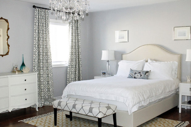
Tranquility, in Benjamin Moore’s Affinity palette, sets off the white trim and wainscoting in this feminine and traditional room. Bright white and light grey often have a sort of ethereal and romantic look together.
Tranquility, in Benjamin Moore’s Affinity palette, sets off the white trim and wainscoting in this feminine and traditional room. Bright white and light grey often have a sort of ethereal and romantic look together.
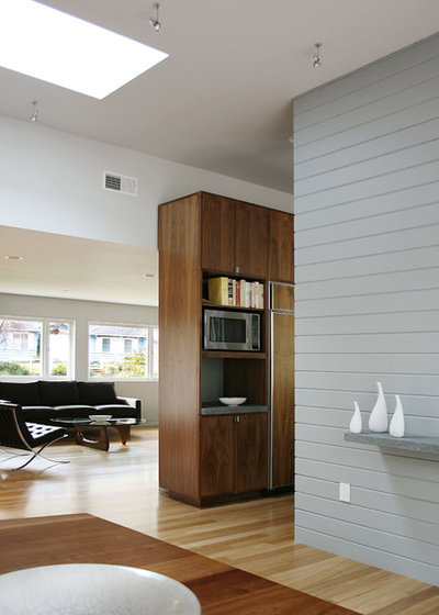
This cool grey accent wall in a big, modern room works because all the wood warms it up.
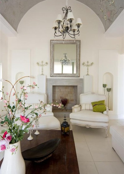
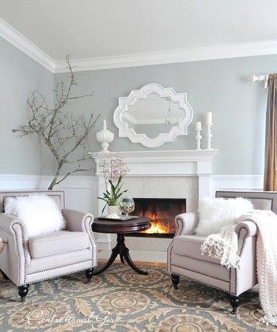
This domed ceiling in a cool light grey (with hand-painted embellishments) gives this elegant room a dreamy quality.
This pinkish grey is in the greige family. Dove Tale by Farrow & Ball; it’s modern but welcoming and cozy too.
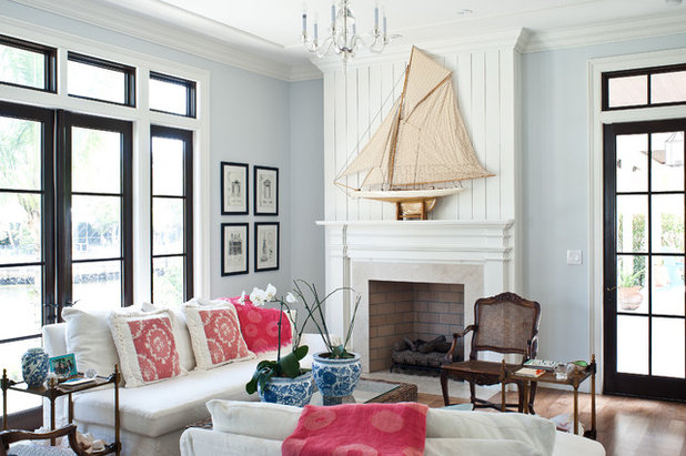
A very blue grey (Benjamin Moore’s Glass Slipper) helps bridge the gap between the traditional elements in this room and the modern windows. The dollops of colour relax it and give it warmth.
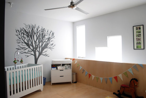
A very pale cool grey is a soothing background for a simple, modern nursery.
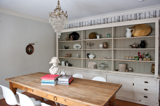
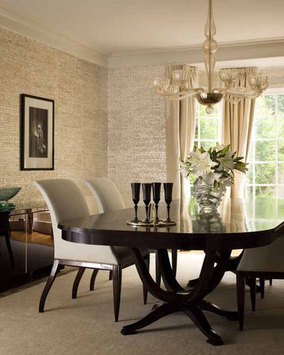
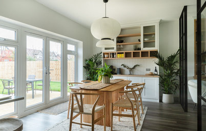
A pale blue-grey on the walls and a darker warm grey behind the open shelving help give this modern farmhouse dining room its eclectic vibe.
This silvery grey wall covering sure looks like Maya Romanoff‘s Mother of Pearl collection.
Find a local painter to transform your walls
Find a local painter to transform your walls
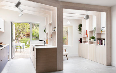
Decorating With Light Grey
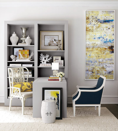
Variations in grey. A light grey bookshelf and desk against a slightly lighter grey on the walls. It all adds up to a sophisticated and soothing space.
Variations in grey. A light grey bookshelf and desk against a slightly lighter grey on the walls. It all adds up to a sophisticated and soothing space.
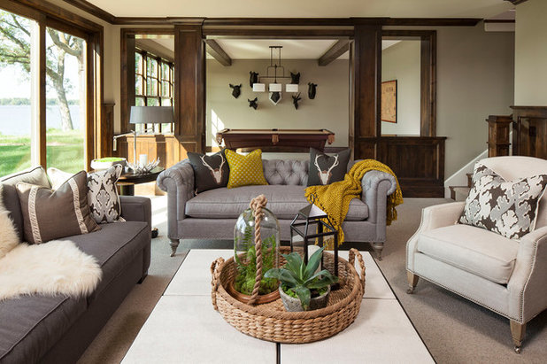
Grey leather upholstery is such a nice change from the more usual black, white or brown. And it goes with anything. This chesterfield-style sofa would be at home in a traditional, modern or eclectic room.
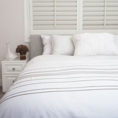
Here’s the ethereal grey and white combo I was talking about earlier. Just like sleeping in a cloud.
10 Things Cluttering Up Your Bedroom – And How to Deal with Them
10 Things Cluttering Up Your Bedroom – And How to Deal with Them
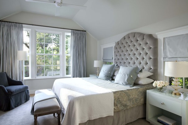
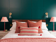
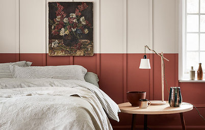
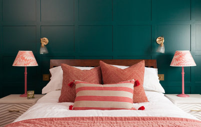
This oversize tufted headboard give this room a regal and commanding presence, but the soft grey keeps it welcoming and comforting.
Romance in grey and creamy white. The wall colour is ICI-Dulux’s Silver Cloud.
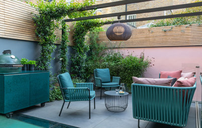
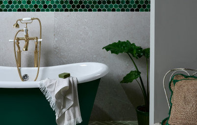
Light Grey to Set Off Colour
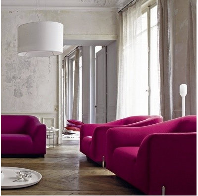
First, these textured plaster walls are just too gorgeous to be true. Second, grey sets off bright pops of colour as well as bright white. Wow, now that’s magenta.
First, these textured plaster walls are just too gorgeous to be true. Second, grey sets off bright pops of colour as well as bright white. Wow, now that’s magenta.
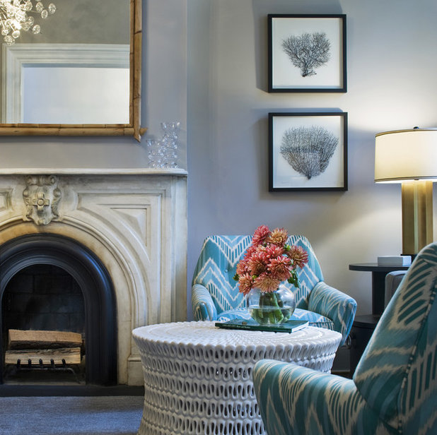
These bright turquoise chairs are set off beautifully by these cool blue-grey walls.
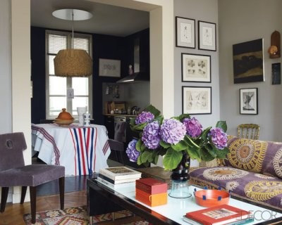
In a wonderfully eclectic room, lots of pattern and colour are balanced by the crisp grey walls and white trim.
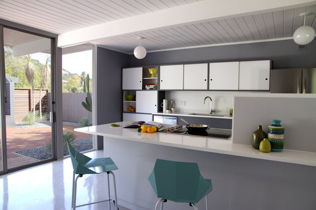
Two shots of turquoise in this very subdued grey and white midcentury kitchen.
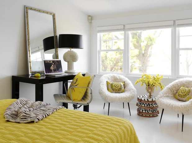
Sunshine yellow and light grey are a match made in heaven. Just think sunshine and rain clouds.
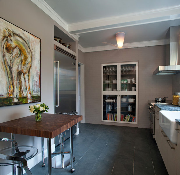
Light Grey in the Kitchen
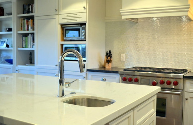
Light grey sets off the texture in marble and goes well with stainless appliances. But look for a warm shade to avoid the laboratory look.
Light grey sets off the texture in marble and goes well with stainless appliances. But look for a warm shade to avoid the laboratory look.
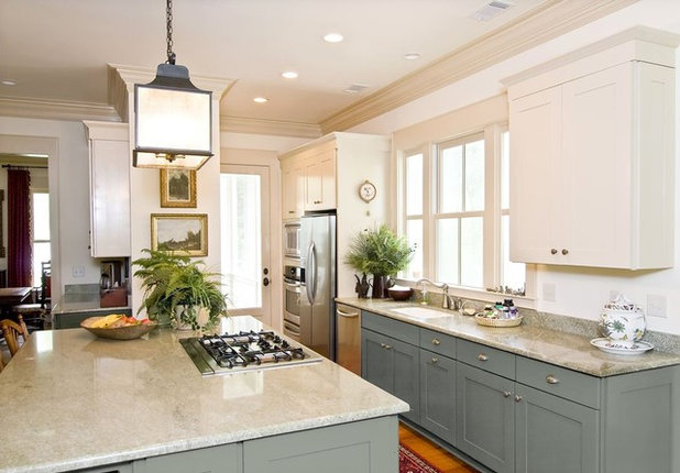
Light grey Shaker-style cabinets are a great way to modernise a traditional look.
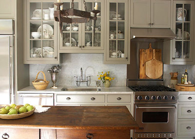
This very warm greige on the upper cabinets gives this kitchen a cosy farmhouse look but is still crisp and modern.

Weathered Wood
Many woods weather to a beautiful silvery grey. These light grey wood floors are an unexpected alternative to the usual brown.
Many woods weather to a beautiful silvery grey. These light grey wood floors are an unexpected alternative to the usual brown.
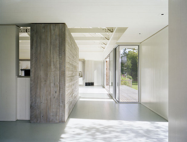
This weathered wood wall adds texture and a hit of nature to a stark white space.
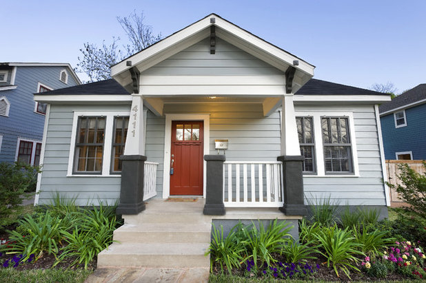
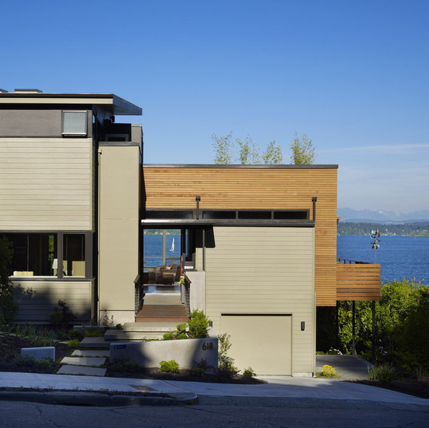
Light Grey Exteriors
A light grey Craftsman home with white, charcoal and red accents.
A light grey Craftsman home with white, charcoal and red accents.
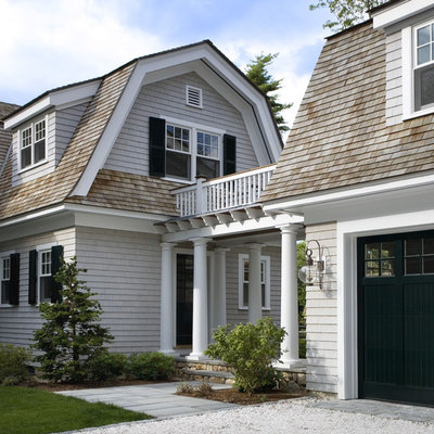
Light grey is the traditional colour of Cape Cod–style houses.
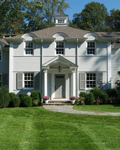
Light grey on a colonial-style home.
This very warm Copley Grey has an earthiness that looks great with wood.

A true light grey. This will appear much darker on the walls. As with any paint, make sure you test the colour on the walls before buying.

A cool silvery grey.

A warm grey with purple undertones.

Benjamin Moore
Pink undertones.

Benjamin Moore
A very pale, almost white grey.
Share photos of your grey interiors in the Comments.
Share photos of your grey interiors in the Comments.


Related Stories

More Rooms
The 5 Most Popular Laundry Rooms on Houzz Right Now
Get decorating ideas for your laundry or utility room from these most-saved photos on Houzz
Full Story
Dining Rooms
The 5 Most Popular Dining Rooms on Houzz Right Now
By Kate Burt
Vintage furniture, great lighting and top tables – feast your eyes on dining room ideas collated from your own clicks
Full Story
Colour
8 Clever Ways to Use Strategic Colour Blocking in Your Home
By Kate Burt
Paint can do so much more than refresh your walls. Explore ways to highlight features, zone areas and trick the eye
Full Story
Utility Rooms
15 Richly Coloured Utility Rooms
The trend for strong, earthy tones has reached the utility room, with hues from plum to ochre to deep green adding depth
Full Story

Kitchens
Which Kitchen Worktop Colour Should You Choose?
By tidgboutique
Consider these popular colours and styles to get the look you want, no matter which material you use
Full Story
Colour
8 Ways to Work a Rust Red and Blue Palette in the Bedroom
By Kate Burt
We’re seeing variations of this combination all over Houzz right now. Check out these tips for trying it yourself
Full Story
Colour
Creative Ways to Make a Feature of Structural Beams
Turn your RSJ into something more than just functional with these clever ideas from our Houzz Tours
Full Story
Gardens
9 Ways to Enjoy Colour in Your Garden All Year Round
By Kate Burt
However your garden grows, you can add colour with hardscaping, furniture and accessories
Full Story
Gardens
What Will We Want in Our Gardens in 2024?
Discover the gardening trends homeowners will be bringing into their outdoor spaces this spring and summer
Full Story
Kitchens
What to Expect at the Biggest Kitchen, Bedroom and Bathroom Show
Plan ahead with our rundown of what’s in store at the kbb Birmingham event this March
Full Story
I'm a real estate agent who sees a lot of Benjamin Moore Light Pewter on new construction and flips. It's a warm gray, ideal with today's white kitchens and bathrooms. And it's lovely with bright white trim.
The way "grey" is discussed in this article makes me think we're not really talking about grey, but rather greyed versions of our entire color wheel. And that's fine, but maybe discussing it that way would help some confused people. I would go so far as to say that the "beige" we are transitioning from is really a pale neutral (browned) sort of yellow, that "greige" is beige with a tiny bit of black thrown in, and now we are opening our minds to all of the color wheel with a little black and white added. And maybe it would help to discuss brown and what it really is. Start with orange, yellow or red. With crayons I made brown with yellow and purple. Complementary colors make brown. Look at cordovan leather and you will see it it basically orange, but that's not how it looks at a distance. In warm light, sure, but in cool light it looks almost purple wine. That's because the colors are layered, not solid.
The same is true of wood. Look at your wood and decide if it is basically yellow, orange, or red. Decide what other colors you have or want in your room. And then choose a greyed version of one of them for your "grey". If you want a complementary color scheme to go with you orange wood, you would choose a blue-grey. An analogous color scheme would call for a warm grey...greige. And there are more choices depending on color scheme. Where would you use a pink grey? A green grey?
A warm grey vs a cool grey splits exactly where the color wheel splits into warm and cool, at green and red. You have warm greens that can be greyed to olive and cool greens that can be greyed to a frost sage. Red can be treated the same. Greyed pink vs greyed apricot...some of these are more appealing in darker grey's, like a medium to dark grey with a touch of red.
Hopefully that will take the mystery out of choosing "grey" for some people.