


Is It Over for Grey?
We fell for it when it was the new neutral and we’ve stuck with it ever since, but have we finally reached peak grey?
Sarah Warwick
26 December 2017
Houzz Contributor. I'm a freelance journalist and editor writing for nationals, magazines and websites. A serial house revamper, I love great design, beautiful interiors and practical solutions.
Houzz Contributor. I'm a freelance journalist and editor writing for nationals, magazines... More
Once upon a time – OK, around seven years ago – grey started its ascent to the interiors throne. What began as a daring choice soon became a staple and grey is still a hugely popular colour, whether we’re talking wall paint, sofas or kitchen cabinetry. But has the time come for grey to relinquish its crown, or is there life in the old shade yet? Let’s read the runes and find out.
Check out the rivals to grey’s throne
The colour: Indigo blue
Why it’s a contender: It’s cocooning
For a room that welcomes you like a hug, a deep, rich blue is hard to beat. It pulls off dark grey’s trick of making a space feel cosy and it’s a calming colour that invites relaxation.
Concerned about the longevity of this trend? Walls in this shade have already proven they’re no fly-by-night fancy, so you won’t have to get the paintbrush out again for a while if you decide to take the plunge.
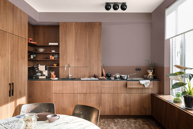
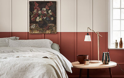
The colour: Pinky-grey
Why it’s a contender: It’s grey, plus warmth
Dulux’s Colour of the Year 2018 is Heart Wood and this, plus other mauves and heathers, are for decorators who’ve fretted about grey looking too cool. The pink element means that threat is avoided, but the tint doesn’t stray into candy territory.
This teaming of wooden cabinetry with pinky-grey is a combination to note if you’re after a kitchen with maximum warmth.
Want to decorate with Dulux’s Colour of The Year 2018? Here’s how to put a little Heart Wood into your home
Here’s another take on pinky-grey. The shade on this shelving is paler – an ultra-sophisticated blush – but like other more mauvey tones, it creates gentle and appealing heat.
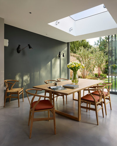
The colour: Green
Why it’s a contender: It’s straight from nature
The green on the wall of this dining space is a subtle olive tone, but it has more colour than a neutral such as grey, so it makes an impact as a backdrop to the pared-back scheme.
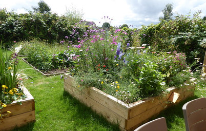
Try green in rooms that lead directly to the garden and have bifold or sliding doors or generous glazing to subtly blend the colours of indoor and out. Quieter shades like this are better for a whole wall, but upholstered furniture also looks good in foliage tints.
Visit the Houzz Shop for dining room updates under £199
Why it’s a contender: It’s straight from nature
The green on the wall of this dining space is a subtle olive tone, but it has more colour than a neutral such as grey, so it makes an impact as a backdrop to the pared-back scheme.
Try green in rooms that lead directly to the garden and have bifold or sliding doors or generous glazing to subtly blend the colours of indoor and out. Quieter shades like this are better for a whole wall, but upholstered furniture also looks good in foliage tints.
Visit the Houzz Shop for dining room updates under £199
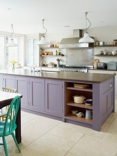
The colour: Purple
Why it’s a contender: It’s on trend for 2018
Pantone, standards provider to the design industry, picked Ultra Violet, aka PANTONE 18-3838, as its colour of the year for 2018. Set that alongside its recent unveiling of a standardised purple to represent rock icon Prince, and you can be sure this shade is going to be a big deal next year.
Ultra Violet is a purple as punchy as they come, but it’s not to everyone’s taste, so how about a softer take on the colour as shown here? It’s a complement to grey – check out the splashback tiles – so you could introduce it to update a painted kitchen without having to change every element of your scheme. Alternatively, follow this example and use it to differentiate an island from the surrounding cabinetry.
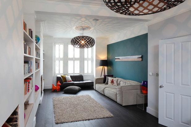
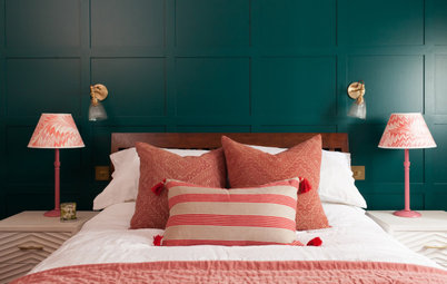
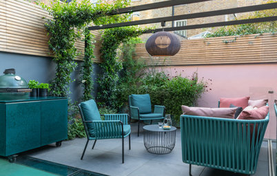
The colour: Teal
Why it’s a contender: It’ll do the feature wall job
White walls all round in a large room can feel stark, and grey’s become a go-to as a feature wall shade to make big spaces feel more intimate. Go for teal and you can get the same effect plus more visual interest.
Why it’s a contender: It’ll do the feature wall job
White walls all round in a large room can feel stark, and grey’s become a go-to as a feature wall shade to make big spaces feel more intimate. Go for teal and you can get the same effect plus more visual interest.
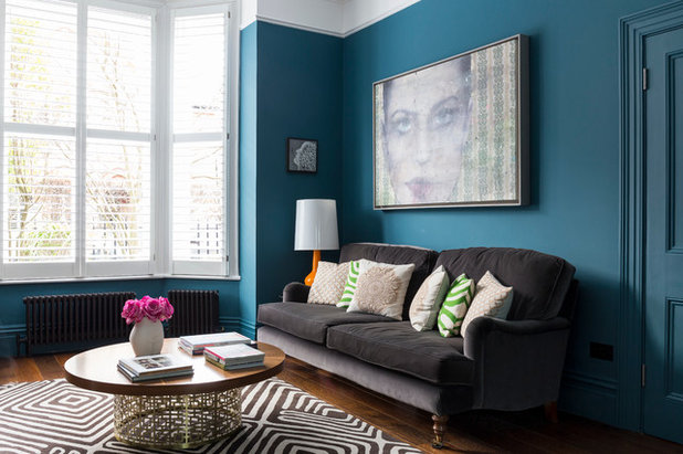
Its not just for single walls. Jewel-like teal can give any scheme a lift and provides a rich depth when used on walls all over or dotted around in soft furnishings.
So, are we really saying goodbye to grey?
There’s no denying the decorative qualities of the alternatives to grey. However, there are also some persuasive arguments for keeping it as part of your palette…
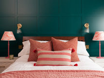
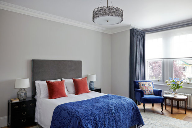
1. It lets colour shine
Looking for a backdrop that allows other shades to stand out? Grey is a natural. This pale grey wall and darker headboard are quiet enough to let blue and orange do the talking where white might be distractingly bright or stark.
There’s no denying the decorative qualities of the alternatives to grey. However, there are also some persuasive arguments for keeping it as part of your palette…
1. It lets colour shine
Looking for a backdrop that allows other shades to stand out? Grey is a natural. This pale grey wall and darker headboard are quiet enough to let blue and orange do the talking where white might be distractingly bright or stark.
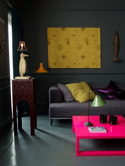
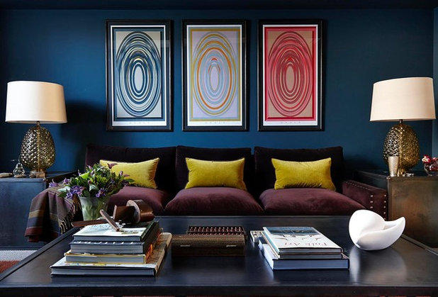
2. It’s instantly contemporary
If black sounds too gothic for your taste, charcoal grey will come to your rescue and create a scheme that’s striking and modern. Team it with fluoro shades, like this coffee table, or let metallics such as gold or brass sparkle.
If black sounds too gothic for your taste, charcoal grey will come to your rescue and create a scheme that’s striking and modern. Team it with fluoro shades, like this coffee table, or let metallics such as gold or brass sparkle.
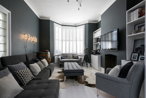
3. It flatters period features
Is your home blessed with the elegant detail of Victorian or Edwardian house building? If so, it will stand out beautifully when painted white against a grey wall, focusing attention on the room’s assets. The prominence of this room’s high skirting board and cornice shows how grey avoids getting into a fight for attention.
Keen to put the character back in your property? Learn how to reinstate period features
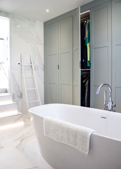
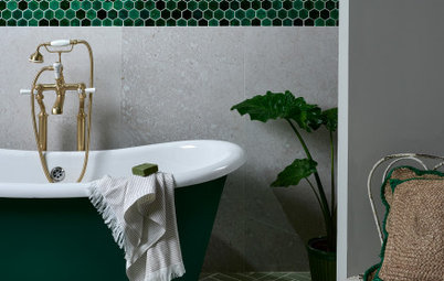
4. It works with stone
A grey-veined stone paired with a grey paint create a pleasing harmony, whether you’re taking a cue from tiles in the bathroom or a worktop or splashback in the kitchen.
In this bathroom, the greeny-grey on the cabinetry – Little Greene’s Pearl Colour Dark – is a perfect partner to the grey-toned tiles on the floor and walls.
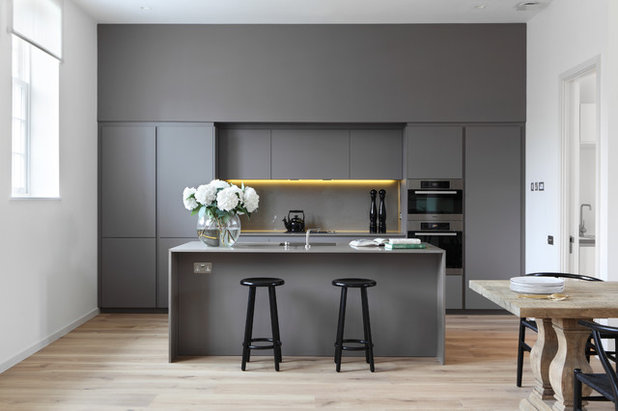
5. It looks great as a block
A wall of super-sleek kitchen cabinetry in grey draws the eye, but could have looked overbearing in a bolder colour. This is a warm version that gives the high-ceilinged space a welcoming atmosphere. A wooden table and flooring bring in organic warmth, too.
Is grey still a decorating favourite for you? Or has it had its moment? Tell us what you think in the Comments section.


Related Stories

More Rooms
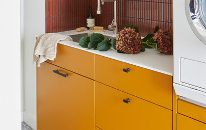
The 5 Most Popular Laundry Rooms on Houzz Right Now
Get decorating ideas for your laundry or utility room from these most-saved photos on Houzz
Full Story
Dining Rooms
The 5 Most Popular Dining Rooms on Houzz Right Now
By Kate Burt
Vintage furniture, great lighting and top tables – feast your eyes on dining room ideas collated from your own clicks
Full Story
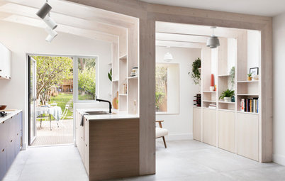
Colour
8 Clever Ways to Use Strategic Colour Blocking in Your Home
By Kate Burt
Paint can do so much more than refresh your walls. Explore ways to highlight features, zone areas and trick the eye
Full Story
Utility Rooms
15 Richly Coloured Utility Rooms
The trend for strong, earthy tones has reached the utility room, with hues from plum to ochre to deep green adding depth
Full Story

Kitchens
Which Kitchen Worktop Colour Should You Choose?
By tidgboutique
Consider these popular colours and styles to get the look you want, no matter which material you use
Full Story
Colour
8 Ways to Work a Rust Red and Blue Palette in the Bedroom
By Kate Burt
We’re seeing variations of this combination all over Houzz right now. Check out these tips for trying it yourself
Full Story
Colour
Creative Ways to Make a Feature of Structural Beams
Turn your RSJ into something more than just functional with these clever ideas from our Houzz Tours
Full Story
Gardens
9 Ways to Enjoy Colour in Your Garden All Year Round
By Kate Burt
However your garden grows, you can add colour with hardscaping, furniture and accessories
Full Story
Gardens
What Will We Want in Our Gardens in 2024?
Discover the gardening trends homeowners will be bringing into their outdoor spaces this spring and summer
Full Story
Kitchens
What to Expect at the Biggest Kitchen, Bedroom and Bathroom Show
Plan ahead with our rundown of what’s in store at the kbb Birmingham event this March
Full Story
Resistance, your situation is dire indeed but without turning HOUZZ into a political platform, all I'll say on the subject is that our weather is being controlled and weaponised... you can hold a country to ransom if you control their weather... and the technological invasion into our homes which sounds good and useful, is in fact, part of an Orwellian agenda...
Denise LaTart indeed. There have been some very useful tips on here in that regard and the post about how to get the most out of life, enjoy the little things and give our house a holiday flavour was delightful. Small changes in our homes, not necessarily expensive ones, can indeed make a difference...
As
Jill Taylor said:
"Chose
colours you like for your home rather than being a slave to fashion
and picking a colour because it's 'on trend'! Try to have some
individuality and let your own personality shine through - it's your
home after all and should reflect you. Go for longevity - if
something is on trend now, it will be 'off trend" (is that a
thing? Lol) tomorrow. So chose colours you love instead."
and
Lloollaa added:
"I
do hope so (that it's over for grey.) Grey is depressing, rather
than calming, and really not good for the mind or the soul, a very
poor colour to live with."
And
Jane agreed:
“I
hope so - it’s grey and dreary outside - why would you want that in
your home as well?”
Three
ladies after my own heart! Very well said!!!