Decorating
10 Calming Colour Schemes and How to Recreate Them at Home
If you’re looking for a soothing colour scheme and are wondering where to begin, take inspiration from these rooms

Colour can have a huge effect on our mood, so if you want to create a calm, tranquil space it’s important to choose the right shades. Check out these gorgeous room schemes and find out how to design a beautiful, zen-like interior.
… or opt for neutrals with warm tones
Warm neutrals tend to be those with brown, lilac or pinkish tones, and for those who prefer to keep things simple, this is a lovely colour combination.
As with cool neutrals, the trick is to think in terms of both hard and soft finishes and to layer different colour depths and tones. Here, the pale walls and joinery details are balanced by the deeper grey of the sofas.
More ideas on how to do neutrals with attitude
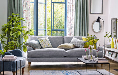
Be seen with blue and green
Chosen with care, blue and green is a match made in decorating heaven. Here, a soft blue and dark green are offset by mid browns in the flooring and the grasscloth backing on the shelves.
To help you get the perfect shade, find an item or picture in the colour you like – or even print out this photo – and take it to a DIY store with a paint-matching service.
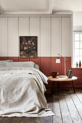
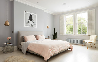
Dabble with jewel tones
Red and green, used sparingly, can impart a light, airy feel, as seen in this pretty cottage bedroom. Choose rich, jewel-like tones, such as ruby and emerald, and pair them with ice blue walls and pale wood tones. This combination works well, as the cool hues in the blue are warmed up by the red.
Discover the perennial appeal of duck egg blue
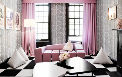
Combine icy mint with dramatic black
Contrasting shades can work together to create a stunning effect. The dramatic lacquered headboard and black lampshade here have been given a feminine feel by the colours around them. Injections of cool, minty blue and vibrant orange lift the dark tones to create a fresh feel.
Contrasting shades can work together to create a stunning effect. The dramatic lacquered headboard and black lampshade here have been given a feminine feel by the colours around them. Injections of cool, minty blue and vibrant orange lift the dark tones to create a fresh feel.
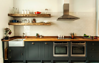
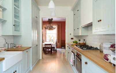
Embrace soothing browns and blues
A classic combination of blue and brown is a good, safe choice, as it imparts a subtle shot of interest while being universally easy on the eye. Here, shades of indigo and teal have been used together to give a soft country look.
This demonstrates that blue is also one of the easiest colours to layer up in different depths and tones.
Team sea greens with earth browns
Soft green-blues, reminiscent of the sea, and earthy brown-greys work wonderfully well together. In a dark space, they provide a warm, cosseting effect, and where light is more abundant, they positively glow.
Soft green-blues, reminiscent of the sea, and earthy brown-greys work wonderfully well together. In a dark space, they provide a warm, cosseting effect, and where light is more abundant, they positively glow.
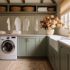
Mix sage with dusky lilac
Green and purple are often used together, and can be a dramatic combination. To prevent the scheme looking stark, choose muted shades of sage and lavender, such as the ones shown here. The heather-toned wool curtains look soft and restful against the sage walls.
Green and purple are often used together, and can be a dramatic combination. To prevent the scheme looking stark, choose muted shades of sage and lavender, such as the ones shown here. The heather-toned wool curtains look soft and restful against the sage walls.
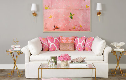
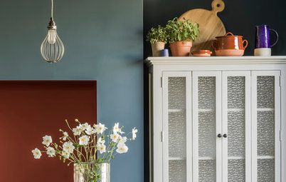
Warm up pink with natural tones
Add warm tones to a modern room with pink and earthy hues. Here, a simple feature wall of icy pink offsets the stone-based neutrals in the rest of this open-plan space. The added shades of terracotta, green and mustard stop the pink from looking too sugary.
Which of these colour combinations do you prefer? Share your thoughts in the Comments below.


Sponsored
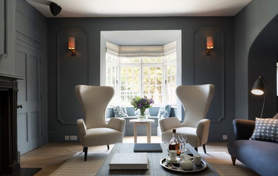
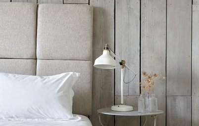
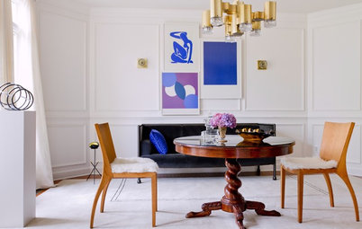
At the risk of telling you something you already know, cool neutrals are generally those that strike us as crisp and fresh. Here, shades of cool grey and taupe balance the use of icy white and elevate basic neutrals.
Hard finishes, such as wallpaper and paint, complement the soft upholstery to create a clean, restful scheme.