7 Not-So-Traditional Palettes That Still Feel Like Christmas
Take a look at last-minute Christmas decor inspiration that’s not red and green
Lisa Batson Goldberg
18 December 2017
I just love the holidays, but truth be told, I’ve never felt that inspired by the traditional holiday colors, red and green. Instead, I prefer to play around with other color schemes when decorating my home for the holiday season.
In my professional work as a designer, I also find that my clients want to mix it up and break from tradition. By using other colors, we’re able to bring energy, life and joy into the home, and aren’t those exactly the types of feelings we are trying to evoke during the holidays anyway?
If you have some last-minute decorating to do before Christmas, take a peek at these seven color options that aren’t red and green but that still capture the magic and beauty of the season.
If you have some last-minute decorating to do before Christmas, take a peek at these seven color options that aren’t red and green but that still capture the magic and beauty of the season.
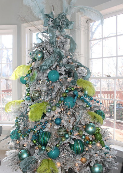
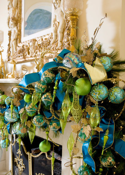
1. Blue and green. Because blue and green are regularly used together in everyday looks, they can be the perfect place to start when branching out (pun intended) from the traditional red and green used for Christmas.
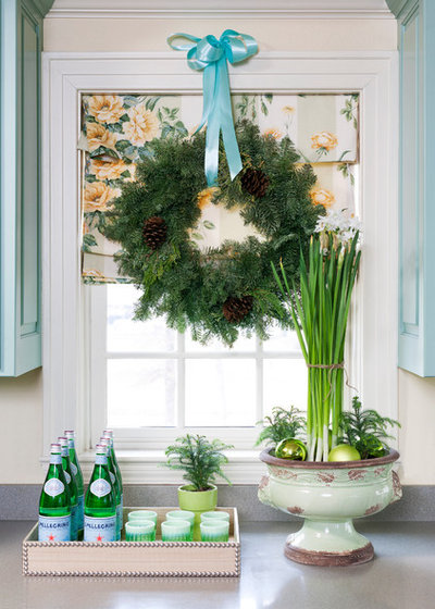
Blue is likely not the first color you think of when it comes to Christmas cheer. But it is a color many of us are comfortable with. Then you have green, which is often used for traditional holiday decor, particularly because of the focus on trees, garlands and other natural elements.
The two colors feel comfortable together, but the pairing still breaks from tradition.
The two colors feel comfortable together, but the pairing still breaks from tradition.
Get creative when choosing the shades of blue and green you’d like to feature. You can use lighter shades for a fresh, playful and even whimsical feel.
Or choose brighter, richer and more vibrant tones of blue and green to create a warm, welcoming and energizing space.
Some of my favorite blues and greens for holiday decor are baby blue, teal and lime green.
Some of my favorite blues and greens for holiday decor are baby blue, teal and lime green.
2. Navy and gold. This dramatic color palette makes any space more glam. Navy is rich and dark, and gives off a relaxed and cool feel. Gold, on the other hand, is hot, vibrant and sparkly. Together, they make any setting look lush.
For the best results, create a navy base in the room and add dots of shimmering gold, whether you do that by choosing a few shiny ornaments or wrapping your gifts in sheets of gold paper.
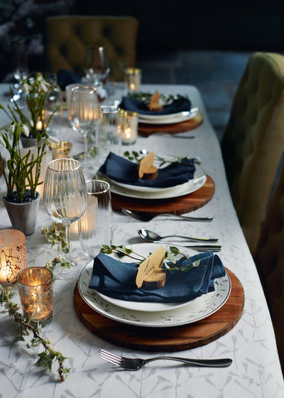
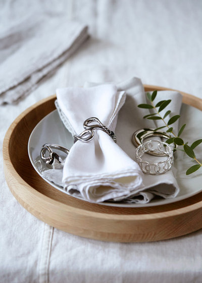
Navy and gold also work well together at your winter dining table. Use navy table linens, such as napkins or a tablecloth. Then sprinkle gold elements around the table in the form of candleholders, napkin rings, decor or flatware. Your tabletop will feel much more sophisticated and festive right away.
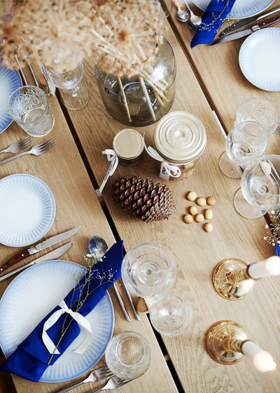
Build upon the color palette by introducing natural elements, such as pine cones, twigs and branches. You can use them as they are, or you can spray-paint them to punch up the color.
3 Holiday Tablescape Looks to Try
3 Holiday Tablescape Looks to Try
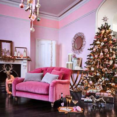
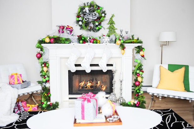
3. Pink and metallics. If you love to go big with color, pink might be your perfect pick for the holidays.
Pink is happy, whimsical and fun, and it pairs well with pretty much any color.
Pink is happy, whimsical and fun, and it pairs well with pretty much any color.
Jewel-toned pink works really well with shiny metallic finishes and creates a joyful and vibrant holiday home — inside and outside.
If you’re not quite ready for a whole room of pink, choose small pink items or use pink gift wrap to brighten up the space around your tree. If you’re going to spend time wrapping presents, you might as well make them part of your holiday decor.
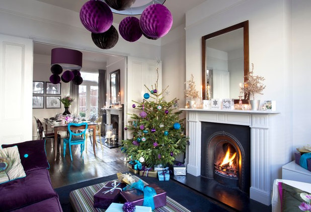
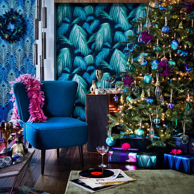
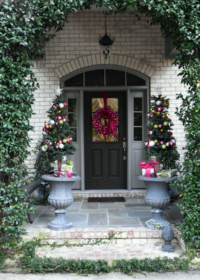
4. Purple and blue. Purple really packs a punch when it comes to dramatic decor and creates a warm, inviting and lush living space. In this home, the orbs at the ceiling catch your attention. And then, as you look more closely, you can find other dots of purple and blue on the gifts and tree.
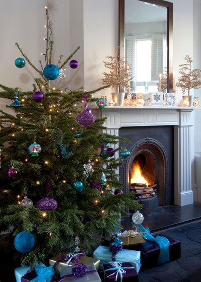
Purple is more of an unconventional holiday color, so pairing it with familiar blue helps give the room a friendly, welcoming look.

While purple holiday accents look stunning on their own, they can also work beautifully with more conventional holiday colors, such as the dark green of a Christmas tree. Inserting purple into the color palette is a great way to diversify it without moving too far out of your color comfort zone.
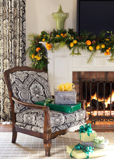
5. Yellow and orange. Yellow and orange are definitely outside the proverbial box when it comes to holiday colors. Nevertheless, this bright color combo is a fabulous choice for a creative and contemporary color palette that will give your home a happy vibe.
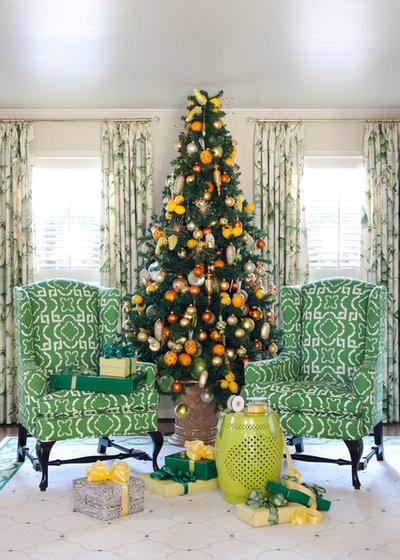
These sunshiny shades also add warmth and comfort to holiday celebrations, as we often associate these colors with warmer, brighter and sunnier months. And who doesn’t want more warmth on the shorter days during the cold, snowy holiday season?
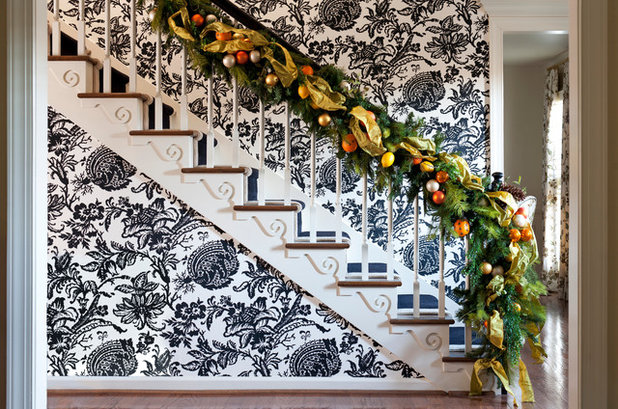
These two colors also work nicely with holiday garland. With the citrus added, this entry has a more lighthearted and inviting look.
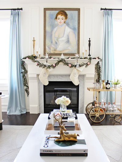
6. White and metallics. If you’re looking for more minimalist but equally dreamy holiday home decor, think white. This look works well in homes that already have a neutral color palette. The layer of white with accents of pearl, gold, or even rose gold warms up the room and provides an air of calm.

White creates a streamlined and peaceful feel when used in decor. Particularly around this magical holiday season, I find that using white and metallics really helps to capture that wondrous feel of the holidays.
2 Looks for Your Christmas Tree, With DIY Garlands
2 Looks for Your Christmas Tree, With DIY Garlands
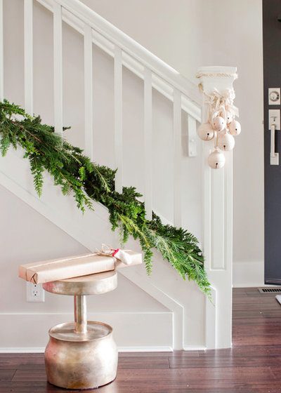
A clean and simple living space really does make us feel happy and at ease, so using this approach with your holiday decor can keep you feeling calm and cool in this hectic holiday season. You don’t need to deck every inch of the hall or staircase. A simple bunch of metallic bulbs and a line of greenery will do the trick.
A tablescape is also a prime place to use this color palette. You can use metallics to dress up a light-colored or neutral table and bring a bit of glamour, energy and fun to your holiday dinner.

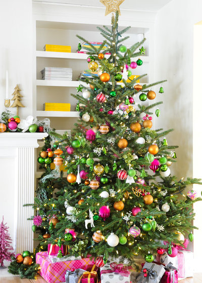
7. The rainbow. If you’re looking to add more color this holiday season, who says you need to stop at just one or two colors?
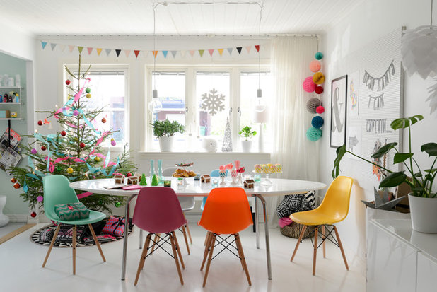
By exploding the rainbow, you can really think outside red and green. It also means that you can look to more generic decor to create your holiday vision, instead of being limited to using traditional holiday items.
Holiday DIY: A Colorful Pompom Garland
Holiday DIY: A Colorful Pompom Garland
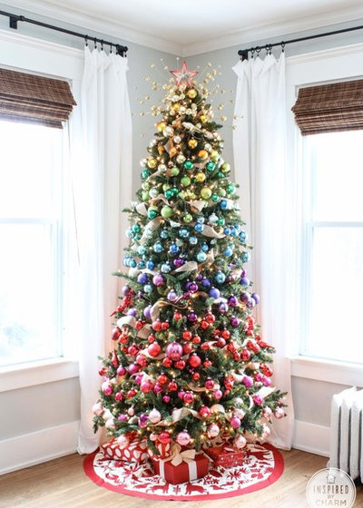
Multicolored holiday decor will make the most impact when used in a predominantly white or neutral living space. Because this tree, which transitions from gold to pink, has a white backdrop, you can really appreciate the effort that went into the ornament placement.
Your turn: What colors did you use this year to decorate for the holidays? Share a photo with us in the Comments.
More
Color and Decor Ideas From 11 Merry Holiday Home Tours
Read more holiday decorating and DIY stories
Shop for holiday decorations
Your turn: What colors did you use this year to decorate for the holidays? Share a photo with us in the Comments.
More
Color and Decor Ideas From 11 Merry Holiday Home Tours
Read more holiday decorating and DIY stories
Shop for holiday decorations


Related Stories
Kitchens
10 Smart Storage Tips for Your Kitchen Bins
Keep kitchen rubbish stylishly tucked away with these clever solutions
Full Story

More Rooms
The 5 Most Popular Laundry Rooms on Houzz Right Now
Get decorating ideas for your laundry or utility room from these most-saved photos on Houzz
Full Story
Gardens
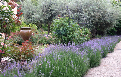
How Do I Create a Drought-tolerant Garden?
By Kate Burt
As summers heat up, plants that need less water are increasingly desirable. Luckily, there are lots of beautiful options
Full Story

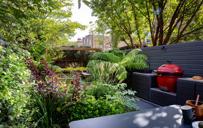
Houzz Tours
Houzz Tour: Warm Tones and Luxurious Surfaces in a City Townhouse
An earthy colour palette, hidden storage and well-placed texture add character and practicality to this London home
Full Story
Gardens
5 Inspiring Before and After Garden Transformations
Check out what a difference designers have made to these once dull plots, visually expanding spaces and creating privacy
Full Story

Houzz Tours
Kitchen Tour: A Gorgeous Extension With a Leafy Glasshouse Feel
By Kate Burt
When the owners of this terraced house extended, they were keen to retain its period feel and highlight the garden
Full Story

Gardens
How to Disguise Rubbish and Recycling Bins Outside Your Home
Need to hide unsightly bins in your garden or driveway? Take a look at these clever ideas for inspiration
Full Story
Renovating
21 Ways Designers Are Incorporating Arches Into Homes
By Kate Burt
Everywhere we look on Houzz right now, a cheeky arch pops up. How would you add this timeless architectural feature?
Full Story
Lifestyle
How to Improve the Air Quality in Your Home
Want to ensure your home environment is clean and healthy? Start by assessing the quality of your air
Full Story

Gardens
Garden Tour: A Bare Roof Terrace Becomes a Pretty, Sociable Space
By Kate Burt
A retired couple got help transforming their large rooftop into a gorgeous, welcoming, multi-functional retreat
Full Story
Beautiful!
@LBG Interiors Thank you!
Your color combination and designs are beautiful and vibrant. I love them.