7 Tips for Picking Colors With Staying Power
Worried that your paint choices will be out of style before the walls dry? Follow these steps for a trend-proof palette
tidgboutique
28 September 2016
Toronto Interior Design Group is a trusted one-stop-shop residential interior design concierge boutique-style firm crafting timeless interiors.
Toronto Interior Design Group is a trusted one-stop-shop residential interior design... More
Jumping on a popular-color bandwagon for your home can be thrilling and fun — until all of a sudden you grow tired of or even irritated by the same color you thought was a good idea to splash everywhere. Taking a little color risk is great, and something I highly recommend, but there are ways to prevent yourself from going overboard and succumbing to trend remorse. Here’s how to create a palette that can absorb and evolve with color trends you want to try.
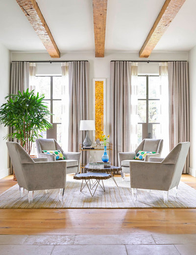
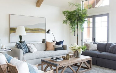
1. White and neutrals. One of the best ways to avoid color trends is of course to avoid wild colors altogether. A palette of pale neutrals is as close to time-proof as you can get, especially if you use a lot of classic white.
A neutral palette doesn’t have to be boring, either. Include rich textures (like woods and plush fabrics) and subtly different neutral shades to give a space life without introducing any dramatic hues that may or may not stand the test of time.
A neutral palette doesn’t have to be boring, either. Include rich textures (like woods and plush fabrics) and subtly different neutral shades to give a space life without introducing any dramatic hues that may or may not stand the test of time.
For a while now, stark ultrawhite has been the ultimate in fashion, but the tides are turning back to slightly warmer whites, and this can be expected to last for years to come. Cool and warm whites can suit whatever color scheme you might find yourself craving down the road, so they’re a safe bet either way for walls, cabinetry and other large surfaces.
Stark white to try: Distant Gray, Benjamin Moore
Subtle warm white to try: Simply White, Benjamin Moore
Stark white to try: Distant Gray, Benjamin Moore
Subtle warm white to try: Simply White, Benjamin Moore
2. Keep your cool. When you’re ready to dip your toe into some nonneutral hues, the best long-term bet is always going to be on the cooler side of the color spectrum — that is, greens, blues and blue-purples. Reds, red-violets, oranges and yellows, no matter the shade, will never be timeless the way their cooler counterparts are.
This may be because fiery colors feel more passionate and vivid, and therefore we tire of them more quickly. It’s hard to say definitively why, but hot hues always become a thing of the past much faster.
This may be because fiery colors feel more passionate and vivid, and therefore we tire of them more quickly. It’s hard to say definitively why, but hot hues always become a thing of the past much faster.
Specifically, shades of blue tend to be the most enduring of all the hues you can choose, with the color on the opposite side of the color wheel — orange — being the most associated with flash-in-the-pan trends.
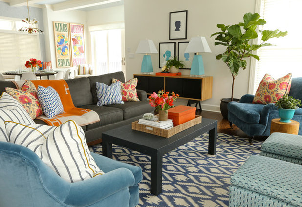
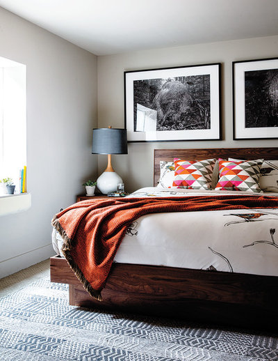
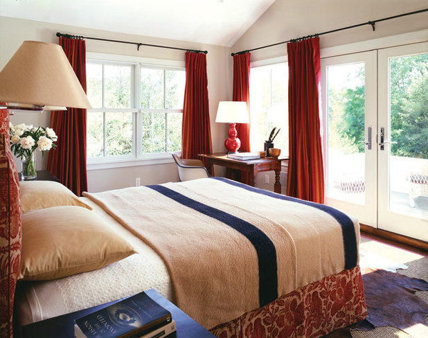
This doesn’t mean, of course, that you should never dare to dabble in a hot hue again. But it does mean you may want to save reds and oranges for lower-commitment accent pieces, and look to cool hues for big-ticket items, as was done with the blue upholstery and orange accessories here.
This doesn’t mean, of course, that you should never dare to dabble in a hot hue again. But it does mean you may want to save reds and oranges for lower-commitment accent pieces, and look to cool hues for big-ticket items, as was done with the blue upholstery and orange accessories here.
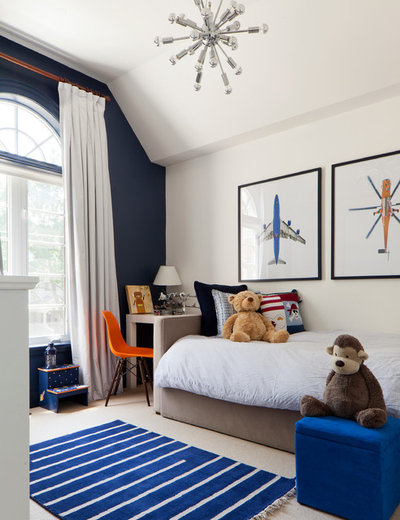
A great aspect of blue in particular is that it works well tone-on-tone, with dark shades like navy and royal blue working well with lighter and brighter shades, complementary colors or simply one another.
Ageless navy to try: Drawing Room Blue, Farrow & Ball
Ageless navy to try: Drawing Room Blue, Farrow & Ball
3. Embrace opportunity. So, strict blue-on-blue isn’t for you? There are other ways to add dramatic colors without feeling like you’re stuck with yesterday’s trend down the road.
Take the opportunity to choose a risky hue for pieces that will naturally have to be replaced someday anyway. Items that receive a lot of wear and tear (sheets, towels, dishware and the like) are great starter items for trying out a bold color choice and seeing how it holds up.
Take the opportunity to choose a risky hue for pieces that will naturally have to be replaced someday anyway. Items that receive a lot of wear and tear (sheets, towels, dishware and the like) are great starter items for trying out a bold color choice and seeing how it holds up.
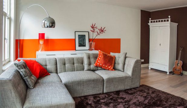
Alternatively, dedicated DIYers can add hot colors via painted accent walls, accepting in advance that in the future these may need to be painted over to suit your changing tastes.
One accent wall, or even a half wall, can go a long way toward completely transforming the mood of a space, and paint is relatively inexpensive, so this can be a great way to change up a look often.
One accent wall, or even a half wall, can go a long way toward completely transforming the mood of a space, and paint is relatively inexpensive, so this can be a great way to change up a look often.
Repeating one color a few times in small ways can make it seem like a lot more color than you’re really committing to, so the occasional update doesn’t have to be a huge undertaking. Pick up the color of linens or pillowcases in a floral arrangement, and you’ll have a vibrant look even if the big-ticket items are all neutrals.
Go-with-anything gray to try: Seal Grey, Glidden
Right-now pink punch to try: Rose Quartz, Pantone
Go-with-anything gray to try: Seal Grey, Glidden
Right-now pink punch to try: Rose Quartz, Pantone
4. Add sophisticated spice. Don’t want fly-by-night color? To add lasting heat to your home’s palette, try introducing vivid hues in pieces that have a rich texture. This gives the color a natural variation that allows more life and longevity than a stark application like paint.
Notice how completely different this orange-red blanket looks compared to the bold orange painted wall two photos above. A quality fabric gives a bold color a high-fashion air that helps it feel timeless, so consider investing in a few great accessories instead of endless inexpensive baubles.
Notice how completely different this orange-red blanket looks compared to the bold orange painted wall two photos above. A quality fabric gives a bold color a high-fashion air that helps it feel timeless, so consider investing in a few great accessories instead of endless inexpensive baubles.
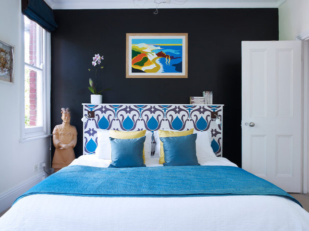
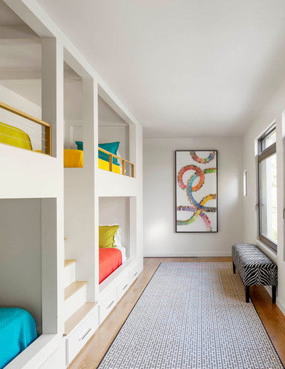
You can also add wild hues in a sophisticated way through worldly elements like artwork and exotic patterns. This evocative painting will be beautiful for years to come, and can always be used as a reference for pulling new colors for accessories like pillows and throws.
Haute orange to try: Calypso Orange, Benjamin Moore
Well-traveled blue to try: Splish Splash, California Paints
Haute orange to try: Calypso Orange, Benjamin Moore
Well-traveled blue to try: Splish Splash, California Paints
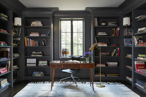
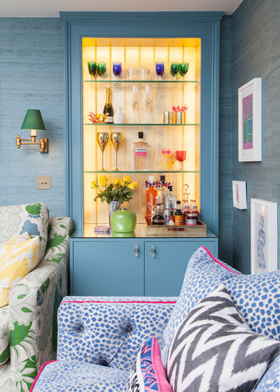
5. Sometimes more is more. Although it may be counterintuitive, sometimes the best way to fight color trends is by simply adding more color. If a room features just one hue that then becomes passé, the whole room feels dated. When a color palette is rich and complex, no single hue becomes the crux of the entire design.
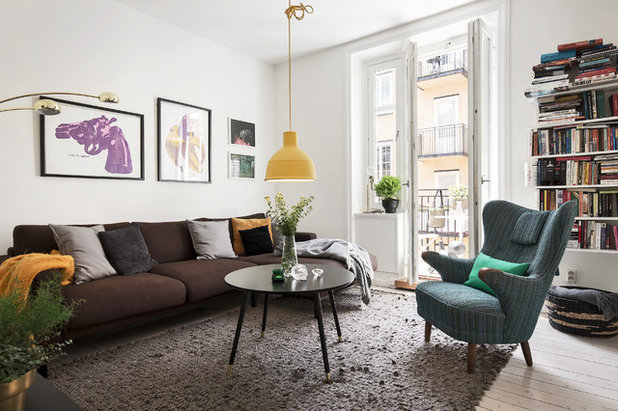
Rather than choosing a dominant color, try using each hue in roughly equal amounts, so the mixture feels balanced despite being so diverse.
Shelves of books or other small mementos can go a long way toward introducing little hits of color. Also try a plug-in pendant in a vivid yellow or red to add punch to the center of the room.
Shelves of books or other small mementos can go a long way toward introducing little hits of color. Also try a plug-in pendant in a vivid yellow or red to add punch to the center of the room.
6. Take on a time-tested look. The best way to make sure a color combination will last for decades to come? Choose one that has already stood the test of time. By drawing on a classic look from past decades that still feels beautiful today, you can virtually guarantee the scheme will hold up in the future.
For example, a nautical red-and-blue combination (tempered with a sandy beige) will look stylish eternally. You can commit fully to the whole look (life preservers and oars hung on the wall and all) or simply apply the color palette to a set of contemporary furnishings.
For example, a nautical red-and-blue combination (tempered with a sandy beige) will look stylish eternally. You can commit fully to the whole look (life preservers and oars hung on the wall and all) or simply apply the color palette to a set of contemporary furnishings.
By doing a little research into the architectural style of your home (or your favorite furnishings) and choosing heritage colors from that period, you can create a cohesive look that reflects the best of a classic design aesthetic. Grab a photo book on historic homes from the library and take it with you to a paint store to find colors that truly reflect a period style.
Soft traditional green to try: Vert de Terre, Farrow & Ball
Beachy beige to try: Adobe Sand, Behr
Soft traditional green to try: Vert de Terre, Farrow & Ball
Beachy beige to try: Adobe Sand, Behr
7. Know yourself. Ultimately, the best way to trend-proof your color scheme isn’t to change your colors, but to change how you feel about trends. No matter what a designer may tell you, no single color can ever be truly 100 percent trend-proof. Fads come and go no matter what, and even the most inoffensive hues might feel passé someday. However, if you choose hues you truly love, no matter whether they make one subtle statement or an edgy color collage, you will never have to compromise to fit someone else’s idea of what’s fashionable.
More
Houzz TV: How to Paint a Wall Faster
Taste a Rainbow: 11 Top Home Decorating Colors and How to Use Them
How to Give Neutral Paint Colors a Subtle Jolt
More
Houzz TV: How to Paint a Wall Faster
Taste a Rainbow: 11 Top Home Decorating Colors and How to Use Them
How to Give Neutral Paint Colors a Subtle Jolt

Related Stories

Houzz Tours
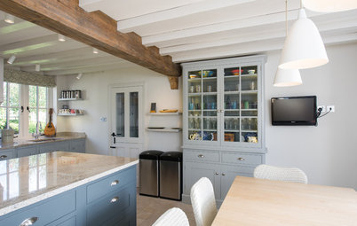
Houzz Tour: A Midcentury Home With a Strong Indoor-outdoor Link
By Becky Harris
A nature-inspired renovation has given this ranch house a relaxed mood and a connection to the outdoors from most rooms
Full Story
Kitchens
10 Smart Storage Tips for Your Kitchen Bins
Keep kitchen rubbish stylishly tucked away with these clever solutions
Full Story

More Rooms
The 5 Most Popular Laundry Rooms on Houzz Right Now
Get decorating ideas for your laundry or utility room from these most-saved photos on Houzz
Full Story
Gardens
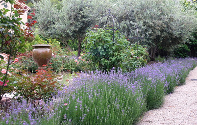
How Do I Create a Drought-tolerant Garden?
By Kate Burt
As summers heat up, plants that need less water are increasingly desirable. Luckily, there are lots of beautiful options
Full Story

Houzz Tours
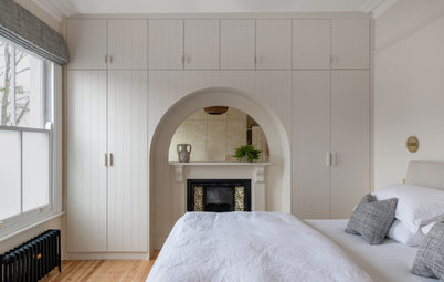
Houzz Tour: Warm Tones and Luxurious Surfaces in a City Townhouse
An earthy colour palette, hidden storage and well-placed texture add character and practicality to this London home
Full Story
Gardens
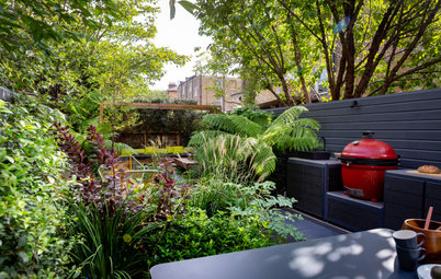
5 Inspiring Before and After Garden Transformations
Check out what a difference designers have made to these once dull plots, visually expanding spaces and creating privacy
Full Story

Houzz Tours
Kitchen Tour: A Gorgeous Extension With a Leafy Glasshouse Feel
By Kate Burt
When the owners of this terraced house extended, they were keen to retain its period feel and highlight the garden
Full Story

Gardens
How to Disguise Rubbish and Recycling Bins Outside Your Home
Need to hide unsightly bins in your garden or driveway? Take a look at these clever ideas for inspiration
Full Story
Renovating
21 Ways Designers Are Incorporating Arches Into Homes
By Kate Burt
Everywhere we look on Houzz right now, a cheeky arch pops up. How would you add this timeless architectural feature?
Full Story
Lifestyle
How to Improve the Air Quality in Your Home
Want to ensure your home environment is clean and healthy? Start by assessing the quality of your air
Full Story
This is very true KK15 and I think this can be attributed to the historical nature of much of the architecture. I've rarely seen much colour used in contemporary European/UK architecture - when was the last time you saw anything but a neutral palette on Grand Designs? The trend for neutral interiors seems to stem from the mid 20th century and so tends to dominate current interior design.
IIRC, Queen Alexandra (Edward VII's wife) began a vogue for white or pale walls during the Edwardian era (or slightly before).