


8 Hallway Colours That Aren’t White or Grey
Let these colour-confident schemes inspire you to move your hall out of neutral
Kate Burt
29 August 2019
Houzz UK. I'm a journalist and editor, previously for the Independent, Guardian and various magazines. I'm now excited to part of the editorial team at Houzz UK & Ireland, bringing the best of British and Irish design, interiors and architecture to Houzz.com.
Houzz UK. I'm a journalist and editor, previously for the Independent, Guardian and... More
According to the Houzz photo search function, white and grey are some of our favourite hallway colours, but they’re not the only hues in town. Take a look at these colourful examples and see if they inspire you to go for bold.
This article is from our Most Popular stories file
This article is from our Most Popular stories file
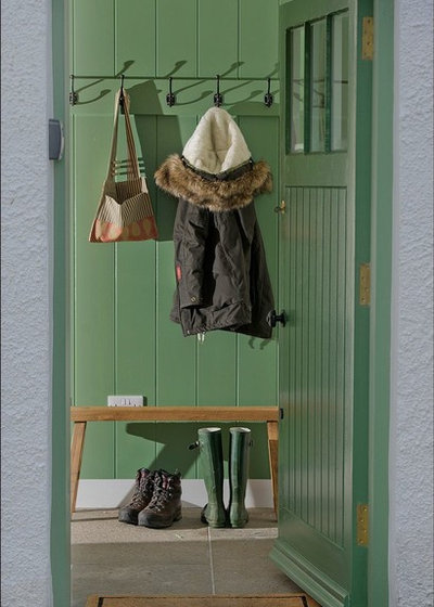
Go green
This rich pine tree green conjures up images of forest walks. What a soothing environment to greet you as you arrive home. Perhaps it’s the reference to nature that helps the colour green invoke feelings of calm (green isn’t used in healthcare settings for nothing).
Here, mixing it with white woodwork gives this a classic finish, perfect for a period property wanting to nod to its historical credentials.

Perk up with pink
While green soothes the senses, ‘hot’ colours, such as pinks, reds and oranges, are said to be energising. Here, the classic clash of pink and red has been employed to give the mid-tone walls even more impact. (By the way, it’s a myth that pink and red shouldn’t be paired up – and here’s the proof.)
Stripped wooden floorboards and classic white paintwork keep the effect of combining these vibrant colours elegant rather than quirky.
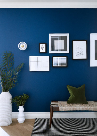
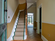
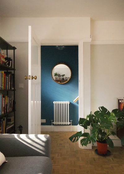
Dabble with dark blue
Hallways are often rather light-starved, and we tend to shy away from dark colours in the worry they’ll make them dingier still. However, choose a vibrant deep shade and you can enhance the space.
Here, the rich blue has a luminous quality and the brightness makes it a colourful wall rather than a dark one. In spaces with little natural light, brights can be better than whites, which can take on a dull, grimy appearance rather than opening up the area.
Find the best local painter and decorator for your job on Houzz.
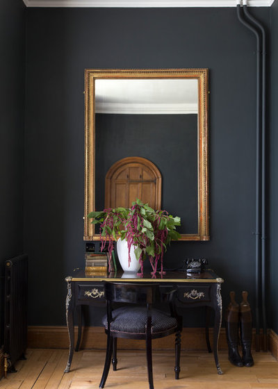
Embrace black
Where you really don’t have much hope of lightening up your hall, however, try going really dark. This almost black scheme celebrates the intimate space a dark hallway can be. Hanging a large mirror will reflect the light you do have available and add a feeling of space.
Where you really don’t have much hope of lightening up your hall, however, try going really dark. This almost black scheme celebrates the intimate space a dark hallway can be. Hanging a large mirror will reflect the light you do have available and add a feeling of space.
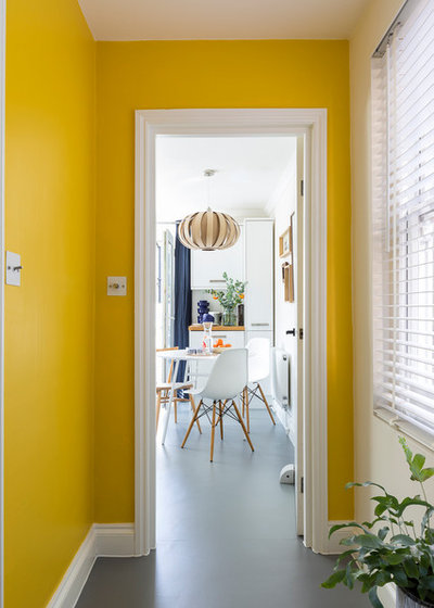
Make it sunny side up
Research by the University of Manchester has put yellow at the top of the happy tree, so for a feel-good homecoming, this cheery colour is worth considering.
Before you look at the beautifully light space pictured here and despair that you could never recreate the look in your dark hallway, remember your new mantra: gloomy spaces don’t have to be painted in pale colours! Counterintuitive as it may seem, they can really be lifted and warmed by bright hues.
Tie in with teal
Interior designers will often talk of a home having a palette. You may have a house full of different colours, but in a well-designed interior, they will all have a connection to one another.
The colour of your hallway and landing is perhaps one of the trickiest spaces to get right, as there are numerous doors opening into other rooms, meaning the various colours will be viewed together.
A colourful hallway could be the perfect complement to neutral main rooms. Let this gorgeous soft teal and pale grey combination inspire you – the colours complement rather than fight each other.
Of course, the success of any paint colour depends on the light, and in a hallway, that can vary hugely as you move through the space and up to the landing, so it pays to test with a variety of shades first.
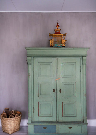
Take it easy with lilac
A soft lilac is a gentle way to bring colour into your hallway, especially in a velvety matt version like this lime paint.
You can enhance the colour on your hallway walls with similarly colourful furniture. Painting pieces, like this freestanding cupboard, in a complementary colour is an interesting way to build a palette in a space.
The lilac and minty green colours here work together so well because they’re equal in tone – a little design rule that’s the secret behind many successful colour pairings.
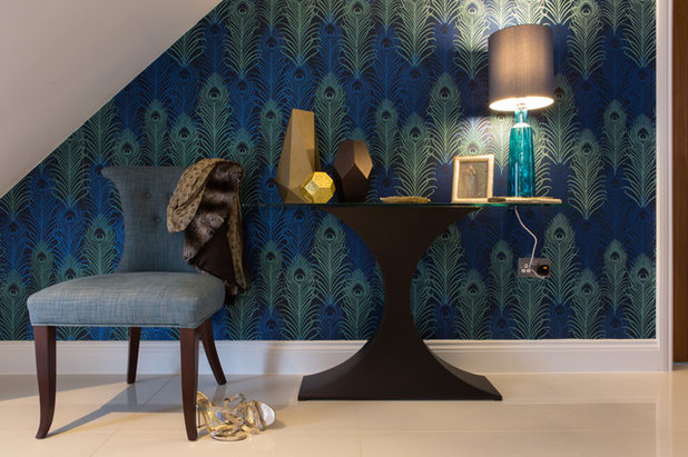
Colour with wallpaper
Paint isn’t the only way to brighten your hall walls – wallpaper can work equally well, especially if you prefer a mix of colours, or can’t settle on a single shade.
Here, a peacock feather paper combines deep greens and blues. Again, the space is not full daylight and the use of these rich, jewel tones illustrates just how well rich colours can work to cosy up the space.
Tell us…
What colour is your hallway painted – and do any of these homes inspire you to redecorate? Share your thoughts in the Comments section.


Related Stories
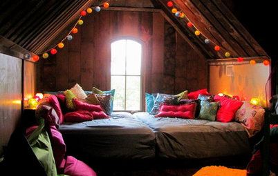
Lofts
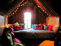
Lofts: Aim High and Fall in Love With Your Attic
By Lara Sargent
We could all use an extra room, so why not look to your loft and transform the space in your roof into something fabulous?
Full Story
Utility Rooms
How to Stylishly Integrate a Laundry Space
By Jo Simmons
With their practical role, utility rooms are often designed with function rather than form in mind, but it doesn’t have to be that way...
Full Story

Utility Rooms
The 5 Most Popular Laundry Rooms on Houzz Right Now
Get decorating ideas for your laundry or utility room from these most-saved photos on Houzz
Full Story
Living Rooms
8 Mistakes to Avoid in Your Small Living Room
Swerve these common design errors to make a big impact in your compact sitting room
Full Story
Dining Rooms
The 5 Most Popular Dining Rooms on Houzz Right Now
By Kate Burt
Vintage furniture, great lighting and top tables – feast your eyes on dining room ideas collated from your own clicks
Full Story
Storage & Organisation
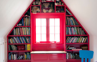
7 Ideas for Children’s Bookshelves
Need bookshelf or book storage ideas for your kid’s bedroom? Browse these stylish rooms for inspiration
Full Story
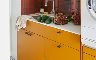
Utility Rooms
15 Richly Coloured Utility Rooms
The trend for strong, earthy tones has reached the utility room, with hues from plum to ochre to deep green adding depth
Full Story
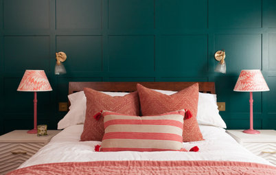
Colour
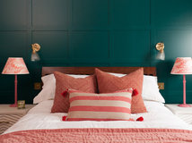
8 Ways to Work a Rust Red and Blue Palette in the Bedroom
By Kate Burt
We’re seeing variations of this combination all over Houzz right now. Check out these tips for trying it yourself
Full Story
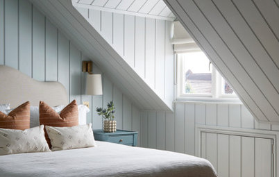
Lofts
How Do I Begin a Loft Conversion?
Wondering where to start when converting your loft? Ask yourself these questions to ensure you plan well
Full Story
Living Rooms
Where Designers Would Spend and Save in a Living Room
By Cheryl F
It’s your main relaxation space, so what should you splurge or scrimp on in the living room?
Full Story
Found it!
Deep Space Blue by Little Greene!
I’m on it! Thanks
Walk Interior Architecture and Design. That should not work but it’s stunning! Love it.
So many do lilac, the green even the rich blue with hot of bright white trim. Colour is the way to go.