How Can I Brighten My Neutral Scheme?
Try these expert tips and tricks for adding stylish shots of colour to a classic, neutral backdrop

The neutral backdrop – furniture, textiles and paint finishes in similar neutral tones layered to create depth – is a look much loved by design enthusiasts and interiors professionals alike. The idea is to create a calming, timeless canvas that won’t date, and which you can spice up with colourful props, accessories and ‘accents’, whether a piece of art, a bright cushion or some neon piping on the upholstery. But how to choose the right colours – plus how much to add and where? Be inspired by these exciting ways to liven up a neutral palette.
Play with extremes
This moody fireplace wall, painted in deepest charcoal grey, is accessorised with natural stone, ceramics and bleached antlers. And then there’s those fuchsia letters, which transform the whole picture. The figurines were already creating a kooky vibe, but it’s the strong, bright colour in the middle that underlines the bold style statement at play here.
You could achieve something similar using super-bright fresh flowers or a coloured vase against an inky backdrop. This homeowner has opted for a very singular pink, but a larger number of extreme colours could equally have been introduced.
Find out why hallways look so luscious painted in dark colours
Use mirror to reflect the colour
This bedroom design cleverly uses a full-length mirror to showcase the yellow accents used on the bed, so they’re visible even as you enter the room from a different angle. The sunshine bright colour has been used in several ways, from the art print to the carefully discarded book on the chair, to create an even more dramatic colour statement.
Grey and yellow are a match made in heaven. Try adding an on-trend shot of teal into your own combination of these two tones to extend the palette.
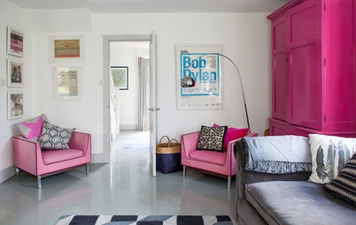
Mix in bold hues to update antique pieces
Too much dark, antique furniture can easily look dated, so pep up any moodily hued wooden heirlooms by teaming them with vibrant partners.
These cornflower blue painted chairs work so well mixed with the other woods in this scheme. Such a contemporary shade of blue makes the traditional mahogany upholstered chairs feel much more at home; without the blue, the scheme could have felt rather old-fashioned.
Brightly painted picture frames, bold lampshades or a colourful, contemporary table runner could provide a similarly perky contrast.
Check out more ways to use colour in unexpected ways
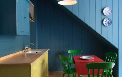
Draw people to the table
A dining table adds a focal point to any space and in this scheme, the homeowner has accentuated that by adding colour to this otherwise black and white corner of the room.
The first bold feature is the cluster of pictures on the wall. Colours in the artworks pick up hues from the dining table and chairs. To prevent such an arrangement looking chaotic, stick to frames of the same colour.
The second eye-catching feature is tiny, but it’s hard to take your eyes off that lime green Perspex ashtray. It’s proof that a splash of bold colour doesn’t need to be large to make an impact. To add a similar focal point, choose a colour not repeated anywhere else in your scheme and restrict it to just one object.
Explore more top tips for adding vibrant brights to white schemes
Introduce your brights with tactile shapes and textiles
Here we have the same blue accent colour, but done in a way that gives a totally different vibe. The luxurious velvet upholstery on these cocktail armchairs adds a gorgeous, tactile splash to this very tailored, neutral palette. The curves on the seating and coffee tables also add a welcome softness to the rawness of the wall finish.
To provide an extra flash of bold colour in a cool, minimal scheme like this, you could opt for colourful coffee table books, or add a dramatic trim around a rug to subtly introduce a further shade into the mix.
Wake up with neon
This monochromatic dining room has a subtle backdrop, featuring Farrow & Ball favourite Elephant’s Breath adorning the walls, an off-white lace tablecloth and monochrome wall art. But two fresh, modern accents have been juxtaposed with the neutrals to lift the scheme: the pink neon candles add sharp colour, while the mint dining chairs are subtler, but still work as a statement accent colour within a sea of calm neutrals.
With a similar backdrop, you could also try swapping the pastel chairs for ones in a bold, jewel-bright shade, and grounding the dining table with some jet black candles instead.
Wow with one wall
Monochromatic schemes often feature painted walls in beautiful neutral shades, with skirting boards, dado rails and cornicing daubed in equally calm tints. But why play it safe entirely? This largely two-tone scheme, with softly painted woodwork and pale floorboards, is lifted by one super-bright yellow wall: unexpected and very modern.
For equally interesting impact but on a smaller scale, you could simply pick out the handrail in a neon hue. And don’t be afraid to go bolder than you might usually be inclined to – you can always change an accent colour, a prop, a painted wall or an accessory very cheaply when you want a change.
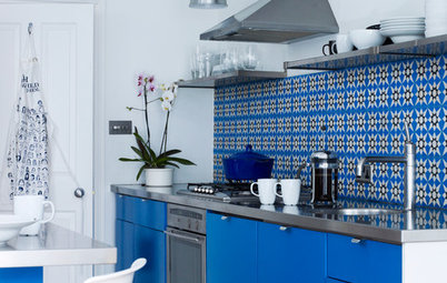
Try a restrained clash
The rule of restraint often applies in other areas of design and fashion, so why not try playing the same card when accenting a neutral kitchen? Instead of going wild with multiple accent colours, try just one or two really zingy pieces of furniture that will draw the eye.
Choosing clashing colours will make the carefully selected combination even more effective. This fluoro-pink Eames chair provides a welcome bright in a sea of calm neutrals, while the orange flowers clash nicely with the pink. Using clashing colours ensures the pink doesn’t feel too bubble-gum sweet, and makes sure the orange feels a bit more edgy, less safe.
Create a micro focal point
This child’s bedroom design shows how a monochrome backdrop can be given an exciting focus by clustering a mix of patterned cushions, creating a sensory colour overload in just one part of the room. The eye makes a beeline for the pillow mashup.
Alternatively, adding a glimpse of an unexpectedly colourful bedsheet peeping out from underneath a neutral bedspread can add a playful touch. A bright curtain or blind at the window picking up one of the colours in the cushions or on the sheet could help to give the scheme cohesion.
Bejewel a moody grey room
A moody backdrop is the perfect foil for jewel brights, which really liven up grey walls. But don’t just use one colour – go for multiple (and slightly clashing) shades to achieve a cool, contemporary scheme and prevent one shade dominating. Mix up the materials and finishes to keep the look layered and tactile.
This sitting room’s traditional white marble fireplace is given a thoroughly modern twist with the colourful props and accessories jostling for position on the mantelpiece. The zingy lemon flowers add a hint of citrus freshness to the whole scheme.
Draw the eye up and away
The stripe of marigold paint running up this staircase is super-thin, but it makes a huge impact and lifts the whole scheme. It’s balanced by the vintage-style orange swivel chair at the foot of the stairs.
For an even bolder look, or an alternative flash of colour, you could try painting your stair treads, even if they only poke out at the sides of a carpet runner; this will also draw the eye onwards and upwards.
TELL US…
How have you livened up a neutral palette? Share your tips or photos in the Comments below.

Sponsored

Sponsored
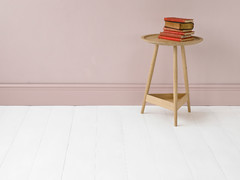
The eye is drawn to the colour in a room that shouts the loudest, so decide on a statement shade to take centre stage. It might be a small item, but one that packs a punch in terms of impact. In this neutral living room, the punchy yellow side table does the talking.
The baby pink cushion adds a softer, ‘back-up’ accent, tying into the pink hues in the artwork. ‘Back-up’ colours, used around a show-stopping accent colour, provide essential support for the hero shade and are just as important to consider.
See more winning yellow and grey schemes