Bye-Bye, Minimalist White — The New Nordic Style Is All About Color
The Scandinavian color palette is moving away from pale, cool shades with hot new hues on walls and floors

Say “Scandinavian style,” and many people visualize light, clean-lined spaces, inspired by images from Nordic noir crime series, Ikea ad campaigns and interior design articles.
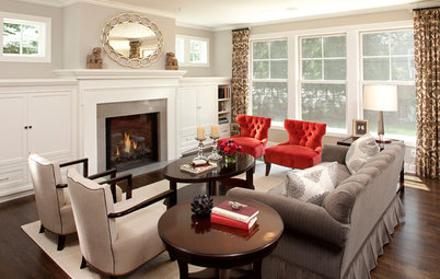
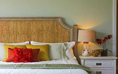
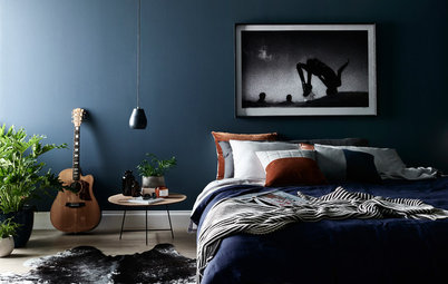
But in recent years, color and darker shades have worked their way into Scandinavian homes and photo shoots. Nordic walls must have been craving a hit of color since living rooms and bedrooms have hungrily embraced shades of gray, blue, green and pink.
Why have Scandinavians suddenly welcomed color, and how is it being used? With the help of trend studies, forecasts and a look in the rear-view mirror, we follow the journey of color into Nordic homes.
“What we’re seeing now, however, is a change,” Bertilsson says. “During the last two or three years, bold colors have returned.” Though a common perception is that Scandinavian homes have been whitewashed and pared back for decades, if not centuries, there have been cycles of colors in the Nordic countries. The 1970s had a touch of psychedelia with bright colors and vivid patterns, followed by pastels in the 1980s and mottled earth tones in the 1990s — all of which preceded the pure paleness of the new millennium.
But now the spectrum is changing again. At Nordic trend exhibitions and fairs, interior design has moved away from the pale blues and violets of the past toward clearer, stronger colors — most recently, orange, pink, yellow and red.
“Trends often represent a reaction to what used to be,” Bertilsson says. “The fashion industry is always the quickest to react, but the interior decoration and design industry isn’t far behind. Since the turn of the millennium and until now, neutral colors, such as white and gray, have been the dominant shades in most Scandinavian homes. The [brighter] color that’s now becoming increasingly popular is simply a response to that.
“However, it’s important to remember that trends are both speculative phenomena and processes that sometimes overlap, and they’re only able to gain ground when we’re mentally ready to accept them,” Bertilsson says.
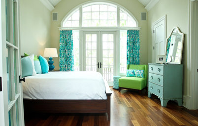
One individual who has dared to use strong color, and whose home, pictured, has received a lot of attention, is Daniel Heckscher, interior architect and designer at Note Design Studio in Stockholm. He painted his home in a palette of turquoise, orange, pink, blue-green and bright yellow. Pictures of Heckscher’s colorful home have been published in the new bookazine My Residence, where he writes that people dress in black and use white for interior design because they don’t dare do anything else.
“They’re afraid of making decisions and mistakes,” he writes. “We Westerners are governed too much by our fears. Life isn’t colorless! Even in early spring, when Sweden is as pale as ever, there are approximately 7,000 nuances if you look out of the window. I don’t understand why designers and creators would want to represent a fictional environment?”
“They’re afraid of making decisions and mistakes,” he writes. “We Westerners are governed too much by our fears. Life isn’t colorless! Even in early spring, when Sweden is as pale as ever, there are approximately 7,000 nuances if you look out of the window. I don’t understand why designers and creators would want to represent a fictional environment?”
How Color Trends Break Through
When discussing color trends, Bertilsson points to studies that NCS uses to develop its analyses. “There’s research that shows color trends are cyclical,” he says. “Austrian [design consultant and psychologist] Leonhard Oberascher has studied color psychology and been able to prove that color trends repeat in cycles of 10 to 15 years. When everything is white and neutral, you grow tired after a while and eventually want to go to the other extreme of the spectrum. Humans work in the same way with everything, and colors are no exception.
“What [Oberscher has] been able to pinpoint specifically are the stages we go through along the way,” Bertilsson says. “Everything was very neutral in our homes a few years ago, then the blue and violet colors took off. This was followed by the chromatic colors. These will subsequently be dampened and darkened before the brown and beige nuances step in, followed by a return to the neutral colors. The reality exactly follows the patterns that Oberascher has been able to map out.” This is true internationally, but with the Nordic homes as early adopters.
There are other factors at play too. Theoretical trend pyramids show that we’re receptive to trends at different points in time, depending on what our current job is, where we live and how we live.
“We’re all affected by trends, whether we like it or not,” Bertilsson says. “Swedes and Danes enjoy a privilege, given our geographical, social and cultural environment, in the sense that we don’t only have the will, but also the means, to carry out extensive home redesigns. Therefore, as the chromatic color trends are on the way, we’ve not been late to embrace them.
“In a lot of other countries, people decide to repaint their walls when the color has started to peel off. In Sweden and Denmark, paint shops look like interior design stores, because when we buy paint, we try to achieve a wholeness. We want to fulfill an idea where the color plays a big part,” he says.
The Nordic consciousness in terms of color and design has lately been augmented by influential interior design bloggers, who have shared their advice on color codes. Arguably the most famous bedroom color in Sweden in recent years has been nicknamed Tant Johanna’s Green, pictured, after stylist and blogger Johanna Bradford, who painted her bedroom in the pale gray-green color.
“The fact that so many questions popped up about the color was in part due to the timing, as white walls had been dominating for years, and also because people were eager to try something else,” Bradford says. “But it’s also because it’s so difficult to find the right color, and that particular one is so unbelievably nice. If you see a color you like, you might as well ask for the color code.”
So, despite the fact that Scandinavians have begun painting with colors, they appear to do it within specific boundaries — the hues are subdued, rather than brash and bold, for example. “We dare to use more than just white, but I still think the end result is quite similar everywhere, since most people choose the same colors — as in the example of my bedroom wall,” Bradford says.
But don’t be fooled by the most recent white-dominant decades into believing that colorful walls in Nordic homes are a new phenomenon. Karin Fridell Anter, architect at the Swedish Association of Architects, has, together with Henrik Wannfors, written the book Painting Methods: Swedish Building Painting Methods From the Late Middle Ages to the Present Day and has a longer view of color trends.
“Colored walls have come and gone in Swedish homes repeatedly throughout history,” Fridell Anter says. “What has mainly determined the choice of color is the availability of different shades and current style trends. The trend pendulum keeps swinging as a counter-reaction to the past, but the difference is that the pendulum is swinging ever faster.
“In the 1970s, we painted and wallpapered with strong colors and large patterns that resembled those of the Baroque period. The 1980s represented a counter-reaction that featured brighter pastels, and the 1990s again saw the return of mottled walls in earth tones, such as terra cotta, or navy blue and/or bright yellow,” she says.
“Further back in time, things didn’t happen as fast, and the difference between rich homes in the big cities and farming households in the countryside was bigger,” Fridell Anter says. “What the peasant community wished for was in many ways an imitation of what had already existed for many years in the trendsetting upper-class homes.”
Color as a Form of Expression
Did Swedes paint their homes more for practical rather than aesthetic reasons in the past? Fridell Anter says that’s not the case. “The purpose of interior painting in Sweden has always been to make the home look beautiful and to manifest something — to show via themes on the walls, the selection of colors or the decorations that you were a pious person, rich or aware of trends that were dominant in other cultures on the continent,” she says.
“In the same way that contemporary Swedes express themselves via interior decoration, the home was a status symbol in previous centuries too,” she adds.
So colored walls are not a new phenomenon in Scandinavia, but the style of painting perhaps has changed over the decades.
“Up until the Stockholm Exhibition in 1930, when the concept of functionalism was presented, decorative painting had been popular,” Fridell Anter says. “Painted surfaces hadn’t been a single color, but instead featured pictures or patterns, or imitated marble or wood. Functionalism represented a change in trends in the sense that people started painting entire walls in one single color, perhaps with a different one on the next wall. What we’re seeing now, with monochrome rooms and painted ceilings and woodwork, is an extension of that.”
“Up until the Stockholm Exhibition in 1930, when the concept of functionalism was presented, decorative painting had been popular,” Fridell Anter says. “Painted surfaces hadn’t been a single color, but instead featured pictures or patterns, or imitated marble or wood. Functionalism represented a change in trends in the sense that people started painting entire walls in one single color, perhaps with a different one on the next wall. What we’re seeing now, with monochrome rooms and painted ceilings and woodwork, is an extension of that.”
Psychological factors, color as a personal form of expression and current trends appear to represent part of the explanation for Scandinavians’ sudden love of color. However, another strong factor in color choice is the response to contemporary life. NCS’ trend analysis for 2016 takes into account political events, the effects of digitization and global phenomena.
“We believe controversies will be the dominating factor in coming years,” says Bertilsson of NCS. “The unrest in the world, increased urbanization and stress lead, on the one hand, to a crudeness that’s influenced by the industrial style, with cold, hard colors. At the same time, the very same factors lead to increased escapism, where we dream of exotic places that inspire us, such as the unknown depths of the oceans and the colorful tropics. Trends will be triggered by upcoming world events, such as the Olympic Games in Brazil.”
The big difference between the company’s 2015 analysis and this year’s is that the colors are more extreme than before — moving from bright and soft nuances to more dramatic and darker colors.
Bringing Nature Indoors
One word that often comes up when talking about Scandinavian style is nature. Has it been responsible for the color trend? “There’s definitely a connection,” Bertilsson says. “Last year, our main interpretation of escapism was that it revolved around dreams about the countryside. When urbanization makes us live closer to each other, in smaller houses or flats and with more noise, we create other mental worlds — we dream about lush trees and open fields.”
Swedish wallpaper company Sandberg recently released a collection that follows this theme. In its trend report, Sandberg has suggested that an unsafe environment leads to greater interest in one’s home. “Interior decoration has become more important and complex. With a serious environmental consciousness, we try to find ways to consume as little and as consciously as possible, while, at the same time, wishing to stay updated with news and trends.”
Stockholm-based color company Alcro suggests that Scandinavians incorporate nature themes into their homes with some of its 2016 colors, which it says “bring to mind forest creatures, misty meadows and bewitching dreams that take place in the hours of dawn.”
With that in mind, the blue-green themes that have become popular on the walls of homes in Sweden and Denmark aren’t entirely surprising. According to Oberascher’s color trend timetable, Scandinavians should be right in the middle of the trend cycle and should look forward to warmer walls before they’re muted and eventually become white again.
With hindsight, Scandinavians seem to be quick to follow interior decoration trends — and the question isn’t whether they will all follow the trend toward using more color in their homes, but, rather, whether they have time to do so. Unlike centuries ago, when it took several decades for color trends to reach Swedish farms, the wheel is spinning faster, and changes are taking place in a digitized, globalized world.
So perhaps there’s no reason to debunk the myth of the white Scandinavian home after all. The newly painted colorful wall might not even have time to dry before the trendsetters have painted it white again.
More
World of Design: Where Color Trends Begin
How to Add Color if You’re Color Shy


Sponsored
Why do we think of Nordic homes as light? Scandinavian homes traditionally have been designed to maximize sunlight. Stockholm is the Nordic region’s sunniest capital, with about 1,800 hours of sunshine a year, and that figure is at least 1,000 hours short of the amount enjoyed in Madrid, Sydney and Miami.
“The foundation of Scandinavian design, and our Nordic homes, will always be brightness and simplicity, because it’s simply what we need due to the lack of sunlight,” says Karl Johan Bertilsson, creative director at NCS Colour Academy, which offers color consultancy services to manufacturers, architects and designers around the world.