Decorating
Colour: 10 Reasons to Splash Out on Paint-pot Primary Colours
Raid the primary end of the colour chart and brighten up your home with red, yellow and blue

If your surroundings are looking a little anaemic, there’s no better way to brighten up your pad than by taking the colour plunge and adding some power-packed primaries. While the colour charts are inundated with fancy vintage greys, pale biscuits and sophisticated eau de nil, this look takes a much bolder, more straightforward approach by sticking to a trio of bright red, yellow and blue, reminiscent of the classroom. These three no-nonsense shades are packed with uplifting energy and spirit that will bring a smile to your face and cheer to your home, be it in the bedroom, bathroom or kitchen. Paint pots at the ready…
Make an artistic statement
If you can’t decide on red, blue or yellow, go for all three in a fabulous Mondrian-esque style. The rigid grid of black horizontal and vertical lines sandwiched with blocks of bold primary hues is graphic, striking and perfect for lovers of modern art. This brave design statement works so well for a wall of modular storage where the rest of the room is stripped back and plain.
If you can’t decide on red, blue or yellow, go for all three in a fabulous Mondrian-esque style. The rigid grid of black horizontal and vertical lines sandwiched with blocks of bold primary hues is graphic, striking and perfect for lovers of modern art. This brave design statement works so well for a wall of modular storage where the rest of the room is stripped back and plain.
Wake up work time
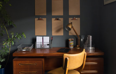
Red is an energetic colour, it goes without saying. So what better way to pep up a working environment and revitalise a sluggish brain than with a flash of ruby red – and in the most unexpected of places. Painting the ceiling beams in a bold primary shakes up this simple white home office – and will certainly keep daydreamers in check.
See 10 more ways to add red to your home
Let the sunshine in
A row of modern pendant lights always creates an eye-catching design statement in the kitchen. Pick a punchy colour, however, like this zingy sunshine yellow, and the lighting feature becomes the standout star of the whole room. And don’t forget, dimmable, rise-and-fall pendants are perfect for flexibly illuminating an island unit or kitchen table to where friends and family tend to gravitate.
A row of modern pendant lights always creates an eye-catching design statement in the kitchen. Pick a punchy colour, however, like this zingy sunshine yellow, and the lighting feature becomes the standout star of the whole room. And don’t forget, dimmable, rise-and-fall pendants are perfect for flexibly illuminating an island unit or kitchen table to where friends and family tend to gravitate.
Play with primaries
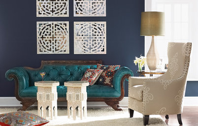
Don’t imagine primary colours only weave their magic in super-modern surroundings. In this period house, for instance, the grand architecture and vintage parquet flooring are juxtaposed with a slash of crimson and a blast of midnight blue, and the effect is striking, to say the least. Feel free to mix and match a contemporary coffee table with antique seating and let the contrast of materials, colours and shapes shine.
Don’t imagine primary colours only weave their magic in super-modern surroundings. In this period house, for instance, the grand architecture and vintage parquet flooring are juxtaposed with a slash of crimson and a blast of midnight blue, and the effect is striking, to say the least. Feel free to mix and match a contemporary coffee table with antique seating and let the contrast of materials, colours and shapes shine.
Be bold outside
We don’t often see bold, primary hues lavished on the outside of buildings, but look how uplifting this hotel restoration is. The timber cladding is saturated with shot after shot of exhilarating colour with refreshing results. The contrast against the natural backdrop only adds to the drama. Be inspired in your own home and paint your front door in a fabulous primary hue.
We don’t often see bold, primary hues lavished on the outside of buildings, but look how uplifting this hotel restoration is. The timber cladding is saturated with shot after shot of exhilarating colour with refreshing results. The contrast against the natural backdrop only adds to the drama. Be inspired in your own home and paint your front door in a fabulous primary hue.
Make it modern
If you are plumping for a splash of paint-box colour, you can’t go wrong by sticking to white everywhere else. The fresh white ceiling, floor and walls here conjure up a cube-like installation effect, where playful chairs in bold primaries look more like works of art – but are probably a lot more comfortable!
If you are plumping for a splash of paint-box colour, you can’t go wrong by sticking to white everywhere else. The fresh white ceiling, floor and walls here conjure up a cube-like installation effect, where playful chairs in bold primaries look more like works of art – but are probably a lot more comfortable!
Brighten up a bathroom
There are no design rules to say the bathroom can’t be as colour-packed as the rest of the house. This canary yellow vanity unit is as slick and modern as they come, but injects a little more personality and pizzazz than a plain white version would. And the glossy yellow doors add an uplifting harmony against the earthy stone floor and walls.
Try more ideas for celebrating bright colour in the bathroom
Rev up with red
Red is such a warm, gutsy colour that it would be a design scandal to keep it hidden away in the playroom. Unleash the power of this vibrant primary by creating a spirited kitchen centrepiece with an island unit painted crimson. Stick to neutral shades for the remainder of the cabinetry and offset with granites and warm woods for a homely, rustic edge.
Red is such a warm, gutsy colour that it would be a design scandal to keep it hidden away in the playroom. Unleash the power of this vibrant primary by creating a spirited kitchen centrepiece with an island unit painted crimson. Stick to neutral shades for the remainder of the cabinetry and offset with granites and warm woods for a homely, rustic edge.
Energise every space
Paint-pot primaries exude a natural energy and certainly instil an up-tempo mood into this pool room. It’s part of a 1920s community hall that has been converted into a modern family home peppered with a daring use of colour and modern-day attitude. The secret to its success is the element of surprise – so paint your vibrant shades in the least expected areas for maximum effect.
TELL US…
Have you made a splash with primary colours? Please share your tips and photos in the Comments below.

Sponsored
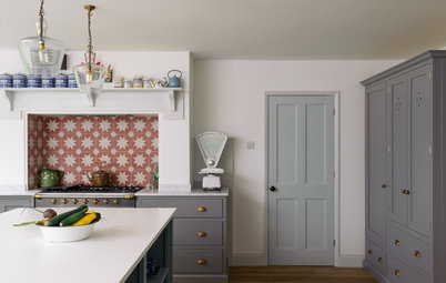
A single powerful primary will wake up an all-white kitchen in seconds. I love this rich, indigo blue, which, when painted on one wall, serves as a dramatic backdrop to highlight the pure white shelves and crockery. It’s an inexpensive design trick, too, demanding nothing more taxing than a quick touch-up if the colour gets scuffed. (And with a colour this deep, dirty fingerprints and cooking stains are far less likely to show up. Tick number two.)