


Colour: How to Layer Tones of Grey for Depth and Harmony
Take just one colour – grey – and explore its many tones, layering them up to create a scheme that looks cohesive and considered
Jo Simmons
2 March 2015
Houzz UK Contributor. I have been an interiors journalist since 1995, writing several books on design and numerous features for glossy homes mags over the years. For Houzz, I cover decorating ideas and trends and interview designers and professionals for their insights. My favourite pieces to write, though, are Houzz Tours, as I love exploring and learning about real homes. Call me curious — or nosy!
Houzz UK Contributor. I have been an interiors journalist since 1995, writing several... More
Grey continues to enjoy its moment as the stylish, go-to shade du jour, but a new trend is emerging in the use of this versatile colour. Rather than sticking to one shade and risking a rather flat outcome, combining greys of different tones is a beautiful alternative. The trick is to zero in on the grey you love most and then look to the left and right of it on the paint chart, sourcing something similar but slightly different. Soft beige-grey, for example, is just a few jumps up the chart from more stormy tones.
Next, have fun layering these shades, using paints, but also texture-rich materials, soft furnishings and artwork. Sometimes, touches of contrasting colour will creep in, too, to punctuate the scheme. It all helps to build up a look that has masses more depth and subtlety than if you used a single grey throughout. These rooms show how it can be done.
Next, have fun layering these shades, using paints, but also texture-rich materials, soft furnishings and artwork. Sometimes, touches of contrasting colour will creep in, too, to punctuate the scheme. It all helps to build up a look that has masses more depth and subtlety than if you used a single grey throughout. These rooms show how it can be done.
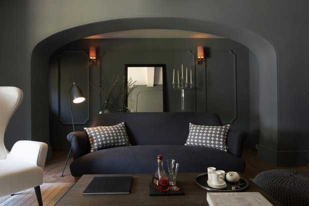
Contrast light and dark
By using the same colour, but in both its palest and deepest incarnations, you can create a rich, contrasting look that is still harmonious and coordinated. Here, grey is used throughout, but the woodwork sports a deep, rich version, while the walls and soft furnishings are far paler.
By using the same colour, but in both its palest and deepest incarnations, you can create a rich, contrasting look that is still harmonious and coordinated. Here, grey is used throughout, but the woodwork sports a deep, rich version, while the walls and soft furnishings are far paler.
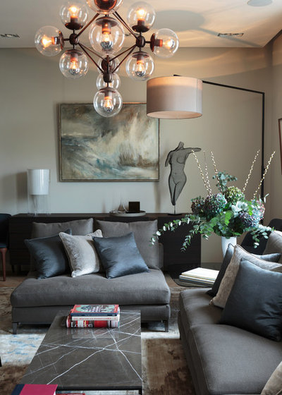
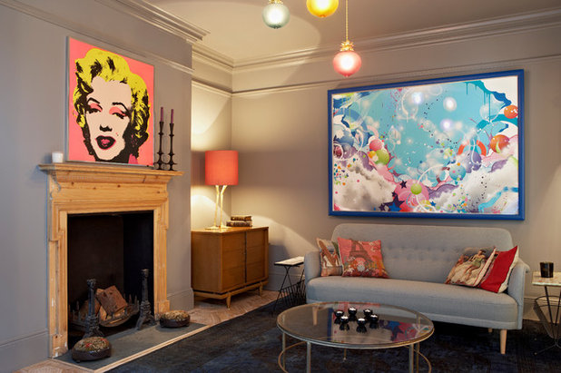
Create multiple layers
Grey is incredibly versatile, and when layered in a variety of shades, textures and finishes, it looks gloriously sophisticated. In this beautiful living room, even the painting is a melange of grey tones. The space feels calm and coordinated, but also full of detail, texture and warmth.
See stylish ideas for bringing grey into every room
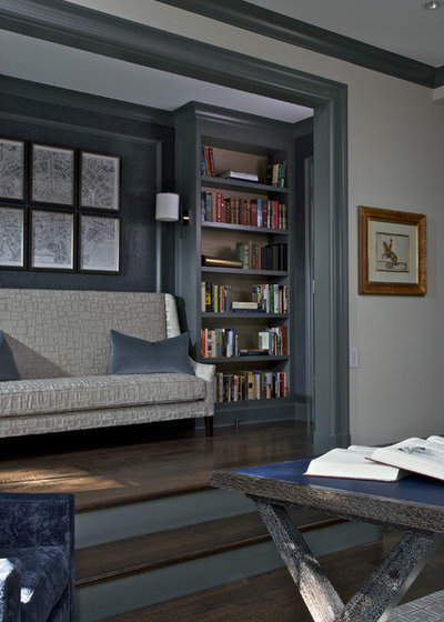
Pick a strong, dark theme
Your tones don’t have to run the length of the colour chart from pale to dark. The greys in this living room are all firmly on the dark side, but their subtle differences, coupled with plenty of inviting textures, add depth. Instead of adding pale grey cushions, these homeowners have cleverly chosen ones in charcoal and white, lightening the look while sticking to the dark grey theme.
Your tones don’t have to run the length of the colour chart from pale to dark. The greys in this living room are all firmly on the dark side, but their subtle differences, coupled with plenty of inviting textures, add depth. Instead of adding pale grey cushions, these homeowners have cleverly chosen ones in charcoal and white, lightening the look while sticking to the dark grey theme.
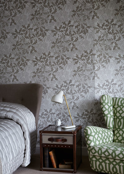
Layer super-pale shades
At the lightest end of the palette, colours become less distinct, so that very light grey looks almost the same as pale duck-egg blue. This opens up lots of layering possibilities. The pale grey furniture and furnishings in this bedroom work beautifully with the wallpaper, which adds warmth to the scheme while still looking harmonious.
At the lightest end of the palette, colours become less distinct, so that very light grey looks almost the same as pale duck-egg blue. This opens up lots of layering possibilities. The pale grey furniture and furnishings in this bedroom work beautifully with the wallpaper, which adds warmth to the scheme while still looking harmonious.
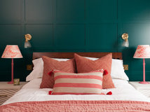
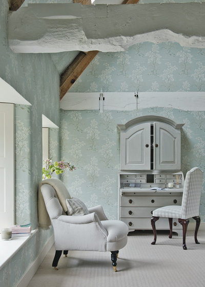
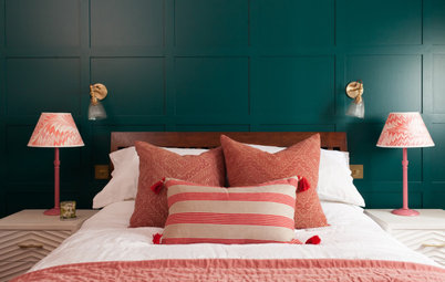
Combine with pattern
This bedroom demonstrates beautifully how combining grey with pattern is a fast track to creating a layered look with lots of movement. Here, the grey tones in the wallpaper are complemented by a dark grey upholstered headboard and silvery quilt for an exciting blend of pattern, texture and finish.
This bedroom demonstrates beautifully how combining grey with pattern is a fast track to creating a layered look with lots of movement. Here, the grey tones in the wallpaper are complemented by a dark grey upholstered headboard and silvery quilt for an exciting blend of pattern, texture and finish.
Choose versatile, muted tones
Take a shade of dove grey that could almost be beige as your starter and use it on the ceiling and walls. Add seating in mid grey and a rug in dark grey to ground the scheme. To give the space a little more energy, simply add a few brighter accents, such as the salmon pink and pale blue in this cocooning living room.
Discover ways to combine grey and natural wood
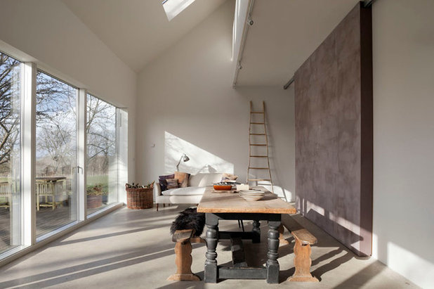
Work in some texture
A polished concrete floor in this large, barn-style home creates a silky grey backdrop for a space that incorporates one wall treated with lime paint in a stormy shade. This natural paint produces a slightly uneven finish that brings personality to the room.
A polished concrete floor in this large, barn-style home creates a silky grey backdrop for a space that incorporates one wall treated with lime paint in a stormy shade. This natural paint produces a slightly uneven finish that brings personality to the room.
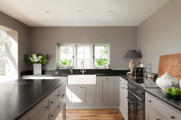
Let one shade steal the show
A simple approach to layering grey is to choose a shade that will do most of the work, and then add small accents in similar tones. Here, dove grey covers the walls and cabinets, but is broken up by the granite worktops, dark range and deep grey lampshade, creating a cohesive scheme that contains some contrast, too.
TELL US…
Like the layered look? Share your thoughts in the Comments below.


Related Stories

More Rooms
The 5 Most Popular Laundry Rooms on Houzz Right Now
Get decorating ideas for your laundry or utility room from these most-saved photos on Houzz
Full Story
Dining Rooms
The 5 Most Popular Dining Rooms on Houzz Right Now
By Kate Burt
Vintage furniture, great lighting and top tables – feast your eyes on dining room ideas collated from your own clicks
Full Story
Colour
8 Clever Ways to Use Strategic Colour Blocking in Your Home
By Kate Burt
Paint can do so much more than refresh your walls. Explore ways to highlight features, zone areas and trick the eye
Full Story
Utility Rooms
15 Richly Coloured Utility Rooms
The trend for strong, earthy tones has reached the utility room, with hues from plum to ochre to deep green adding depth
Full Story

Kitchens
Which Kitchen Worktop Colour Should You Choose?
By tidgboutique
Consider these popular colours and styles to get the look you want, no matter which material you use
Full Story
Colour
8 Ways to Work a Rust Red and Blue Palette in the Bedroom
By Kate Burt
We’re seeing variations of this combination all over Houzz right now. Check out these tips for trying it yourself
Full Story
Colour
Creative Ways to Make a Feature of Structural Beams
Turn your RSJ into something more than just functional with these clever ideas from our Houzz Tours
Full Story
Gardens
9 Ways to Enjoy Colour in Your Garden All Year Round
By Kate Burt
However your garden grows, you can add colour with hardscaping, furniture and accessories
Full Story
Gardens
What Will We Want in Our Gardens in 2024?
Discover the gardening trends homeowners will be bringing into their outdoor spaces this spring and summer
Full Story
Kitchens
What to Expect at the Biggest Kitchen, Bedroom and Bathroom Show
Plan ahead with our rundown of what’s in store at the kbb Birmingham event this March
Full Story
Little Green are great and in my opinion a bit easier to use than F&B. Also, critically they still do oil based eggshell which F&B don't. I find water based paint for woodwork not tough enough. Also Little Green do paler versions of each colour so easy to match if you struggle with toning wall paint with woodwork paint. All F&B and Little Green seem to have a small amount of the complimentary colour in the paint which 'knocks' it back and makes it subtle. I don't find this is the case so much with cheaper paints and finally, they are beautifully chalky and matt. Paint samples onto A4 pieces of white card (3 coats) so you can try them in different rooms. Hope this helps.