


Decorating: How to Use Victorian Colours in a Modern Home
In part one of a series on decorating period homes, discover how to use colour in a Victorian house without being a slave to historic detail
Emma and Simon Page
22 October 2015
Houzz UK Contributors. Directors at The Victorian Emporium
A period house renovation information resource which also offers period property renovation consultancy and project management.
Houzz UK Contributors. Directors at The Victorian Emporium
A period house renovation... More
As seasoned renovators with many years’ experience of working on Victorian houses, we’ve come to love old properties and appreciate these varied, beautiful and complicated buildings. The craftsmanship that went into them never ceases to amaze us, especially when you consider there were no sophisticated tools available at the time.
However, while many of us are keen to live in a period house and enjoy its original features, we also want to add contemporary décor and the comforts of modern living. We’re often asked to integrate the new into an old house and we’ve discovered some key rules to follow when mixing old or reproduction period details with contemporary features – and colour is no exception. Here’s what you need to know about how the Victorians used colour – and how you can adapt their style to match your own.
However, while many of us are keen to live in a period house and enjoy its original features, we also want to add contemporary décor and the comforts of modern living. We’re often asked to integrate the new into an old house and we’ve discovered some key rules to follow when mixing old or reproduction period details with contemporary features – and colour is no exception. Here’s what you need to know about how the Victorians used colour – and how you can adapt their style to match your own.
Know the basics
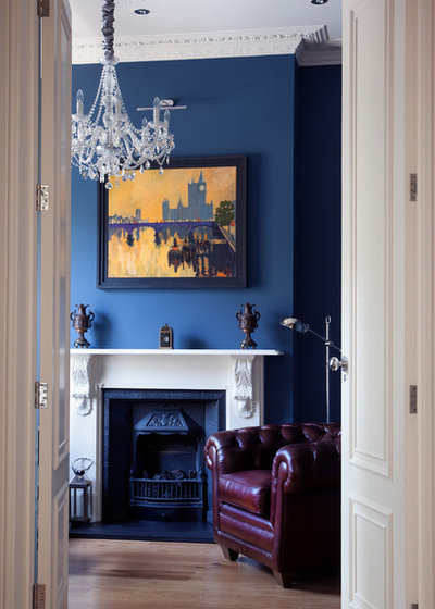
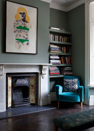
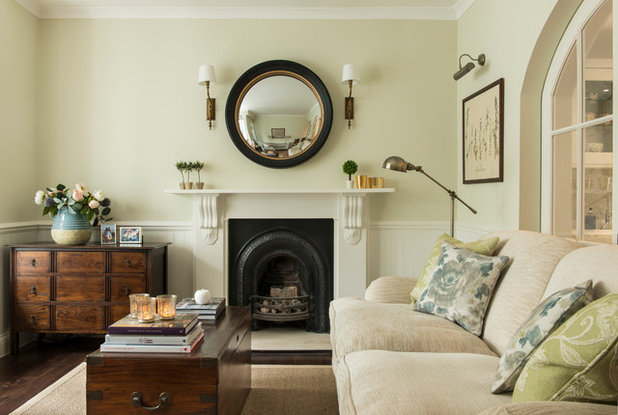
The Victorian colour palette was dark and consisted of browns, maroons, deep reds, burgundy, chestnut, dark green and blue. But if this sounds a bit dramatic for a modern home you can mix this imposing palette with lighter shades. As seen in the room here, the dark wall colour is lightened by the contrasting white-painted woodwork, fireplace and architraves, plus the pale-wood floor.
Browse ways to make the most of a period fireplace
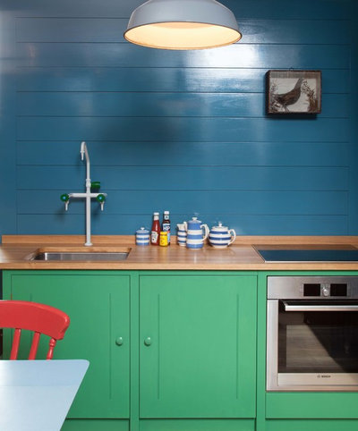
Update brown with blue
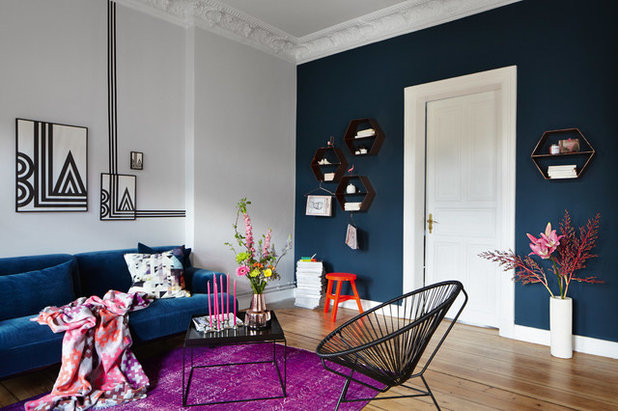
The deep chocolate browns used by the Victorians could sometimes give their houses an oppressive feeling, so if you want to give your version of the décor a more contemporary feel stick to the dark greens and blues or pick a teal shade as above and accessorise with rich plum tones.
The deep chocolate browns used by the Victorians could sometimes give their houses an oppressive feeling, so if you want to give your version of the décor a more contemporary feel stick to the dark greens and blues or pick a teal shade as above and accessorise with rich plum tones.
Replace pastel shades with cream tones
Pastels were not used by the Victorians – the closest they came to them was off-whites, creams and muted shades of their strong colours. So if you want to go subtle, choose greys, creams and buttermilk. You can always add in one strong Victorian shade for an authentic period feel.
Tour this carefully modernised Victorian home
Use different shades
Authentically, a room should be decorated using varying tones of the same colour. Your darkest hue (and this can be really deep) should be below the dado rail, while above it, whether wallpaper or paint, should be a few degrees paler, with your woodwork lighter still. But rules are made to be broken, so have fun experimenting with varying tones.
For a different look using the same rules, you could also try painting inexpensive kitchen cabinets in a colour a few shades darker than your kitchen walls. Spray-paint the cabinets before installation (they’ll need three or four coats) and add brass handles and classic dentil coving around the cabinet tops to complete the look.
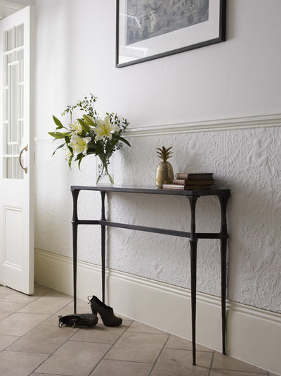
Add texture
The Victorians loved to show off their wealth and good taste in the decoration of their homes, using fashionable colour, texture, high-quality finishes and eye-catching designs. Painted embossed wallcoverings, such as Lincrusta and Anaglypta (both developed around 1877), perfectly fitted this bill and were wipeable – so deemed hygienic – practical and able to hide rough and uneven walls.
If you choose to use either of these wallcoverings (still being produced today) below your dado rail, you could paint it in a deep colour from the Victorian palette. Then lighten the effect by using a patterned paper or pale paint colour above the dado rail. Or alternatively give it a modern twist by painting it a crisp white.
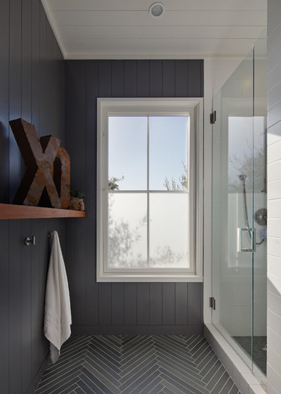
Bend the rules to allow grey
Grey was not part of the Victorian palette, but it’s a hugely popular contemporary colour and looks fabulously smart on wood panelling or cupboard doors in a traditional space.
If you don’t have any original panelling woodwork in your period house, you can create a similar effect by building cupboards or fitting tongue and groove in MDF or pine, adding period-style mouldings for extra detail. Paint in a moody dark grey and finish off surrounding woodwork in white, as seen here. Add brass accessories, such as handles and door pulls, for authenticity.
Darken your floors
Victorians favoured oak floorboards and often stained cheaper pine floorboards darker to replicate oak. It’s up to you whether you go for the full dark stain or keep the floorboard colour somewhere between the two, depending on the rest of your colour scheme. Add a traditional rug to soften the effect.
Victorians favoured oak floorboards and often stained cheaper pine floorboards darker to replicate oak. It’s up to you whether you go for the full dark stain or keep the floorboard colour somewhere between the two, depending on the rest of your colour scheme. Add a traditional rug to soften the effect.
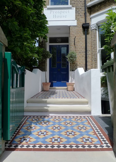
Make a feature
This tiled path, in traditional shades of blue, chestnut and buttermilk is an example of a classic Victorian colour palette. Although you might not want to follow the Victorian palette to the letter, it can work beautifully as a standout feature.
This tiled path, in traditional shades of blue, chestnut and buttermilk is an example of a classic Victorian colour palette. Although you might not want to follow the Victorian palette to the letter, it can work beautifully as a standout feature.
Use lighting to bring it up to date
Don’t forget that we benefit from much better lighting than the Victorians did, so even with darker colours on walls, rooms can be lit in such a way that the room does not appear gloomy, but simply vibrant and interesting. Plan your lighting carefully to make the most of your period-style schemes.
See lighting ideas for a period property
TELL US…
Would you use Victorian colours in your home?
Would you use Victorian colours in your home?


Related Stories

More Rooms
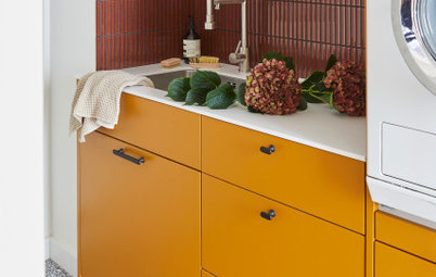
The 5 Most Popular Laundry Rooms on Houzz Right Now
Get decorating ideas for your laundry or utility room from these most-saved photos on Houzz
Full Story
Dining Rooms
The 5 Most Popular Dining Rooms on Houzz Right Now
By Kate Burt
Vintage furniture, great lighting and top tables – feast your eyes on dining room ideas collated from your own clicks
Full Story
Colour
8 Clever Ways to Use Strategic Colour Blocking in Your Home
By Kate Burt
Paint can do so much more than refresh your walls. Explore ways to highlight features, zone areas and trick the eye
Full Story
Utility Rooms
15 Richly Coloured Utility Rooms
The trend for strong, earthy tones has reached the utility room, with hues from plum to ochre to deep green adding depth
Full Story

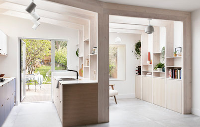
Kitchens
Which Kitchen Worktop Colour Should You Choose?
By tidgboutique
Consider these popular colours and styles to get the look you want, no matter which material you use
Full Story
Colour
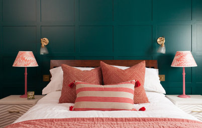
8 Ways to Work a Rust Red and Blue Palette in the Bedroom
By Kate Burt
We’re seeing variations of this combination all over Houzz right now. Check out these tips for trying it yourself
Full Story
Colour
Creative Ways to Make a Feature of Structural Beams
Turn your RSJ into something more than just functional with these clever ideas from our Houzz Tours
Full Story
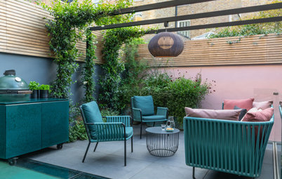
Gardens
9 Ways to Enjoy Colour in Your Garden All Year Round
By Kate Burt
However your garden grows, you can add colour with hardscaping, furniture and accessories
Full Story
Gardens
What Will We Want in Our Gardens in 2024?
Discover the gardening trends homeowners will be bringing into their outdoor spaces this spring and summer
Full Story
Kitchens
What to Expect at the Biggest Kitchen, Bedroom and Bathroom Show
Plan ahead with our rundown of what’s in store at the kbb Birmingham event this March
Full Story
@carolineshep77 if you click into the photo you can 'Ask a question about this photo' at the bottom right. This will notify the designer who may be able to answer!
The film 'Mr Turner' was very committed to an authentic looking decor, with deep colours and wooden floors -- I wonder if I was the only person paying more attention to the walls, floors, windows etc than to the plot!
Time consuming but glad I did it. ☺️