


Houzz Tour: A 1920s Wiltshire Semi Gets a Family-size Extension
Extending this home in Swindon to the side and rear created vital space, transforming it from snug to super-spacious
Jo Simmons
11 February 2017
Houzz UK Contributor. I have been an interiors journalist since 1995, writing several books on design and numerous features for glossy homes mags over the years. For Houzz, I cover decorating ideas and trends and interview designers and professionals for their insights. My favourite pieces to write, though, are Houzz Tours, as I love exploring and learning about real homes. Call me curious — or nosy!
Houzz UK Contributor. I have been an interiors journalist since 1995, writing several... More
“Don’t move, improve!” was the argument that won out when Emma Barber and her husband were working out how to gain more space. “It was between moving house or extending,” Barber recalls. “Eventually, because we loved the garden and location, we opted to extend.”
Working to a maximum budget of £85,000, Barber, who’s an interior designer, planned and project-managed a spacious extension to the side and rear of their home in Swindon. “Now the house works for us as a family,” she says. “We could have spent the same amount just on moving costs, but what we spent here we see and enjoy every day.”
Working to a maximum budget of £85,000, Barber, who’s an interior designer, planned and project-managed a spacious extension to the side and rear of their home in Swindon. “Now the house works for us as a family,” she says. “We could have spent the same amount just on moving costs, but what we spent here we see and enjoy every day.”
Houzz at a Glance
Who lives here Emma Barber, an interior designer, her husband and their two children, aged between 4 and 6
Location Swindon, Wiltshire
Property A 1920s semi-detached house
Size 4 bedrooms, 1 bathroom, plus a cloakroom
Project duration September to late December 2014
Cost £84,500
Interior designer Emma Barber of EB Interiors
Photos by CP Photography
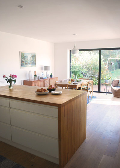
The Barbers bought their home 14 years ago. It originally had a very small cookspace at the back, but a new extension means the kitchen is now wonderfully spacious.
“Everything is centred on this space,” says Emma Barber. “It’s a very social area. We should probably use the living room more, but we spend all our time in here.”
Who lives here Emma Barber, an interior designer, her husband and their two children, aged between 4 and 6
Location Swindon, Wiltshire
Property A 1920s semi-detached house
Size 4 bedrooms, 1 bathroom, plus a cloakroom
Project duration September to late December 2014
Cost £84,500
Interior designer Emma Barber of EB Interiors
Photos by CP Photography
The Barbers bought their home 14 years ago. It originally had a very small cookspace at the back, but a new extension means the kitchen is now wonderfully spacious.
“Everything is centred on this space,” says Emma Barber. “It’s a very social area. We should probably use the living room more, but we spend all our time in here.”
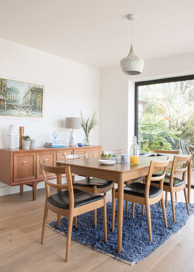
The house originally had a detached garage, “but you couldn’t get a car down to it,” says Barber. “We were just using it as a storeroom, so we decided to lose it and make use of the space at the side and extend at the back as well.” The dining area is now in the space the garage used to occupy.
Barber consulted her cousin, architect Bill Pier, for advice about the structural details. “He helped draw plans that did clever things, such as incorporating the original [hard to remove] walls to create hidden storage in the master bedroom,” says Barber (see the plan of the first floor at the end). “This kept costs down, as we didn’t have to put in extra supports, which all cost money.”
Table; chairs, all Ikea. Sideboard, given to Barber by a relative.
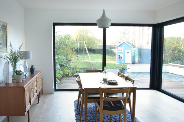
Installing generous amounts of glazing on the extension was a top priority. “We knew we really wanted glazing, but not bifold doors,” says Barber. On the rear wall are two static windows, while the glazing to the side is a sliding door. “That was a major feature that cost £10,000, so when it came to budget, we worked around that.”
Luckily, the family had a lot of existing furniture. “I knew what furniture we had, so it was about getting the finishes right,” says Barber. These original pieces now sit proudly in the new, larger space. “The table and chairs used to fit snugly in the dining room before,” she adds. “You could never extend the table and if you did, you then couldn’t actually sit down at it!”
The new glazing is a huge success. Barber can see the children in the garden and her son, in particular, spends most of his time out there in the summer. “It’s a cliché, but those windows do also bring the outside in, making the garden part of the house,” she says. “We’re really pleased with them. This is a bright space at any time of the year.”
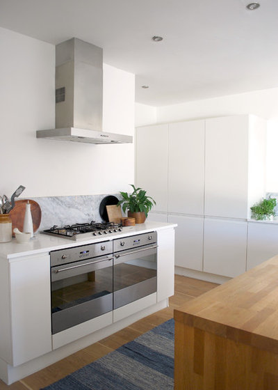
“After doing all this work and building the extension, I didn’t want to cut back on the kitchen, but I did shop around and keep an eye on the budget,” says Barber. This paid off. “I found a kitchen I loved that was also 60% off that weekend,” she says. “It’s really good quality and was a bargain deal.”
Odina kitchen, Homebase.
Odina kitchen, Homebase.
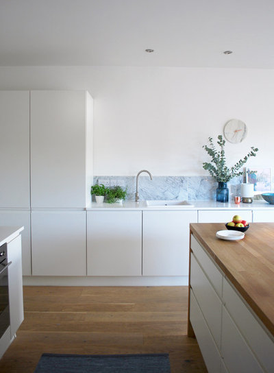
Barber chose matt white cabinets with her small children in mind. “I like gloss, but it shows up every hand print, especially with all that light coming in,” she says. Carrara marble tiles form the splashback. “It’s a tiny bit of luxe and they break up the white,” she says.
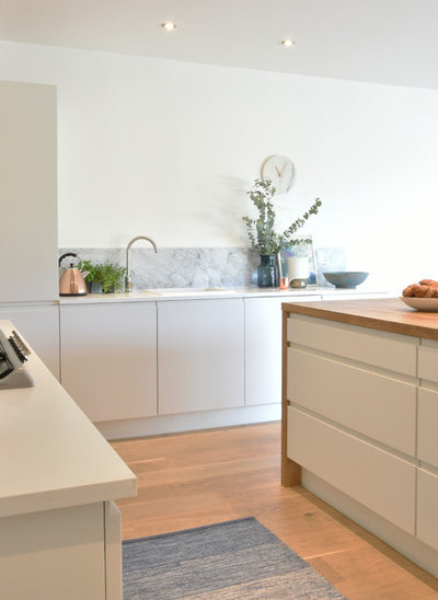
To stay on budget, Barber recommends project-managing jobs such as a new kitchen yourself. “I tried to get good deals for everything – the cabinets, worktops, tiles – and then got people in to install them,” she says. “I think that’s where people get lost with money – they buy everything from one place. You do have the luxury of having it all done at once, but, with a bit of hard work researching and buying it all yourself, you can save a lot of money.”
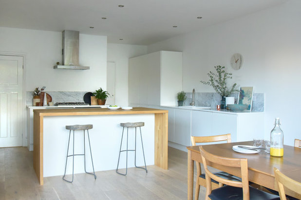
A generous island has a wraparound oak worktop and, on the outer side, space to sit at a breakfast bar. The cabinets are topped off with a white resin work surface.
Stools, French Connection.
Stools, French Connection.
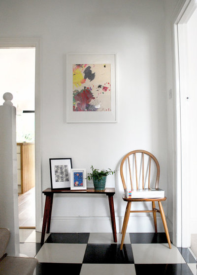
Barber laid porcelain chequerboard tiles in the hall when she first moved into the house. “I wanted a bit of wow as soon as you walk in,” she says.
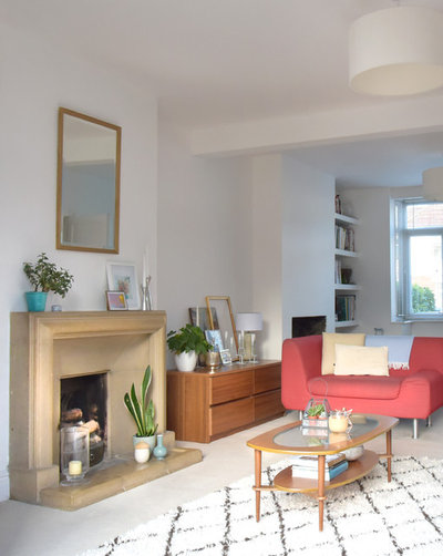
As well as extending at the rear, Barber also knocked the living room through into what had been the dining room at the front of the house. “This was done right at the end of the build, just before Christmas,” says Barber. “Then we painted like we’ve never painted before to get it done in time! We just wanted a bright, clean backdrop. I knew I could change it later, but in fact I’ve kept it this way, white and fresh.”
The neat set of drawers was previously in another room. “I was debating whether to keep it or not, but moving it to the living room gave it a new lease of life,” says Barber. Now, it’s vital storage for DVDs. “Moving your pieces around makes a space feel really fresh. I would definitely recommend that to anyone. Just move what you already own or rejig it with a lick of paint.”
Armchair, Habitat. Storage, Homebase. Berber rug, John Lewis.
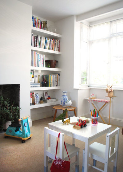
At the front of the living space there’s room for the children to play. Barber’s husband built the shelves in the chimney alcove.
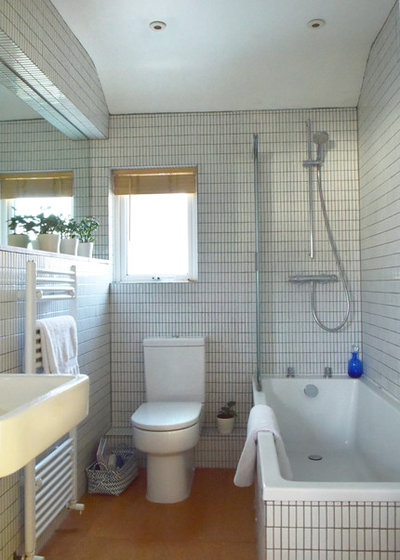
Barber modernised the bathroom about four years ago. “It had a magnolia suite and blue tiles,” she says. “I wanted to freshen it up.” She installed a mirror down one wall to maximise light from the small window. “I also chose a wall-mounted basin to keep things off the floor, so you see more floor space. This makes the room feel larger,” she says.
Cork floor tiles, Wickes. Wall tiles, local supplier. Suite and radiator, all Bathstore.
Cork floor tiles, Wickes. Wall tiles, local supplier. Suite and radiator, all Bathstore.
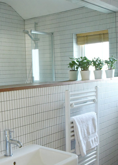
Plants are dotted throughout the house. “They really soften a space,” says Barber. “As soon as you put some greenery in, it really brings a room to life and freshens it up.”
Radiator, Bathstore.
Radiator, Bathstore.
“I like children’s rooms to be bright and colourful,” says Barber. Her son loves bright colours and Barber wanted to do something that showed off his collection of dinosaurs. “I wanted them to be the centrepiece,” she says. She painted the stool to create a bedside table.
Bed, John Lewis.
Bed, John Lewis.
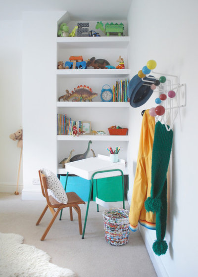
The desk was an eBay find. “I was maybe going to paint the legs, but my son loved them,” says Barber. “Green is his favourite colour, so he won that battle.”
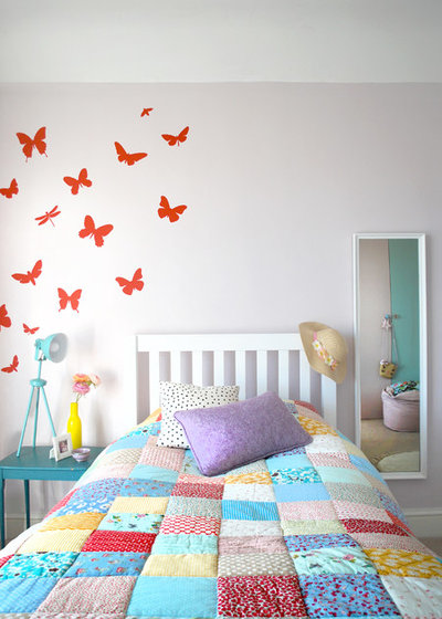
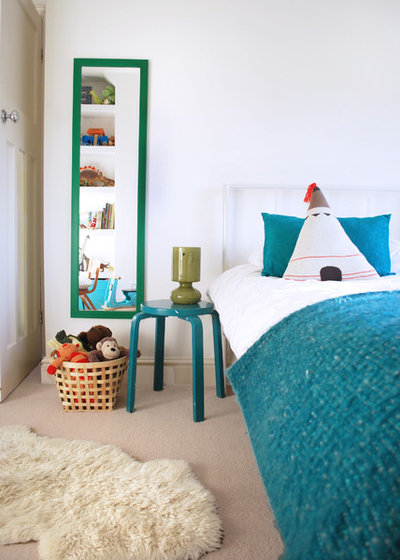
Barber’s daughter loves butterflies and these versatile stickers have moved around the house with her, from her nursery to her son’s room, when she was in there, to her own room here. “They’ve been absolutely brilliant,” says Barber.
Lamp, HomeSense. Walls painted in Pale Amethyst, Laura Ashley. Stickers, Ferm Living.
12 easy budget-friendly bedroom upgrades
Lamp, HomeSense. Walls painted in Pale Amethyst, Laura Ashley. Stickers, Ferm Living.
12 easy budget-friendly bedroom upgrades
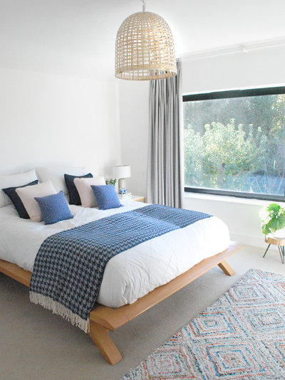
The master bedroom sits above the kitchen extension and features the same glazing, lined up neatly with the large windows below.
“It’s brilliant to have a new, much bigger bedroom,” says Barber. “We’ve done it all wrong, though! We had two small children in a tiny house with our bed squeezed into what is now her daughter’s room. This would now be the perfect house to have a baby in – I could fit a cot in here. Not that we’re going to have more children!”
Bed, House of Fraser.
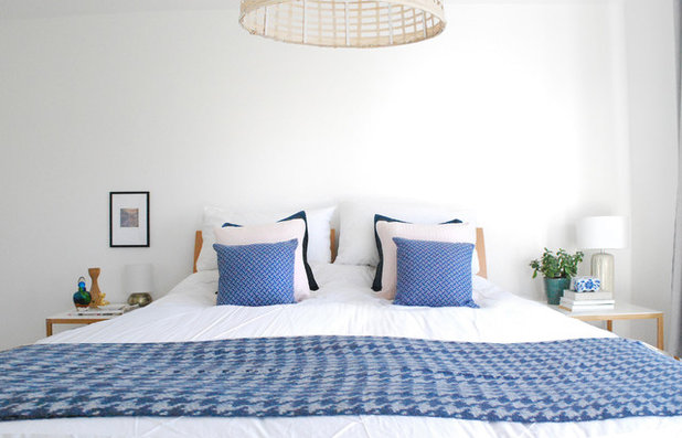
The same white scheme used throughout keeps the bedroom fresh and bright, punctuated with a blue throw and cushions.
Throw, HomeSense.
Throw, HomeSense.
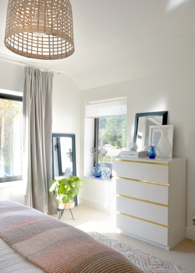
Barber added built-in wardrobes to the extended master bedroom. “I wanted somewhere I could hide all my stuff away and not have wardrobes in the room,” she says. “Now, we just have the bed, bedside tables and chest of drawers in here. Everything else is hidden away. It’s a lovely, relaxing space.”
Barber cleverly upcycled an Ikea chest of drawers with some flashes of gold sticky-back plastic. “It adds highlights to it and kind of brings the piece to life,” she says.
Lampshade, John Lewis. Malm chest of drawers, Ikea.
11 flexible features to maximise space in your bedroom
Barber cleverly upcycled an Ikea chest of drawers with some flashes of gold sticky-back plastic. “It adds highlights to it and kind of brings the piece to life,” she says.
Lampshade, John Lewis. Malm chest of drawers, Ikea.
11 flexible features to maximise space in your bedroom
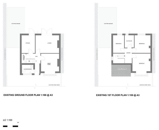
Plans of the original layout show its slightly cramped configuration and the impossible-to-access garage. “It was quite a square house to start with and it’s now more L shaped,” says Barber.
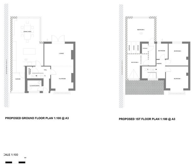
In addition to radically extending at the rear and side to create a large kitchen-diner, the original living and dining space were knocked through. Three steel beams support the new kitchen-dining space on the ground floor.
On the first floor, Barber looked into removing the corner of what had been bedroom three to open up the new master bedroom. However, that would have involved installing more steels up here and reconfiguring the roof, so instead, she kept the corner structure in and incorporated it by creating a storage space.
What do you think of this creative family home? Tell us in the Comments below.

Related Stories

House Tours
Houzz Tour: A Midcentury Home With a Strong Indoor-outdoor Link
By Becky Harris
A nature-inspired renovation has given this ranch house a relaxed mood and a connection to the outdoors from most rooms
Full Story

House Tours
Houzz Tour: Warm Tones and Luxurious Surfaces in a City Townhouse
An earthy colour palette, hidden storage and well-placed texture add character and practicality to this London home
Full Story

Room Tours
Kitchen Tour: A Gorgeous Extension With a Leafy Glasshouse Feel
By Kate Burt
When the owners of this terraced house extended, they were keen to retain its period feel and highlight the garden
Full Story

Gardens
Garden Tour: A Bare Roof Terrace Becomes a Pretty, Sociable Space
By Kate Burt
A retired couple got help transforming their large rooftop into a gorgeous, welcoming, multi-functional retreat
Full Story

House Tours
Houzz Tour: A Smart Layout and Genius Storage in a Victorian Home
Flipping the standard layout and carving out excellent storage have turned this tired house into a brilliant family home
Full Story

House Tours
Houzz Tour: A Victorian House Brought Impressively Up to Date
By Jo Simmons
A cohesive layout and warm colours combined with energy-efficiency measures thoroughly modernise this terraced home
Full Story

Kitchen Tours
Kitchen Tour: An Open, Airy Space Made for Entertaining
Combining two separate rooms has improved flow and created a sociable open-plan kitchen, dining and seating space
Full Story

House Tours
Houzz Tour: A Family Home Inspired by its Seaside Location
Coastal colours and practical design combine to create a house that will adapt as the family grows
Full Story

Kitchens
5 Inspiring Before and After Kitchen Transformations
Whether you want to boost storage, incorporate original features or maximise your space, take ideas from these designs
Full Story

House Tours
Houzz Tour: An Airy, Scandi Finish for a Tall Victorian House
By Kate Burt
From a tricky inherited bath to a sticky-out staircase, on-site problem-solving led to a seamless update for an old home
Full Story
I really love the light in your home, and you have created a friendly warmth with your interiors. Love the rug in your master bedroom too! :-)
Beautiful clean space! The style of the cabinets are incredibly popular at the moment!