Houzz Tour: A 1950s House is Cleverly Extended on Three Sides
Crittall windows, cork flooring and pale ash wood were used to sympathetically extend this Cotswolds home
Cheryl F
21 May 2019
Houzz Contributor. I'm a London-based journalist with years of experience writing for the UK's top interiors titles. I love shopping for quirky accessories, have a passion for rummaging through vintage stores and I'm ever-hopeful of finding that elusive perfect paint shade.
Houzz Contributor. I'm a London-based journalist with years of experience writing... More
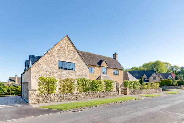
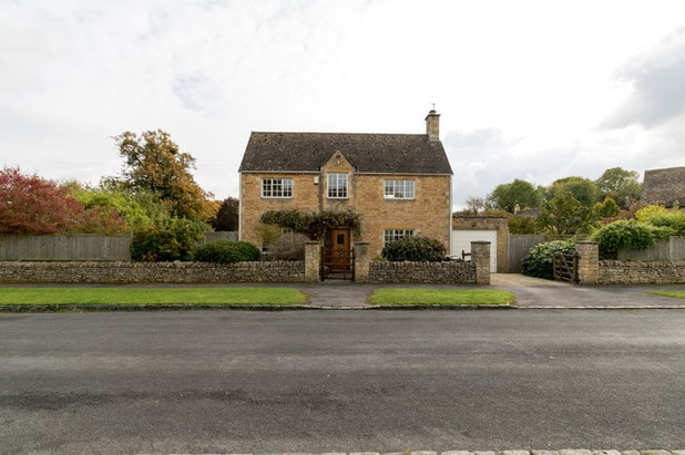
When architect Lydia Robinson and her partner, Lawrence Grigg, spotted this 1950s house in the Cotswolds town of Chipping Campden, they knew they had to have it. Though it sat on a slightly awkward corner plot, they could see it was something special, its Arts and Crafts-style design richly connected to the local heritage.
“We thought it had lots of potential, as the quality of the house was high – it was constructed by Pyments, a local builder that had worked for Arts and Crafts architects Griggs & Ashbee,” Lydia says. “We bought it as a project, as it was a small house on a large [fifth of an acre] plot.”
Now their beautifully updated, expanded home has the best of all worlds – heritage charm combined with modern, Scandi cool and timeless midcentury touches. “Architecturally, we tried to stay true to the house’s origins and celebrate original details, such as the terracotta tile windowsills, cork flooring and Crittall windows,” Lydia says.
House at a Glance
Who lives here? Lydia Robinson and Lawrence Grigg, directors of architecture practice Design Storey (Lydia is an architect; Lawrence is a project manager)
Location Chipping Campden, Gloucestershire
Property Two-storey 1950s Cotswolds stone house, originally built by local Arts and Crafts builders. It now has three extensions (a porch, two storeys to one side and a single storey to the other)
Size 4 bedrooms, 3 bathrooms; 200 sq m in total
Architects Lydia Robinson and Lawrence Grigg of Design Storey
Photos by Colin Poole and Design Storey
The house was structurally in good condition when the couple first spotted it. However, Lydia says, “It was tired and badly in need of attention.
Lydia and Lawrence knew the challenges this could involve, but they also wanted to stay ambitious. “We like to push our designs to the maximum, trying out new ideas and innovative techniques,” Lydia says.
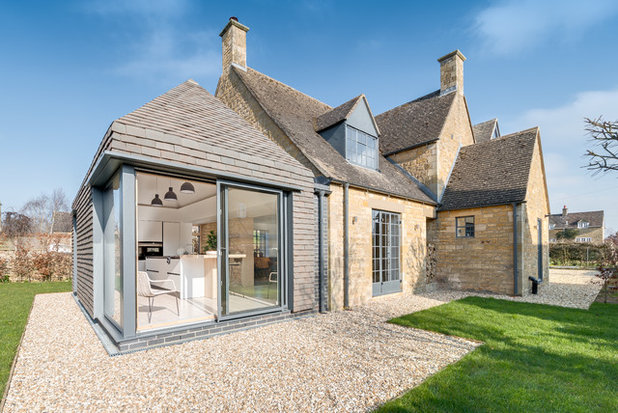
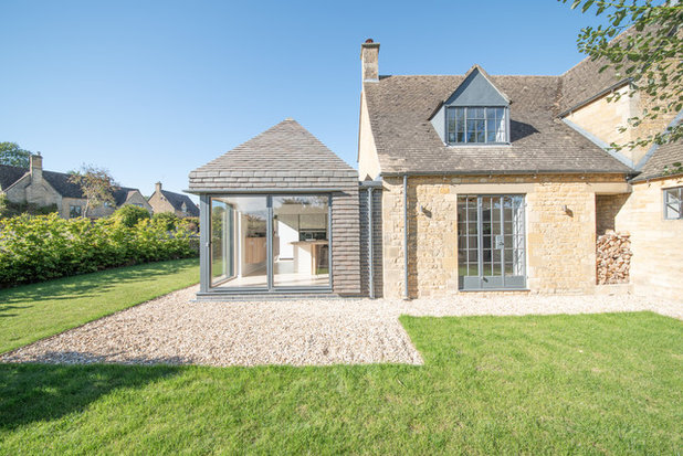
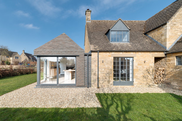
One challenge was the vertically hung tiles on the outside of the single-storey extension. “These were handmade for the project, and involved eight different types of tile to get the seamless finish,” she says.
One challenge was the vertically hung tiles on the outside of the single-storey extension. “These were handmade for the project, and involved eight different types of tile to get the seamless finish,” she says.
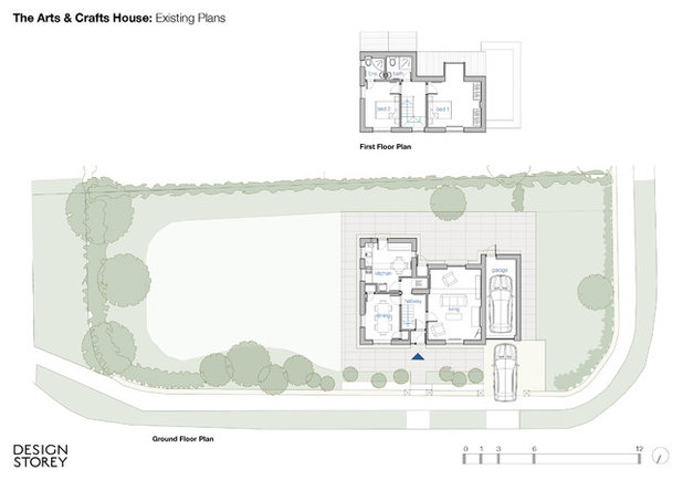
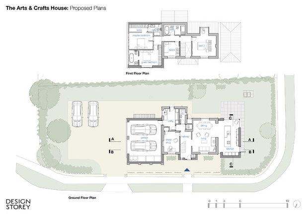
The pair had big plans for their new house. “We really wanted to make the most of it, including its connection to the garden,” Lydia says. “We demolished an existing garage and added a single-storey extension to the house, taking advantage of its south-west aspect.
“We also added a porch at the front to increase the hallway size, and changed the run and configuration of the staircase for a double-height entrance,” she says.
“Finally, we added a two-storey extension [on the opposite side of the house to the single-storey addition], which contains a master bedroom with walk-in wardrobe and a guest bedroom,” she says. “This also has a carport underneath that could be converted into an additional living space in future.”
Expanding the house was a major project. “Effectively, we knocked three sides off the house, reworked the circulation and stairs, and opened up the house internally to improve the flow of space,” Lydia says.
“In addition, we added several vaulted areas, including the new kitchen and the bedrooms in the two-storey extension, which was quite complicated to achieve and involved some tricky engineering, a lot of structural steel and quite a bit of plywood!,” she says.
“To reduce costs, we tried to preserve the core of the existing house – the load-bearing masonry walls,” she adds.
The couple also created a new driveway and parking area to the side closest to the road, and converted the existing kitchen into a boot room, utility room and cloakroom.
The original floorplan…
…and the extended version.
Lydia describes the updated house’s style as “fresh and Scandinavian”. However, the design stays true to the building’s Arts and Crafts roots “in terms of the quality of the construction and some of the details – the buttresses, triangular dormer windows and so on”.
When furnishing the house, Lydia tried, where possible, to use objects that were designed locally or echoed the property’s design heritage.
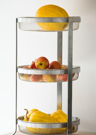
“For example, the kitchen’s vegetable rack is by Robert Welch, a pioneer of the Arts and Crafts movement. Welch designed the iconic Campden toaster rack that was mass produced in the 1970s by Old Hall.”
“For example, the kitchen’s vegetable rack is by Robert Welch, a pioneer of the Arts and Crafts movement. Welch designed the iconic Campden toaster rack that was mass produced in the 1970s by Old Hall.”
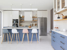
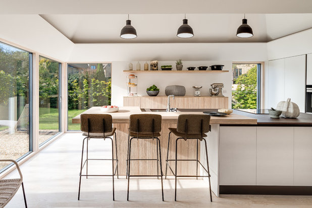
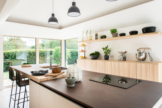
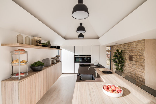
The kitchen has a fresh, Scandi vibe, but with a nod to the home’s heritage. “We wanted clean lines, but a few touches that evoked the 1950s spirit of the house, hence the black trims on the cabinets,” Lydia says.
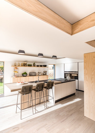
“We chose an Italian kitchen, customised for the space. We wanted each element to feel like a separate piece of furniture, so designed a ‘floating’ cabinet with open shelves, plus a huge island with a breakfast bar at one end that dominates the space and draws you out to the garden,” she says.
Handleless Pedini kitchen units in plain white and bamboo finish, L’una Design.
The exposed stone wall adds a little rustic charm. “This was the end gable of the original house,” Lydia explains. “We thought the Cotswolds stone worked well with the new kitchen scheme.”
The worktop is Silestone on the island and bamboo elsewhere.
Don bar stools, Ondarreta. Lights, Muuto. Boiling-water tap, Quooker.
The worktop is Silestone on the island and bamboo elsewhere.
Don bar stools, Ondarreta. Lights, Muuto. Boiling-water tap, Quooker.
The tall bank of cupboards at the far end provides storage and a home for the fridge and ovens. “It allows the rest of the space to be more playful,” Lydia says.
The units are white for a reason. “They’re designed to ‘disappear’ into the wall in order to make the island have more presence,” she says.
“We also always like including open shelves in a design, as it’s great to be able to add character by displaying personal objects,” she adds.
Find the right person for your project by searching the Houzz Professionals Directory.
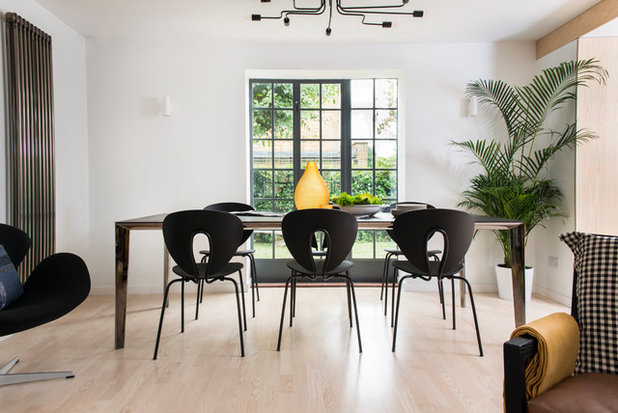
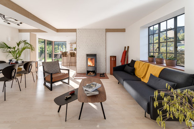
The dining area, which is now part of the broken-plan kitchen and living room, is positioned so diners get a view of the garden.
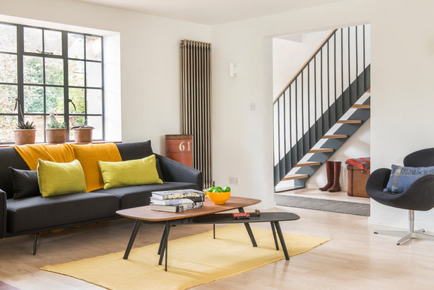
The living room furniture was inspired by 1950s design. “We wanted a fresh, modern, yet slightly retro feel that tied in with the rest of the house,” Lydia says.
“The Crittall windows are the original 1950s ones – we’re the only house in the area to still have them,” she says. “They were in good condition, but single-glazed. We wanted to retain them, as they’re a beautiful, original feature, so we took them out and had them shot-blasted, powder-coated and reglazed with slimline double-glazed units.”
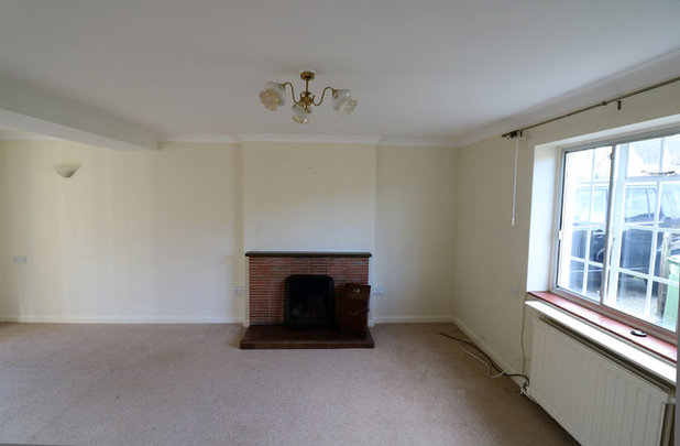
The wood-burning stove replaced an existing “unattractive” fireplace (see the next photo). “When we removed it, we discovered the brick behind and painted it a light grey,” Lydia says.
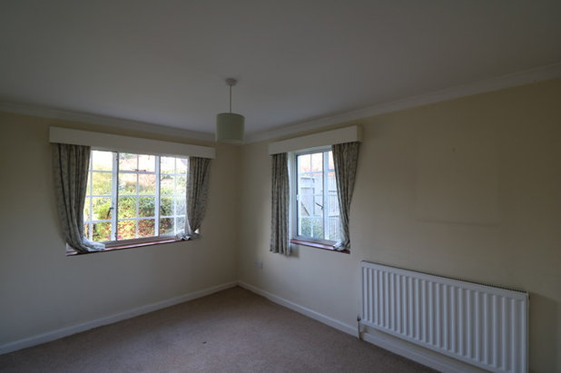
The living room before the renovation, showing the fireplace and previously white-painted Crittall windows.
Pale ash wood flooring helps the living room to look light and airy. “Ash is the predominant tree species in the Cotswolds and, because it’s a hardwood, we could use it for the joinery, flooring and stair treads,” Lydia says.
“We also used ash ply around the chimney breast and beams to tie in with the flooring and joinery,” she adds.
Flooring, Kahrs.
“We also used ash ply around the chimney breast and beams to tie in with the flooring and joinery,” she adds.
Flooring, Kahrs.
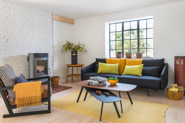
While the colour scheme is muted, with dark grey windows, terracotta sills and white walls, brighter colours, such as mustard and lime, are added through the soft furnishings.
“We wanted to be able to easily adjust the mood of the space in the future, so deliberately kept the shell quite neutral,” Lydia says.
Stua Costura sofa, B&B Italia. Clio armchair; Stua Solapa coffee table, L’una Design.
“We wanted to be able to easily adjust the mood of the space in the future, so deliberately kept the shell quite neutral,” Lydia says.
Stua Costura sofa, B&B Italia. Clio armchair; Stua Solapa coffee table, L’una Design.
“We’re really pleased with the sense of space and the aesthetic,” Lydia says. “The clean lines and pale floor help to showcase the classic lines of the furniture. However, it’s not a clinical house and it still has the ambience of a cosy, welcoming home.”
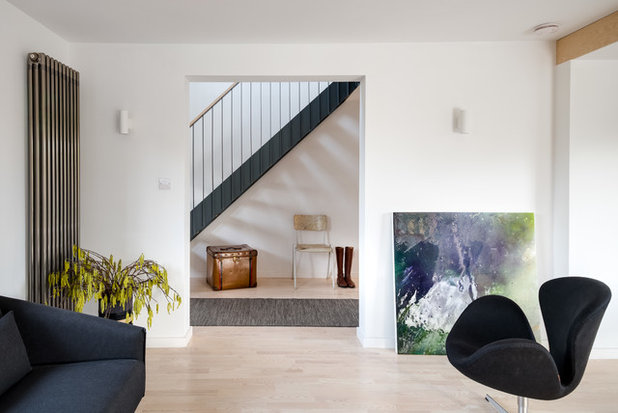
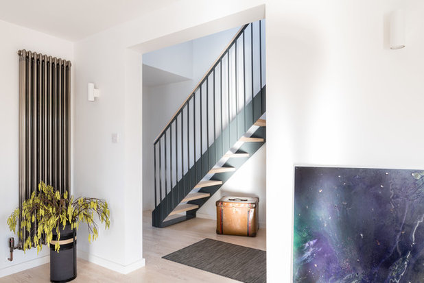
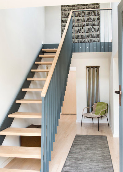
A bespoke staircase, designed by the architect, makes a statement in the hall. “Again, the inspiration was the style of the original house,” Lydia says. “We wanted a simple but well-crafted design, and used the open risers, ash treads and steel balustrade to make it feel lightweight and allow sunlight to filter through it.
“It’s powder-coated in shade RAL 7012 – the same colour as the windows – and finished with an ash handrail and treads made by a local joinery company,” Lydia adds.
“It’s powder-coated in shade RAL 7012 – the same colour as the windows – and finished with an ash handrail and treads made by a local joinery company,” Lydia adds.
Don’t underestimate the impact stairs can have, Lydia says. “Stairs are at the heart of a property and typically one of the first features you see. You want them to set up the expectation of the design and quality of the rest of the house,” she says. “They shouldn’t be an afterthought.”
Raw steel radiator, Column Rads.
Raw steel radiator, Column Rads.
The original dining room, seen here, has been turned into a snug.
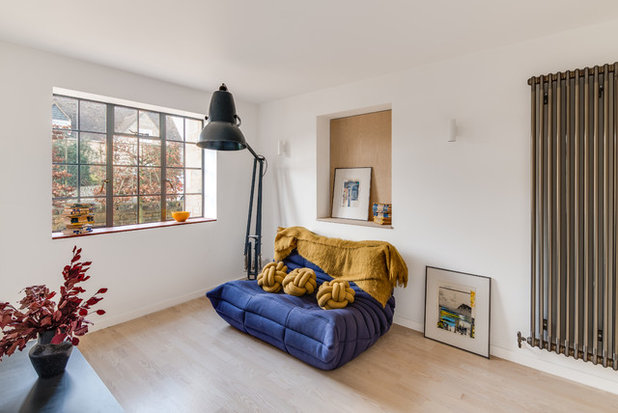
The new snug, TV and media room is a place to unwind. “The sofa is the most comfortable one I’ve ever sat on and great for watching movies,” Lydia says.
Anglepoise floor lamp; Togo sofa by Ligne Roset, both Heal’s.
Anglepoise floor lamp; Togo sofa by Ligne Roset, both Heal’s.
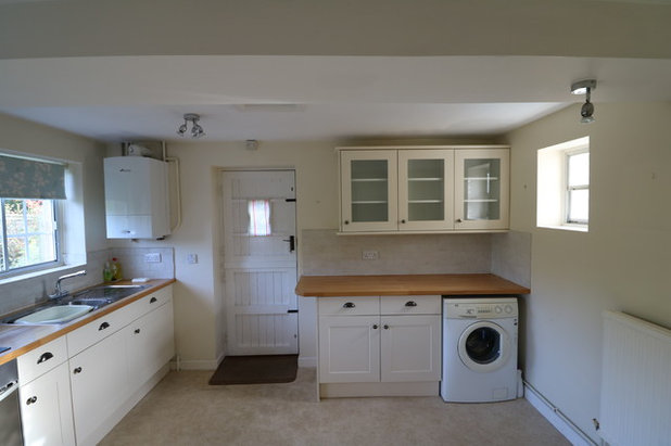
The former kitchen…
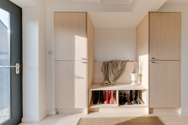
…has been turned into a boot room and utility area. The bespoke storage and bench clad in ash panelling were designed by the architect.
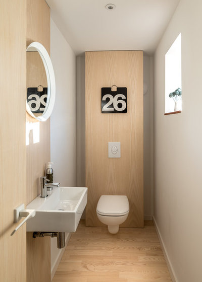
Space was also carved out of the old kitchen for a cloakroom, which features ash panelling and flooring.
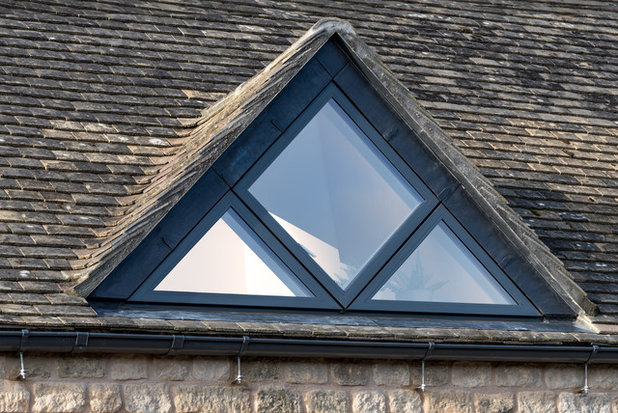
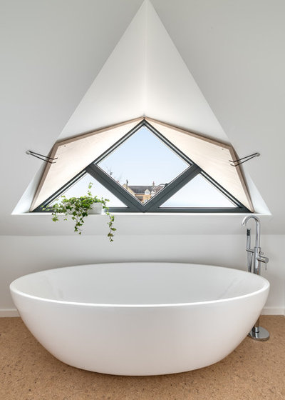
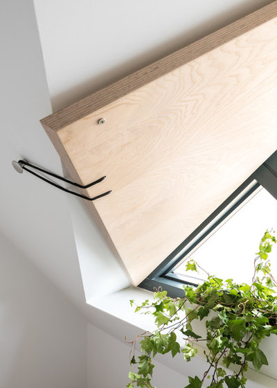
The two-storey extension features striking triangular dormers. “They have casements hung at 45 degrees, which was a new challenge for the window manufacturer,” Lydia says.
Triangular dormers, Idealcombi.
Triangular dormers, Idealcombi.
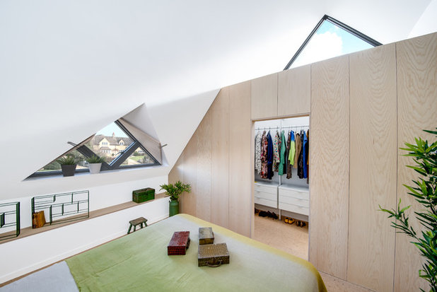
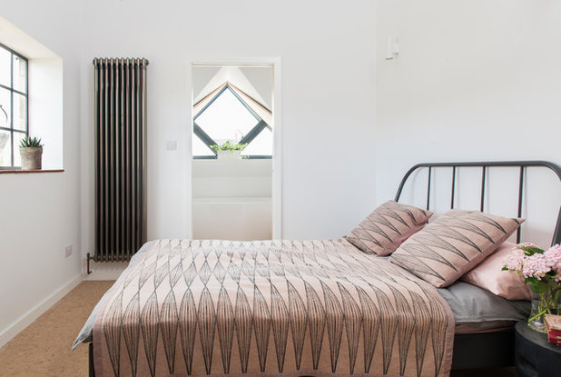
The first floor of the two-storey extension houses a master bedroom suite and a guest suite.
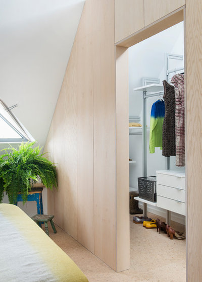
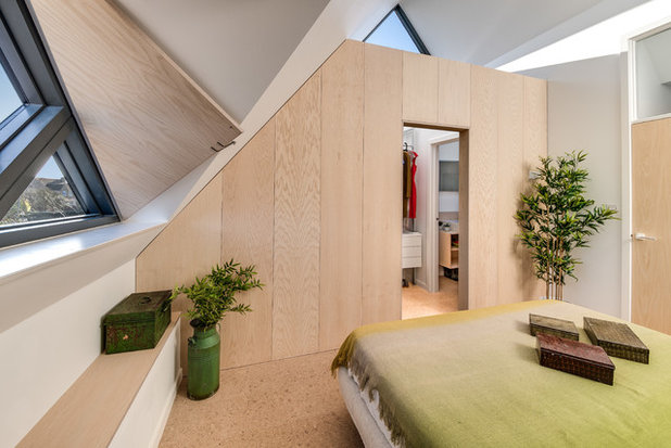
Lydia and Lawrence sectioned off an area of the master bedroom to form a walk-in wardrobe, finished in ash-faced ply.
Lydia and Lawrence sectioned off an area of the master bedroom to form a walk-in wardrobe, finished in ash-faced ply.
The wardrobe adds a cool Scandi touch. “The vibe here is ‘Arne Jacobsen on a weekend away in the Cotswolds’,” Lydia says.
To the right of the wardrobe is an en suite shower room. The flooring throughout is cork, which is warm underfoot and has a lovely natural look.
The two-storey extension also houses a guest bedroom with en suite. “For this bedroom, we reused two of the original Crittall windows, reclaimed from the gable end, and joined them together with a metal strip,” Lydia says. “This ensured all the Crittall windows were the same on the front elevation.
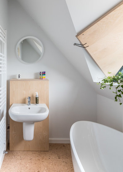
“We wanted the bath to be located in the dormer, with the basin and toilet to the side, so when the pocket door is open, it feels as if the bathroom is part of the space,” she adds.
“We wanted the bath to be located in the dormer, with the basin and toilet to the side, so when the pocket door is open, it feels as if the bathroom is part of the space,” she adds.
Belle freestanding bath, Soak.com.
The cleverly designed ash-faced ply shutters on the triangular windows can be hooked back.
A bespoke ash unit houses the floating basin.
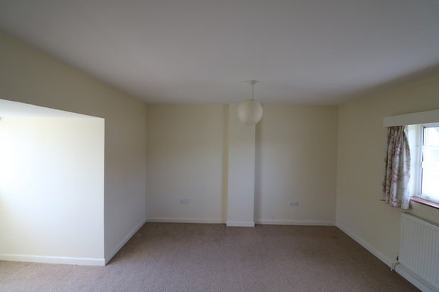
The old master bedroom was converted into a second guest bedroom.
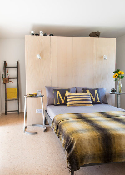
In the second guest room, the built-in wardrobe doubles up as a headboard with integrated lighting.
“We retained the existing master bedroom as a good-sized third [second guest] bedroom, but the wardrobe and headboard improves the proportions and functionality of this room,” Lydia says.
“We retained the existing master bedroom as a good-sized third [second guest] bedroom, but the wardrobe and headboard improves the proportions and functionality of this room,” Lydia says.
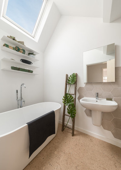
The main bathroom, which serves bedrooms three and four, has a vaulted ceiling and cork flooring. “The existing en suite and master bathroom were knocked together to form this larger room,” Lydia says.
Hex tiles, Porcelain Superstore. Cork flooring, The Cork Flooring Company. Ava slimline freestanding bath, Soak.com.
Hex tiles, Porcelain Superstore. Cork flooring, The Cork Flooring Company. Ava slimline freestanding bath, Soak.com.
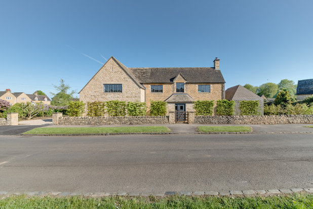
There’s no doubt being on a corner plot was tricky. “Every elevation of the house is exposed, so you don’t have a clearly defined back and front, as you would have in, say, a terraced house,” Lydia says.
“When it came to planning, we had to make a strong case for coming forward with all the extensions, so we didn’t encroach on the back garden, which is south-facing. In addition, we couldn’t add new windows on the second storey to the rear, as this would have overlooked the neighbouring garden, so we used a combination of clerestory windows, skylights and dormers.”
That abundance of light is Lydia’s favourite thing about the finished home. “It’s beautiful due to the fact that a number of the rooms are dual or even triple aspect,” she says. “The Crittall windows allow masses of light through the slimline frames. We also enjoy the connectivity with the garden, which entices you outside.”
Tell us…
What do you think of this spacious Arts and Crafts home? Share your thoughts in the Comments section.
Related Stories
House Tours
Houzz Tour: Warm Tones and Luxurious Surfaces in a City Townhouse
An earthy colour palette, hidden storage and well-placed texture add character and practicality to this London home
Full Story
Room Tours
Kitchen Tour: A Gorgeous Extension With a Leafy Glasshouse Feel
By Kate Burt
When the owners of this terraced house extended, they were keen to retain its period feel and highlight the garden
Full Story
Gardens
Garden Tour: A Bare Roof Terrace Becomes a Pretty, Sociable Space
By Kate Burt
A retired couple got help transforming their large rooftop into a gorgeous, welcoming, multi-functional retreat
Full Story
House Tours
Houzz Tour: A Smart Layout and Genius Storage in a Victorian Home
Flipping the standard layout and carving out excellent storage have turned this tired house into a brilliant family home
Full Story
House Tours
Houzz Tour: A Victorian House Brought Impressively Up to Date
By Jo Simmons
A cohesive layout and warm colours combined with energy-efficiency measures thoroughly modernise this terraced home
Full Story
Kitchen Tours
Kitchen Tour: An Open, Airy Space Made for Entertaining
Combining two separate rooms has improved flow and created a sociable open-plan kitchen, dining and seating space
Full Story
House Tours
Houzz Tour: A Family Home Inspired by its Seaside Location
Coastal colours and practical design combine to create a house that will adapt as the family grows
Full Story
Kitchens
5 Inspiring Before and After Kitchen Transformations
Whether you want to boost storage, incorporate original features or maximise your space, take ideas from these designs
Full Story
House Tours
Houzz Tour: An Airy, Scandi Finish for a Tall Victorian House
By Kate Burt
From a tricky inherited bath to a sticky-out staircase, on-site problem-solving led to a seamless update for an old home
Full Story
House Tours
Houzz Tour: A 17th Century Cottage Gains Warmth and Character
The clever use of colour and pattern has revived this old building while creating a 21st century family home
Full Story




We actually organised the refurbishment of them ourselves. This involved taking out the windows and removing the glass, taking them to be shot blasted, then taking them to be powder coated. We got a local glazing company to install the double glazing. However, if you speak to Toby at Hawkscroft he should be able to discuss how to go about refurbishing them. https://www.hawkscroft.com/. I should say we are not in a conservation area and its not a listed building so we were able to remove the glass, which was modern and add in double glazing. We thought they came out really well, especially the patio doors.
Lovely. Just lovely. And so much thought and attention to detail in the planning & execution. I love the revamped Crittall windows... My favourite colour for window frames too, charcoal grey.
The house is absolutely beautiful. I love what they've done. The only thing I find surprising is the total massacre of the garden. There doesn't seem to be much left of it at all!