


Houzz Tour: A Brilliant Layout Rejig Transforms a City Flat
A dull flat has been turned into a gorgeous, calming space thanks to a new layout that makes the most of its terrace
Bea González
2 December 2021
The terrace of this 65 sq m flat in a 1930s building in Madrid, Spain, was a miserable space, until a three-month-long renovation revived it – and brightened the interior along the way. Now, the living room and bedroom are positioned around it, so the owners can access it and enjoy views of the city from both rooms.
The couple wanted a home with a sophisticated style, and their main priority for the renovation was to reconfigure the layout of the rooms to gain space and light. They found and hired the ideal professional for their project on Houzz. “Contacts through Houzz are easy and usually very effective, because when someone messages you directly, they’ve already seen your profile, rates and projects, so they already like your work,” interior designer Nora Zubia of Slow & Chic – Interiorismo says. “That’s how it was with these clients: they saw a project of mine that suited them and, from that point on, everything went smoothly and easily.”
The couple wanted a home with a sophisticated style, and their main priority for the renovation was to reconfigure the layout of the rooms to gain space and light. They found and hired the ideal professional for their project on Houzz. “Contacts through Houzz are easy and usually very effective, because when someone messages you directly, they’ve already seen your profile, rates and projects, so they already like your work,” interior designer Nora Zubia of Slow & Chic – Interiorismo says. “That’s how it was with these clients: they saw a project of mine that suited them and, from that point on, everything went smoothly and easily.”
Flat at a Glance
Who lives here? A couple
Location Madrid, Spain
Size 65 sq m
Designer Nora Zubia of Slow & Chic - Interiorismo
Budget Total about €30,000 (£25,260), including all work related to the masonry, electricity, plumbing and painting. Furniture and materials by room: complete kitchen, €9,000 (around £7,578); complete bathroom, €3,000 (around £2,526); living room,€3,300 (around £2,778); bedroom, €1,800 (around £1,515); dressing room, €800 (around £674); office, €900 (around £758); terrace, about €3,600 (around £3,030).
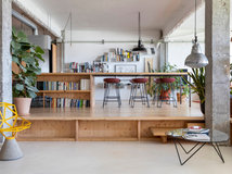
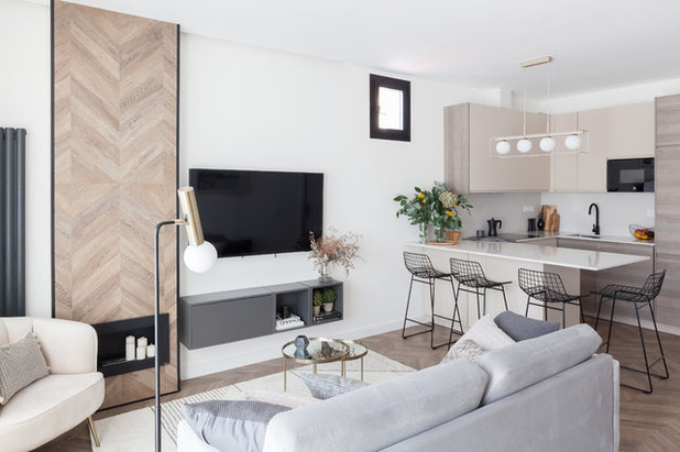
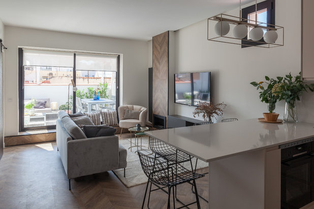
The key goals of the renovation were to improve access to the terrace and to integrate it so well into the interior that it could serve as additional dining and relaxation space for the open-plan kitchen-living room.
The team knocked through to create this open social space, and fitted sliding doors onto the terrace. The chimney finish and fireplace are also new.
Who lives here? A couple
Location Madrid, Spain
Size 65 sq m
Designer Nora Zubia of Slow & Chic - Interiorismo
Budget Total about €30,000 (£25,260), including all work related to the masonry, electricity, plumbing and painting. Furniture and materials by room: complete kitchen, €9,000 (around £7,578); complete bathroom, €3,000 (around £2,526); living room,€3,300 (around £2,778); bedroom, €1,800 (around £1,515); dressing room, €800 (around £674); office, €900 (around £758); terrace, about €3,600 (around £3,030).
The key goals of the renovation were to improve access to the terrace and to integrate it so well into the interior that it could serve as additional dining and relaxation space for the open-plan kitchen-living room.
The team knocked through to create this open social space, and fitted sliding doors onto the terrace. The chimney finish and fireplace are also new.
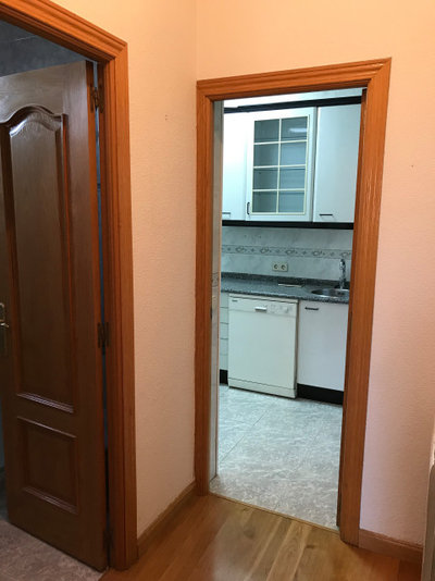
Before Photo
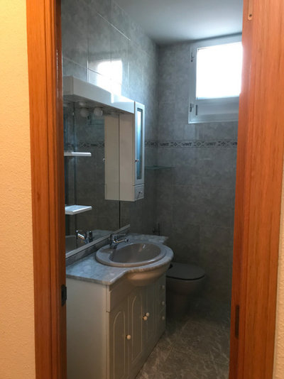
The space now taken up by the kitchen-living room was originally broken up into three small rooms. The old bathroom, pictured here, was where the kitchen now stands. The owners recall that when they bought the property, it had a long, very dark corridor. The terrace was just part of the background.
They told Nora they wanted a spacious, bright interior in which the terrace would play protagonist, and they are very happy with the result. For them, having this terrace in the heart of Madrid is a treasure, but having it at the heart of the house, connected to the dining room with patio doors and to the office and bedroom through windows, is key.
They told Nora they wanted a spacious, bright interior in which the terrace would play protagonist, and they are very happy with the result. For them, having this terrace in the heart of Madrid is a treasure, but having it at the heart of the house, connected to the dining room with patio doors and to the office and bedroom through windows, is key.
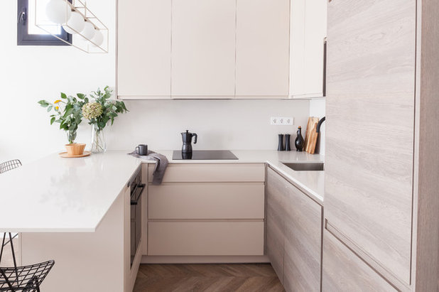
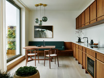
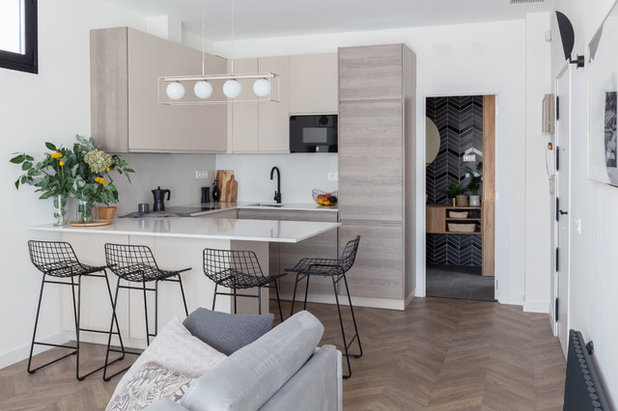
The new kitchen is U-shaped and has a peninsula that serves multiple functions: it visually separates the kitchen from the living area, and features an expansive worktop that doubles as a breakfast area and bar. The objective was to design a space that would perfectly blend into the living room.
“As for the kitchen, I would like to highlight the combination of the cashmere colour and the wood,” Nora says. “We wanted it to blend in with the living room furniture and not look like a typical kitchen. So we went for unusual colours and added black taps and appliances to make it look very elegant.”
“As for the kitchen, I would like to highlight the combination of the cashmere colour and the wood,” Nora says. “We wanted it to blend in with the living room furniture and not look like a typical kitchen. So we went for unusual colours and added black taps and appliances to make it look very elegant.”
The materials chosen in the renovation are warm and elegant throughout: dark flooring, velvet textiles and black and gold light fixtures and furniture. The floor is laminate in a herringbone pattern.
“We really liked the colour, thinking it added an elegant touch to the home despite the dark shade,” Nora says. “We chose the herringbone because we realised it would help create a common thread running through the house once we opened up the main space by getting rid of the partitions. The same pattern is on the bathroom wall tiles and the bedroom wallpaper.”
“We really liked the colour, thinking it added an elegant touch to the home despite the dark shade,” Nora says. “We chose the herringbone because we realised it would help create a common thread running through the house once we opened up the main space by getting rid of the partitions. The same pattern is on the bathroom wall tiles and the bedroom wallpaper.”
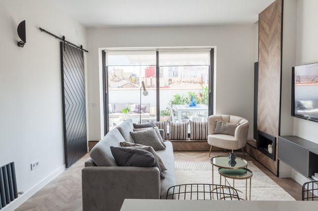
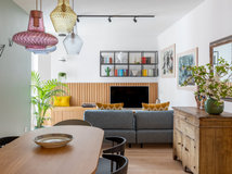
Nora defines the décor as contemporary and elegant with a sophisticated touch. “I proposed furniture and then checked with the owners, who contributed their own ideas,” she says. The black, custom-made sliding door stands out. “It’s one of the key décor elements in the living room. We wanted a partition that was decorative and original.”
Nora also points out the off-white velvet armchair by the fireplace. “It was the owners’ suggestion,” she says. “It’s an unusual and very elegant armchair.”
Nora also points out the off-white velvet armchair by the fireplace. “It was the owners’ suggestion,” she says. “It’s an unusual and very elegant armchair.”
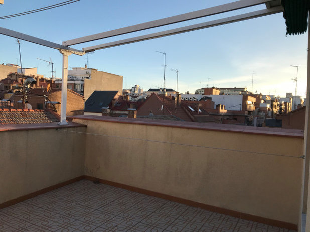
Before, the terrace had been neglected and disconnected from the rest of the flat.
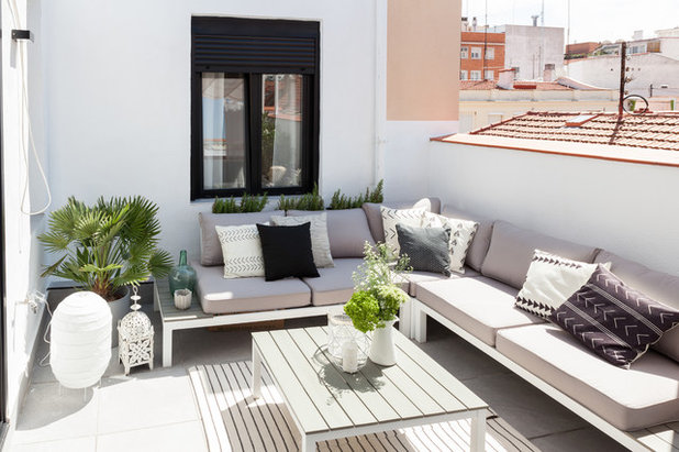
Now, the owners have a terrace divided into two zones – a dining area and a relaxation space with an L-shaped sofa. Nora also installed an awning to provide shade.
Before Photo
The old kitchen is now the bathroom, pictured in the following two photos.
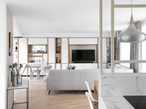
This photo of the living room shows its integration with the kitchen and the bathroom in the background.
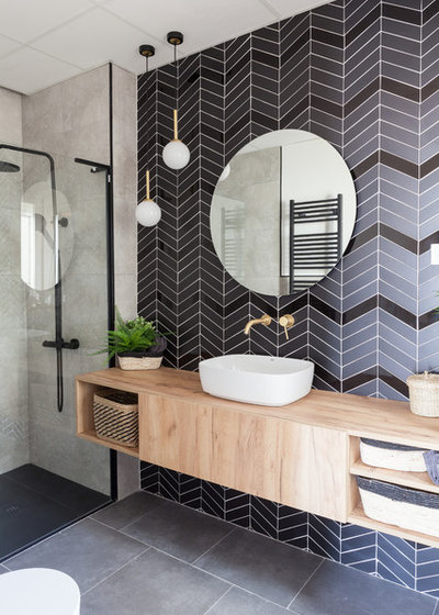
“I think the bathroom is one of the most successful spaces,” Nora says. “We put a lot of thought into it and went through a lot of proposals. It wasn’t easy to go for a dark grey wall, but we had a large space with natural light and thought we should take a chance. It was important to combine it with elements in matt gold and black for contrast.”
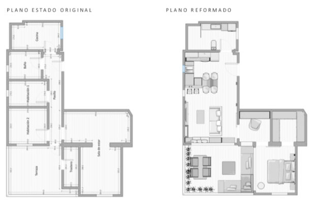
This is the layout of the flat before and after the renovation. Three rooms were joined to form the living room, and Nora also created a bright new bedroom, a dressing room and an office.
The layout is unusual in that that the bathroom is close to the kitchen rather than the bedroom. “That was mainly a structural issue,” Nora says. “The plumbing was at the back of the flat, so, if we’d wanted to place the bedroom close to the bathroom, we would have had to make hallways and would have lost the possibility of walking straight into an open area from the entrance. It’s not the usual set-up, but in this case, the result was worth it.”
The layout is unusual in that that the bathroom is close to the kitchen rather than the bedroom. “That was mainly a structural issue,” Nora says. “The plumbing was at the back of the flat, so, if we’d wanted to place the bedroom close to the bathroom, we would have had to make hallways and would have lost the possibility of walking straight into an open area from the entrance. It’s not the usual set-up, but in this case, the result was worth it.”
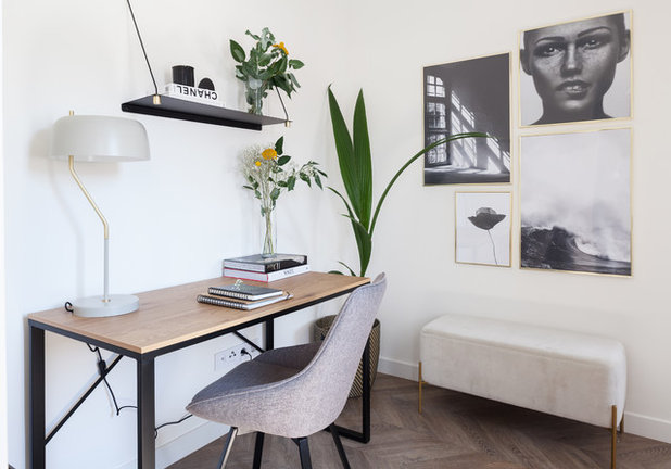
The office area is very compact and tidy. “A load-bearing wall was a constraint in the entire bedroom, so we wanted to take advantage of it by giving it a special and separate use as a work area,” Nora explains. “This way, we isolated the bedroom from the living room on the one hand, and gained an office on the other.
“We must bear in mind that the floor space is limited, but we do consider it important to have a personal office space without having to invade the living room or bedroom,” she adds.
“We must bear in mind that the floor space is limited, but we do consider it important to have a personal office space without having to invade the living room or bedroom,” she adds.
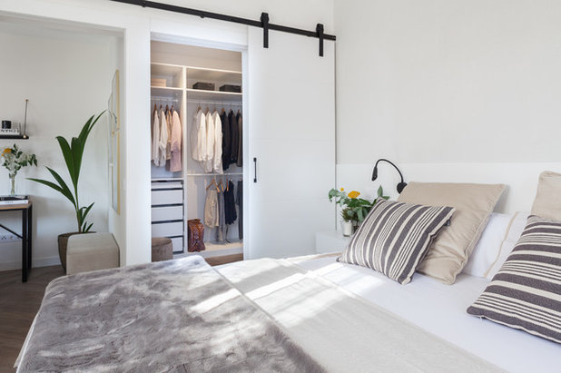
From here you can see the little office space and the walk-in wardrobe.
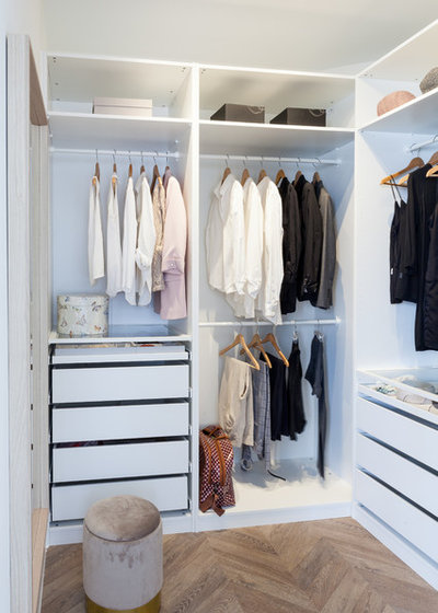
The dressing room illustrates the soft tones and beautiful herringbone floor that unite all of the spaces in the home.
Tell us…
What do you like about this home? Share your thoughts in the Comments.
Tell us…
What do you like about this home? Share your thoughts in the Comments.


Related Stories

House Tours
Houzz Tour: A Midcentury Home With a Strong Indoor-outdoor Link
By Becky Harris
A nature-inspired renovation has given this ranch house a relaxed mood and a connection to the outdoors from most rooms
Full Story

House Tours
Houzz Tour: Warm Tones and Luxurious Surfaces in a City Townhouse
An earthy colour palette, hidden storage and well-placed texture add character and practicality to this London home
Full Story

Room Tours
Kitchen Tour: A Gorgeous Extension With a Leafy Glasshouse Feel
By Kate Burt
When the owners of this terraced house extended, they were keen to retain its period feel and highlight the garden
Full Story

Gardens
Garden Tour: A Bare Roof Terrace Becomes a Pretty, Sociable Space
By Kate Burt
A retired couple got help transforming their large rooftop into a gorgeous, welcoming, multi-functional retreat
Full Story

House Tours
Houzz Tour: A Smart Layout and Genius Storage in a Victorian Home
Flipping the standard layout and carving out excellent storage have turned this tired house into a brilliant family home
Full Story

House Tours
Houzz Tour: A Victorian House Brought Impressively Up to Date
By Jo Simmons
A cohesive layout and warm colours combined with energy-efficiency measures thoroughly modernise this terraced home
Full Story

Kitchen Tours
Kitchen Tour: An Open, Airy Space Made for Entertaining
Combining two separate rooms has improved flow and created a sociable open-plan kitchen, dining and seating space
Full Story

House Tours
Houzz Tour: A Family Home Inspired by its Seaside Location
Coastal colours and practical design combine to create a house that will adapt as the family grows
Full Story

Kitchens
5 Inspiring Before and After Kitchen Transformations
Whether you want to boost storage, incorporate original features or maximise your space, take ideas from these designs
Full Story

House Tours
Houzz Tour: An Airy, Scandi Finish for a Tall Victorian House
By Kate Burt
From a tricky inherited bath to a sticky-out staircase, on-site problem-solving led to a seamless update for an old home
Full Story
Je trouve cela tres reussi, mais je reste encore une fois dubitative sur le manque de rangements.... une remarque de femme, me dirait mon conjoint.... un meuble riquiqui dans le salon sous la tv, le dressing, les meubles de cuisine et basta.
A moins que le couple soit hyper minimaliste ???....
Podrías pasarme el contacto de los profesionales?
Très belle réalisation ! Un petit bémol tout même : j’aurais créé une salle à manger, à la place du bureau peut-être (difficile à dire, le plan metré est très flou)