Houzz Tours

Houzz Tour: A Clever New Layout Transforms a 19th Century Flat
A smart rethink gave this apartment a third bedroom and a very stylish kitchen-dining-living room

This couple of property professionals bought their own home in the heart Lyon, France, on the third floor of a beautiful 19th century building. Stretching from street-front to courtyard, the flat overlooks the central Place des Terreaux.
Though the home was rundown and in need of a makeover when the couple first saw it, they were hooked by its ideal location and Haussmannian style, with high ceilings, oak floors, wainscotting and a fireplace.
They asked Marie-Anne Chapel, an experienced architect keen on antiques, high-end décor and unusual interiors, to rework its classical layout while adding style and a bit of wow factor.
New floorplan – anticlockwise from top entrance: hallway, living room-kitchen, bedroom 1, bathroom 1, bathroom 2, utility room, bedroom 3, bedroom 2, cloakroom
After The owners wanted the final layout to have three bedrooms, two bathrooms, a laundry room and an open living room-kitchen in order to make it both more contemporary and better suited to a family. They also wanted to arrange the rooms in such a way that the apartment could be split into two units in future.
The owners love to travel and collect beautiful things, so they were looking for something extraordinary in their décor. They wanted to rediscover the Haussmannian style while at the same time venturing out of overused classicism.
The extent of the work to be done was why the couple turned to Chapel, an experienced architect who knows building regulations well. “As soon as you get your hands on an old building from the 19th century, you have to realise that all the partitions are partially load-bearing and require reinforcement,” Chapel says.
“Moreover, in anticipation of splitting the apartment in the future, it was necessary to install a SAD 200 dividing wall [light grey in the plan; this wall architecture, developed by Placostil, provides thermal and acoustic insulation and fire barriers between divided areas], separate these partitions from the floors in compliance with fire-safety standards, and create two independent networks for water and electricity.
“We also built a second bathroom with separate drainage and sewage systems,” she adds.
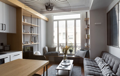
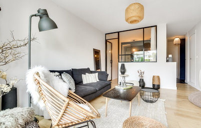
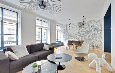
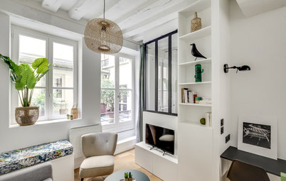
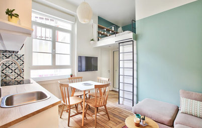
The most beautiful room in the apartment is undoubtedly the 25 sq m living room, with its high ceiling, large period windows, chevron-patterned oak floor and panelled double doors. This is the room that sold the apartment to the owners.
As experienced property professionals, the couple have well-honed tastes, and were certain they didn’t want a fully classical space. They were all for taking a design risk.
Although the living room faces north, Chapel suggested repainting the walls and even the ceiling in teal. It was a great choice, and a visually striking element.
“We chose the colour by a process of elimination. As we didn’t want [it to feel like] a white freezer, it had to be either a warm colour – red or aubergine – which we didn’t pick in the end, or a cool colour. So we went for Hague Blue by Farrow & Ball, a deep blue that contrasts with the original, honey-coloured wood floor well,” Chapel says.
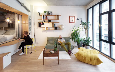
They went bargain-hunting for bright furniture to make up for light lost through the dark walls. The owners have a predilection for vintage, especially midcentury Scandinavian, furniture.
On the other hand, they selected radiators that wouldn’t attract too much attention. Electric models with charcoal-coloured steel fronts were chosen to sit discreetly on the wall.
“The owners approved of these models, because they can be controlled remotely through a smartphone, which is convenient when you travel a lot,” she says.
An antique rug, which was also a bargain find, cleverly echoes all of the colours in the room and defines the living area.
1960s rosewood and Carrara marble coffee table by Hugues Poignant. Sofa, bought at Pamono. Table lamp, Habitat.
1960s rosewood and Carrara marble coffee table by Hugues Poignant. Sofa, bought at Pamono. Table lamp, Habitat.
The sideboard is a Danish-made model in Brazilian rosewood, found at Danke Galerie in Lyon. The large colourful painting was hung above to draw attention to it.
“It comes from a stockpile of pieces that I bought at a studio liquidation. I resell these pieces to my clients,” the architect says.
“It comes from a stockpile of pieces that I bought at a studio liquidation. I resell these pieces to my clients,” the architect says.
Chapel, who has a passion for art, also found this wooden head at a flea market. “It was carved in the 1980s and comes from Papua New Guinea,” she says.
Shop for artwork and prints on Houzz
Shop for artwork and prints on Houzz
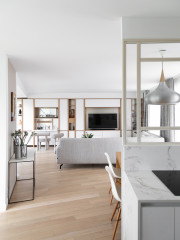
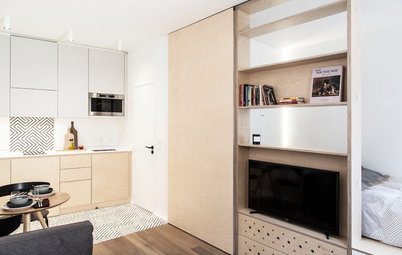
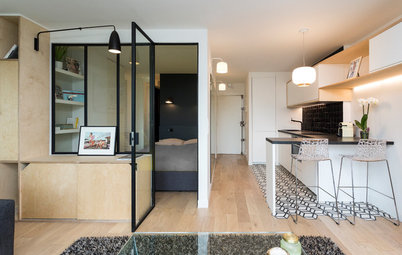
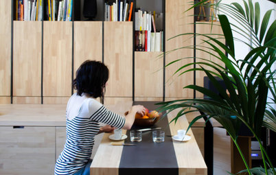
The owners decided to move the kitchen into what had previously been the dead end of the hallway, and to connect it to the sitting room to create a contemporary living area.
The space once occupied by the kitchen was converted into a third bedroom. The hallway partition was torn down and replaced with painted steel columns for support.
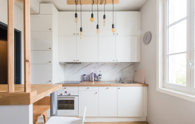
But what finish would work for a kitchen in a dark blue space? “A white kitchen would have been too commonplace, while oak cabinets would have given the room an overly classical look,” Chapel says.
A dark tone was chosen “to create an unusual, luxurious look”. The owners completely agreed and chose a burnt-pine laminate finish by Egger.
The space once occupied by the kitchen was converted into a third bedroom. The hallway partition was torn down and replaced with painted steel columns for support.
But what finish would work for a kitchen in a dark blue space? “A white kitchen would have been too commonplace, while oak cabinets would have given the room an overly classical look,” Chapel says.
A dark tone was chosen “to create an unusual, luxurious look”. The owners completely agreed and chose a burnt-pine laminate finish by Egger.
The architect orientated the woodgrain of the cupboard finishes vertically to emphasise the height of the ceiling, while the splashback was turned horizontally to soften the effect. The thin worktop is made of high-pressure laminate.
The dining room furniture was bought second-hand from a private individual.
The dining room furniture was bought second-hand from a private individual.
Next to the kitchen hangs a shield from Oceania. “It was part of the owner’s collection and fits here perfectly,” Chapel says.
Looking to fit a kitchen in your home? Read reviews of kitchen designers in your area
Looking to fit a kitchen in your home? Read reviews of kitchen designers in your area
Load-bearing steel columns now stand where the partition once was. They lend the kitchen a bit of Art Nouveau brasserie flair.
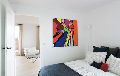
The master bedroom adjoins the living room. The owners had an idea for how to make their Haussmannian bedroom unique: a painted ceiling. This quirky addition to a traditional flat was realised using very modern techniques.
The starting point was a figure study by Pierre Puvis de Chavannes – incidentally, a Lyon native. They resized it on a computer to fit the exact dimensions of the ceiling. Finally, a digital print was made on several strips of non-woven wallpaper, which were then glued onto the ceiling.
Browse a range of wallcoverings in the Houzz Shop
The panelled wardrobe doors and the Carrara marble fireplace with its brass frame were already there, and only needed to be freshened up. The oak floor was sanded and covered in a matt varnish from Bona.
The owners are fond of the 1950s bedside table they found in a junk shop, which is made of gilded Murano glass (seen in the first bedroom photo). Their favourite pieces, however, are the wall lamps on either side of the bed. The owner got them from his brother, Frédéric, a lighting designer, who made them in his workshop, Llume Studio, in Nantes, in western France.
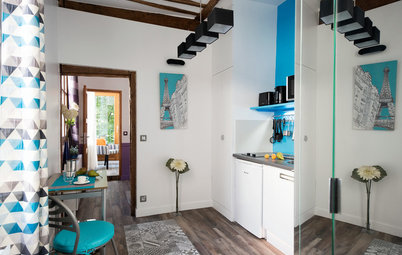
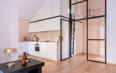
A bathroom with a shower now takes the place of one of the original storage rooms off the hallway. To give it a luxurious touch, it was finished with marble-look porcelain stoneware by Marazzi.
In keeping with the vintage theme, the vanity unit is made of a 1950s teak sideboard the couple found while bargain-hunting, with its legs removed. The mirrors and wall lamp were found at the Puces de Lyon flea market.
In keeping with the vintage theme, the vanity unit is made of a 1950s teak sideboard the couple found while bargain-hunting, with its legs removed. The mirrors and wall lamp were found at the Puces de Lyon flea market.
This side of the hallway originally ended in a bedroom and a kitchen. The latter was converted into a third bedroom.
“We moved the partition wall to resize the rooms and have a second bedroom with the correct dimensions,” the architect says.
“We moved the partition wall to resize the rooms and have a second bedroom with the correct dimensions,” the architect says.
The owners love travelling, and wanted to make their bedrooms feel like sightseeing tours. This one was inspired by Japanese style, in a white, black and wood palette.
“I recently brought some vintage kimonos back from a trip, and I gave one to the owners. It now dominates the wall, hanging from a piece of bamboo from my patio,” Chapel says.
“I recently brought some vintage kimonos back from a trip, and I gave one to the owners. It now dominates the wall, hanging from a piece of bamboo from my patio,” Chapel says.
A console table, found at Puces de Lyon, is accompanied by a mirror that recalls the shape of entrances to Shinto shrines. The table is adorned with an old Japanese roof tile and is teamed with a Hans Wegner chair.
A paper lampshade and a vase with cherry blossoms complete the décor.
The adjoining bedroom was originally the kitchen. “We wanted to keep traces of the history of the apartment. One can still see the place where the cement tiles of what was once the kitchen meet the wood floor of the Japanese room,” the architect says.
The room has undergone quite a transformation. “It’s the Gaudí bedroom, as [the owners] christened it, recalling their favourite architect,” Chapel says.
The interior shutters that are characteristic of traditional Lyonese architecture were missing in this room. They were reconstructed more cheaply in birch plywood.
The interior shutters that are characteristic of traditional Lyonese architecture were missing in this room. They were reconstructed more cheaply in birch plywood.
To connect the Gaudí-inspired Spanish metaphor with Art Nouveau style, they placed a vintage drawing, a cow’s head and a collection of plates on the wall – all in modernist style from the same period. The cement tiles, which also fit the theme, do not disappoint.
A piece of art hangs in the hallway between these two bedrooms and their closest bathroom.
“This is a Kanak blanket made of vegetable fibres that already belonged to the owners. As it’s very old and fragile, in order to hang it I made a burlap support with a fringe on the bottom. Then I protected it with Plexiglas,” the architect says.
“This is a Kanak blanket made of vegetable fibres that already belonged to the owners. As it’s very old and fragile, in order to hang it I made a burlap support with a fringe on the bottom. Then I protected it with Plexiglas,” the architect says.
This bathroom has a different decorative register from the first. “We wanted it to be just as luxurious as the other, but totally different,” Chapel says. “We used the same white tiles, and I had the vanity unit made from Trespa panels, a siding generally used on decorative building facades.”
The cloakroom still has the original floor tiles, one of the few parts of the apartment that were in good condition. Three paintings, selected by the architect, add an artistic touch.
Tell us…
What do you think of this apartment? Share your thoughts in the Comments section.
Tell us…
What do you think of this apartment? Share your thoughts in the Comments section.

Sponsored

Sponsored
Apartment at a Glance
Who lives here A couple of property professionals
Location Lyon, France
Size Three bedrooms and two bathrooms; about 1,025 sq ft (95 sq m)
Architect Marie-Anne Chapel of UNE Architecte
Budget €100,000 euros (about £89,158), including all aspects of the décor, excluding tax
Duration of work Five months; completed in June 2017
Photos by Thomas Marquez
Before “This four-room apartment bore the marks of history along its lengthy hallway,” Chapel says.
As you can see in this picture of the original plan, the home had originally been arranged around a large hallway that reached a dead end at the living room wall.
This old-fashioned layout included two huge storage rooms (marked RGMT on the plan), a very small bathroom and a large enclosed kitchen at the back of the apartment. It was impractical, with lots of wasted space.
“When this bourgeois building was built, an entire floor would have been occupied by a single apartment. It had a typical French layout defined by the exterior walls of the building. The owners moved through the living areas, while the staff used the hallways.
“Here, the original apartment was divided in two, which is why part of the hallway looks as if it leads nowhere,” Chapel says.