Houzz Tours

House Tours


Houzz Tour: A Dated 1960s End-of-terrace Gets a Scandi Makeover
See amazing before and after shots of this chic, simple, midcentury family home that mixes minimalism with retro warmth

When architects Studio Wolter Navarro came on board to redesign this 1960s family home in Ealing, west London, it was a case of out with the old and in with the new – in every way. Yellow walls were painted over, tatty wallpaper stripped and cornicing removed from ceilings.
They were replaced with a look architect Almudena Navarro describes as “soft minimalism mixed with a Scandinavian feel”. In practice, says Navarro, this meant “the project was more about taking out than adding in”. The result is a house that embodies perfect simplicity – being modern, light and fresh, but also wonderfully calm.
They were replaced with a look architect Almudena Navarro describes as “soft minimalism mixed with a Scandinavian feel”. In practice, says Navarro, this meant “the project was more about taking out than adding in”. The result is a house that embodies perfect simplicity – being modern, light and fresh, but also wonderfully calm.
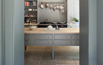
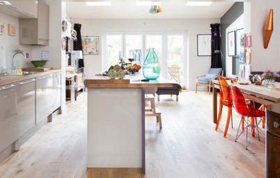
While the whole house had a top-to-toe makeover, some of the most radical changes took place in the kitchen.
This is how the original kitchen looked.
This is how the original kitchen looked.
“There was a wall in-between the kitchen and living room that made the downstairs feel narrow and dark,” recalls Navarro.
Creating plenty of storage and worktop space was the homeowners’ main brief for the space, which measures 3.1m x 2.1m. “We raised the microwave,” she says. “This ensured that the only full-height unit was the fridge, making it possible to have as much worktop as a small space like this one can have.”
Creating plenty of storage and worktop space was the homeowners’ main brief for the space, which measures 3.1m x 2.1m. “We raised the microwave,” she says. “This ensured that the only full-height unit was the fridge, making it possible to have as much worktop as a small space like this one can have.”
The kitchen as it looked originally.
The simple cabinets are from Ikea. “We had to play with the available standard sizes, as a bespoke kitchen wasn’t an option – really a challenge. Ikea’s 3D online tool was quite helpful here,” says Navarro.
Most of the lights throughout the home are recessed spots. “Even though the room heights are not too bad, we didn’t want to create any ‘visual interference’ in the ceilings in order to enhance the feeling of space.
“We carefully studied where other types of lighting were necessary – for example, the pendants over the bedside tables in the bedroom or the wall light in the dining area – and decided to keep the rest recessed. Some are dimmable to create different uses or zones.”
Kitchen, Ikea. Worktop in Warm Grey, Corian.
Wall units, shelves or blank space – which is best for your kitchen?
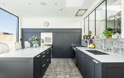
Even patterned details, such as these geometric tiles in the kitchen, have a pleasingly unfussy design. “All the tiles, floor finishes and fittings in this house follow a desire to reduce and not shout too much,” says Navarro.
“I love Scandinavian geometric patterns,” she adds, “and the tiles were also a way of introducing Scandi and midcentury style into a plain house with no modernist features of its own, in a solid, durable way.
“The owners found these ones, ordered a sample, and we all agreed we would go for them.”
“I love Scandinavian geometric patterns,” she adds, “and the tiles were also a way of introducing Scandi and midcentury style into a plain house with no modernist features of its own, in a solid, durable way.
“The owners found these ones, ordered a sample, and we all agreed we would go for them.”
What’s striking about this home is how it manages to be simple but still warm – not always an easy combination to achieve.
“Both René and I are into minimalism,” says Navarro, “but when it comes to houses – and especially houses you don’t get to design from scratch – you need to be careful to not be too minimal. If you are, you might end up producing uninteresting spaces that are just cold. Here, I believe we’ve achieved a calm space with a soft touch where family life can grow and evolve.”
With this property, the era of the architecture made their plans easier to implement. “With a 1960s house like this, there’s pretty much an empty shell, so you’re more free,” says Navarro. “However, you also need to make a bigger effort to create something interesting.”
A small peninsula unit divides the kitchen and dining area. “The owner loves baking and owns various kitchen gadgets. We also decided to introduce a peninsula, so she could store them there.”
Every detail has been carefully considered. “Even small ones, such as door handles or the shower screen,” says Navarro. “We made sure we kept the general look relaxed and uniform to achieve a timeless, functional, clutter-free space, but we wanted a good level of quality.”
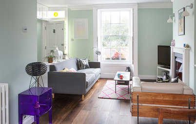
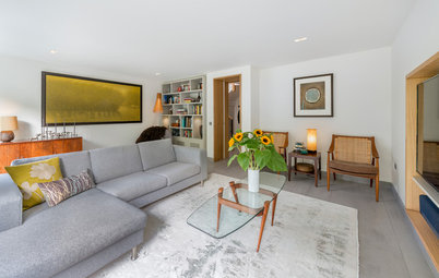
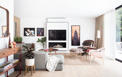
There’s a serene, restful atmosphere in the living room. Key is a palette of calming, pale shades that help create an impression of space. “The previous owners had decorated the walls and doors in a variety of bright colours that, especially in the case of the yellow downstairs, made the rooms feel small and compressed,” says Navarro.
“We knew from the start we’d keep the colour range to a minimum and make use of light, neutral tones with slight contrasts between them.”
The lovely wooden floor adds warmth and colour. The Ercol chair was bought second-hand on eBay and adds to the vintage vibe.
Walls painted in Dimpse, Farrow & Ball. Coffee table, Achica. Ercol Originals easy chair, Ercol.
The living room before its Scandi-style transformation.
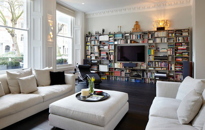
Pared-back it may be, but there’s also a decidedly retro flavour here. Midcentury pieces, including this vintage sideboard, add personality, and slot in with the 1960s heritage.
“The owner is quite into midcentury and Scandinavian furniture, so the fact the house is simple with no architectural features, such as cornices or fireplaces, was not a problem, but actually an opportunity,” says Navarro.
Copperfield sofa, Studio Copenhagen.
Check out 5 essential pieces for a midcentury mood
The beautiful modern parquet floor is the icing on the cake, adding the warmth the neutral décor needs. Originally, there was a Brazilian cedar parquet floor, but this was replaced with lighter, more modern oak.
“While the floor was interesting, there’d been some moisture issues and it would have taken a lot of our budget to properly restore it,” recalls Navarro. “However, the owner kept every piece and sold it to someone who was going to use it in their house, which was nice.” (You can also see some original wood flooring on the staircase, which was painted before the renovation.)
A mirror at the bottom of the stairs has a window-like effect.
Engineered oak chevron flooring in Jacobean finish, Reeve Wood. Cabinet, Love Handmade. Rochester mirror, Achica. Bench and cushions, eBay.
The original staircase.
There’s now a solid wall where the balustrade was previously. This allows for a little seating nook, where the owners have placed a bench.
Start the year as you mean to go on with these easy decluttering tips
Start the year as you mean to go on with these easy decluttering tips
Even the stairs have a pleasing simplicity in this home.
The original stairs.
The bathroom and toilet have been knocked together to create one room.
You can get an idea in this Before photo of how they looked as separate rooms.
“The original bathroom had mint green fittings and ugly patterned glass in the windows that we exchanged for plain frosted glass without beads,” says Navarro. Now the room is functional and chic, like the rest of the house.
Nexo sink, Roca. Tap, Crosswater.
Nexo sink, Roca. Tap, Crosswater.
The basin and bath in the original, smaller space.
The square bath was a practical solution to a common family dilemma. “There’s only one bathroom in the house, so the owners wanted us to ensure they could use the bath for their kids,” explains Navarro, “but the adults wanted to shower comfortably, too. In the beginning, they were thinking of having a curved shower bath, which I totally forbade! Instead, we researched baths large enough for a comfortable shower.”
Geometric tiles add an edge. “When we came across these, we knew straight away they were the ones. They were slightly more expensive than other options, but sometimes it’s worth spending a little extra,” says Navarro.
Tiles, Azulej Collection by Patricia Urquiola for Domus.
Geometric tiles add an edge. “When we came across these, we knew straight away they were the ones. They were slightly more expensive than other options, but sometimes it’s worth spending a little extra,” says Navarro.
Tiles, Azulej Collection by Patricia Urquiola for Domus.
One thing that’s striking about this house is the sense of light, including in areas that often suffer from gloominess, such as the landing, hallway and staircase.
“It was mostly the circulation spaces that were making the house feel sad and dark,” says Navarro. “We knew we had to do something, not only about the colours, but also the heights of the doors. We brought as much natural light as possible into the staircase and landing area through the use of floor-to-ceiling doors, clean lines and light colours.”
Perhaps contrary to expectations, installing a more solid balustrade was part of the solution. “It’s white and brightens the space without adding more shadows.”
The light and bright landing.
The bedrooms in particular needed an overhaul, including removing some unsatisfactory wardrobes.
“We had a strong opinion about the weird layout of the built-in wardrobes upstairs!” says Navarro. “They were super-deep (more than 85cm), and taking up a lot of space. But they also weren’t very wide, so they didn’t even provide enough storage.”
The layout upstairs was subtly tweaked to improve functionality and looks, and remove oddly shaped corners (see the floor plans, below).
“The small bedroom had a strange built-in cupboard that didn’t go all the way to the floor in order to create headroom for the staircase below. This made the first steps of the stairs feel compressed and dark.
“There was also a small return in the wall between the master bedroom and smallest room, which created an uninteresting corner.”
The master bedroom as it looked before the renovation.
Here, in another Before shot of the master bedroom, you can see one side of the wardrobes Navarro describes.
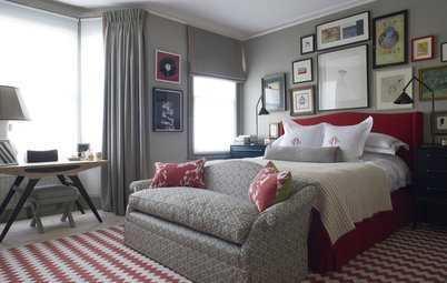
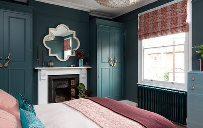
The suspended copper lights are a chic touch in the newly decorated master bedroom. “The pendants are a way of introducing some architectural interest. They’re vintage copper shades the owners bought at a local auction. I sourced the linen lighting cable and ceiling roses,” says Navarro.
Rose and cables, Urban Cottage Industries.
Rose and cables, Urban Cottage Industries.
“I wanted a dark greyish blue [for the feature wall], but I couldn’t quite find one I loved,” says Navarro. “Then I found this colour, a nice, neutral tone that gives warmth to the room without making it feel smaller, and neutralises the reddish tone of the furniture.
“Having this colour was something I had to convince the owners to try, as they initially wanted all the walls in lighter tones to make the space feel bigger. Despite it being dark, this colour brings everything together.”
Bespoke extra-large bed, Mark Stephens Furniture. Wall painted in S5005-B20G, Leyland.
The mirror in the master bedroom is another Scandi geometric touch.
Brass mirror, Idyll Home at Not On The High Street.
Brass mirror, Idyll Home at Not On The High Street.
The two children share a bedroom, though the plan is to undertake a loft conversion in the future to create an extra room.
“We experimented with the paint colours and house shapes to create a minimal but playful kids’ room,” says Navarro.
Kritter beds; Stuva units, all Ikea.
“We experimented with the paint colours and house shapes to create a minimal but playful kids’ room,” says Navarro.
Kritter beds; Stuva units, all Ikea.
The upstairs of the house has had a subtle reconfiguration to make the rooms work better (see more in the floor plans, below).
“We modified the layout of the bedrooms by taking down the wall in-between them and splitting the available space, so both rooms could have wall-to-wall storage of a standard depth of 60cm,” Navarro explains.
“We removed the partition between the master bedroom and small bedroom to make it align with the corridor wall and not have any return. This was also done to make the master bedroom slightly wider to help accommodate a large bed.
“The smallest bedroom became slightly smaller because of this, but the brief was to turn it into an office, and the space that remains works really well for this.”
A large, white, freestanding wardrobe with drawers and cupboards provides plenty of space for socks, dresses and trousers for two little ones.
Placing two single beds head to head, says Navarro, provides a “fun bench” the kids can hang out on.
Placing two single beds head to head, says Navarro, provides a “fun bench” the kids can hang out on.
The smallest bedroom is now a perfectly formed study. A midcentury shelving unit fits right in with the vintage look elsewhere.
The original front door.
The exterior of this 1960s property now looks smart and stylish.
A lick of dark blue paint on the front door and changing the glass panels has given it a more modern feel.
Front door painted in Railings, Farrow & Ball.
A lick of dark blue paint on the front door and changing the glass panels has given it a more modern feel.
Front door painted in Railings, Farrow & Ball.
The original layout of the ground floor.
In the After plan, you can see how the ground floor has been subtly altered.
The original layout of the first floor.
In the After plan of the first floor, you can see the new bedroom dimensions, where space has been more evenly distributed. The toilet and bathroom have also been merged.
What do you think of this home’s pared-back design and reconfigured layout? Share your thoughts in the Comments below.
What do you think of this home’s pared-back design and reconfigured layout? Share your thoughts in the Comments below.

Sponsored
Who lives here A professional couple in their 30s, plus their two young children
Location Ealing, west London
Property A 1960s end-of-terrace house
Size 3 bedrooms, 1 bathroom (85 sq m)
Architect Almudena Navarro of Studio Wolter Navarro
Originally, Almundena Navarro and her partner, architect René Wolter, were brought on board to advise on last-minute decisions regarding kitchen and bathroom finishes and fittings, to help create a stylish, family-friendly home.
However, the duo quickly realised that, for the owners to make the most of the existing space – and, in Navarro’s words, to “make things look brighter and bigger” – more radical changes were called for.
“We basically had less than one week to come up with a set of proposed alterations and construction drawings for the builders,” she says. To keep costs on budget, new contractors were hired – and the ensuing project was something of a baptism of fire.
“Things were pretty much getting designed one day and being built the next, so there was no room for mistakes or second thoughts,” says Navarro. “It was very different from the standard way we work, but it was a super-interesting process from which we learned a lot.” Fortunately, all the quickfire decisions worked out, as the stylish finished result shows.