Houzz Tours

House Tours


Houzz Tour: A Dated 1980s Home Gets a Very Unusual Extension
Before and after photos show how a surprising idea has totally transformed this bland modern house

“The brief was very loose,” says Martin Gruenanger of Space Group Architects, the man behind the creative reinvention of this dated 1980s redbrick house. “Our clients wanted Scandinavian flair, open-plan living, plenty of storage, and space they could each use for working from home.”
Martin’s idea for creating all of this was novel: he not only extended the back of the house and opened up the ground floor, he also added a small, unusual two-storey extension to the front of the house, giving the property a distinctive look.
Martin’s idea for creating all of this was novel: he not only extended the back of the house and opened up the ground floor, he also added a small, unusual two-storey extension to the front of the house, giving the property a distinctive look.
“When the owners purchased the house, they were aware it lacked character, but they liked the location and saw some potential,” Martin says. “The house was really basic and bland, with unattractive brickwork and brown uPVC windows.”
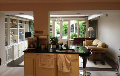
Here, you can see the living space before the renovation, with a conservatory visible at the back.
Browse the Houzz Professionals Directory to find reviewed architects and building designers near you.
Here, you can see the living space before the renovation, with a conservatory visible at the back.
Browse the Houzz Professionals Directory to find reviewed architects and building designers near you.
This shows the view of the living space from back to front. On the left are tilting windows to a small front garden. This is the position of the original kitchen window, but Martin took the opening down to the ground.
To the right is the vestibule (the front door is on the left of it, out of sight) and – ahead – a door leading into a new ground floor bathroom in the extension added to the front of the house. A fridge is tucked under the stairs, along with two storage cupboards.
“Our first task was to open up the ground floor as much as possible and correct the convoluted layout,” Martin says. “We provided long views through the house and added dedicated storage for coats, keys, the gas meter and so on.”
Martin and his team also reglazed the entire house, which included introducing rooflights to the stairwell to bring light deep into the home, and thermally upgraded the building.
One small but nifty touch is a letterbox discreetly fitted into the wall, so post falls onto the worktop, not the floor. You can just see it at the far end of the worktop beneath the bottom shelf.
This is how the kitchen originally looked. The windows above the washing machine are in the same position as the full-height windows seen in the previous photo.
“The kitchen is Ikea, but we added a Corian worktop to make it more exclusive-looking,” Martin says. It also has a marble splashback made from geometric tiles, which create an interesting pattern, and shelves made by the contractor to match the wall units.
The pier on the left-hand end of the kitchen unit run is where the old house ended. It’s been kept visible to provide delineation between the cooking and living spaces. “It also made the structure simpler and cheaper to construct,” Martin explains.
The pier also contains the sockets. “So rather than puncturing your beautiful new marble, you can tuck all the appliances down into this corner,” he says.
Martin had the table on wheels made specially. It has a recycled glass top and can be used flexibly as a worktop overspill or a table around which people can have meetings when the owners are working here.
Ovens; hob, all Smeg. Lighting, Holloways of Ludlow, Made to Last and Astro. Wall tiles, Mandarin Stone.
At the back of the room is the home workstation with a floating desk. The wall is clad in Whiterock, which is hardwearing and hygienic. It’s handily also a surface that can be written on.
To the left is an entire wall of handleless storage. The pale flooring is engineered ash.
Whiterock wall cladding, Altro.
To the left is an entire wall of handleless storage. The pale flooring is engineered ash.
Whiterock wall cladding, Altro.
The patio outside the rear extension is made from recycled plastic for its slip-resistance and durability. The brickwork is the same as on the street-facing extension. “It’s an homage to what we did to the front of the house,” Martin says.
LED strips between the decking and the bricks create an attractive feature after dark.
A discreet flap for the couple’s cat has been added to the right of the glass doors.
LED strips between the decking and the bricks create an attractive feature after dark.
A discreet flap for the couple’s cat has been added to the right of the glass doors.
“The original conservatory was too hot in summer and too cold in winter,” Martin says.
The elevation facing the garden is split into three zones. Bifolding doors open to the left and right. The middle section has a super small brass mesh called MicroLouvre laminated into the external layer of the double glazed unit to reduce solar gain.
“The mesh also has interesting properties,” he adds. “You can sense a real animation of the space as the sun moves around the room, and the reduction of solar gain is really noticeable on the glass with the mesh.”
Read more about how to avoid an extension that’s too hot and too bright.
“The mesh also has interesting properties,” he adds. “You can sense a real animation of the space as the sun moves around the room, and the reduction of solar gain is really noticeable on the glass with the mesh.”
Read more about how to avoid an extension that’s too hot and too bright.
From the downstairs bathroom, you can see all the way to the back of the house.
Encaustic floor tiles; marble wall tiles, all Mandarin Stone.
Encaustic floor tiles; marble wall tiles, all Mandarin Stone.
This window, which has the house number picked out on its glass, gives onto the street (see the next photo). It looks like a door, but for security it tilts to allow air in rather than opening fully.
There’s a walk-in shower and, on the right, storage for linen, towels and the washing machine.
There’s a walk-in shower and, on the right, storage for linen, towels and the washing machine.
From the front of the house, the exterior of the bathroom window is visible to the left. It overlooks a small courtyard in which plants will grow to make a discreet spot for the bins.
“The front extension is very visible to the public,” Martin comments. “The owners have told us lots of people complement it. They joked if they’d been given a pound for every time this happened, it would have paid for the extension!”
“The front extension is very visible to the public,” Martin comments. “The owners have told us lots of people complement it. They joked if they’d been given a pound for every time this happened, it would have paid for the extension!”
The front of the house as it was. “There was a small porch [left], which meant two doors too close together,” Martin says. The extension covers the place the porch occupied.
The original kitchen windows can be seen on the right.
The original kitchen windows can be seen on the right.
This little room is on the first floor of the front extension. The window above the front door is on the left, there’s mirrored storage on the right, and more storage is tucked into the eaves.
The new front extension from the outside shows the window in the first floor room, with the front door (open) below it and the kitchen window, with new bespoke planter beneath it, to the right.
The brickwork of the new section, while a very similar colour to the old, has a different texture. This, along with the ‘ribbon’ of glazing, and the decorative protruding bricks, subtly marks the extension as an addition.
The hardstanding for the car has grass pavers to soften the look.
The brickwork of the new section, while a very similar colour to the old, has a different texture. This, along with the ‘ribbon’ of glazing, and the decorative protruding bricks, subtly marks the extension as an addition.
The hardstanding for the car has grass pavers to soften the look.
The upstairs bathroom includes a bath with two showerheads above it so two people can shower at the same time.
The glass sliding door into the room (left) features a digital print designed by Space Group Architects to reference the unusual brickwork pattern on the front extension. “The red parts are the bricks that protrude,” Martin says.
A niche created by concealing the cistern provides shelf storage and mirrored cupboards above it.
Wall and floor tiles, Mandarin Stone. Tiles in niche, Pentagon Tiles. Stone resin composite basin with integrated towel rail, Lusso Stone. Brassware, Samuel Heath.
The master bedroom is upstairs at the back of the house. A circular mirror slightly recessed into the wall and surrounded by LED lighting makes an interesting feature.
Tell us…
What do you think of this unusual front and back extension idea? Share your thoughts in the Comments section.
Tell us…
What do you think of this unusual front and back extension idea? Share your thoughts in the Comments section.

Sponsored

Sponsored
Who lives here? A professional couple and their cat
Location East London
Property A 1980s terraced house
Size Three bedrooms and two bathrooms (increased from two bedrooms, a boxroom and one bathroom)
Architect Martin Gruenanger of Space Group Architects
Photos by Paul Riddle/Space Group Architects