Houzz Tours
House Tours
Houzz Tour: A Dated Victorian House is Revamped for Modern Life
The bones of this house were perfect, but the décor hadn’t been touched in 70 years. Luckily, it had a lot of potential…
“It’s all about vision,” architect Emilie Mauran says, recalling the first time she saw this house. Her clients were looking for a place that would suit their growing family and, as they already knew Emilie would be working on their new home, it made sense that she helped with the house hunt. This is where her professional vision was invaluable, as this house might not have looked promising to the untrained eye.
Emilie did a few sketches on the estate agent’s floorplans and, based on that, the couple made an offer.
Emilie did a few sketches on the estate agent’s floorplans and, based on that, the couple made an offer.
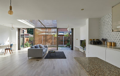
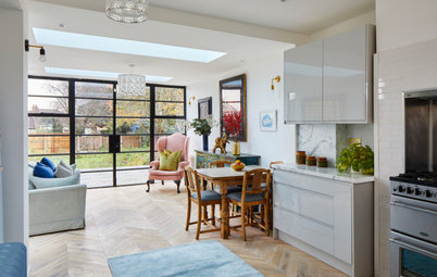
This after photo shows part of the “big room” Emilie had envisioned, opening up the back of the house and flooding it with natural light.
Emilie put three glazed areas into this space: a large rooflight, sliding doors and an Oriel window, seen on the left. “Because it’s south-facing, the glass is solar-controlled,” she says. “We also put in a recessed track for curtains to provide additional shade when the sun comes directly through the doors.
The photos were taken just before a few key deliveries and there’s now a large rug beneath the dining table and lots of plants dotted around. “It’s crucial not to underestimate the importance of acoustics in a large open space, and plants and soft furnishings both absorb noise,” Emilie says.
This space was designed around the parents – a spot to read a book, have a drink or entertain. “Although it’s one big room, my aim was to create distinctive spaces,” Emilie says. “You have a clear living room area, a dining area and a kitchen.”
Sofa; large floor lamp; dining table, all Roche Bobois. Dining chairs, Gubi. Cushions, Designers Guild.
This view of the rear elevation after works shows the big changes Emilie made to the house. She added a three metre extension on the ground floor; on the first floor, she made the windows more symmetrical, removing doors and a Juliet balcony, while at loft level, she designed a large dormer with tall doors and a glass balustrade.
Behind the window in the side return is a new utility room, and behind this is a new garage. “It’s a semi-detached house, but we used the full width [of the plot] to fill in and create a garage,” Emilie explains. “It’s really useful; we put the boiler and all the services in there, and it’s great, as the family has lots of bikes.”
Find the perfect professional for your project in the Houzz Professionals Directory.
Emilie’s design took in quite a bit of garden landscaping to create a flush floor level inside and out. Originally, the garden had been level with the new planters. “We levelled the garden, which is now lower than the neighbours’,” she says. “This is why we created the planters – it allowed us to go down with the garden level while keeping the planters level with neighbours’ gardens.
“The garden now has a feeling of extra space and is great for the children,” she adds.
Curtain tracks, Silent Gliss. Curtains, Ma Maison.
“The garden now has a feeling of extra space and is great for the children,” she adds.
Curtain tracks, Silent Gliss. Curtains, Ma Maison.
Part of what makes the living area cosy is the bioethanol fire. “It’s really warm and a fantastic way to incorporate a fire when you don’t have a flue,” Emilie says. There’s also underfloor heating throughout.
The alcove bookshelves conjure up a sitting room feel, too, though the ‘chimney breast’, not required for functionality, is there only to help define the space.
Coffee table; chevron chairs, all Red Edition. Engineered oak flooring, Natural Flooring Co. Sliding doors, Maxlight.
The alcove bookshelves conjure up a sitting room feel, too, though the ‘chimney breast’, not required for functionality, is there only to help define the space.
Coffee table; chevron chairs, all Red Edition. Engineered oak flooring, Natural Flooring Co. Sliding doors, Maxlight.
Next to the dining area there’s an oriel window. As well as adding light, this was part of Emilie’s aim to create distinct spaces within the open-plan area.
“It helps to create an interesting corner that takes your attention from the living area. There are some amazing plants that will grow up that fence outside, including a camellia, so in time the window will almost look like a picture frame,” Emilie says.
“The children love to be in this space, reading a book or chilling while the parents are finishing breakfast,” she adds. “Kids don’t like to stay still at the table and this is a nice way for them still to be with you, but in a cosy way.”
Oriel window, Maxlight.
This was one of the smaller downstairs rooms, roughly in the position now occupied by the new kitchen area, below.
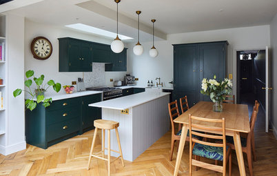
The new kitchen is bright and airy, with dark blue units and white quartz worktops.
An unusual feature is the black, wood-framed internal window behind the sink. It looks over a corridor leading to the cloakroom. “You might not see the point in doing a window into a corridor,” Emilie says, “but it makes the corridor feel so much nicer.” It also contains a large circular mirror. “It means you can see the whole garden when you’re sitting at the [island].”
The L-shape of the kitchen floor is tiled, to zone it as well as to provide a hardwearing, water-resistant surface.
Kitchen cabinet knobs, Armac Martin. Floor tiles, Artisans of Devizes. Wall tiles, Porcelanosa. Lights, Buster & Punch. Tap, Quooker. Worktops, Quartzforms.
“I love designing kitchens!” says Emilie, who aims for maximum functionality. The bins are in the island. “It’s where you tend to prepare food and feed the kids,” she says. She also likes to keep the island worktop empty, rather than putting in a hob or sink. “The island is where people always gather when you’re entertaining,” she says.
Where possible, Emilie will also always specify a double sink. “One for cleaning and one for keeping drying dishes out of sight,” she says.
Next to the hob, there are drawers for herbs, oils and “everything that helps you to cook. If [these things] are too far away, they always end up around the hob anyway, as they’re used so much,” Emilie says.
There’s a pantry on the left-hand side of the fridge (in the floor-to-ceiling units, just seen in the previous photo). On the right of it, there’s a “massive” tall cupboard for all the plates and glasses, as well as some food.
Sockets and switches are bronze to complement the bronze door handles. “I like bronze, as it doesn’t leave fingermarks,” Emilie says. The room also features a Sonos system in the ceiling.
The door to the right of the hob leads to the utility room.
Walls painted in Ammonite, Farrow & Ball. Units painted in Indigo Blue, Sanderson.
The utility room features the same floor tiles and worktops as the kitchen, but less expensive units. There’s also a wall-mounted drying rack and two windows. “It’s full of natural light, which is unusual for a utility,” Emilie says.
The door seen here leads to the garage. “The utility is the link between the kitchen and the garage,” Emilie explains.
The door seen here leads to the garage. “The utility is the link between the kitchen and the garage,” Emilie explains.
This is the original living room at the front of the house, which has a TV and a sound system contained within bespoke joinery, designed by EMR. Out of shot, behind the sofa, there is also a home office space.
Again, there are now more rugs, soft furnishings and accessories in here than when the photo was taken.
Coffee table, Red Edition. Roman blinds, Ma Maison.
Again, there are now more rugs, soft furnishings and accessories in here than when the photo was taken.
Coffee table, Red Edition. Roman blinds, Ma Maison.
The wonderful glazed front doors are original, but have been repainted to match the kitchen units. “I like that the colours are blue, red and white – the colours of both France and the UK.” It’s a fun touch for the couple. The ironmongery was also updated to bronze to complement the kitchen.
Doorknobs, A Touch of Brass.
Doorknobs, A Touch of Brass.
A view from the original top floor down the stairs.
The view from the new top of the house, higher up, looking down to the ground floor.
The staircase was repainted, with the banister stained in ebony. The stair runner is the same carpet as in the bedrooms, but finished with a taped edge.
The staircase was repainted, with the banister stained in ebony. The stair runner is the same carpet as in the bedrooms, but finished with a taped edge.
Emilie fitted a rooflight above the stairwell. “We always try to create as much light as possible in this way from a flat roof,” she says. “It’s split into three pieces, as it’s much cheaper, otherwise we would have had to bring the glass up with a crane, for five times the cost.”
As a safety precaution, the spindles at the very top of the staircase, seen on the left here, were designed to be higher than the originals lower down, at 1m compared to 70cm. “Building Regulations require 90cm, but I recommend 1m for a landing when you’re above a big void,” Emilie explains.
As a safety precaution, the spindles at the very top of the staircase, seen on the left here, were designed to be higher than the originals lower down, at 1m compared to 70cm. “Building Regulations require 90cm, but I recommend 1m for a landing when you’re above a big void,” Emilie explains.
The main bedroom is at the back of the house. Emilie designed the headboard to define the bed and provide some storage and display.
Opposite the bed there are two doors: one leads to the en suite and one to a walk-in wardrobe.
Walls painted in Peignoir, Farrow & Ball. Bed linen, The White Company. Bedside tables, Habitat. Lamps, Made.com. Wall lights, Astra.
Opposite the bed there are two doors: one leads to the en suite and one to a walk-in wardrobe.
Walls painted in Peignoir, Farrow & Ball. Bed linen, The White Company. Bedside tables, Habitat. Lamps, Made.com. Wall lights, Astra.
The walk-in wardrobe has bespoke storage and a pocket door. “It means you don’t have to have doors on the storage itself,” Emilie says.
The mirror at the end of the room is a radiator; pipes have been hidden in the wall to disguise it.
The mirror at the end of the room is a radiator; pipes have been hidden in the wall to disguise it.
This is the main bedroom’s en suite, which has a walk-in shower with a bespoke screen. Emilie points out that the connection between the plaster and the wall tiles is flush. “I prefer this to having to use a tile trim,” she says.
Because there’s a lot of storage within the vanity unit, the owners didn’t feel the need for mirrored wall cabinets. “So we created a niche with a mirror at the back and a black frame to equal the shower frame,” Emilie says.
Bathroom fittings, Alternative Bathrooms. Tiles, European Heritage.
Because there’s a lot of storage within the vanity unit, the owners didn’t feel the need for mirrored wall cabinets. “So we created a niche with a mirror at the back and a black frame to equal the shower frame,” Emilie says.
Bathroom fittings, Alternative Bathrooms. Tiles, European Heritage.
At the front of the house is the youngest boy’s bedroom. “Every time I design a child’s bedroom, I make sure it can evolve. People underestimate how quickly they grow,” Emilie says.
As such, there’s storage at the back of the room, with open shelving and drawers on the right. “At the moment, it’s for toys, but it can grow into a library and [the design] gives you more possibilities,” she says. “If this were [for] a teenager, you might only want to change the wallpaper.”
Wallpaper, Cole & Son.
The front of the same room.
Pendant light, John Lewis.
Pendant light, John Lewis.
This is the dormer in the new loft – another of the children’s bedrooms. The sliding doors overlook the garden and have a glass balustrade.
This is the same loft room from a different angle. The bed is within a recess with a bespoke headboard and bookshelves. “Again, this can evolve over time,” Emile says.
This is the loft room at the front of the house, with an original window. It’s the third boy’s bedroom.
The wallpaper is the same in all the boys’ rooms. “They all loved it, so we just picked different colours.”
The wallpaper is the same in all the boys’ rooms. “They all loved it, so we just picked different colours.”
This is the boys’ bathroom. “There were two windows already, but I added the rooflight,” Emilie says. “It’s openable, meaning you can get access to clean the massive rooflight above the staircase from here. It’s also always nice to look at the sky.”
Tiles, European Heritage. Bathroom fittings, Alternative Bathrooms.
Tell us…
Which features do you most like about this renovation? Share your thoughts in the Comments.
Tiles, European Heritage. Bathroom fittings, Alternative Bathrooms.
Tell us…
Which features do you most like about this renovation? Share your thoughts in the Comments.
Need a pro for your home renovation project?
Let Houzz find the best pros for you
Let Houzz find the best pros for you



Who lives here? A Franco-British family with three young boys under 8 and a soon-to-be-born baby girl.
Location Putney, south London
Property A Victorian semi-detached house
Size Five bedrooms and three bathrooms
Designer Emilie Mauran of EMR Architecture
Budget £800,000, including the design and all the building work
‘After’ photos by David Butler.
This before photo of the house as Emilie and the couple found it shows the view across one of the original downstairs rooms into the garden.
“The downstairs was lots of little rooms and the house was in a very traditional style – carpet everywhere and everything extremely dark – yet you could tell there was potential,” Emilie says.
She was impressed by the width of the house, which is unusual in London, and appreciated its south-facing garden. “I could see that in this house you could work on the light. You could create a very big room downstairs, which was important, as the couple love entertaining.”