Houzz Tours

House Tours


Houzz Tour: A Family Home Full of Pattern, Colour and Personality
Each room of this Victorian home has its own character, but clever design ensures the whole house feels cohesive

It’s easy to assume you need to change the layout of a Victorian home, but the owners of this property were happy to keep everything as it was. “The house needed new plumbing, heating and electrics,” designer Caroline Nicholls of Slightly Quirky says. “But apart from that, the couple didn’t want to do any internal rejigging.”
What they did ask Caroline for, however, was to help them push their design boundaries. “They wanted to go bold, which was like music to our ears,” she says. “They were keen for us to come up with ideas they wouldn’t have thought of themselves.”
What they did ask Caroline for, however, was to help them push their design boundaries. “They wanted to go bold, which was like music to our ears,” she says. “They were keen for us to come up with ideas they wouldn’t have thought of themselves.”
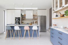
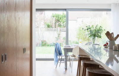
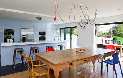
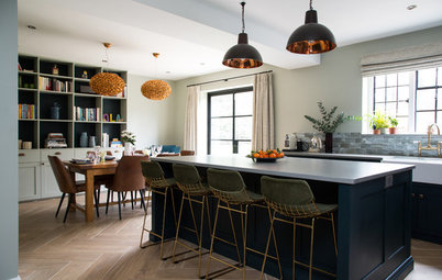
Two rooms had previously been knocked through to form the kitchen, leaving a couple of nibs protruding either side. “We took these out and put in a joist, so we could fit in straight runs of furniture,” Caroline says. “It was the only structural change we made in the house.”
The units are standard carcasses with bespoke doors and handles. “The handles are a mix of recessed and protruding,” Caroline says. “We placed them in a random pattern to add interest, but they also needed to be located where they would be most practical.”
The wall cabinets are a mix of white and red. “We painted two of them the same colour as the wall to blend in and accentuate the height of the room,” Caroline says. “The red features in other areas of the house and is just one of a few links that give cohesion to the property.”
The wall cabinets are a mix of white and red. “We painted two of them the same colour as the wall to blend in and accentuate the height of the room,” Caroline says. “The red features in other areas of the house and is just one of a few links that give cohesion to the property.”
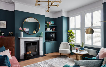
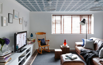
The living room is next to the kitchen, but is accessed from the hallway. “We chose quite a dramatic wallpaper, but only put it on two walls so it doesn’t feel overwhelming,” Caroline says.
The owners wanted this room to be a cosy, family space, so opted for a soft carpet rather than wooden flooring. An unattractive fireplace was removed to reveal an opening for a wood-burning stove and slate hearth.
Caroline kept the original radiators, but had them resprayed dark grey.
Jungle Palms wallpaper, Clarke & Clarke. Sofa, BoConcept.
Lighting was key in the living room, and includes a contemporary black track light to illuminate the walls and artwork.
“There was a pelmet over the bay window that must have been fitted in the 1960s or 1970s,” Caroline says. “We convinced the owners to leave it in place and added LED striplights below to create a lovely glow in the evening.”
“There was a pelmet over the bay window that must have been fitted in the 1960s or 1970s,” Caroline says. “We convinced the owners to leave it in place and added LED striplights below to create a lovely glow in the evening.”
The adjacent dining room had a gas fire in the chimney, so the owners found a replacement online.
Caroline chose a bold pattern for the walls. “It would have been quite heavy to use from floor to ceiling, so we added a dado rail,” she says. “We then colour-matched the wall paint below with one of the wallpaper shades.
“The dado rail breaks up the wallpaper, adds interest and brings back a period feature that’s more in keeping with the house,” she says.
Amazon wallpaper, Clarke & Clarke. Walls painted in 7030B50G, Dulux.
The curtains were also made to match the wallpaper and the material is highlighted by LED strips, once again placed in the pelmets.
Curtain fabric, Clarke & Clarke.
Curtain fabric, Clarke & Clarke.
A Victorian garden room with timber-framed glazing is located next to the dining room.
Tempted to give your home a refresh? Find interior designers in your area and read client reviews.
Tempted to give your home a refresh? Find interior designers in your area and read client reviews.
“The wallpaper in the cloakroom was one of the starting points for the house,” Caroline says. “The owners loved it and it helped to inform our colour choices.”
She divided the walls with a picture rail and a dado rail and laid practical tiles at the lower level. The back wall is covered by a mirror, which reflects the light and gives the illusion that the wallpaper runs around the whole room.
“The owners had already been brave with the wallpaper, but the red ceiling really pushed them,” Caroline says. “It adds drama to the space and ties in with the floor tiles as well.
“We also put LED striplights above the picture rail to give another layer of light and highlight the ceiling,” she adds.
Geometric Aviary wallpaper, Divine Savages. Toilet, Grohe. Door painted in Forest Grey, Dulux.
A curtain frames the staircase window, while LED pelmet lights give an atmospheric glow at night. The fabric has the same pattern as the living room wallpaper, but in a different colourway.
“It was really important that every room had its individual style, but that it subtly flowed together,” Caroline explains.
Walls painted in Strong White, Farrow & Ball.
“It was really important that every room had its individual style, but that it subtly flowed together,” Caroline explains.
Walls painted in Strong White, Farrow & Ball.
The doors and joinery in the ground floor hallway were painted in a dark grey, but it would have been too costly to paint the woodwork throughout the house. “We didn’t want the dark grey to stop in the hall, though,” Caroline says, “so we brought the colour up to the first floor landing.”
There are arched corridors either side of the staircase, so Caroline painted each of these areas in the same grey shade.
Walls painted in Forest Grey, Dulux.
There are arched corridors either side of the staircase, so Caroline painted each of these areas in the same grey shade.
Walls painted in Forest Grey, Dulux.
The owners wanted their children’s bedrooms to grow with them. “In this room, we chose a fun, colourful fabric for the blind and based the scheme around it,” Caroline says. “The wall paint picks out one of the shades from the fabric.”
Blind made from Paikka fabric, Scion. Walls painted in Custard, Little Greene.
Blind made from Paikka fabric, Scion. Walls painted in Custard, Little Greene.
The adults have their own bathroom on the top floor, so the family bathroom is mainly used by the children. “We wanted it to be fun, so we chose a bright yellow and grey scheme,” Caroline says.
“We designed a central shower column and took the tiles up the wall,” she continues. “It leads you into the room and takes your eye upwards.”
The wall behind was built out to hide the pipework and give the space a streamlined look.
Solar vanity unit, Hudson Reed.
“We designed a central shower column and took the tiles up the wall,” she continues. “It leads you into the room and takes your eye upwards.”
The wall behind was built out to hide the pipework and give the space a streamlined look.
Solar vanity unit, Hudson Reed.
Above the bath is a black-framed circular mirror, which reflects the shower tiles opposite and picks out the black tones in the pattern.
Wall painted in Mister David, Little Greene.
Wall painted in Mister David, Little Greene.
The owners were keen for the guest bedroom to feel comfortable, fresh and inviting. Caroline chose a blue, dragonfly-patterned fabric for the blind and complemented this with the cupboard paint and bedding.
Cupboard painted in Hague Blue, Farrow & Ball. Blind made from Demoiselle fabric, Harlequin.
Cupboard painted in Hague Blue, Farrow & Ball. Blind made from Demoiselle fabric, Harlequin.
Next door to the guest bedroom is a small shower room. Caroline used the same red as in the kitchen and cloakroom to add some bold colour to the sloping ceiling.
“We laid simple white tiles with red grout as a cost-effective way to add drama to the room,” she says.
Red grout, Mapei.
“We laid simple white tiles with red grout as a cost-effective way to add drama to the room,” she says.
Red grout, Mapei.
The couple have their bedroom on the second floor, alongside a dressing room and en suite. “They wanted it to be a calm, relaxing sanctuary, so we chose a tranquil grey for the walls,” Caroline says.
“However, we also wanted it to be connected to the rest of the house,” she says, “so we added some bold colours on through the textiles.”
“However, we also wanted it to be connected to the rest of the house,” she says, “so we added some bold colours on through the textiles.”
The room has a beautiful arched window with views of the countryside. Caroline framed it with patterned curtains in a colourway that tones with the walls.
Curtains made from Ophelia fabric, Clarke & Clarke. Throw, Noblis. Cushions, Amara.
Curtains made from Ophelia fabric, Clarke & Clarke. Throw, Noblis. Cushions, Amara.
The en suite was an unusual space, which made it quite tricky to lay out. The couple were hoping to include a bath and a shower, with enough room for the husband to stand comfortably.
Caroline added walls either side of the sloping ceiling to create a shower area with seating. Windows were incorporated into the walls to ensure plenty of light could spill in, and the extra wall space provided an area for radiators and towel rails.
The dark green tiles and wooden vanity unity add warmth and texture to the space.
Carnaby wall tiles, Mandarin Stone. Vanity unit, Bathstore.
Tell us…
Which is your favourite room in this house? Share your thoughts in the Comments section.
Carnaby wall tiles, Mandarin Stone. Vanity unit, Bathstore.
Tell us…
Which is your favourite room in this house? Share your thoughts in the Comments section.


Sponsored
Who lives here? A couple with two small children
Location Godalming, Surrey
Property A detached Victorian house
Size Four bedrooms and three bathrooms
Designer Caroline Nicholls of Slightly Quirky
In the kitchen, a run of units on the left sits opposite a large fridge-freezer with storage built around it to make it feel integrated into the room. The owners wanted to include a table for family dinners and a small desk area.
“It was quite tricky to work out where the desk would go, as we didn’t want anything splashing on the computer,” Caroline says. “It works well here at the end of the run.”
Base units painted in Payne’s Grey; wall units painted in Pale Celadon, both Craig & Rose. Single red wall unit painted in Bronze Red, Little Greene.