


Houzz Tour: A Family Home With a Sunny Open-plan Kitchen
Blasts of bold colour have given this Victorian house life and personality
Cheryl F
15 March 2019
Houzz Contributor. I'm a London-based journalist with years of experience writing for the UK's top interiors titles. I love shopping for quirky accessories, have a passion for rummaging through vintage stores and I'm ever-hopeful of finding that elusive perfect paint shade.
Houzz Contributor. I'm a London-based journalist with years of experience writing... More
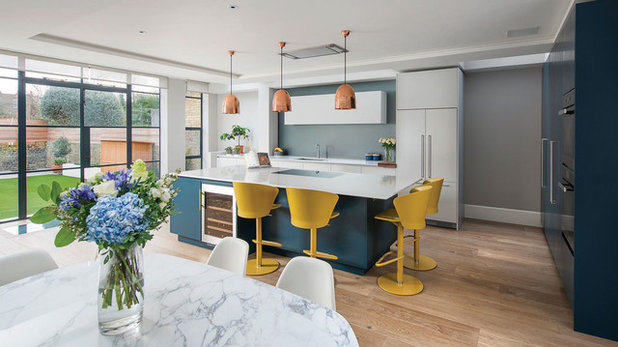
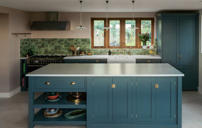
Where bold colour is concerned, many of us love the idea in principle, but revert to safer neutrals when it comes to the crunch. This cheerful family home, though, shows how colour can transform a space. A light, bright kitchen, featuring splashes of bold yellow teamed with a rich dark blue, is modern and uplifting.
“We wanted to create something that was a statement and reflected the owners’ personalities,” says interior designer Cinzia Moretti of Moretti Interior Design.
“We wanted to create something that was a statement and reflected the owners’ personalities,” says interior designer Cinzia Moretti of Moretti Interior Design.
House at a Glance
Who lives here? A family of four
Location Chiswick, London
Property A four-storey Victorian house
Size Five bedrooms and three bathrooms
Designer Cinzia Moretti of Moretti Interior Design
Photos by Tom St Aubyn
The kitchen in this refurbished family home was already in place when Cinzia was brought on board. (The house had recently been extended at the side, and the basement and loft converted.) However, she helped to decide the final colour scheme, including cabinet paint finishes and worktop material.
Her first step, she says, was doing “a colour analysis of the owners through their personalities. Yellow was a colour they both really liked,” she says. “It makes you feel alive and it also suits a space that’s used by kids, it’s so vibrant.”
Cabinets painted in Hague Blue, Farrow & Ball. Walls painted in French Grey Mid, Little Greene. Bar stools from a trade supplier.
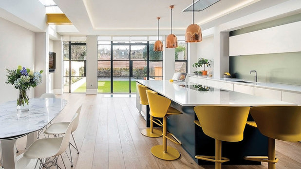
The dark blue island and black-framed Crittall windows help to ground this big, bright space. “The kitchen is quite minimal, but it doesn’t feel cold, thanks to the heritage shades,” Cinzia says.
They chose a dazzling white, super-slim marble worktop that’s been treated so it won’t stain. The dining table has a similar top, and was made bespoke to suit the space.
The flooring in here is an engineered grey oak, which extends across the whole ground floor, apart from the hallway.
White Eames Eiffel chairs, Vitra. Kitchen units, Roundhouse.
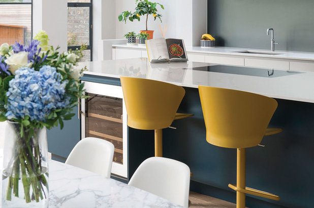
“I love that people are using more yellow now,” Cinzia says. “It’s followed from fashion into interiors. However, as it’s a bright primary colour, people sometimes don’t know how to use it. The key is to have a little – not too much of it.”
The owners love cooking and entertaining, so the roomy dining zone is perfect.
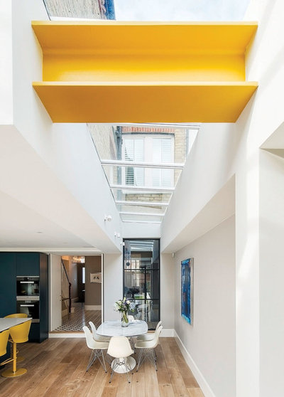
A golden beam carries the colour theme into the dining area. “Originally, this was black, but painting it yellow has turned it into a real feature,” Cinzia says.
A golden beam carries the colour theme into the dining area. “Originally, this was black, but painting it yellow has turned it into a real feature,” Cinzia says.
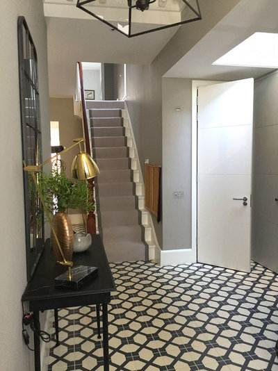
The owners chose patterned tiles for the hallway. “We wanted a Victorian feel, but with a contemporary twist,” Cinzia says. “We chose a pattern that made it resemble a traditional period property, but with a more industrial look.”
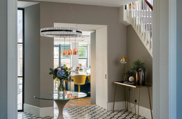
Saturno crystal pendant light, Baroncelli. Floor tiles, Fired Earth.
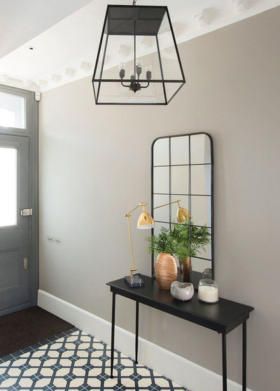
Gold and copper metallic accessories add some subtle glamour.
Read reviews of interior designers in your neighbourhood.
Read reviews of interior designers in your neighbourhood.
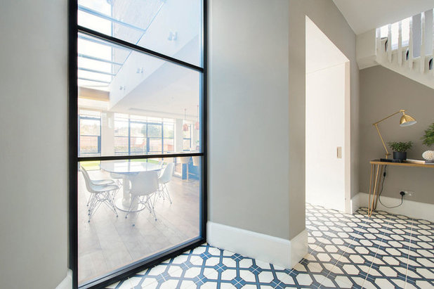
Internal windows, skylights and over-sized doorways let the light flow through into the hallway from the adjoining spaces and really open up this area.
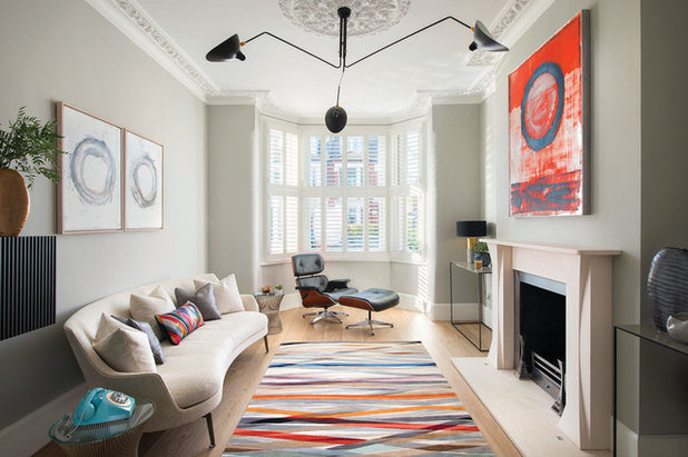
The living room’s design began with the owners’ Eames leather lounge chair, an iconic midcentury piece. “Her style is more Nordic, his is more modern, so we tried to blend both together in here,” Cinzia says.
A bold rug and large artwork add colour to a largely neutral backdrop, while the curvy sofa is minimal but soft.
Rug, The Rug Company. Sofa, Flexform. Astrom ceiling light, Serge Mouille.
A bold rug and large artwork add colour to a largely neutral backdrop, while the curvy sofa is minimal but soft.
Rug, The Rug Company. Sofa, Flexform. Astrom ceiling light, Serge Mouille.
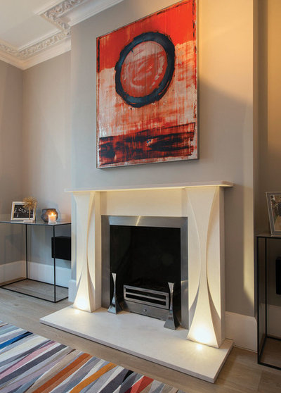
The fireplace is reminiscent of origami. “It echoes the shape of the pedestal table in the hallway,” Cinzia says.
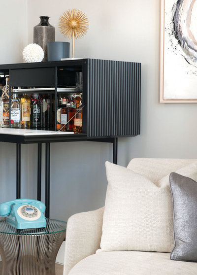
‘Luxury meets simplicity with a dash of midcentury chic’ is the vibe in the living room. The stylish drinks cabinet was made bespoke and fits right in.
The couple already owned a fair few pieces of furniture, including the wirework table; Cinzia added the phone for a retro touch.
The couple already owned a fair few pieces of furniture, including the wirework table; Cinzia added the phone for a retro touch.
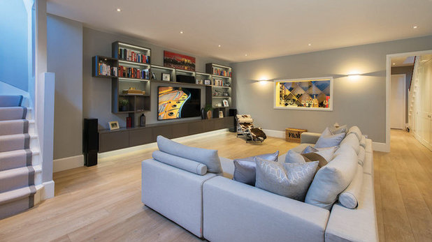
The basement room has a large corner sofa and a big TV for family film nights.
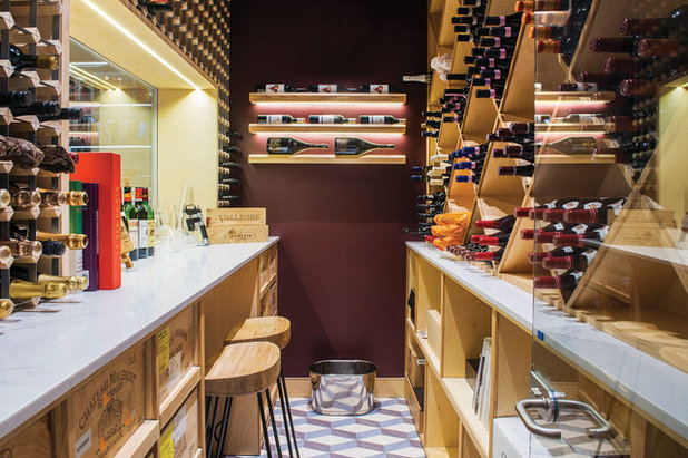
The owners love a fine wine. “In the cellar, the wall colour was picked to resemble a tavern, as well as the wine itself,” Cinzia says.
Walls painted in Brinjal, Farrow & Ball.
Walls painted in Brinjal, Farrow & Ball.
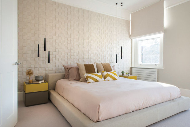
In the master bedroom, a wall of soft, 3D wallpaper with a suedette finish takes the place of a padded headboard. “The owners already had the bed, and it wasn’t possible to fit a headboard to it. As the room is big and bright, we also wanted to create a feature wall, so this was a great solution,” Cinzia explains.
The yellows deliberately echo the sunny shades in the kitchen, “so there’s a flow through the house,” she says.
The yellows deliberately echo the sunny shades in the kitchen, “so there’s a flow through the house,” she says.
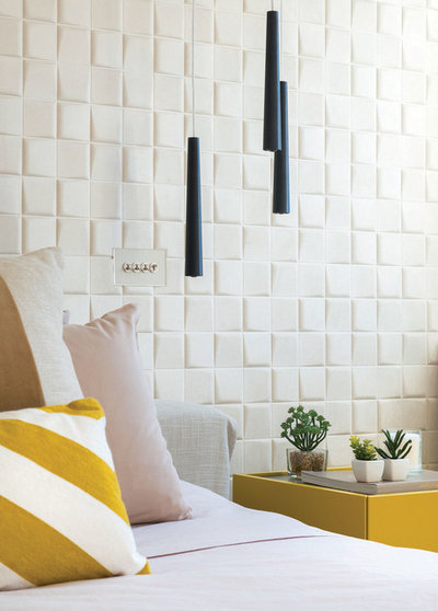
Slim pendant lights help to create a boutique hotel atmosphere in the master bedroom, and the layered cushions add to the sense of comfort and luxury.
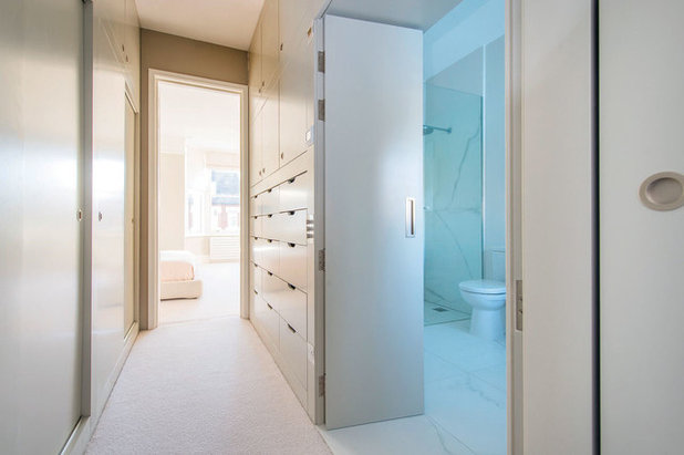
A streamlined walk-in wardrobe made of ply lines the corridor between the master bedroom and the en suite. “As the space is quite narrow, we went for recessed handles,” Cinzia says.
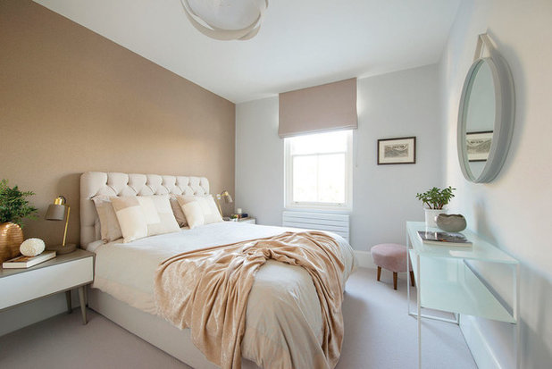
Soft blush shades give this second bedroom a calm, inviting feel.
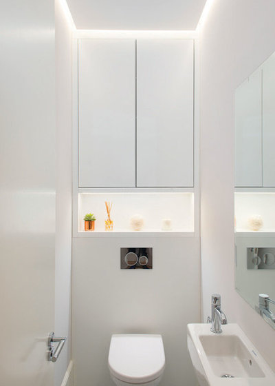
Bespoke cabinetry and concealed lighting make the most of the space in this small bathroom.
Tell us…
What do you like about this light-filled home? Share your thoughts in the Comments section.
Tell us…
What do you like about this light-filled home? Share your thoughts in the Comments section.

What are you working on?


Related Stories

House Tours
Houzz Tour: Warm Tones and Luxurious Surfaces in a City Townhouse
An earthy colour palette, hidden storage and well-placed texture add character and practicality to this London home
Full Story

Room Tours
Kitchen Tour: A Gorgeous Extension With a Leafy Glasshouse Feel
By Kate Burt
When the owners of this terraced house extended, they were keen to retain its period feel and highlight the garden
Full Story

Gardens
Garden Tour: A Bare Roof Terrace Becomes a Pretty, Sociable Space
By Kate Burt
A retired couple got help transforming their large rooftop into a gorgeous, welcoming, multi-functional retreat
Full Story

House Tours
Houzz Tour: A Smart Layout and Genius Storage in a Victorian Home
Flipping the standard layout and carving out excellent storage have turned this tired house into a brilliant family home
Full Story

House Tours
Houzz Tour: A Victorian House Brought Impressively Up to Date
By Jo Simmons
A cohesive layout and warm colours combined with energy-efficiency measures thoroughly modernise this terraced home
Full Story

Kitchen Tours
Kitchen Tour: An Open, Airy Space Made for Entertaining
Combining two separate rooms has improved flow and created a sociable open-plan kitchen, dining and seating space
Full Story

House Tours
Houzz Tour: A Family Home Inspired by its Seaside Location
Coastal colours and practical design combine to create a house that will adapt as the family grows
Full Story

Kitchens
5 Inspiring Before and After Kitchen Transformations
Whether you want to boost storage, incorporate original features or maximise your space, take ideas from these designs
Full Story

House Tours
Houzz Tour: An Airy, Scandi Finish for a Tall Victorian House
By Kate Burt
From a tricky inherited bath to a sticky-out staircase, on-site problem-solving led to a seamless update for an old home
Full Story
House Tours
Houzz Tour: A 17th Century Cottage Gains Warmth and Character
The clever use of colour and pattern has revived this old building while creating a 21st century family home
Full Story
I would love a floorplan too. It looks as though the second reception (the one that usually becomes dark with these extensions) has been sacrificed in favour of a wider hallway and the stairs to the basement...? Brave!
Hmmm, those copper pendants in the kitchen get to me... they clash with the yellow seating. The lights are great with the blue kitchen as are the yellow seats (and that beam) but with each other? The large bare wall in the master bedroom is too much for me... Dispensing with pictures etc, I'd want to use a dramatic decal in lieu of the 3D wallpaper. Each to their own. One can't deny it's a luxurious transformation but to me, it lacks cosiness prob due to the expanse of space and lack of personal effects to fill it.