


Houzz Tour: A Flat Transformed by a Genius Layout Idea
Moving the kitchen into the hallway turned a clumsily laid-out apartment into this airy two-bed family home
Agnès Carpentier
7 December 2021
When their baby daughter was born, this couple in their thirties were living in a studio that was completely impractical for a family. So they set out in search of a three-room flat near Montmartre in Paris, France, with a designer already in mind – Amélie Colombet of Inhale.
They settled on a 79 sq m flat on the fifth floor of a beautiful Haussmannian building in the Barbès district, and Amélie cleverly re-planned the layout to create a cosy space for the couple, who love flea markets and bohemian style.
They settled on a 79 sq m flat on the fifth floor of a beautiful Haussmannian building in the Barbès district, and Amélie cleverly re-planned the layout to create a cosy space for the couple, who love flea markets and bohemian style.
Flat at a Glance
Who lives here? A couple in their thirties and their two-year-old daughter
Location Paris, France
Size 79 sq m
Date renovated End of March to end of August 2020
Interior designer Amélie Colombet of Inhale
Budget €100,000 (around £85,092) for the work, plus approx €4,000 (around £3,404) for the furniture and lighting
Photos by Agathe Tissier
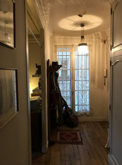
Before Photo
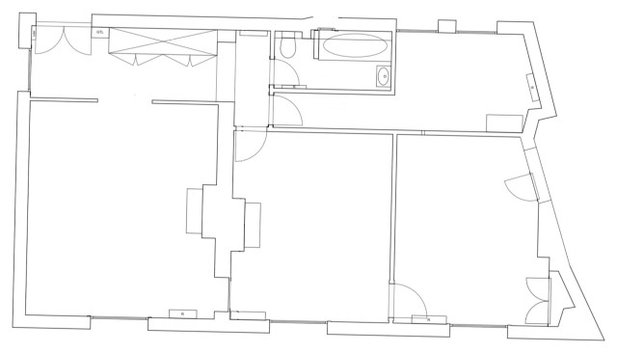
Originally, the flat had three rooms facing the street, served in classic Parisian style by a long, dark hallway. The couple consulted Amélie before purchasing the property, to confirm the flat’s potential and the budget they would need for the renovation.
“The owners wanted to make sure they’d be able to separate the two bedrooms, one of which was a walk-through, and bring the kitchen into view alongside the living room,” the interior designer says. She estimated the work would cost about €1,300 (£1106) per sq m, a little less than the usual price for a complete renovation.
“In general, it’s €1,500 [£1,276] per square metre for the complete renovation of an old property in Paris, but here my clients decided to limit the amount of built-in furniture,” Amélie says.
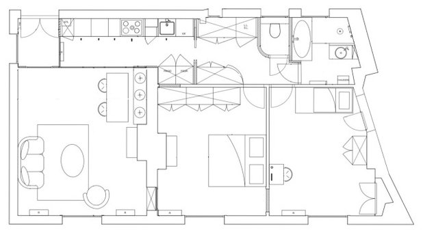
In terms of layout, the couple’s priority was to separate the living and sleeping areas properly. Amélie came up with a plan that drastically cut down the large hallway, opened up the kitchen towards the living room, offered two cosy bedrooms, and optimised the bathroom with a shower and bath. She even added a large dressing room/storage space and a laundry area.
Before Photo
The flat’s last owners had been living there for a long time, and had never renovated it. Electric cables ran in full view along the walls, the windows had single glazing, and the paint was peeling. The couple needed to renovate everything.
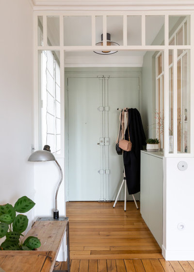
Amélie didn’t think the entrance hall, which is located at one end of the flat and took the form of a hallway running alongside the rooms, was a disadvantage. Instead, she saw it as an opportunity to create even more privacy in the bedrooms.
She turned the large entrance into a buffer zone facing the living room, bringing in light and giving it beautiful lines of sight. The idea for a window into the kitchen came to Amélie on holiday. “I’d just spent some time on the Ile de Ré, where many houses have this type of entrance. It’s a way to bring the holiday home,” she says.
A bespoke shoe rack doubles as a spot for keys and post.
Feeling inspired by this clever makeover? Find a local interior designer today.
Before, this arch had connected the entrance to the living room.
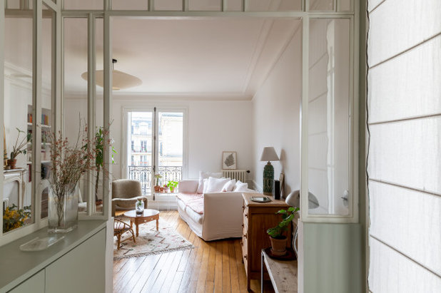
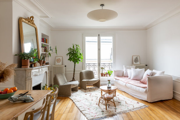
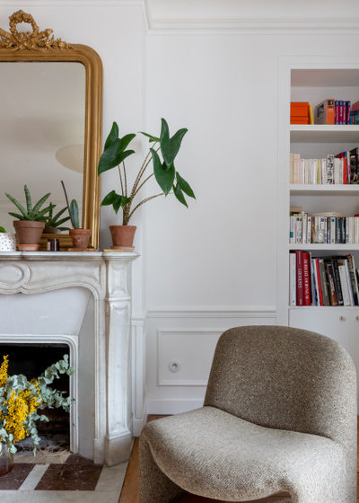
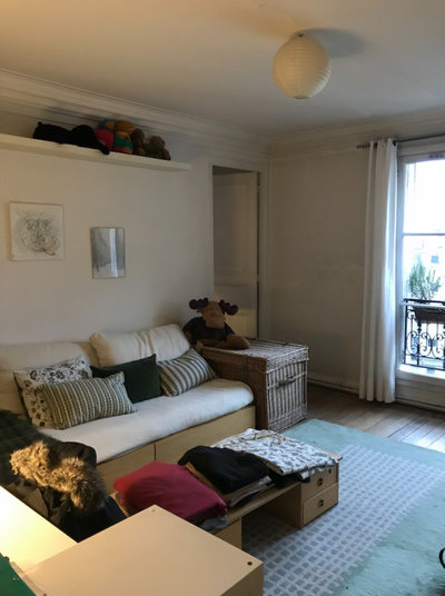
Luckily, the wall between the entrance and the living room was not load-bearing. “We opened everything up, and that’s clearly what makes the project what it is,” Amélie says. Facing the entrance door, the living room was already a gorgeous space, with mouldings and a white marble fireplace. Amélie painted it white and sanded the parquet to spruce it up.
The designer has a method for learning her clients’ décor preferences: listening closely and, most importantly, asking them what they dislike. “You waste a lot less time and prevent conflicts between the couple,” she says.
She therefore designed around the washed-linen, boho-style sofa from Maison de Vacances, which the couple already owned, and enhanced the design with touches of soft colours and numerous plants. “The owner loves vegetation, which brings a lot to the interior,” Amélie says.
Much of the furniture in this space was found second-hand, including the pair of Alky armchairs created by designer Giancarlo Piretti for Castelli in 1969. The light fixtures, however, are new. “We didn’t choose top brand names, but models that are a good match for the bohemian spirit [of the flat],” Amélie says.
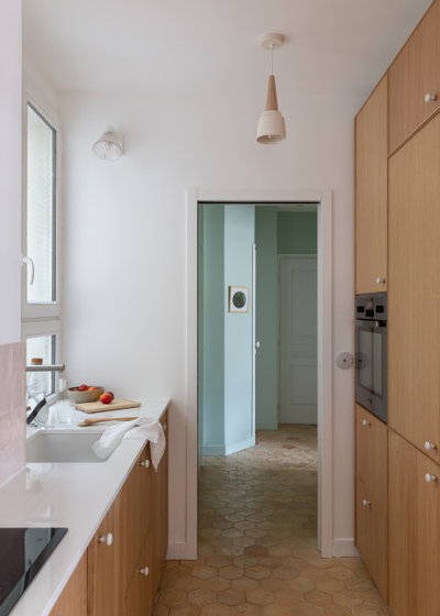
The original entrance hallway had led to the living room, and then into the kitchen-hallway. It was important to give a function to these dark areas that were taking up precious space.
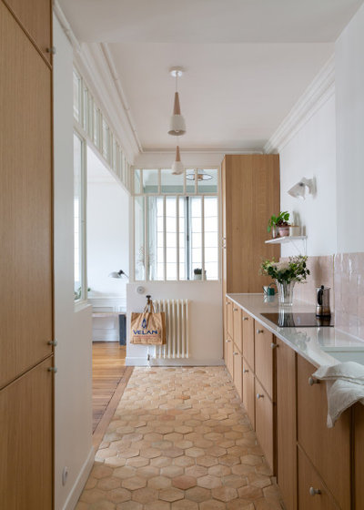
Amélie’s clever idea for regaining usable floor space was to move the kitchen into the hallway and widen the opening into the living room to bring in more light.
As she wanted to install waterproof insulation on the kitchen floor, she got rid of the wood flooring. “I suggested travertine, but my clients preferred terracotta tiles, a material that’s historically common for Parisian floors,” she says.
As she wanted to install waterproof insulation on the kitchen floor, she got rid of the wood flooring. “I suggested travertine, but my clients preferred terracotta tiles, a material that’s historically common for Parisian floors,” she says.
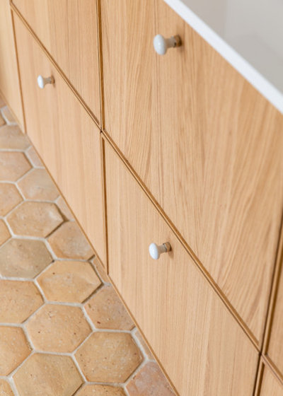
Amélie often reuses old terracotta tiles from flea markets, but these came new from Carrelages de Saint-Samson, a traditional brickyard in Oise. The couple chose hexagonal tiles that are lighter in colour than those generally found in old Parisian buildings. They were laid at slightly different levels. “I love textured effects on floors and walls in general,” Amélie says.
The kitchen was designed with Ikea cupboards and fronts, and enhanced with porcelain and brass handles for a vintage twist. “Many people regret that this model, in a light oak finish, was discontinued; it was very popular,” Amélie says.
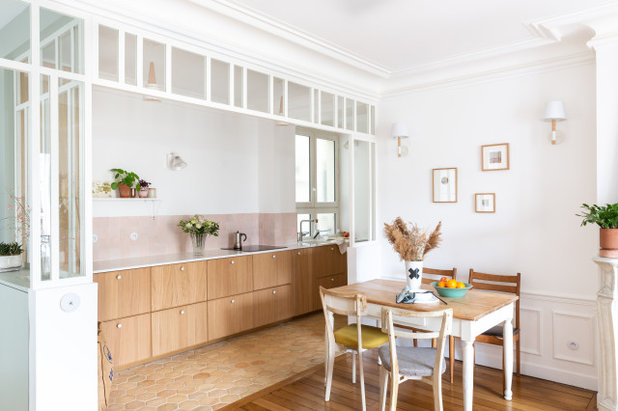
The glass-and-wood frame extends from the window at the entrance, and separates the spaces. Like the terracotta floor, it adds an updated traditional touch.
The glass-and-wood frame extends from the window at the entrance, and separates the spaces. Like the terracotta floor, it adds an updated traditional touch.
Before Photo
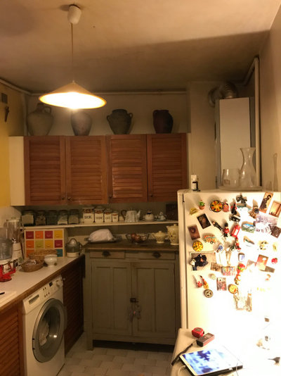
Here is the original kitchen at the far end of the hallway – the antithesis of cosy cooking at home.
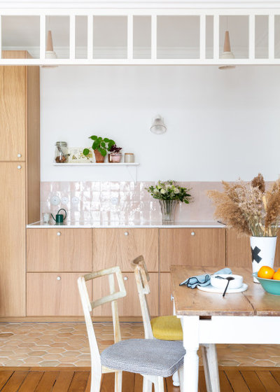
More central in the layout, the new kitchen is understated and practical. It’s mainly made up of under-counter drawers. A quartz worktop and pale pink splashback complete the décor.
“My client fell in love with my profile because of a ‘nude’ tile splashback that I had made for a previous project. She wanted the same thing,” Amélie says.
“My client fell in love with my profile because of a ‘nude’ tile splashback that I had made for a previous project. She wanted the same thing,” Amélie says.
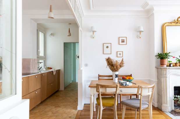
A dining area was sited next to the kitchen at one end of the living room. This cosy nook for four people includes vintage chairs and two wall lights.
Before Photo
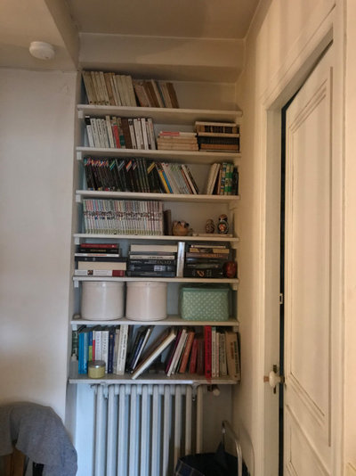
This built-in bookcase concealed a pleasant surprise.
During the demolition, Amélie discovered a window overlooking the courtyard, hidden behind the bookcase. The kitchen would have been quite dark without it.
“It’s crazy how the potential of these old flats was often underexploited,” she says, referring not only to the walled-up window, but also the tiny kitchen, which had been hidden away at the back of the flat, a common layout in Paris.
This photo shows the oven and fridge, cleverly placed on the other side of the hallway so they wouldn’t be visible from the living room. The designer had initially suggested installing a hob with an integrated extractor, but this did not fit in the budget. “If you don’t want an overhead extractor hood, I recommend the German brand Bora, who invented hobs with integrated worktop hoods,” Amélie says.
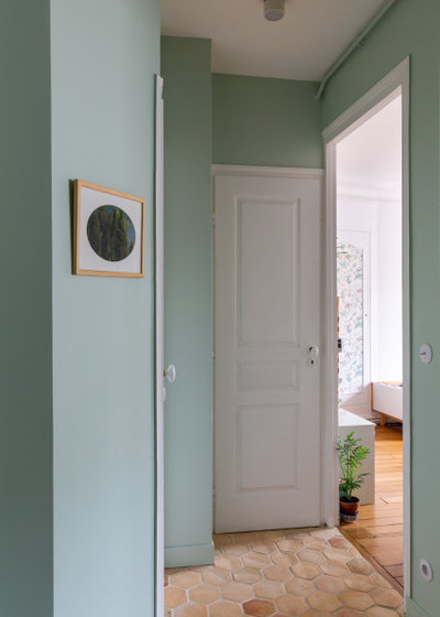
A buffer space at the back of the kitchen leads to the sleeping area. This celadon-green space leads to a toilet on the left, followed by a large dressing room and a laundry cupboard. The door at the back leads to the bathroom. The bedrooms are on the right.
The master bedroom was originally a pass-through to the second bedroom.
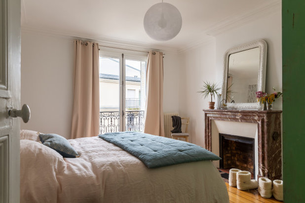
The owners initially wanted to place the main bedroom as far away as possible from the living room, where their daughter loves to play. But during the project the couple thought it would be more logical to use this room, with its beautiful red marble fireplace.
The three original doors have been filled in and Amélie moved the new doorway to the far end of the room.
The three original doors have been filled in and Amélie moved the new doorway to the far end of the room.
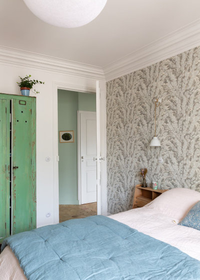
The décor again incorporates touches of colour, while a wallpaper with a plant motif in shades of grey brightens up the headboard.
The designer had suggested creating a bespoke wardrobe, but the owners preferred this green unit from a flea market. “They didn’t want a built-in unit so they could have the freedom to move things around and use unique furniture for a touch of originality, which I completely supported,” Amélie says.
The designer had suggested creating a bespoke wardrobe, but the owners preferred this green unit from a flea market. “They didn’t want a built-in unit so they could have the freedom to move things around and use unique furniture for a touch of originality, which I completely supported,” Amélie says.
Before Photo
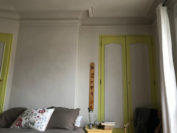
Originally, the only access to the bedroom at the end of the flat was through the master bedroom.
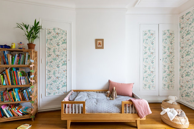
It can now be entered from the hallway. They selected this room to serve as the nursery because of a peculiar feature. “Due to an existing chimney duct, the wardrobes on the side are very shallow and would not have been practical for adult clothing,” Amélie says.
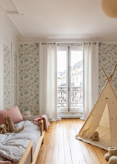
To give the space character, the owners chose a pretty wallpaper with a bird motif and found an antique bed and a rattan bookcase.
Before Photo
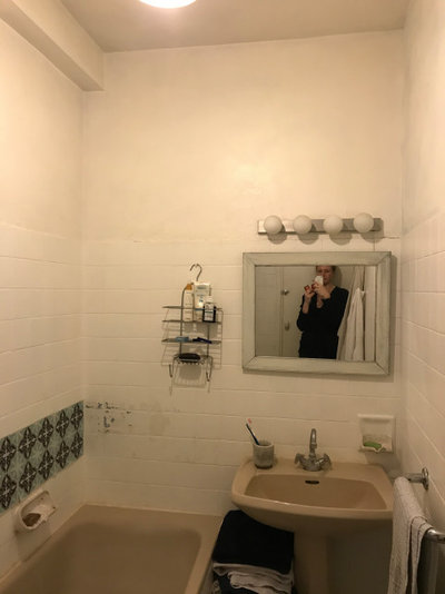
The bathroom was originally a long space adjacent to the kitchen.
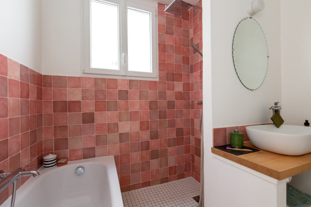
The bathroom has been moved to the space previously occupied by the kitchen, so it now has a window. The layout was challenging, because the owners wanted to fit in both a bath and a shower.
“As the boiler was on the most practical wall for installing the shower, we had to create a nested layout where the shower is positioned perpendicular to the bath, which sits against the shower wall,” Amélie says.
“We should pamper our interiors by making layouts that change everything in our daily lives. Too much potential goes underexploited,” she says.
Tell us…
What do you like about this clever redesign? Share your thoughts in the Comments.

What are you working on?

Related Stories

House Tours
Houzz Tour: Warm Tones and Luxurious Surfaces in a City Townhouse
An earthy colour palette, hidden storage and well-placed texture add character and practicality to this London home
Full Story

Room Tours
Kitchen Tour: A Gorgeous Extension With a Leafy Glasshouse Feel
By Kate Burt
When the owners of this terraced house extended, they were keen to retain its period feel and highlight the garden
Full Story

Gardens
Garden Tour: A Bare Roof Terrace Becomes a Pretty, Sociable Space
By Kate Burt
A retired couple got help transforming their large rooftop into a gorgeous, welcoming, multi-functional retreat
Full Story

House Tours
Houzz Tour: A Smart Layout and Genius Storage in a Victorian Home
Flipping the standard layout and carving out excellent storage have turned this tired house into a brilliant family home
Full Story

House Tours
Houzz Tour: A Victorian House Brought Impressively Up to Date
By Jo Simmons
A cohesive layout and warm colours combined with energy-efficiency measures thoroughly modernise this terraced home
Full Story

Kitchen Tours
Kitchen Tour: An Open, Airy Space Made for Entertaining
Combining two separate rooms has improved flow and created a sociable open-plan kitchen, dining and seating space
Full Story

House Tours
Houzz Tour: A Family Home Inspired by its Seaside Location
Coastal colours and practical design combine to create a house that will adapt as the family grows
Full Story

Kitchens
5 Inspiring Before and After Kitchen Transformations
Whether you want to boost storage, incorporate original features or maximise your space, take ideas from these designs
Full Story

House Tours
Houzz Tour: An Airy, Scandi Finish for a Tall Victorian House
By Kate Burt
From a tricky inherited bath to a sticky-out staircase, on-site problem-solving led to a seamless update for an old home
Full Story
House Tours
Houzz Tour: A 17th Century Cottage Gains Warmth and Character
The clever use of colour and pattern has revived this old building while creating a 21st century family home
Full Story
New layout is so clever and the colour scheme used is gorgeous! I love the simplicity of this home.
Loved how the original glass doors (rejuvenated) and removal of part of the wall gave the kitchen a 'window' and then finding an actual window boarded up what a bonus! Plus use of furniture rather than adding built in's lets the flat continue to evolve.
Not impressed by the uneven floor tiles in the kitchen, trip hazard in neon lights and as someone said hard to clean, will get chipped etc. But they look stunning.
What a great transformation. Well done owners and design team.