Houzz Tours

House Tours

Houzz Tour: A Grown-up, Family-friendly Home in the Hollywood Hills
See how this couple made their new home ready to welcome their baby twins without compromising on style

When the owners of this Hollywood Hills home purchased it, they were bracing for some major life changes. They were relocating from New York City, and were about to become parents of twins. Most would agree that those items constitute a full plate, but the couple went further by deciding to buy this house, a Spanish Mediterranean in the Hollywood Hills. They hired Krista Schrock and David Dick of Disc Interiors to help them make a house that was family-friendly but not exclusively kid-centric.
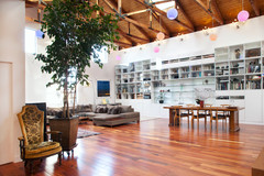
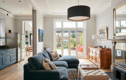
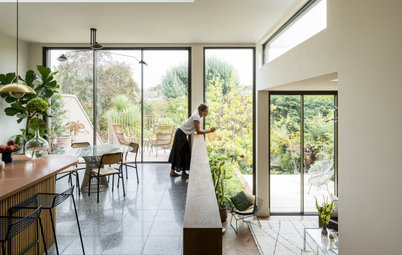
Although it’s hard to tell from the photos, the neutral colour palette is enlivened by leafy-green views from each of the large arched windows. It’s that view that’s responsible for the sofa design: one end is a backless chaise, so as not to block the window.
The painting of the woman curled on a bright red sofa provides a vivid colour splash. It’s by Jose Trujillo, an artist who is also a friend of the couple’s.
Bookshelf, Casamidy.
The painting of the woman curled on a bright red sofa provides a vivid colour splash. It’s by Jose Trujillo, an artist who is also a friend of the couple’s.
Bookshelf, Casamidy.
And that’s not the only unexpected burst of colour: a bright pink side table makes for a kick in the corner.
Console, Lawson-Fenning.
Console, Lawson-Fenning.
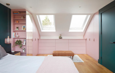
A more pronounced colour statement is on the ceiling of the twins’ nursery. In this room, the designers gave the traditional idea of pink and blue a modern twist: the ceiling is a coral colour, and stripes on the curtains are closer to teal.
The octagonal room is an unusual shape, but it allowed the designers to place cots across the room from each other. ‘They are close but not too close,’ Dick says. ‘This way, when one baby wakes up, there’s a chance it won’t wake the other.’
One of the owners wanted some furniture that would age with the children, so she had the designers create a chest in a natural wood finish. ‘The feeling was that as they get older, white wouldn’t fit as well,’ Dick says.
Glider, DwellStudio. Ottoman, Anthropologie. Rug and baskets, Serena & Lily. Dresser, bespoke.
Cots have a shorter shelf life, so white made sense. Banners of paper streamers (made with coral, teal and metallic strips) are hung securely over the cots, and seem to give the space a celebratory air. The floral bedding picks up some of those colours, while gold and silver cloud-and-stars mobiles reflect the banner’s glitter.
The designers installed sconces over the cots, allowing the parents to check on the individual babies without turning on the overhead light or floor lamp.
Cots, Oeuf. Bedding, Fayce Textiles.
The designers installed sconces over the cots, allowing the parents to check on the individual babies without turning on the overhead light or floor lamp.
Cots, Oeuf. Bedding, Fayce Textiles.
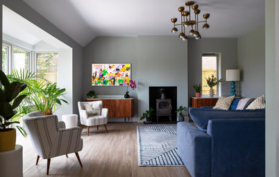
The bedroom for the adults has an outlook that’s less rosy and more verdant. The wall, which reads very dark in this photograph, is a deep, rich green. It sets off the light-coloured headboard, bedding and side table like dark velvet showcases diamonds in a jewellery store.
‘It makes for a very dramatic moment,’ Dick says. ‘I tell clients that you want one strong moment in the room, and you build around that. Too many strong elements is not a good thing.’
Wall painted in Studio Green, Farrow & Ball.
Discover 8 ways to work dark green into your home
‘It makes for a very dramatic moment,’ Dick says. ‘I tell clients that you want one strong moment in the room, and you build around that. Too many strong elements is not a good thing.’
Wall painted in Studio Green, Farrow & Ball.
Discover 8 ways to work dark green into your home
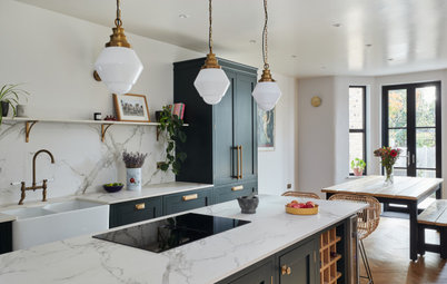
Another strong moment happens in the kitchen, where there are two chairs with a powerful print and banquette seating around a table. This corner was a blank spot before the designers created the banquette and table.
The upholstery on the cushions and chairs is made from outdoor fabric. The top of the bespoke, rounded-corner table is made from white Caesarstone. ‘The clients wanted a table that could easily be wiped off, as kids will be eating here,’ Dick says. ‘One of our clients also plans to use her laptop at the table, so we made sure an outlet is nearby.’
Check out more clever ways to use a bench or banquette in your dining area
The designers worked with the existing cabinetry, adding some contemporary bar stools to freshen the look.
Bar stools, Thomas Hayes Gallery.
Bar stools, Thomas Hayes Gallery.
The adjacent dining room is also an octagonal shape. The designers used a dining room table the clients already owned, and added modern dining chairs. A vintage Moroccan lantern adds a dash of glitz.
Again, the photography doesn’t allow readers to see out of the window, but each pane is filled with green. ‘The light and landscape is really beautiful in Los Angeles, and sometimes we feel like dramatic colours aren’t needed,’ Dick says. ‘The earthier tones can balance everything out.’
Again, the photography doesn’t allow readers to see out of the window, but each pane is filled with green. ‘The light and landscape is really beautiful in Los Angeles, and sometimes we feel like dramatic colours aren’t needed,’ Dick says. ‘The earthier tones can balance everything out.’
TELL US…
What do you think of this Hollywood Hills home? Share your thoughts in the Comments below.
What do you think of this Hollywood Hills home? Share your thoughts in the Comments below.


Sponsored
Sponsored
Houzz at a Glance
Who lives here A couple and their twins (boy and girl)
Location Hollywood Hills, Los Angeles
Size 3 bedrooms, 2½ bathrooms
Year built 1926
Designers Krista Schrock and David Dick of Disc Interiors
The designers were faced with some unique conditions: the clients liked clean, Scandinavian design, and they wanted an interior that would work for kids and adults, because their household was about to double with the birth of their twins. They started with something of a clean slate. ‘They had just moved from New York City,’ Dick says. ‘They had some furniture, but not much.’
The designers created a living room with a subtle palette and a kid-friendly secret. ‘The ottoman opens up for toy storage,’ Dick says. The designers created the piece with soft, rounded corners so it wouldn’t bump the heads of babies who will turn into unsteady-on-their-feet toddlers.
‘The goal of this room was for it to be super comfortable but sophisticated,’ Dick says.