


Houzz Tour: A One-bed London Flat Gets a Stylish New Look
An improved layout, clever ideas and a fresh take on the midcentury look give this neat urban flat style and space
Jo Simmons
15 March 2017
Houzz UK Contributor. I have been an interiors journalist since 1995, writing several books on design and numerous features for glossy homes mags over the years. For Houzz, I cover decorating ideas and trends and interview designers and professionals for their insights. My favourite pieces to write, though, are Houzz Tours, as I love exploring and learning about real homes. Call me curious — or nosy!
Houzz UK Contributor. I have been an interiors journalist since 1995, writing several... More
The owners of this compact apartment, which was built in the 1990s, had lived in a furnished, rented home before, so moving here was a fun opportunity to start from scratch. They asked interior designer Olga Alexeeva to design the new look for their sixth-floor pad in the City of London. “They wanted to add some clever tricks and solutions to help boost space,” she says. “Functionality and good space planning were crucial to this project.” Alexeeva redesigned the layout, borrowing square footage from the bathroom to create a functional, light kitchen and then added space-efficient furniture and lighting to create a hard-working but cosy home, rocking a softly midcentury style.
Houzz at a Glance
Who lives here A professional couple who work in the City
Location The City of London
Property An apartment on the 6th floor of a 1990s block
Size One bedroom, one bathroom
Interior designer Olga Alexeeva of Black & Milk Interior Design
Photos by Daniel Lysenko
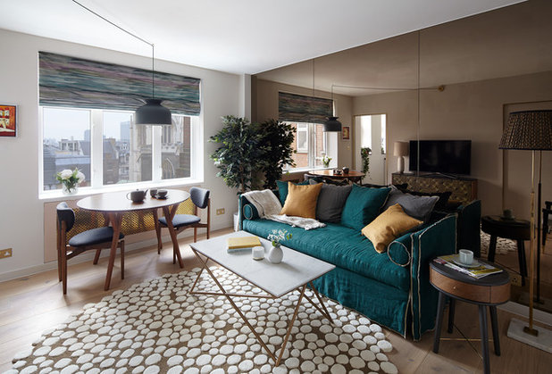
The apartment was completely refurbished, with walls removed, to create a larger kitchen and all the flooring and ceilings replaced. Alexeeva decided to keep a wall of mirrors, original to the flat. “It was there from the start,” she says. “We joked that there was someone sitting behind there watching us! The builders covered it up to protect it during the work and this made us realise how much it actually helped the room, so we decided to keep it.”
You can see in the mirror the two pockets doors that give access to the kitchen and hallway. “When you’re dealing with a small space, pocket doors are one of my favourite solutions!” says Alexeeva. “They are an easy option but really help to free-up the wall space that an open door would block.”
Who lives here A professional couple who work in the City
Location The City of London
Property An apartment on the 6th floor of a 1990s block
Size One bedroom, one bathroom
Interior designer Olga Alexeeva of Black & Milk Interior Design
Photos by Daniel Lysenko
The apartment was completely refurbished, with walls removed, to create a larger kitchen and all the flooring and ceilings replaced. Alexeeva decided to keep a wall of mirrors, original to the flat. “It was there from the start,” she says. “We joked that there was someone sitting behind there watching us! The builders covered it up to protect it during the work and this made us realise how much it actually helped the room, so we decided to keep it.”
You can see in the mirror the two pockets doors that give access to the kitchen and hallway. “When you’re dealing with a small space, pocket doors are one of my favourite solutions!” says Alexeeva. “They are an easy option but really help to free-up the wall space that an open door would block.”
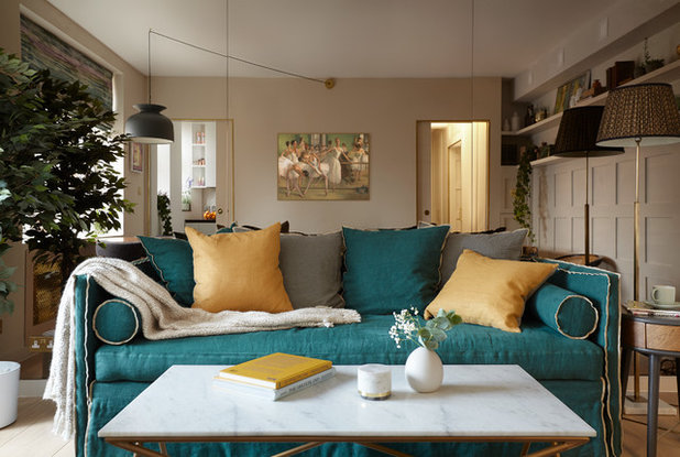
The mirrored wall became the starting point for the whole style and arrangement of the apartment. The sofa is positioned against it, so no one sitting down looks into it. “You don’t really notice it during day-to-day life, but it does a great job of making the space feel bigger and brighter,” says Alexeeva.
She chose an emerald-green sofa to introduce some colour, and then the gold touches on switches and other furniture felt like a natural complement. “The sofa was the anchor for the scheme,” she says. “Then it was quite an organic process of building up the look.”
The sofa is multifunctional and works as a bed for guests, too. “There is a large mattress underneath which pulls out,” says Alexeeva. “It has a slightly French look to it and it’s also incredibly practical.”
Italian sofabed, available through Black & Milk Interior Design. Wormley chair, Duistt.
Alexeeva also positioned a tall plant between the mirrored wall and the dining space, to shield diners from a view of themselves eating!
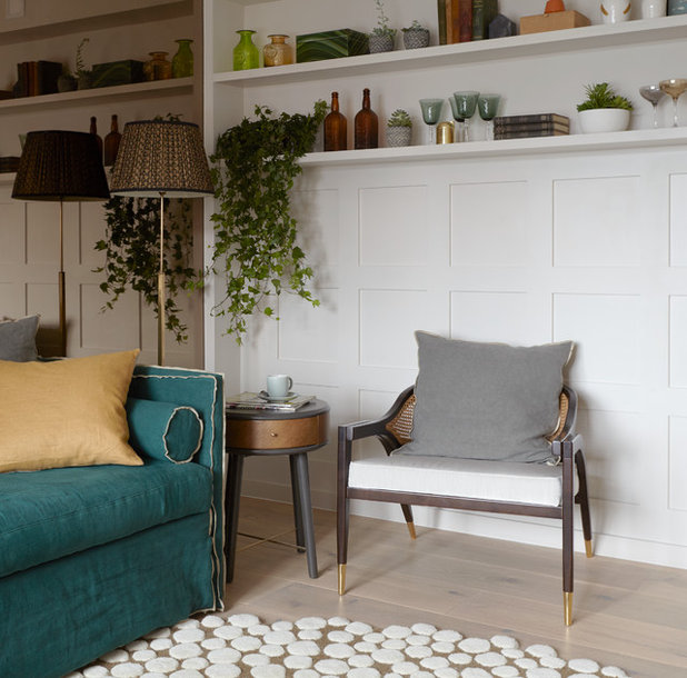
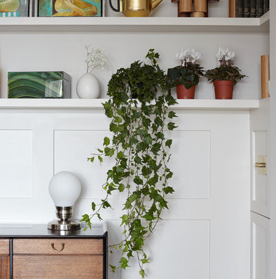
Houseplants feature throughout the apartment. “I like to use plants to make a space feel cosy,” she says. “They add movement, organic shape and colour to a home and really improve its feel. They don’t cost a great deal, either.”
The flooring is wide oak boards, but Alexeeva chose a playful rug, too. “I knew I wanted a round rug just to help level up the geometry in the space,” she says. “The sofa isn’t symmetrically arranged with the sideboard opposite, and a rectangular rug would have drawn attention to that.”
Rug, Houseology. Wide engineered oak boards, Havwoods. Stellar white marble coffee table, Atkin and Thyme. Ronde pendant light, Gubi.
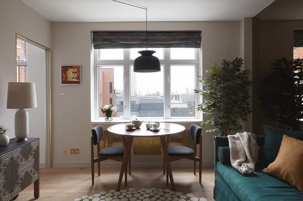
The décor is gently midcentury in style. “The architecture of the block is very contemporary, so I felt we couldn’t go that traditional in here,” says Alexeeva, “but the owners wanted something cosy and homely, so I thought, let’s find a look that is in between traditional and contemporary.”
Mid-century Dining table and Classic Cafe dining chairs, West Elm. Rug, Houseology, as before. CoucouManou Loop sideboard, Clippings. Ronde pendant light, Gubi, as before.
Mid-century Dining table and Classic Cafe dining chairs, West Elm. Rug, Houseology, as before. CoucouManou Loop sideboard, Clippings. Ronde pendant light, Gubi, as before.
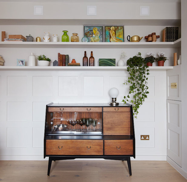
Alexeeva found this midcentury cabinet at a vintage store in Rye, East Sussex. “I just loved it!” she says. “I asked the clients if they wanted it, and said if not, I’ll have it! There was just enough space for it and it’s a lovely original piece which brings real warmth.”
Lights are fitted into the wall, rather than the ceiling. “The ceilings are not very high, so we didn’t want lights dropping down into the space,” says Alexeeva.
Lights are fitted into the wall, rather than the ceiling. “The ceilings are not very high, so we didn’t want lights dropping down into the space,” says Alexeeva.
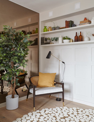
Rather than go for a uniformly midcentury look, Alexeeva also chose pieces that referenced the style but with a twist. “This chair has gold-tipped legs which is a bit traditional, and it helps link together the more classic sofa with the original midcentury pieces,” says Alexeeva. “I love midcentury style, but you can’t recreate the whole look. We live in a new age; we shouldn’t take everything from just one style. Many of the pieces in here are a new interpretation of that look.”
Wormley chair, Duistt, as before. Floor lamp, Pooky.
Wormley chair, Duistt, as before. Floor lamp, Pooky.
Wall panelling softens the feel in the living room and helps it to look more classic than contemporary. “That said, this panelling is quite modern,” says Alexeeva. “It has no mouldings or fussy details, just very straight lines.”
Floor-to-ceiling shelving would have eaten into vital wall space and taken up room where furniture now sits. Instead, Alexeeva installed shelving above the panelling, answering a need for storage and display space.
Read 10 great ideas for creating vignettes in your living room
Floor-to-ceiling shelving would have eaten into vital wall space and taken up room where furniture now sits. Instead, Alexeeva installed shelving above the panelling, answering a need for storage and display space.
Read 10 great ideas for creating vignettes in your living room
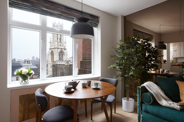
A midcentury-style dining table and chairs sits neatly by the window, which has views over the city of London towards the London Eye. Alexeeva created the golden radiator covers using metal mesh, to both conceal the radiators and tie in with the touches of brass and gold dotted throughout.
Dining table and chairs, West Elm, as before. Ronde pendant light, Gubi, as before.
Dining table and chairs, West Elm, as before. Ronde pendant light, Gubi, as before.
The bathroom originally extended all the way to this exterior wall, while the kitchen itself butted out awkwardly into the living space. Alexeeva redesigned both rooms, squaring the kitchen off so it’s in line with the bathroom and doesn’t intrude on the living space and then reducing the size of the bathroom, so that this portion of light-flooded space now belongs to the kitchen.
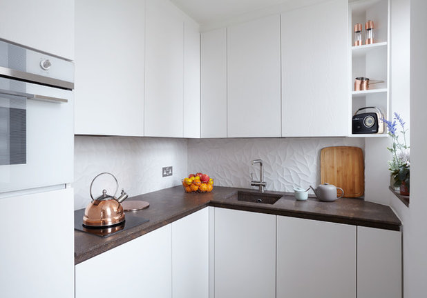
The apartment lacked a proper kitchen, but the owners wanted a decently equipped room, with a dishwasher, washing machine and microwave. “They wanted all the functionality but in a really small space,” says Alexeeva.
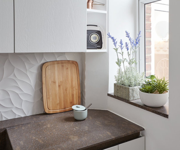
The redesigned kitchen now features white units topped off with rugged stone worktops. “It’s very simple and plain in here, apart from the distinctive Italian stone on the worktop,” she says. “I wanted to add some elegance; something to contrast with the stone, and found these ceramic tiles with a wave in them, which look really gentle.”
Ceramic tiles, Porcelanosa. Stone, sourced directly from Italy, available through Black & Milk Interior Design.
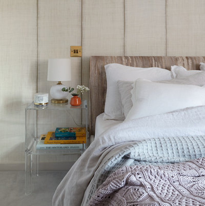
The bedroom was designed to be very calm and subtle, but once finished, Alexeeva decided it was looking too plain. “It was lacking something!” she says. “So I found this really fantastic wallpaper with an organic, uneven pattern on it, which works well with the brass switches. It’s perfect!”
Sari Nomades wallpaper, Elitis. Philippe Starck for Kartell Ghost Buster night table, John Lewis. Lilac throw, Zara Home.
Sari Nomades wallpaper, Elitis. Philippe Starck for Kartell Ghost Buster night table, John Lewis. Lilac throw, Zara Home.
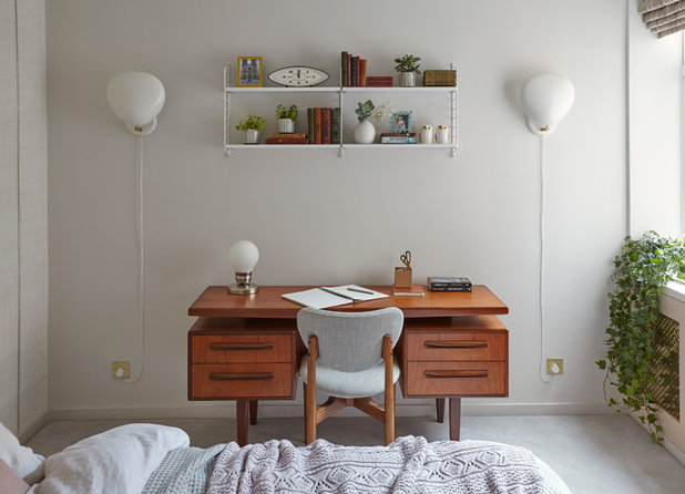
The owners wanted a small office area to be included in the bedroom and Alexeeva sourced an original midcentury desk for them. The chair matches those around the dining table and can be used as extra seating when friends come to dinner. Layers of lighting, including these beautiful wall lights, create a cosy, intimate feel.
Original midcentury desk, Layer Home. Classic Cafe dining chair, West Elm, as before. String shelving, Skandium. Cobra wall lights, Gubi.
These nine tidy spaces will inspire you to organise your home
Original midcentury desk, Layer Home. Classic Cafe dining chair, West Elm, as before. String shelving, Skandium. Cobra wall lights, Gubi.
These nine tidy spaces will inspire you to organise your home
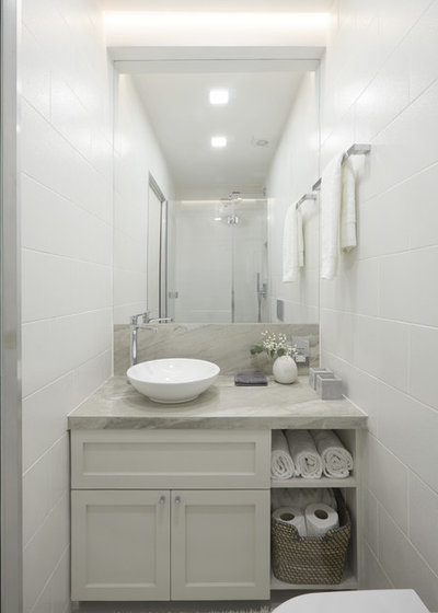
As already mentioned, to create space in the kitchen and streamline the layout of the living room, the bathroom had to lose space, but it remains a good size. “The shower is really big and there’s a generous vanity unit in there,” says Alexeeva. To help it feel bright, she used wall mirrors and light colours, too.
Alexeeva designed the vanity unit to fit the newly reconfigured bathroom and used a basin that the owners had been given. “The top looks like really nice stone but it’s actually a porcelain tile, so much less expensive,” she says.
Tiles on vanity unit and walls, Porcelanosa.
Inspired by this gentle take on midcentury style? Share your thoughts in the Comments below – and please remember that you’re discussing someone’s home!


Related Stories

House Tours
Houzz Tour: Warm Tones and Luxurious Surfaces in a City Townhouse
An earthy colour palette, hidden storage and well-placed texture add character and practicality to this London home
Full Story

Room Tours
Kitchen Tour: A Gorgeous Extension With a Leafy Glasshouse Feel
By Kate Burt
When the owners of this terraced house extended, they were keen to retain its period feel and highlight the garden
Full Story

Gardens
Garden Tour: A Bare Roof Terrace Becomes a Pretty, Sociable Space
By Kate Burt
A retired couple got help transforming their large rooftop into a gorgeous, welcoming, multi-functional retreat
Full Story

House Tours
Houzz Tour: A Smart Layout and Genius Storage in a Victorian Home
Flipping the standard layout and carving out excellent storage have turned this tired house into a brilliant family home
Full Story

House Tours
Houzz Tour: A Victorian House Brought Impressively Up to Date
By Jo Simmons
A cohesive layout and warm colours combined with energy-efficiency measures thoroughly modernise this terraced home
Full Story

Kitchen Tours
Kitchen Tour: An Open, Airy Space Made for Entertaining
Combining two separate rooms has improved flow and created a sociable open-plan kitchen, dining and seating space
Full Story

House Tours
Houzz Tour: A Family Home Inspired by its Seaside Location
Coastal colours and practical design combine to create a house that will adapt as the family grows
Full Story

Kitchens
5 Inspiring Before and After Kitchen Transformations
Whether you want to boost storage, incorporate original features or maximise your space, take ideas from these designs
Full Story

House Tours
Houzz Tour: An Airy, Scandi Finish for a Tall Victorian House
By Kate Burt
From a tricky inherited bath to a sticky-out staircase, on-site problem-solving led to a seamless update for an old home
Full Story
House Tours
Houzz Tour: A 17th Century Cottage Gains Warmth and Character
The clever use of colour and pattern has revived this old building while creating a 21st century family home
Full Story
I love every bit except the mirror wall. <8-s
How wonderful to see the 3 Door Loop Cabinet in it's home Alexeeva. Great to have worked with you.
ahindler
"The Dance Class" Serguei Zlenko
https://www.saatchiart.com/art/Painting-The-Dance-Class-1874-2013/53545/1649287/view