


Houzz Tour: A Smart Extension Pours Light Into a Dark, Dated Home
Neutral, soothing tones and a spacious glass extension breathe new life into this Victorian family house

When the owners of this large London property first moved in, they waited more than a year before they took on a professional to overhaul it. “The clients wanted a welcoming family home, child-friendly and comfortable to live in, with an area where they could entertain and maximum light,” says interior designer Sybille Garnier Le Mené of Into Interior Design, who was tasked with transforming the property.
“The owners are French, like me, and we found we had a lot in common,” she says. “It was good that they lived in the house first, as it gave them the opportunity to really think about what they wanted.”
“The owners are French, like me, and we found we had a lot in common,” she says. “It was good that they lived in the house first, as it gave them the opportunity to really think about what they wanted.”
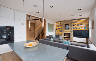
The built-in shelving and TV cabinet is a bespoke piece designed by Garnier Le Mené, painted in the same colour as the walls and skirting boards to meld with the architecture.
“Pierre once said to his mum that the bookcases had been ‘Sybilled’,” says Garnier Le Mené with a smile. “I found this really sweet and it became an inside joke on how the clients presented the newly designed house to their friends.”
Garnier Le Mené had the cushions made in Istanbul in the Grand Bazaar.
“My client had mentioned that she would love a touch of flashy pink in the living room and these silk ikat cushions bring an interesting accent colour to the neutral scheme.”
Long Island coffee tables, Maisons du Monde.
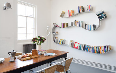
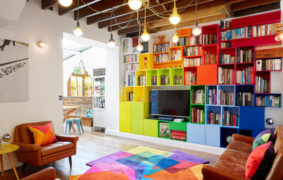
Discover how to lift a white room with rainbow brights
“Pierre once said to his mum that the bookcases had been ‘Sybilled’,” says Garnier Le Mené with a smile. “I found this really sweet and it became an inside joke on how the clients presented the newly designed house to their friends.”
Garnier Le Mené had the cushions made in Istanbul in the Grand Bazaar.
“My client had mentioned that she would love a touch of flashy pink in the living room and these silk ikat cushions bring an interesting accent colour to the neutral scheme.”
Long Island coffee tables, Maisons du Monde.
Discover how to lift a white room with rainbow brights
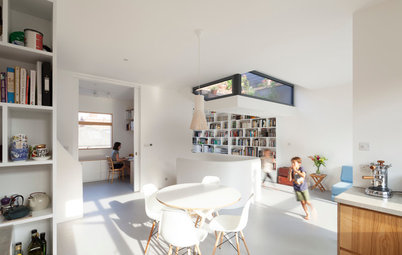
Garnier Le Mené created a wide opening between the dining room and living area at the front to bring in as much natural light as possible.
“The dining room was very dark, but now the light comes in from both sides – from the living room and from a skylight in the new rear extension,” says the interior designer.
“The walls are painted two tones lighter in here, but the difference is barely noticeable, as this area is not as bright as the adjoining living room.”
Light oak engineered floorboards enhance the neutral backdrop.
Walls painted in Slate III, Paint & Paper Library. Eames DSW chairs, available from Heal’s.
A modern, sculptural light fitting contrasts with the original ceiling rose.
“It was chosen because it had several bulbs,” Garnier Le Mené says. “We wanted to keep the beautiful ceiling rose, while choosing a fixture that would throw enough light onto the dining table in the evening.”
Molecular suspension light, House Doctor.
“It was chosen because it had several bulbs,” Garnier Le Mené says. “We wanted to keep the beautiful ceiling rose, while choosing a fixture that would throw enough light onto the dining table in the evening.”
Molecular suspension light, House Doctor.
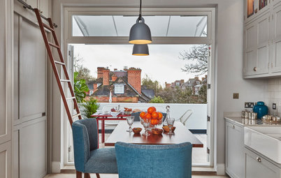
From the dining room, there’s a clear view into the new extension.
“One of the biggest challenges of the house was creating a rear extension in a conservation area, and designing an external shape that would work with the style of the house,” Garnier Le Mené says.
“One of the biggest challenges of the house was creating a rear extension in a conservation area, and designing an external shape that would work with the style of the house,” Garnier Le Mené says.
One of the key aspects of the clients’ brief was a spacious rear extension in which they could relocate the kitchen and create a relaxed sitting area.
“My clients wanted to maximise wall space in the extension for the kitchen units and for a large, L-shaped sofa,” Garnier Le Mené says. “They didn’t want long, sliding doors, which would have taken up too much wall space. However, they wanted the room to be very bright and were happy with the idea of having lots of windows, a wide glass roof and a skylight.”
The room is painted in bright white to contrast with the dark grey window and door frames, and to help maximise the natural light pouring through the glass.
“The L-shaped sofa from Ikea was restyled with new wooden legs from PrettyPegs,” says Garnier Le Mené. “The desk is an old Singer [sewing machine] table, perfect for hosting a computer, that was originally in the hallway.”
The wall light was chosen to echo the sloped wall, which starts very high and finishes at 2m 20cm. “Something big was needed in here and this was the perfect fitting,” the designer says.
Flos 265 wall light, available from Utility. Soderhamn sofa, Ikea. Cushions, Caravane and Niki Jones. Louis de Poortere Medallion rug, Nina Burgess.
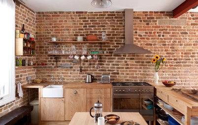
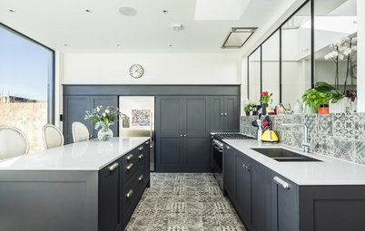
White matt lacquer units and oak veneer wall cabinets create an effortless, easy-on-the-eye kitchen vibe.
“The clients wanted plenty of storage, an island unit that could seat at least five people on high stools, an American fridge-freezer and an all-white minimalist look,” explains the designer. “They prefer modern-style kitchen units to traditional ones, because they find them more functional.”
Alnostar Fine kitchen units, Linear London. Oven and hob, Miele. Goliath fridge-freezer, Fisher & Paykel. Dishwasher and extractor fan, Neff. Byron pendant lights, Neptune.
It was important the extension worked with the original architecture of the house.
“I came up with the idea of a pitched roof in order to create a visual separation between the kitchen and seating area in the extension,” Garnier Le Mené says.
“Initially, I was hoping to go for Crittall windows and thin frames, but this wasn’t feasible, technically, for the glazed pitched roof, so we went for a contemporary structure with thicker frames.”
The light, bright hallway sets the tone for the rest of the revamped property, and is one of Garnier Le Mené’s favourite parts of the house.
“It’s a timeless and welcoming entrance, with its stained-glass door and original Victorian tiles and mouldings,” she says. “From the entrance, you’re instantly drawn to walk through to the bright new extension at the back of the house and out into the big garden.”
Console; mirror, both Maisons du Monde. Sisal stair runner, Nina Burgess.
The original floor tiles were restored to their former glory.
“The client absolutely wanted to keep them, as they’re part of the original house,” says the designer. “The grey-khaki tone of the walls was chosen to work with the brown and blue tones of the floor tiles.”
Walls painted in Slate V, Paint & Paper Library. Zap bamboo pendant light, Holly’s House.
“The client absolutely wanted to keep them, as they’re part of the original house,” says the designer. “The grey-khaki tone of the walls was chosen to work with the brown and blue tones of the floor tiles.”
Walls painted in Slate V, Paint & Paper Library. Zap bamboo pendant light, Holly’s House.
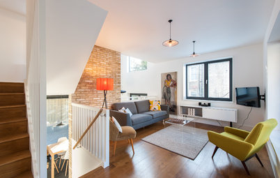
White-painted walls and banisters, with a contrasting black handrail, open up the light-filled stairwell.
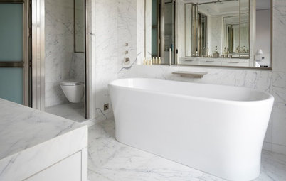
The redesigned spacious and bright yet calm master bathroom on the first floor is the designer’s favourite.
“There was a gorgeous old Victorian tub in here when my clients first visited the house, but the previous owner took it away, as well as an antique basin,” she says. “Thankfully, he left the old radiator and the copper towel rail and these were the starting point of the redesign.”
Harrison freestanding bath, Victoria Plumb.
Mistakes to avoid when designing a new bathroom
An elegant mix of old and new creates a sophisticated mood in the bathroom.
“My client was keen to mix traditional and contemporary lines, especially for the bath and basins, as she wanted them to be very functional,” Garnier Le Mené says.
The designer offset timeless, blue patterned floor tiles with metro tiles for the walls and a distressed French armoire.
“The armoire was originally in the master bedroom, but it was put to better use in the bathroom to store everything we wanted to hide,” Garnier Le Mené says.
Ceramic glazed floor tiles; Architecture matt metro tiles, all Fired Earth. Happy D basins, Duravit. Mirrors, Maisons du Monde. Hector Medium wall lights, Original BTC.
The sleek, walk-in shower contrasts with the vintage elements in the bathroom. The simple, frameless glass screen was cut by a specialist.
“We went for ceramic glazed tiles for the floor, which are suitable for use in a wet room,” Garnier Le Mené explains. “Cement tiles are too porous and wouldn’t have been suitable for the shower area.”
“We went for ceramic glazed tiles for the floor, which are suitable for use in a wet room,” Garnier Le Mené explains. “Cement tiles are too porous and wouldn’t have been suitable for the shower area.”
An original copper towel rail adds character.
A new guest bathroom was created in a dressing room space on the first floor. The pretty, star-print cement tiles add subtle pattern and colour.
“The mirror is from Maisons du Monde,” says Garnier Le Mené. “I wanted something big in here and with a vintage look.”
Wall-hung basin, Bathstore. Floor tiles, Mosaic del Sur.
“The mirror is from Maisons du Monde,” says Garnier Le Mené. “I wanted something big in here and with a vintage look.”
Wall-hung basin, Bathstore. Floor tiles, Mosaic del Sur.
The clean-lined look is enhanced with white metro tiles and a simple, over-bath shower screen.
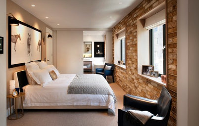
The master bedroom is decorated in serene grey tones.
“Behind a discreet door painted in the same colour as the walls [not shown], and without any architrave, is a hidden dressing room with 3m of wardrobe space inside,” explains Garnier Le Mené.
The portrait of the little boy is of the owner when he was young.
Walls painted in Slate V, Paint & Paper Library. Bed, Warren Evans. Bed linen, The White Company. Cushions; eiderdown, all Caravane.
What do you think of this redesigned family home? Share your thoughts in the Comments below.

Sponsored
Who lives here A French family – Catherine, a property market analyst, Guillaume, an economist, their three children, Juliette, 14, Pierre, 11, and Alexandre, 8, and their two cats
Location Heaver conservation area in Balham, south London
Property A three-storey, semi-detached Victorian house
Size 5 bedrooms, 3 bathrooms
Designer Sybille Garnier Le Mené of Into Interior Design
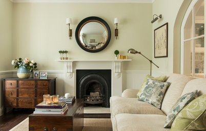
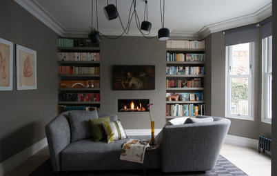
The living room, at the front of the property, was originally separated from the dining room and, like the rest of the house, was dark and very dated, although it did have some beautiful period features.
“There was dark green wallpaper with lilies on it, deep brown varnish applied on every door, and yellow walls in many rooms, which instead of providing light, absorbed it,” says interior designer Sybille Garnier Le Mené.
Now, the north-facing room is a sophisticated palette of greys with touches of colour.
“I love working this way, as it’s easier to change a colour scheme by switching cushions, instead of changing wall colours,” she says.
Walls painted in Slate V, Paint & Paper Library. Holly loveseat, Sofa.com.