


Houzz Tour: A Studio Space Reinvented as a Stylish One-bed Flat
Before and after photos show how a studio has been given a new bedroom, roomy storage and smart, Scandi-inspired décor
Agnès Carpentier
5 May 2018
After a year of searching, the owner of this flat finally found the place of her dreams: a 398 sq ft (37 sq m) studio on the fifth floor of a 1960s building. She loved its location, brightness, oak floor and open views.
But while the flat was in fairly good condition, it didn’t meet several of this first-time-buyer’s non-negotiable requirements. The first was that the bedroom should be separate from the rest of the space; the second was a large dressing room for storing all her clothes and shoes. Finally, she longed for a cosy interior that would reflect her personality.
She was won over by the creativity of the June agency – a young interior design duo – and entrusted the renovation to them.
Houzz at a Glance
Who lives here A young woman
Location Neuilly-sur-Seine (just west of Paris), France
Property A flat in a 1960s building
Size About 398 sq ft (37 sq m)
Budget About £28,000 (€32,000) excluding tax
Completed February 2017
Interior designers Anne Fath and Julia Schmit of June
Photos by Shoootin
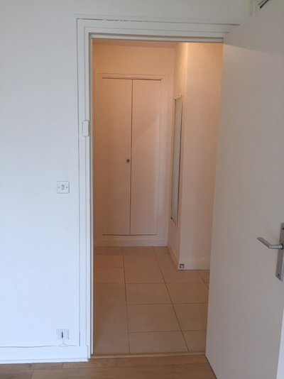
Before This is what the entrance to the studio looked like when Anne Fath and Julia Schmit saw it on their first visit. With white walls, vinyl flooring and outdated wiring, the property really needed a makeover.
Who lives here A young woman
Location Neuilly-sur-Seine (just west of Paris), France
Property A flat in a 1960s building
Size About 398 sq ft (37 sq m)
Budget About £28,000 (€32,000) excluding tax
Completed February 2017
Interior designers Anne Fath and Julia Schmit of June
Photos by Shoootin
Before This is what the entrance to the studio looked like when Anne Fath and Julia Schmit saw it on their first visit. With white walls, vinyl flooring and outdated wiring, the property really needed a makeover.
After “A door had separated the original entrance from the studio. We opened the entrance up to the living room while adding some drama with midnight blue paint,” Fath says. “This dark hallway calls out to those who enter, attracting them irresistibly towards the light and the core of the apartment.”
Blue wall painted in SL25 Minuit, Ressource.
Blue wall painted in SL25 Minuit, Ressource.
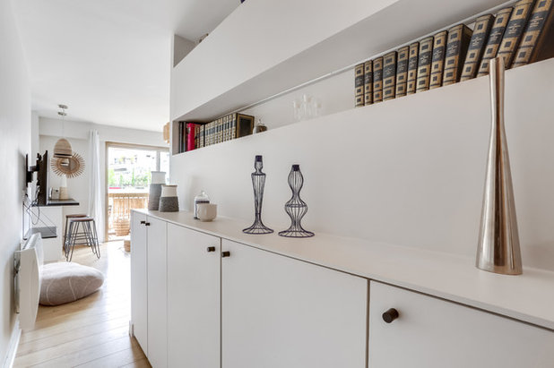
In the hallway, the original wall that had partitioned off the bathroom was remodelled and extended: it now conceals electrical wiring and pipes and is equipped with cupboards.
The lower part stores the owner’s shoes, while the niches above hold her books and decorative objects.
How to sneakily pack more storage into your flat
The lower part stores the owner’s shoes, while the niches above hold her books and decorative objects.
How to sneakily pack more storage into your flat
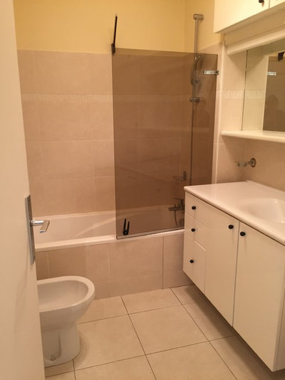
Before Just opposite the front door is the bathroom, which was the area most affected by the renovation. This 86 sq ft (8 sq m) room originally had a bath, toilet, bidet and basin. It was disproportionately large for the small square footage of the studio as a whole.
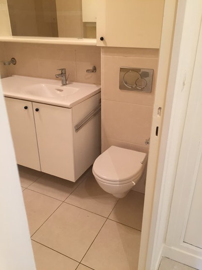
The designers took the opportunity to split the bathroom to gain more space for the bedroom and dressing room. They put in a shower and turned an existing cupboard by the entrance into a separate toilet.
Search for bathroom designers and fitters on Houzz
Search for bathroom designers and fitters on Houzz
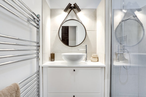
After The new shower room was reduced to the smallest possible size, although it still has a comfortable shower and vanity unit.
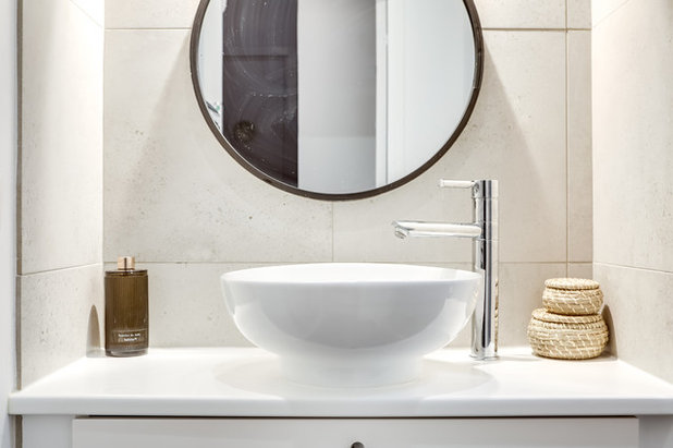
A stylish mirror and concrete-look tiles are a chic touch.
Mirror, Leroy Merlin.
Find your perfect round mirror in the Houzz Shop
Mirror, Leroy Merlin.
Find your perfect round mirror in the Houzz Shop
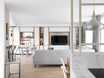
The young owner wanted the interior designers to create a small, detached bedroom next to the living room. As all the studio’s windows are on the same side, they opted for a glass partition to pull some of that light into the room.
“[The owner] is keen on art and design. So rather than proposing the kind of glass wall you see everywhere nowadays, we designed an original model, inspired by Mondrian’s paintings,” Fath says. The glass wall cost about £3,507 (€4,000 euros).
“[The owner] is keen on art and design. So rather than proposing the kind of glass wall you see everywhere nowadays, we designed an original model, inspired by Mondrian’s paintings,” Fath says. The glass wall cost about £3,507 (€4,000 euros).
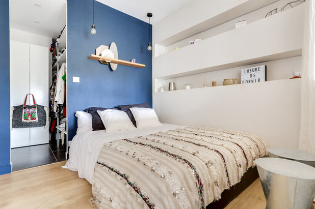
The new bedroom is not huge, but it can accommodate a double bed. Creating it took floor space from the living room, while the dressing area behind the headboard – distinguishable by the change in flooring – takes up part of what used to be the bathroom. The dressing room floor is covered with anthracite-coloured porcelain.
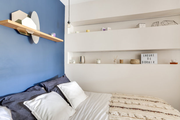
The side wall is, in fact, the other side of the partition by the entrance. The interior designers shaped this wall on both sides in such a way that sections on one side correspond to niches on the other. On the bedroom side, they make up for the lack of bedside tables.
An accent wall in midnight blue – the same colour as in the hallway – gives the room a sense of depth and perspective when seen from the living room. An oak shelf with three embedded mirrors, created by the interior designers, stands out at the centre. The handira, or Moroccan wedding blanket, on the bed adds a soft, cosy feel. These textiles are hand-woven by the women of the Atlas Mountains and worn by Berber brides on their wedding day.
An accent wall in midnight blue – the same colour as in the hallway – gives the room a sense of depth and perspective when seen from the living room. An oak shelf with three embedded mirrors, created by the interior designers, stands out at the centre. The handira, or Moroccan wedding blanket, on the bed adds a soft, cosy feel. These textiles are hand-woven by the women of the Atlas Mountains and worn by Berber brides on their wedding day.
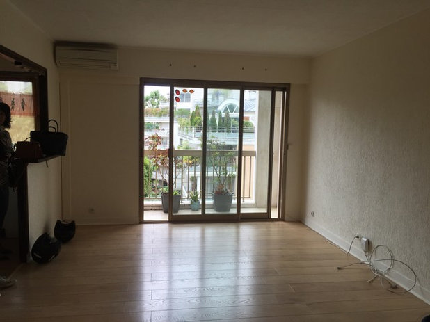
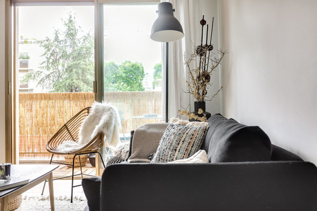
Before The owner fell in love with the living room because of its glazed sliding door, which opens onto a small balcony.
To its left, a half-wall had divided the kitchen from the living room, creating a small breakfast bar.
To its left, a half-wall had divided the kitchen from the living room, creating a small breakfast bar.
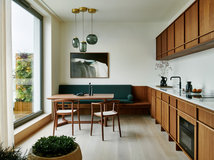
After The designers kept the kitchen in the same place, but completely renovated it to give it a new look. The main transformation was the conversion of the breakfast bar into a kitchen peninsula. Not only did this create more worktop space in the kitchen, it provided the owner with a dining table and work area.
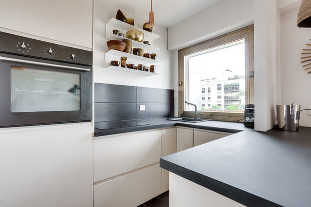
The larger worktop also creates more space for cooking, and there’s plenty of storage space at its sides. The original kitchen was also replaced with an Ikea model with off-white fronts. The worktop is matt anthracite laminate, and the floor is in matching porcelain.
Velvet Mat worktop, Lapeyre. Murano porcelain floor tiles, Leroy Merlin.
Velvet Mat worktop, Lapeyre. Murano porcelain floor tiles, Leroy Merlin.
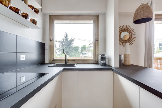
The black resin sink is tucked into a corner of the kitchen to free up as much worktop space as possible. It was placed in a corner cabinet with the dishwasher on its right.
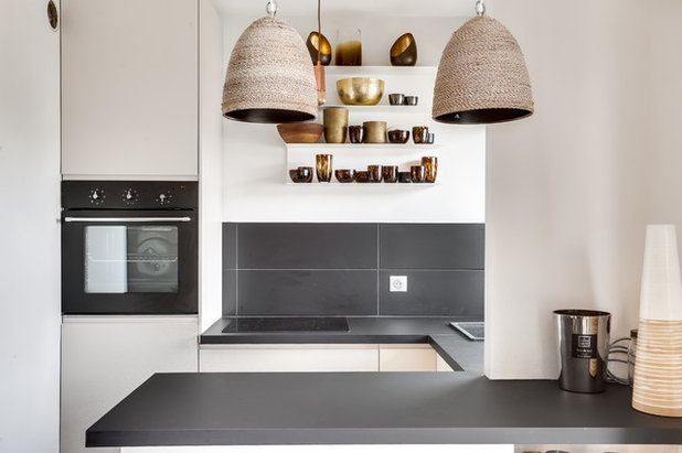
The tall kitchen cabinet holds a traditional oven, a microwave at the top and a fridge-freezer at the bottom. The owner displays her collection of vases and tableware – things she particularly likes to bargain-hunt for – on the two folded-metal shelves.
Light fixtures, La Redoute.
Light fixtures, La Redoute.
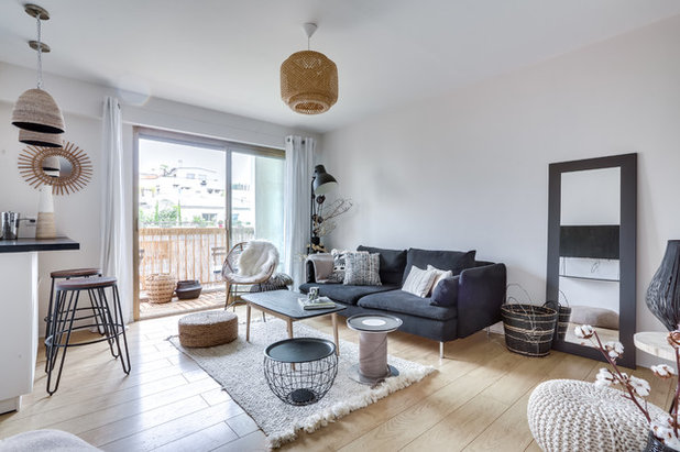
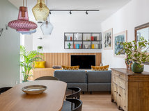
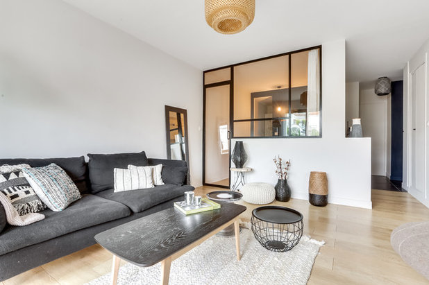
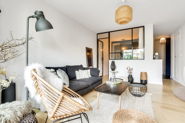
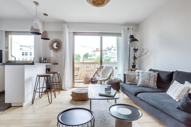
In the living room, the owner focused her attention on the décor. “We were dealing with a design enthusiast who already had a lot of things from her previous home. We only added a few touches,” Fath says.
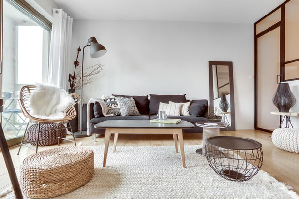
The design duo created a feeling of hygge, the Danish décor philosophy of intimate, welcoming, convivial and restorative interiors. “[The owner] loves black and white, the colours she often wears. We started from this classic palette and added natural fibres for their warm colour,” Fath says.
Sofa; floor lamp; chair throw, all Ikea. Wool pouffe, La Redoute. Net coffee table, second-hand find.
Sofa; floor lamp; chair throw, all Ikea. Wool pouffe, La Redoute. Net coffee table, second-hand find.
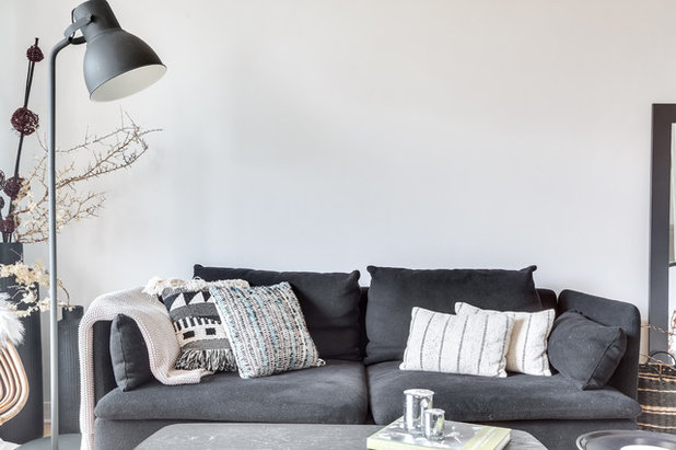
To ensure the contrast between black, white and light wood wouldn’t be too stark, the designers used grey, beige and pattern. From the cushions on the sofa to the throws and the coffee table top, everything was carefully selected to create this final look, which now feels like the obvious choice.
The mixture of materials is another key to the success of the refined and relaxed interior. Wood and openwork metal echo the steel frame of the glass wall.
Likewise, the arrangement of the pieces is visually dynamic, with the vertically extended lamp and mirror (just out of shot) balancing the horizontal coffee table and sofa.
Likewise, the arrangement of the pieces is visually dynamic, with the vertically extended lamp and mirror (just out of shot) balancing the horizontal coffee table and sofa.
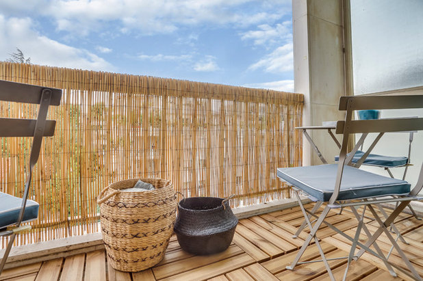
The interior designers also refreshed the balcony, which now serves as an extension of the interior. It visually enlarges the living room and partially makes up for the space lost to the bedroom. An exotic wood duckboard picks up on the feel of the interior floor. A bamboo screen adds a natural touch and some privacy.
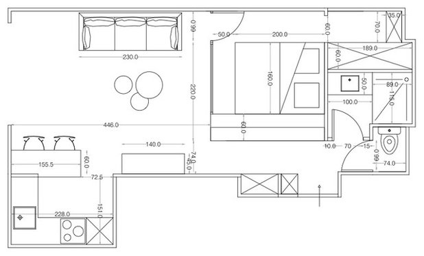
The floorplan shows how the space has cleverly been reconfigured to accommodate the bedroom.
It took the interior designers two-and-a-half months to completely redesign the space. The £28,000 budget may seem large, but it included the complete revamp of the electrical, heating and plumbing systems in addition to the functional and decorative makeover. In addition, a dropped ceiling was installed throughout the flat, both to allow for soundproofing and to conceal wiring from light fixtures. Finally, new channels were created in the wall for wires that had previously been hidden under trunking.
Tell us…
What do you think of the new layout and style of this flat? Share your thoughts in the Comments section.


Related Stories

House Tours
Houzz Tour: A Midcentury Home With a Strong Indoor-outdoor Link
By Becky Harris
A nature-inspired renovation has given this ranch house a relaxed mood and a connection to the outdoors from most rooms
Full Story

House Tours
Houzz Tour: Warm Tones and Luxurious Surfaces in a City Townhouse
An earthy colour palette, hidden storage and well-placed texture add character and practicality to this London home
Full Story

Room Tours
Kitchen Tour: A Gorgeous Extension With a Leafy Glasshouse Feel
By Kate Burt
When the owners of this terraced house extended, they were keen to retain its period feel and highlight the garden
Full Story

Gardens
Garden Tour: A Bare Roof Terrace Becomes a Pretty, Sociable Space
By Kate Burt
A retired couple got help transforming their large rooftop into a gorgeous, welcoming, multi-functional retreat
Full Story

House Tours
Houzz Tour: A Smart Layout and Genius Storage in a Victorian Home
Flipping the standard layout and carving out excellent storage have turned this tired house into a brilliant family home
Full Story

House Tours
Houzz Tour: A Victorian House Brought Impressively Up to Date
By Jo Simmons
A cohesive layout and warm colours combined with energy-efficiency measures thoroughly modernise this terraced home
Full Story

Kitchen Tours
Kitchen Tour: An Open, Airy Space Made for Entertaining
Combining two separate rooms has improved flow and created a sociable open-plan kitchen, dining and seating space
Full Story

House Tours
Houzz Tour: A Family Home Inspired by its Seaside Location
Coastal colours and practical design combine to create a house that will adapt as the family grows
Full Story

Kitchens
5 Inspiring Before and After Kitchen Transformations
Whether you want to boost storage, incorporate original features or maximise your space, take ideas from these designs
Full Story

House Tours
Houzz Tour: An Airy, Scandi Finish for a Tall Victorian House
By Kate Burt
From a tricky inherited bath to a sticky-out staircase, on-site problem-solving led to a seamless update for an old home
Full Story
Oh, it's so gray. I live on the Oregon coast. We have gray in spades, thank you.
which design concept you have used??